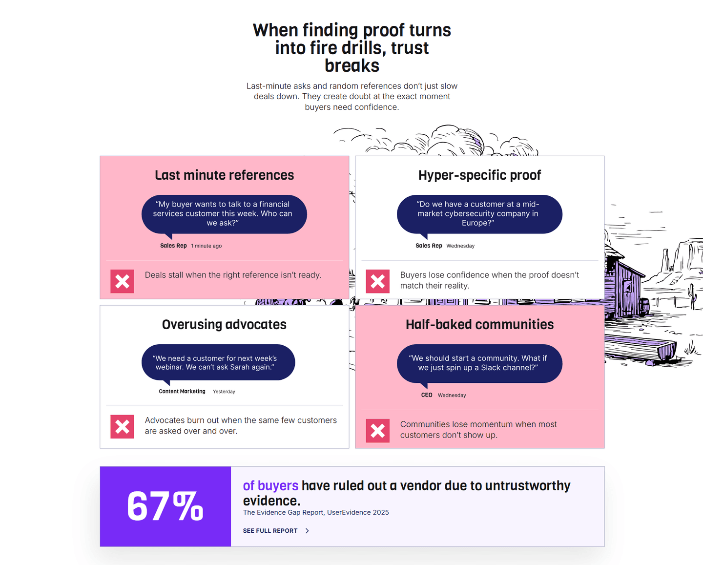
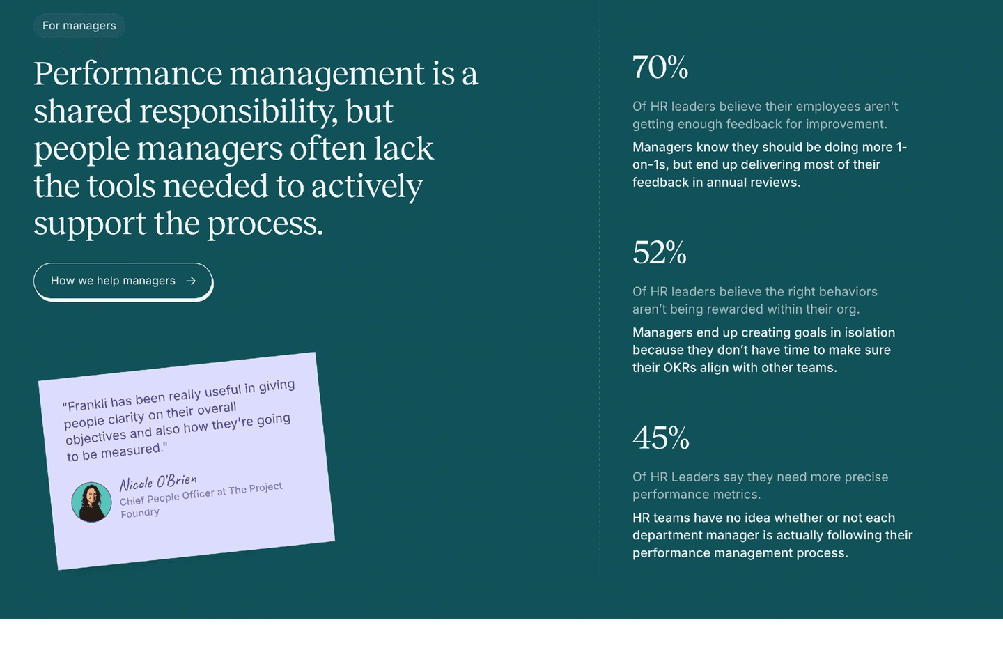
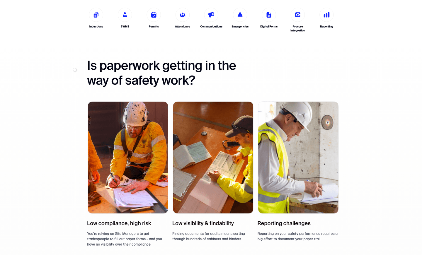
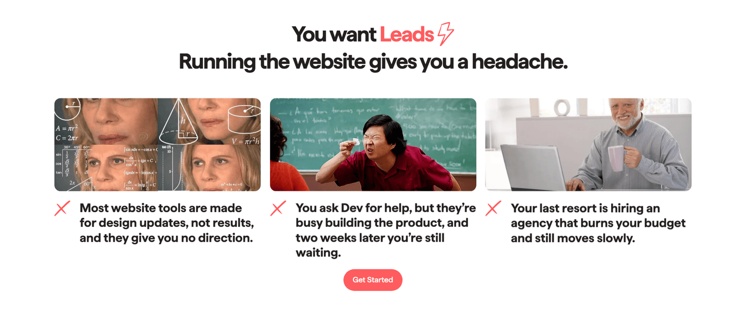
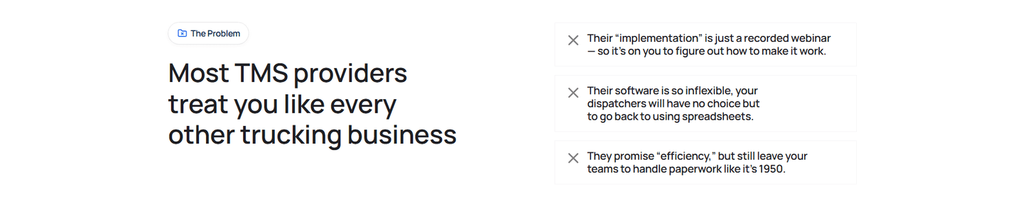
Problem|
UserEvidence SaaS Problem Design
80/100
Hand-picked 60 problem sections from SaaS landing pages, scored across conversion best practices. See how the best agitate pain and drive action.
Showing 1–21 of 60 examples


Every problem section is scored across 5 conversion best practices. Copy the best practice stack, not the layout. See what converts and why.
Hand-picked from 350+ companies and analyzed by our AI conversion agent. Real problem sections on live landing pages. Every entry earns its spot.
Found a problem section you admire? Run yours through the same scoring engine. See where you stand on the same best practices, and what to fix first.
We scored 60 problem sections from SaaS companies across conversion best practices. The table below shows how widely each element is adopted. The lower the number, the bigger your edge by adding it.
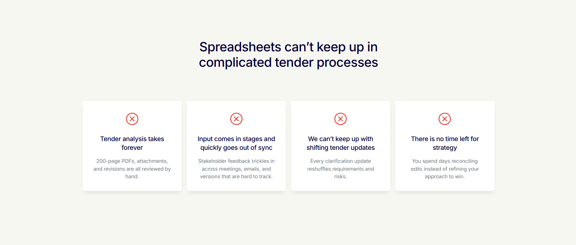
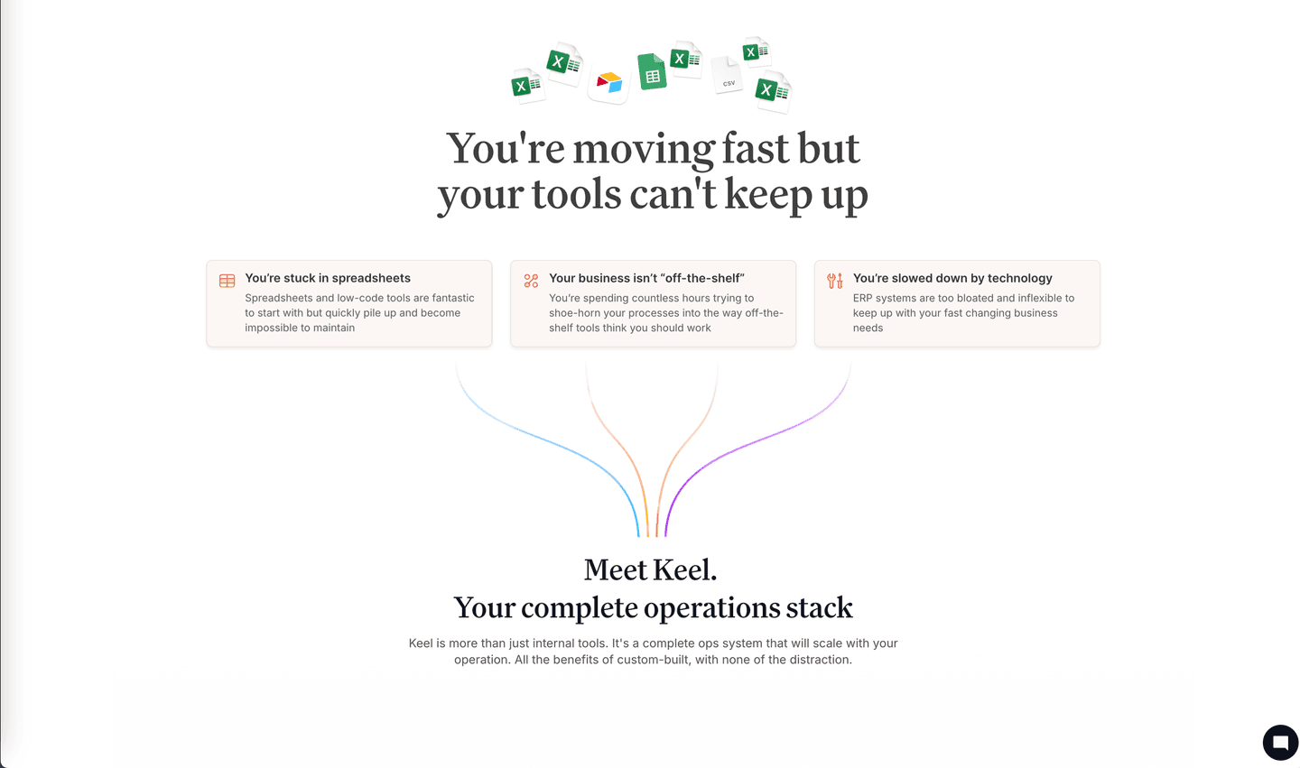
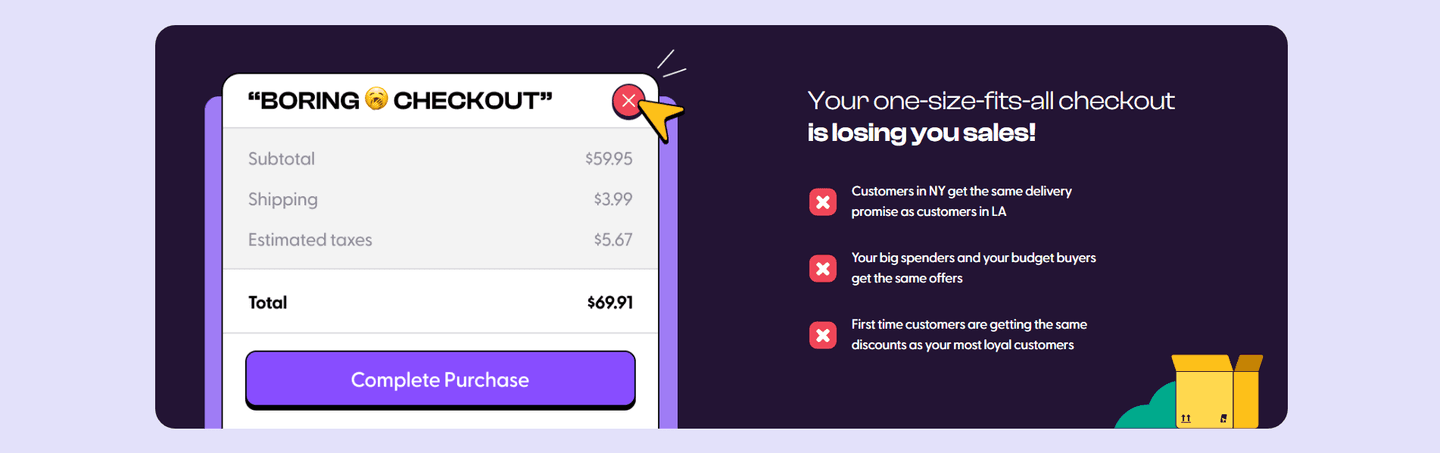
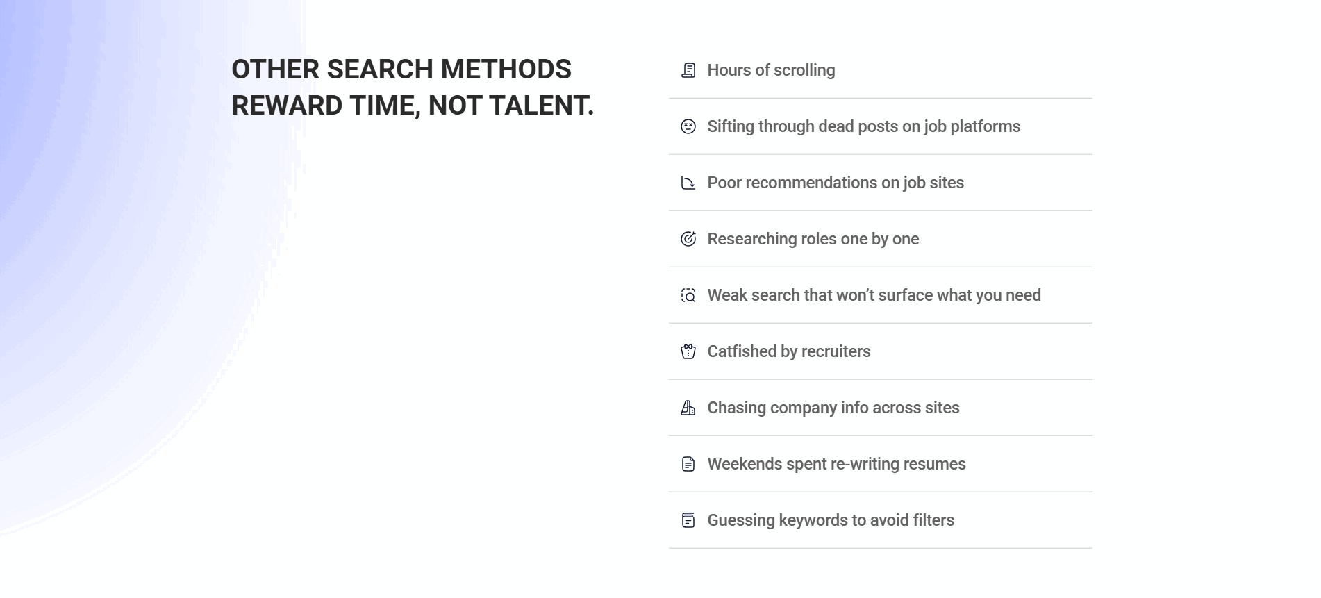
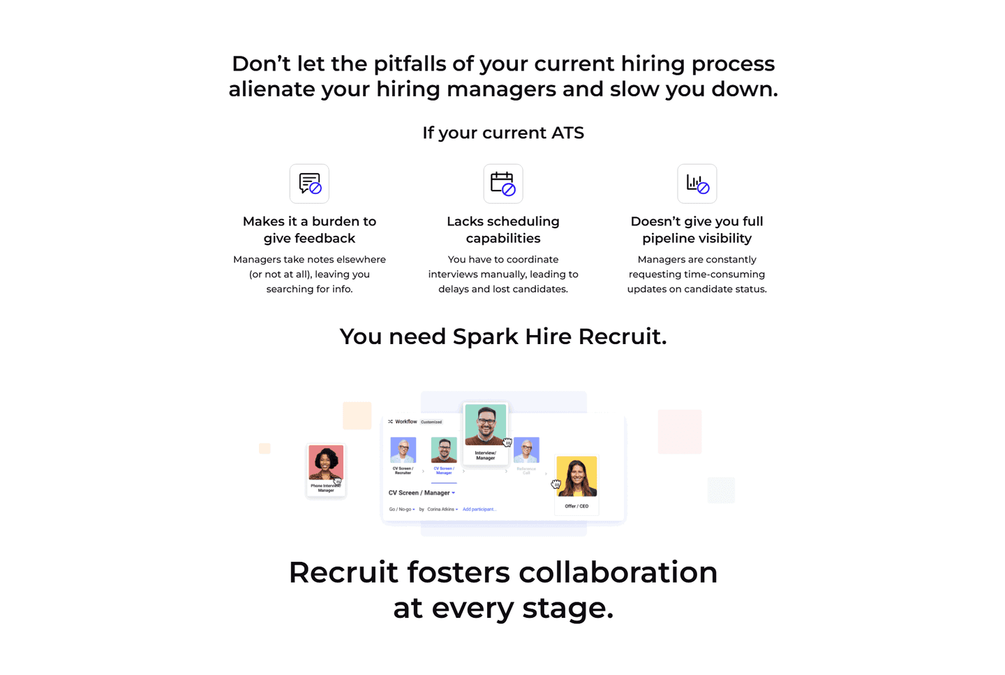
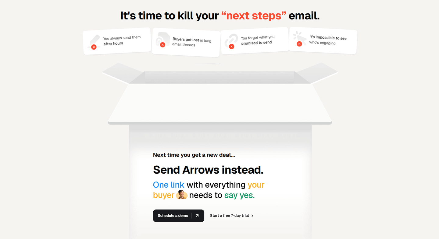
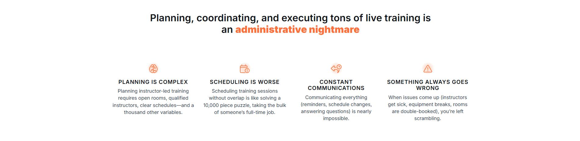
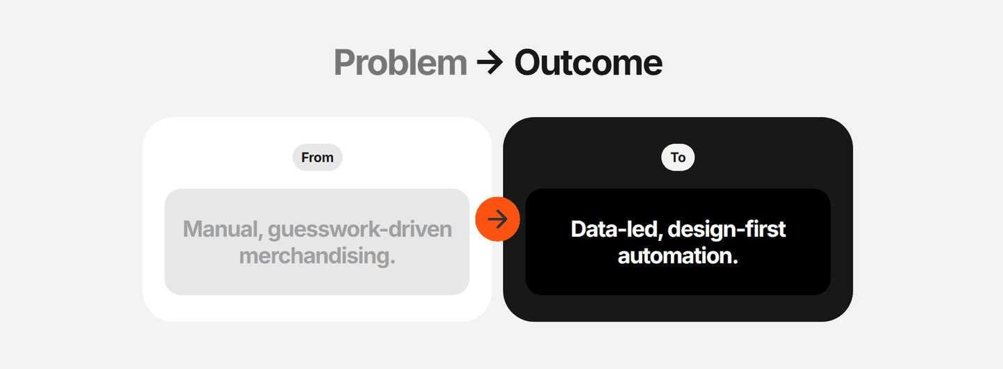
Old way vs. new way, side-by-side. Creates visual contrast between the painful status quo and the product's world
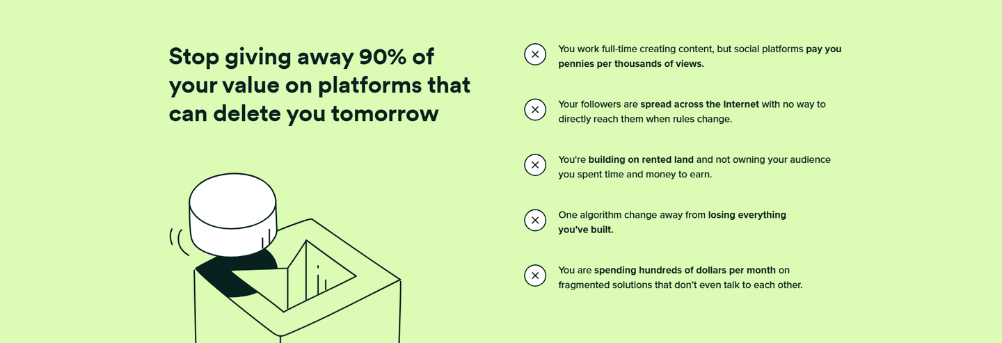
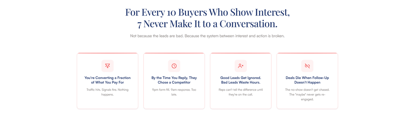
"$X wasted monthly," "Y hours lost per week," "Z% of leads never contacted." Specific numbers that make the pain concrete
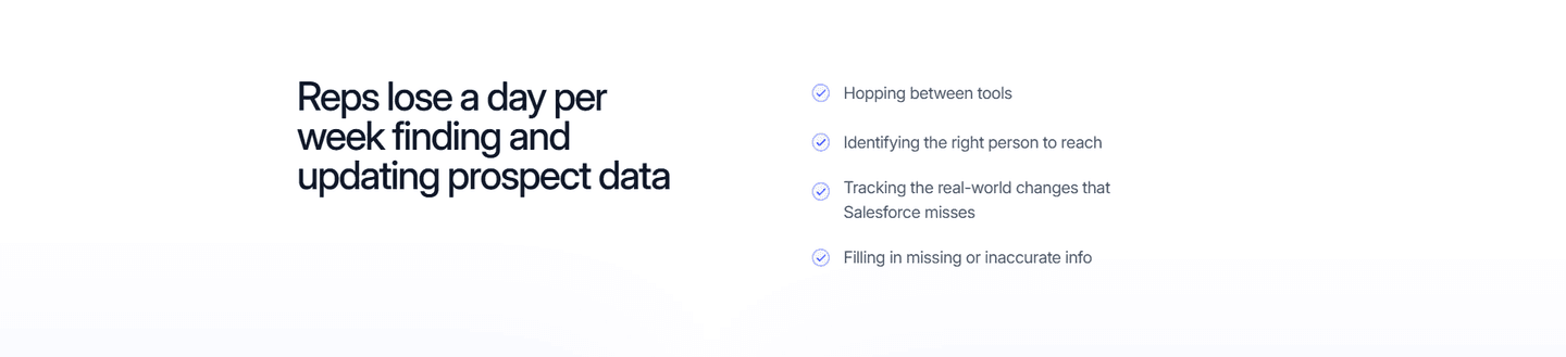
The copy "feels true" to the visitor. Uses words like "frustrated," "stuck," "overwhelmed" that mirror real internal dialogue
"Every month without this costs you $4,200 in lost deals" or "Your team wastes 12 hours per week." What happens if you don't fix this
"For sales teams tired of manual CRM updates" or "If you're a founder drowning in spreadsheets." The visitor sees their own role and frustration
| Element | What it means | Use it | Type |
|---|---|---|---|
| Before/after setup | Old way vs. new way, side-by-side. Creates visual contrast between the painful status quo and the product's world | 36% | Opportunity |
| Quantified pain | "$X wasted monthly," "Y hours lost per week," "Z% of leads never contacted." Specific numbers that make the pain concrete | 45% | Opportunity |
| Emotional resonance | The copy "feels true" to the visitor. Uses words like "frustrated," "stuck," "overwhelmed" that mirror real internal dialogue | 55% | Common |
| Cost of inaction | "Every month without this costs you $4,200 in lost deals" or "Your team wastes 12 hours per week." What happens if you don't fix this | 73% | Common |
| Persona-specific pain | "For sales teams tired of manual CRM updates" or "If you're a founder drowning in spreadsheets." The visitor sees their own role and frustration | 82% | Table stakes |
Persona-specific pain is the most common best practice (82% use it), but the biggest gap is quantified pain. Only 45% of problem sections put a number on the cost. The best-in-class section does. Saying "you waste time on manual data entry" is weaker than "your team loses 12 hours per week on manual data entry."
The surprise: before/after setup, the format most people associate with problem sections, doesn't appear in the best-in-class at all. Equals scores 100 without it. The data suggests that stacking four other best practices matters more than the before/after visual.
Across 60 scored problem sections, here's how scores break down.
Our AI conversion agent evaluates every problem section against a weighted checklist that spans three dimensions. Each best practice gets a pass or fail based on the actual page content and screenshot.
Not every best practice carries the same weight. Quantified pain and cost of inaction pull the score up more because in our dataset, problem sections with those two create more urgency than sections that rely on vague emotional appeals alone.
Sections flagged best-in-class are hand-picked by our team from the highest-scoring sections. A high score gets you on the list. Best-in-class means the copy and psychology work together to make the visitor feel the pain and want the fix.
Interactive quiz
Does your copy name the specific role or persona feeling the pain?
"For sales teams tired of manual CRM updates"
1 problem section in our library is flagged best-in-class: Equals, with a perfect 100. It stacks 4 out of 5 conversion best practices.
What makes it work: the section doesn't describe the problem in the abstract. It names the persona, puts a number on the pain, shows what happens if you ignore it, and makes the reader feel it.
 100/100
The lowest-scoring problem sections in our library aren't wrong about the problem. They just don't go deep enough.
A problem section scoring 33/100 typically has 2 conversion best practices: persona-specific pain and emotional resonance. The section acknowledges who the visitor is and that they're frustrated. But it stops there.
The most common gap: no quantified pain. 55% of all problem sections don't put a number on the cost. "Manual data entry is tedious" vs. "Your team wastes 12 hours per week on manual data entry." The first is a complaint. The second is a business case.
Second: no cost of inaction. 27% of problem sections skip this entirely. The visitor reads about the pain, nods along, and thinks "yeah, but I've lived with this for months." Without showing what the problem costs them over time, there's no urgency to act now.
The fix is straightforward. Add one stat that quantifies the pain. Add one sentence about what happens if they don't fix it. Two additions that separate a 33 from a 67 in our scoring.
Want to know which best practices your problem section is missing? Try our landing page analyzer →
 10/100
Curated by
Gabriel Amzallag , Founder, LPA
5 years CRO + SEO at Qonto (2021–2025). After advising 15+ SaaS on their websites (Payfit, Pigment…), the same patterns kept breaking — so I decided to build the source of truth on what works on the web: the intelligence layer every tool, builder, and team uses to ship sites that perform.
See how different industries design their problem sections.
Real examples from top SaaS landing pages, scored and analyzed.
The first thing visitors see. Browse hero sections scored on value proposition clarity, social proof, risk reducers, and visual hierarchy.
Browse hero examples
After the problem comes the process. See how top SaaS pages walk visitors through step-by-step processes with outcome visualization.
Browse how it works examples
The moment of action. Browse CTA sections scored on consolidation, friction reduction, microcopy quality, and secondary paths.
Browse CTA examplesPaste your URL. Get a scored analysis of your problem section with specific fixes. Free, no signup.
Everything you need to know about problem section design, based on our analysis of real SaaS landing pages.
A problem section should be 2-4 short paragraphs, roughly 80-150 words. It lives before your solution or features section. Long enough to make the visitor feel the pain, short enough that they don't leave before seeing the fix. In our library of 60 problem sections, the highest-scoring one stays under 120 words.
Between the hero and the solution, almost always. The hero hooks the visitor; the problem section earns the right to pitch. Place it in the second or third scroll, right before your features or how-it-works block. Skip it if your hero already frames the pain explicitly. Don't bury it below testimonials. By then the visitor has either bought in or left. On long-form landing pages, repeat a compressed version of the pain before the pricing CTA to reset the stakes before the ask.
Yes, if your product solves a pain the visitor might not fully recognize yet. SaaS landing pages, campaign pages, and product launch pages benefit most. A problem section primes the visitor to care about your solution. Skip it if your audience already knows the problem (e.g., searching "CRM software" implies they know they need one).
Go to the source, not your imagination. Read 20-30 sales call transcripts or support tickets (Gong and Intercom both export these) and write down the exact phrasing people use. Run five 20-minute customer interviews and ask "what did you try before this?" The complaints about the old way are your copy. Scrape review-site snippets (G2, Reddit, Trustpilot) for the verbs people use when they describe the pain. The best problem sections paraphrase real sentences, not invented ones.
Different jobs. A hero problem statement is one line. It signals "this page is for someone like you" in under two seconds. The problem section is a block of 80-150 words that makes the visitor feel the cost. The hero frames the problem. The problem section agitates it. If your hero already quantifies the pain ("Your team loses 12 hours a week on X"), you can skip the full problem section. If the hero is benefit-led ("Close more deals"), you need the block to surface the pain the benefit is solving.
Run your page through our landing page audit. You'll get a scored breakdown of your problem section across 5 conversion best practices (persona-specific pain, quantified pain, emotional resonance, cost of inaction, before/after setup) with specific fixes prioritized by impact.