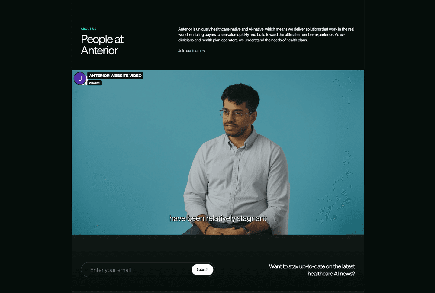
Best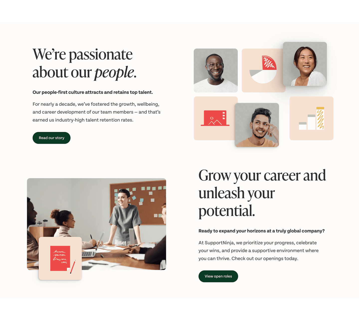
About|
SupportNinja B2B About Design
100/100
Hand-picked 24 about sections, scored across conversion best practices. See what the best do differently.
Showing 1–21 of 24 examples


Every about section is scored across 4 conversion best practices. Copy the best practice stack, not the design. See what converts and why.
Hand-picked from 350+ companies and analyzed by our AI conversion agent. Not a random dump of homepages. Every entry earns its spot.
Found an about section you admire? Run yours through the same scoring engine. See where you stand on the same best practices, and what to fix first.
We scored 24 about sections across conversion best practices. The table below shows how widely each element is adopted. The lower the number, the bigger your edge by adding it.
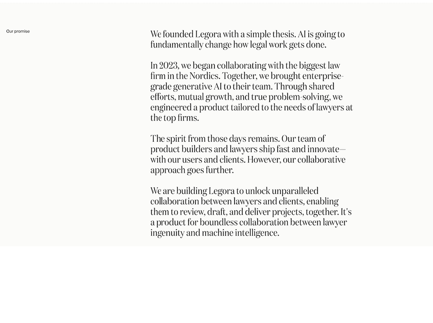
Origin narrative. Why the company exists and what problem sparked it
A link to a dedicated about page for the full story. Exploration path
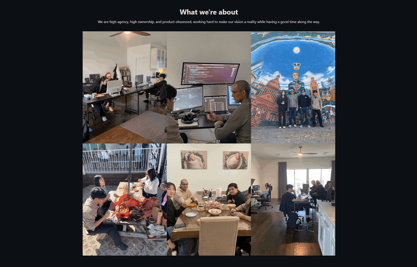
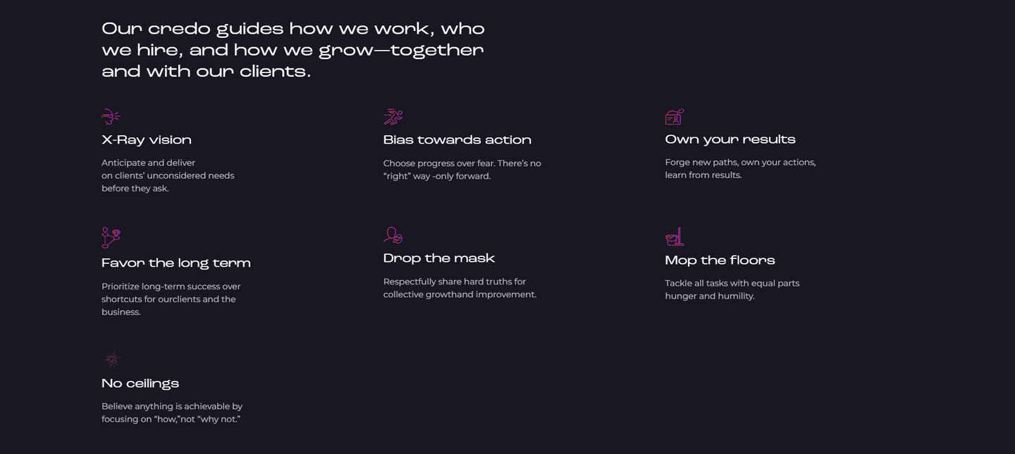
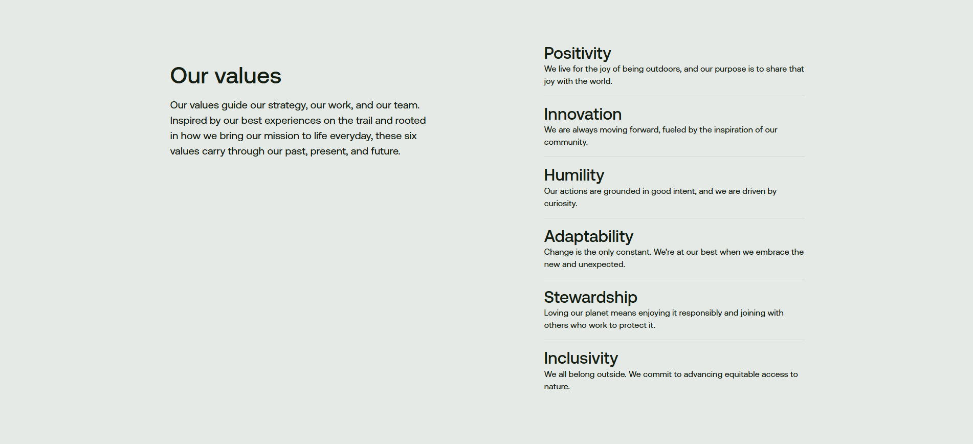
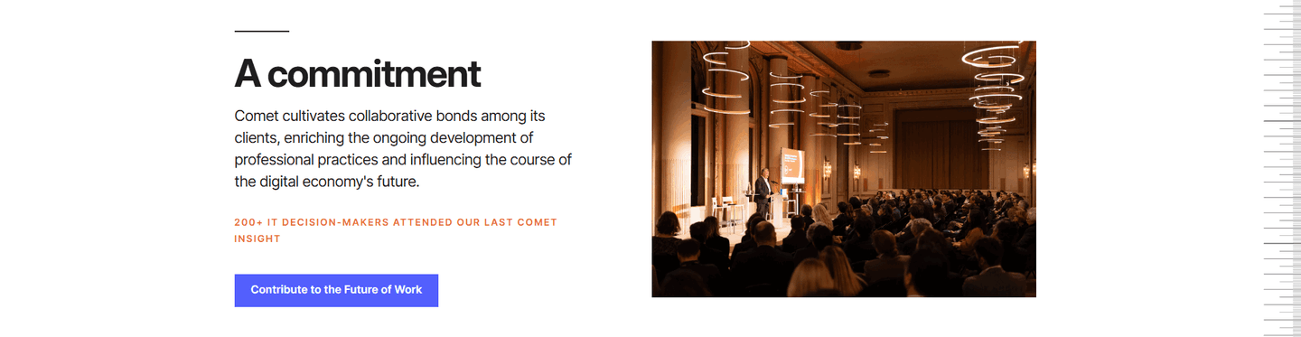
Values, work culture, personality cues. Brand identity beyond the product
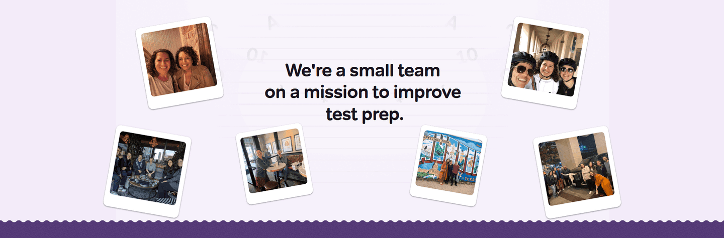
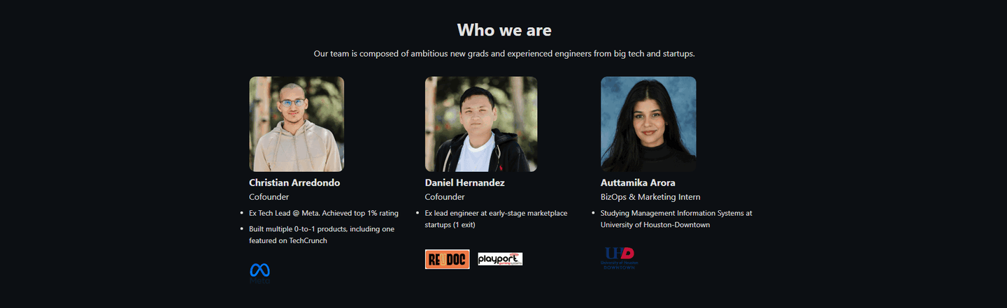
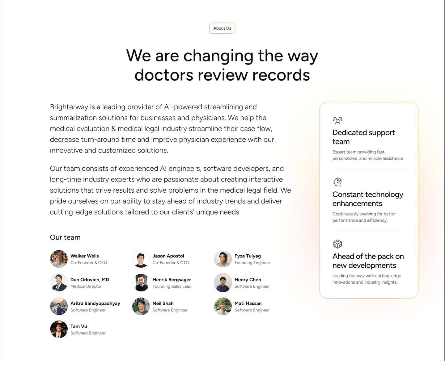
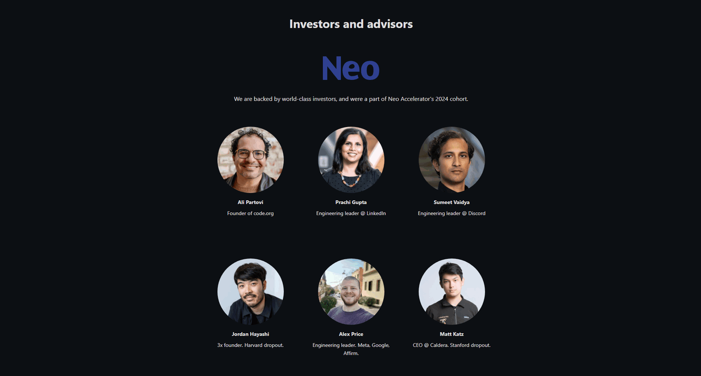
Actual team or founder photos, not stock imagery. Authenticity you can feel
| Element | What it means | Use it | Type |
|---|---|---|---|
| Founder story | Origin narrative. Why the company exists and what problem sparked it | 33% | Opportunity |
| Learn more CTA | A link to a dedicated about page for the full story. Exploration path | 42% | Opportunity |
| Culture signals | Values, work culture, personality cues. Brand identity beyond the product | 54% | Common |
| Real photos | Actual team or founder photos, not stock imagery. Authenticity you can feel | 58% | Common |
Every best-in-class about section uses real photos, culture signals, and a learn-more CTA. That's the winning combination. None of them tell the founder story in the section itself.
Founder story is the most surprising data point: 33% of about sections include one, but 0% of the best do. The top-scoring sections save the origin narrative for the dedicated about page and use the section space to show who the team is today.
Across 24 scored about sections, here's how scores break down. Most land between 0 and 59.
83% of about sections score under 60. Only 17% break 80. The bar is low — adding real photos + culture signals puts you at the top.
Our AI conversion agent evaluates every about section against a weighted checklist that spans two dimensions. Each best practice gets a pass or fail based on the actual page content and screenshot.
Real photos and culture signals carry the most weight. In our dataset, about sections with both of those build more trust than sections with a founder story alone.
Sections flagged best-in-class are hand-picked by our team from the highest-scoring sections. A high score gets you on the list. Best-in-class means authenticity and navigation work together.
Interactive quiz
Do you use real team or founder photos, not stock?
Natural photos at work, in meetings — visitors see humans, not a brand
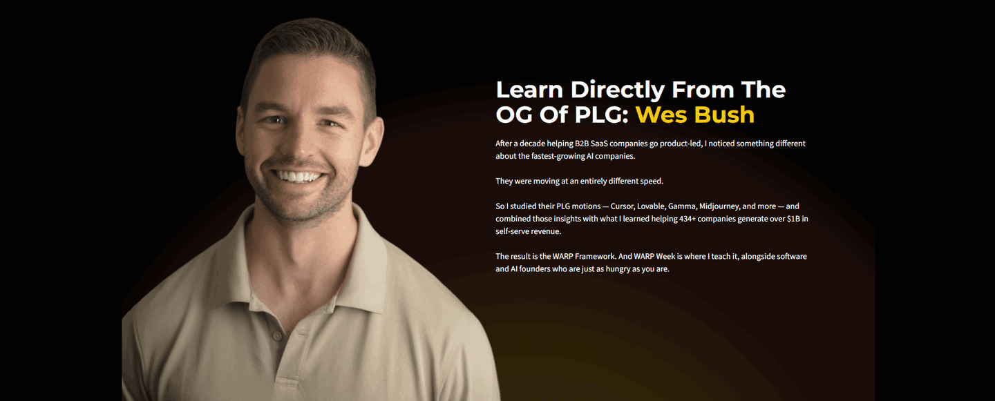
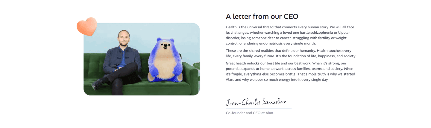
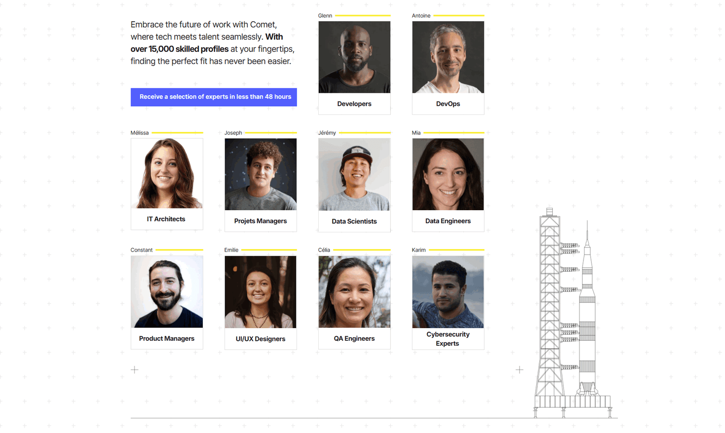
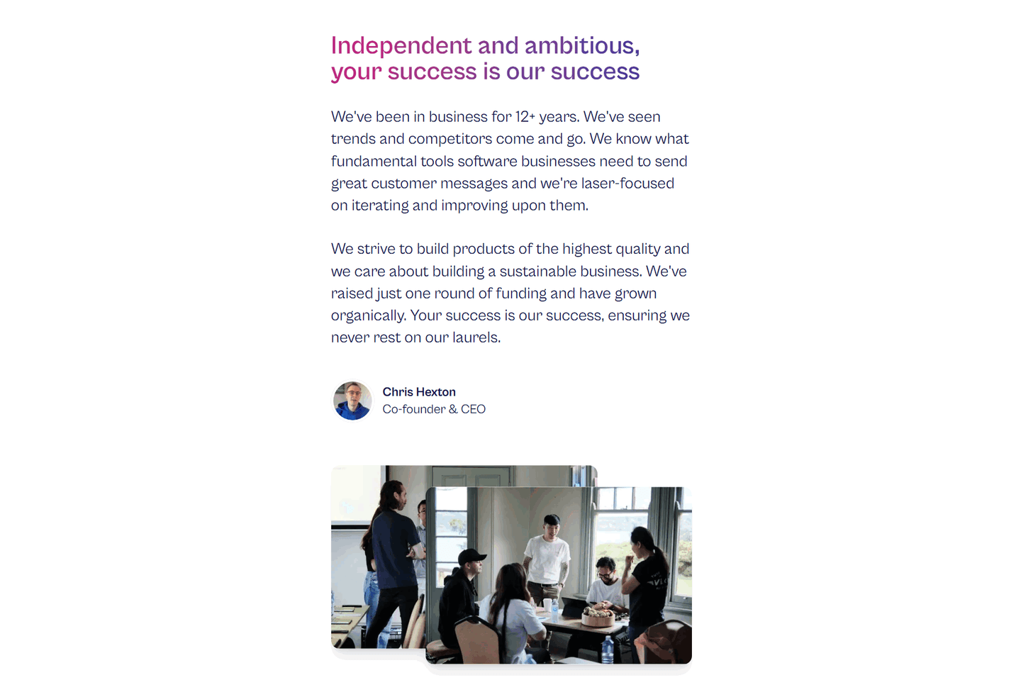
1 about sections in our library are flagged best-in-class: Ahrefs, SupportNinja, and Comet. They share the same playbook.
All three use real team photos, not stock. All three display culture signals (values, personality, cues about life at the company). And all three include a CTA to a dedicated about page rather than trying to tell the whole story in 300 words.
What all three skip: the founder story. 33% of all about sections include one, but the best leave it for the dedicated page. The about section is for trust and identity, not storytelling.
100/100The lowest-scoring about sections in our library share one problem: they don't humanize the brand. They talk about the company without showing the people behind it.
The most common gap: no real photos. 42% of all about sections use illustrations or stock. When the visitor sees generic imagery in the "who we are" section, the section backfires: it reduces trust instead of building it.
Second: no link to a dedicated about page. 58% of about sections are dead ends. The visitor reads the paragraph and has nowhere to go if they want more. The best sections offer an exploration path.
The fix isn't rewriting all the copy. Add a real team photo (even a smartphone shot) and a "Learn more" button. Two changes, and your about section goes from generic to credible.
Want to know which best practices your about section is missing? Try our landing page analysis →
10/100
Curated by
Gabriel Amzallag , Founder, LPA
5 years CRO + SEO at Qonto (2021–2025). After advising 15+ SaaS on their websites (Payfit, Pigment…), the same patterns kept breaking — so I decided to build the source of truth on what works on the web: the intelligence layer every tool, builder, and team uses to ship sites that perform.
See how different industries design their about sections.
Real examples from top SaaS landing pages, scored and analyzed.
Logos, quotes, case studies, video testimonials. Browse the patterns that build trust and reduce hesitation.
Browse testimonials
Client logos, security badges, social proof numbers. How top SaaS products build credibility.
Browse trust sections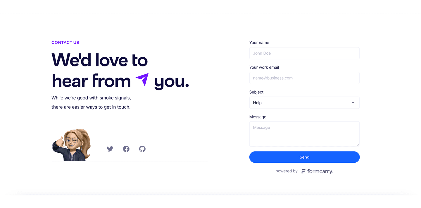
Short forms, trust signals, response times. How top SaaS pages capture leads with minimal friction.
Browse contact sectionsPaste your URL. Get a scored analysis of your about section with specific fixes. Free, no signup.
Everything you need to know about about section design, based on our analysis of real SaaS landing pages.
It depends on your conversion goal. For homepages and product pages, a short about section helps humanize the brand. For campaign landing pages (webinar, ebook), it's usually unnecessary. Across the 24 about sections in our library, they appear mostly on homepages and product pages, rarely on campaign pages.
A coordinated smartphone shoot is the easiest path: everyone sends a candid photo from their workspace on the same day, shot with natural window light. Alternatively, book a virtual photographer like Anchor Photo or hire a local one for each hub. Or stitch together screenshots from a real team call. It reads authentic because it is. Avoid compositing people into a fake group photo. Visitors spot it, and the section loses the trust it's supposed to earn.
The about section is a block on your landing page, 200-400 words max. It gives just enough context for the visitor to feel confident in the brand. The dedicated about page tells the full story: founders, timeline, mission, hiring. The best about sections act as a teaser with a "Learn more" link to the full page.
Every 6-12 months, or whenever the team shape changes materially. Two triggers: headcount growth that leaves the photo looking thin, and a pivot that makes the culture copy feel off. Swap the team photo when you've hired or lost a third of the people pictured. Rewrite the culture signals after any major positioning change. Values that felt fresh a year ago often read as generic once the company has grown. A stale about section quietly tells visitors the site isn't maintained.
Low on the page, after features and testimonials. The about section isn't a conversion lever. It's a reassurance layer for visitors who are already interested but want to know who's behind the product. Putting it up top steals space from the value prop. The right spot is between social proof and the final CTA, where a curious visitor can pause, feel the team, and decide to click. On a homepage, that's usually the second-to-last section before the closing CTA.
Run your page through our landing page analyzer. You'll get a scored breakdown of your about section across conversion best practices (real photos, culture signals, learn-more CTA, founder story) with specific fixes prioritized by impact.