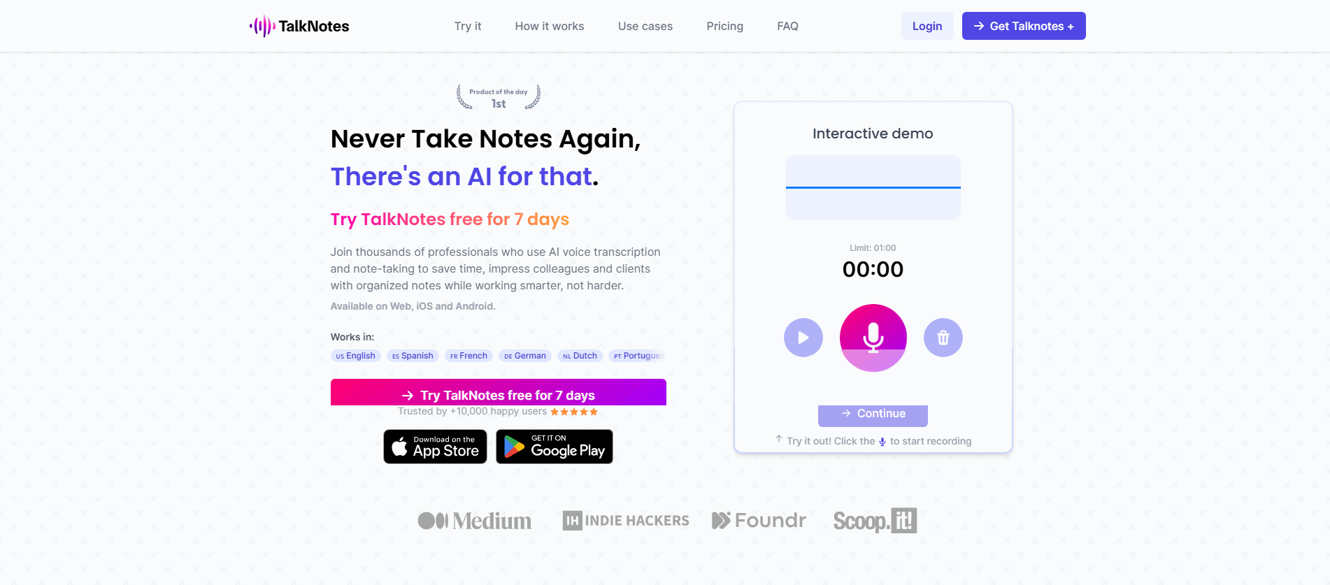
Best
Hero|
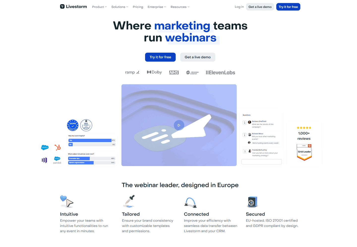
Scout AI Hero Design
89/100
Hand-picked 254 hero sections, scored across conversion best practices. See what the best do differently.
Showing 1–21 of 254 examples


Every hero section is scored across 6 conversion best practices. Copy the best practice stack, not the design. See what converts and why.
Hand-picked from 350+ companies and analyzed by our AI conversion agent. Not a random dump of homepages. Every entry earns its spot.
Found a hero you admire? Run yours through the same scoring engine. See where you stand on the same best practices, and what to fix first.
We scored 254 hero sections across conversion best practices. The table below shows how widely each element is adopted. The lower the number, the bigger your edge by adding it.
"In 5 minutes," "results in 2 weeks." When you get the result
"Unlike X" or "The only Y." Positions you against alternatives
Logos, a stat, or a quote visible before scrolling
"No credit card," "Free plan," "Cancel anytime" near the CTA
"For sales teams," "Built for ecommerce" — visitor knows in 5 seconds
A real screenshot or demo of the product, not a stock illustration
Big headline → smaller subheadline → CTA button. Eye flows naturally
"Ship 2x faster" or "The SEO toolset for growing traffic"
| Element | What it means | Use it | Type |
|---|---|---|---|
| Outcome timeframe | "In 5 minutes," "results in 2 weeks." When you get the result | 21% | Big opportunity |
| Differentiation | "Unlike X" or "The only Y." Positions you against alternatives | 26% | Big opportunity |
| Social proof above fold | Logos, a stat, or a quote visible before scrolling | 41% | Opportunity |
| Risk reducer | "No credit card," "Free plan," "Cancel anytime" near the CTA | 42% | Opportunity |
| Target audience clarity | "For sales teams," "Built for ecommerce" — visitor knows in 5 seconds | 61% | Common |
| Product visual | A real screenshot or demo of the product, not a stock illustration | 68% | Common |
| Visual hierarchy | Big headline → smaller subheadline → CTA button. Eye flows naturally | 74% | Common |
| Clear value proposition | "Ship 2x faster" or "The SEO toolset for growing traffic" | 89% | Table stakes |
Best-in-class heroes are twice as likely to show social proof before the scroll (81% vs 41%) and 50% more likely to include a risk reducer near the CTA (65% vs 42%). That's the biggest gap in the data.
Outcome timeframe is the rarest best practice: only 21% of heroes use it. When it's there ("Get your first report in 2 minutes"), it makes the promise concrete instead of aspirational.
Across 254 scored hero sections, here's how scores break down. Most land between 30 and 59.
76% of heroes score between 30 and 59. Only 8% break 70. The bar is low — adding 2-3 best practices puts you in the top 10%.
Our AI conversion agent evaluates every hero section against a weighted checklist that spans three dimensions. Each best practice gets a pass or fail based on the actual page content and screenshot.
Not every best practice carries the same weight. Social proof and risk reducers pull the score up more because in our dataset, heroes with those two convert better than heroes without them, even when the other best practices are present.
Sections flagged best-in-class are hand-picked by our team from the highest-scoring sections. A high score gets you on the list. Best-in-class means the design, copy, and psychology all work together.
Interactive quiz
Can a visitor read your headline and know what you do?
e.g. "Ship 2x faster" not "Welcome to our platform"
5 hero sections in our library are flagged best-in-class. They score higher because they stack best practices differently.
81% include social proof before the scroll, nearly double the average. They don't wait for a testimonials section further down the page. They put one proof point in the hero and let it do the heavy lifting early.
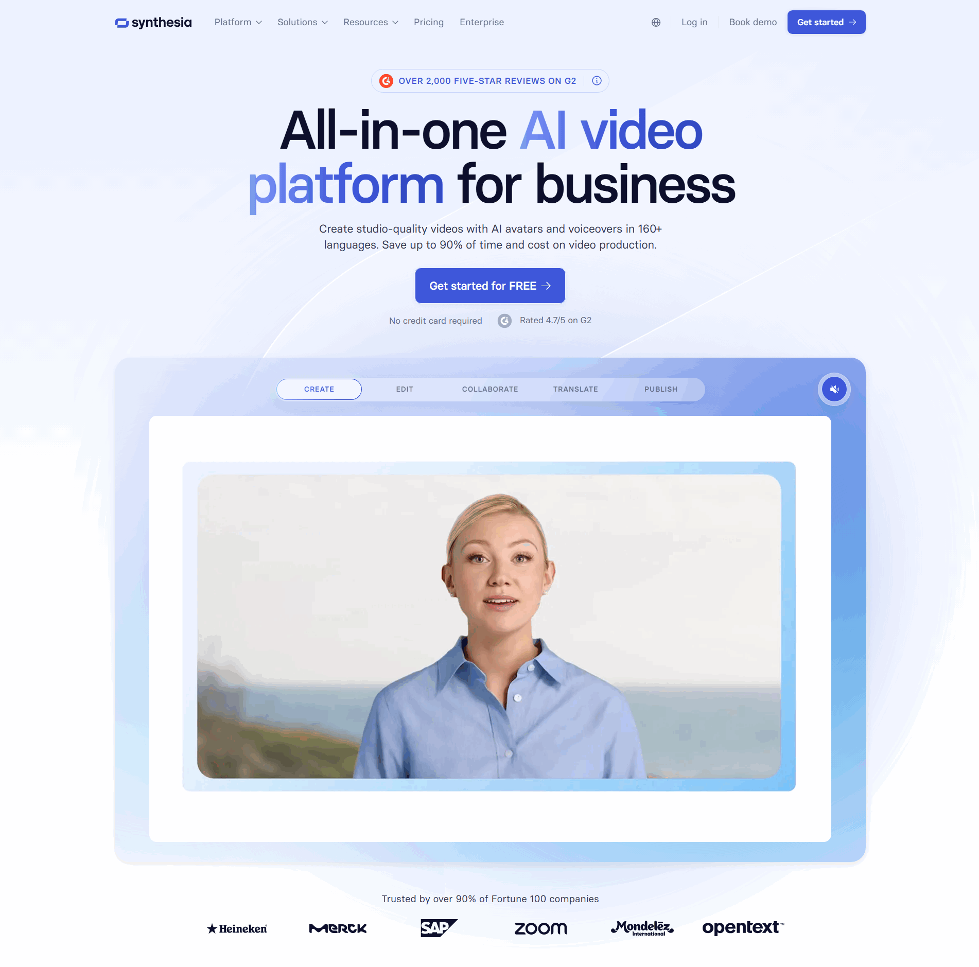
SE Ranking, Ahrefs, Gong, Bloomfire all do this on top of the three best practices above. Four or five conversion best practices stacked in a single hero. That's what a score of 100 looks like.
100/100The lowest-scoring hero sections in our library aren't ugly. Most of them look good. They just don't do enough.
A hero scoring 10/100 typically has only 2 conversion best practices: a value proposition and a product visual, or a value proposition and visual hierarchy. The basics. No social proof, no risk reducer, no differentiation.
The most common gap: no social proof anywhere in the hero. 59% of all hero sections skip it before the scroll. In the bottom tier, it's nearly universal. Visitors land, read the headline, and have zero reason to trust the claim.
Second: no risk reducer near the CTA. The button says "Get Started" or "Sign Up" with nothing underneath it. No "free trial," no "no credit card." The visitor has to guess what happens after they click.
Then there's differentiation. Or the lack of it. 74% of all heroes skip the "why us, not them" framing entirely. The headline could belong to any competitor in the space.
The fix isn't redesigning the page. It's adding 2-3 elements that are already proven. A logo bar takes 30 minutes to build. A "no credit card required" line is one sentence. The gap between a 10 and a 67 is usually two missing best practices, not a missing design system.
Want to know which best practices your hero is missing? Try our landing page analyzer →
 25/100
Curated by
Gabriel Amzallag , Founder, LPA
5 years CRO + SEO at Qonto (2021–2025). After advising 15+ SaaS on their websites (Payfit, Pigment…), the same patterns kept breaking — so I decided to build the source of truth on what works on the web: the intelligence layer every tool, builder, and team uses to ship sites that perform.
See how different industries design their hero sections. Same scoring framework, different conversion playbooks.
Real examples from top SaaS landing pages, scored and analyzed.

See how top SaaS pages structure their call-to-action sections to drive clicks. Scored examples with conversion analysis.
Browse CTA examples
Logos, quotes, case studies, video testimonials. Browse the patterns that build trust and reduce hesitation.
Browse testimonials
How top products present their features: grids, bento layouts, interactive demos. Real examples with scores.
Browse features sectionsPaste your URL. Get a scored analysis of your hero section with specific fixes. Free, no signup.
Everything you need to know about hero section design, based on our analysis of real SaaS landing pages.
A hero section should fill the first screen, roughly 600-800px tall on desktop at 1440px wide. On mobile, it's the first screenful before any scroll. Don't confuse "fills the screen" with 100vh. That pushes supporting content completely out of view. Use min-height: 70vh or ~700px and let the top of your next section peek in as a visual cue.
The header is the navigation bar at the top: logo, menu links, CTA button. The hero section is everything below the header and before the scroll: headline, subheadline, visual, and call-to-action. We score them together because visitors experience them as one unit.
Yes, if your page has a conversion goal. Landing pages, homepages, product pages, campaign pages. The hero tells visitors what this is, who it's for, what to do next, and why to trust you, all in under 5 seconds. The exception: app dashboards, documentation, and pages where users already know what the product does.
Name the audience and the outcome in the same sentence. "Ship 2x faster" works because ship is the outcome and the verb implies the audience (people who ship software). "The SEO toolset for growing your search traffic" works because SEO toolset names the audience and growing your search traffic names the outcome. If a competitor can swap their name into your headline and it still reads true, it's too generic. Rewrite it with a specific verb plus a specific result. The subheadline expands on the how in one sentence, not a paragraph.
Every time the product changes enough that the headline no longer matches, and at least once a year otherwise. Hero copy drifts out of sync fast: you add a feature, change pricing, narrow your ICP, and the headline still reflects last year's positioning. Put a quarterly review on the calendar. If the value prop, audience, or primary outcome has shifted, rewrite the headline, the subheadline, and the risk reducer underneath the CTA together, not one at a time.
Run your page through our landing page audit. You'll get a scored breakdown of your hero section across 6 conversion best practices (visual hierarchy, product visual, risk reducer, social proof, differentiation, outcome timeframe) with specific fixes prioritized by impact.