Pricing Table|
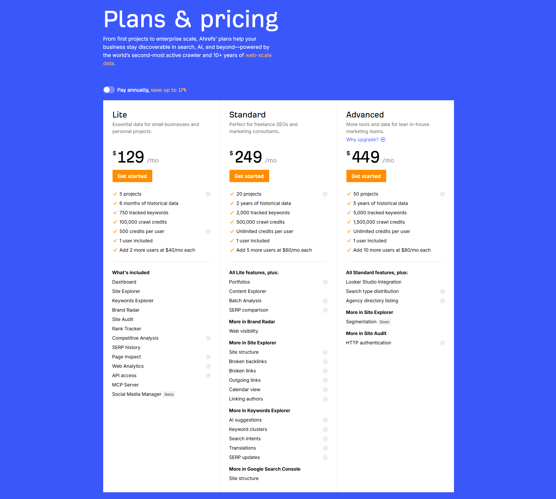
Qonto Fintech Pricing Table Design
100/100
39 pricing tables scored across conversion best practices. See how the best SaaS companies design comparison tables that convert.
Showing 1–21 of 39 examples

Every pricing table is scored across 6 conversion best practices. Copy the best practice stack, not the design. See what converts and why.
Hand-picked from 350+ companies and analyzed by our AI conversion agent. Not a random dump of pricing pages. Every entry earns its spot.
Found a pricing table you admire? Run yours through the same scoring engine. See where you stand on the same best practices, and what to fix first.
We scored 39 pricing tables across conversion best practices. The table below shows how widely each element is adopted. The lower the number, the bigger your edge by adding it.
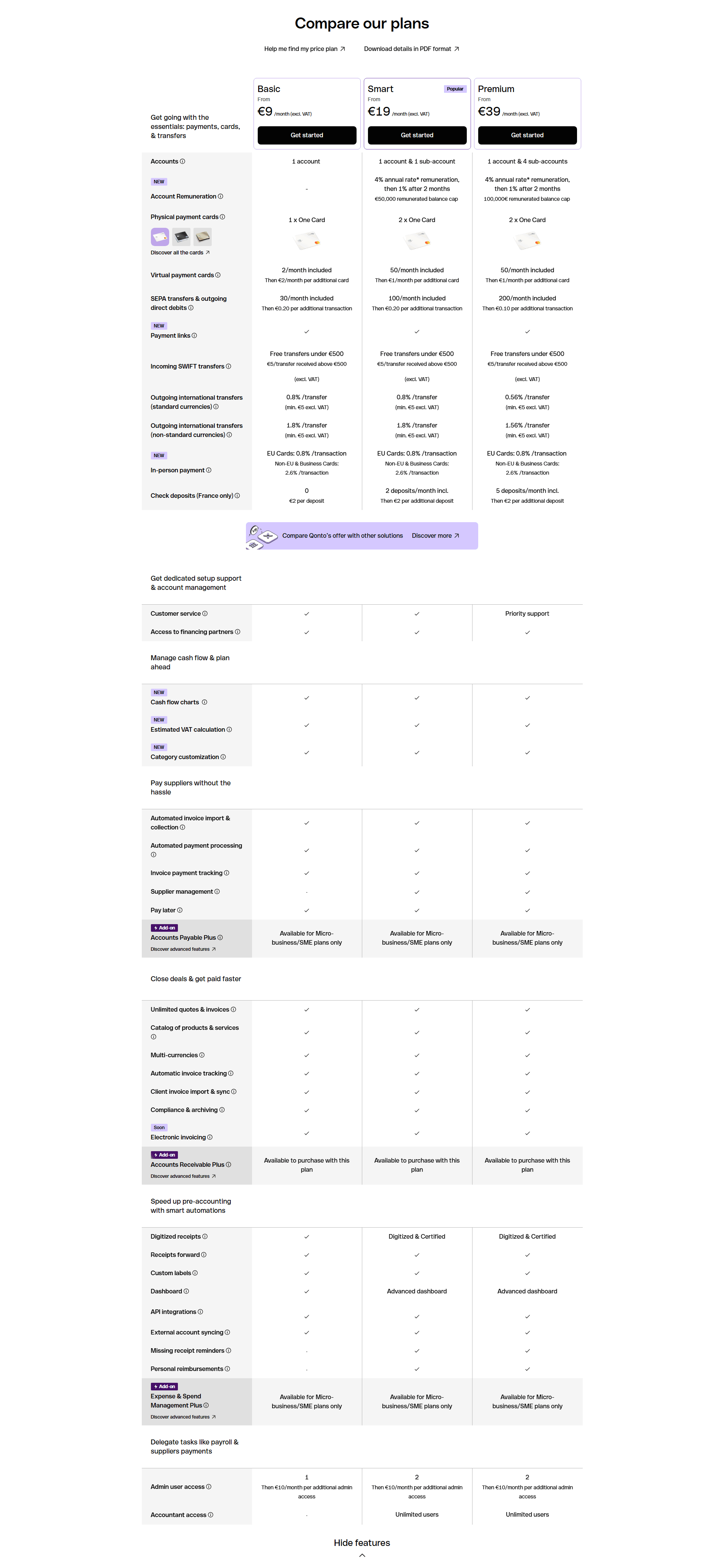
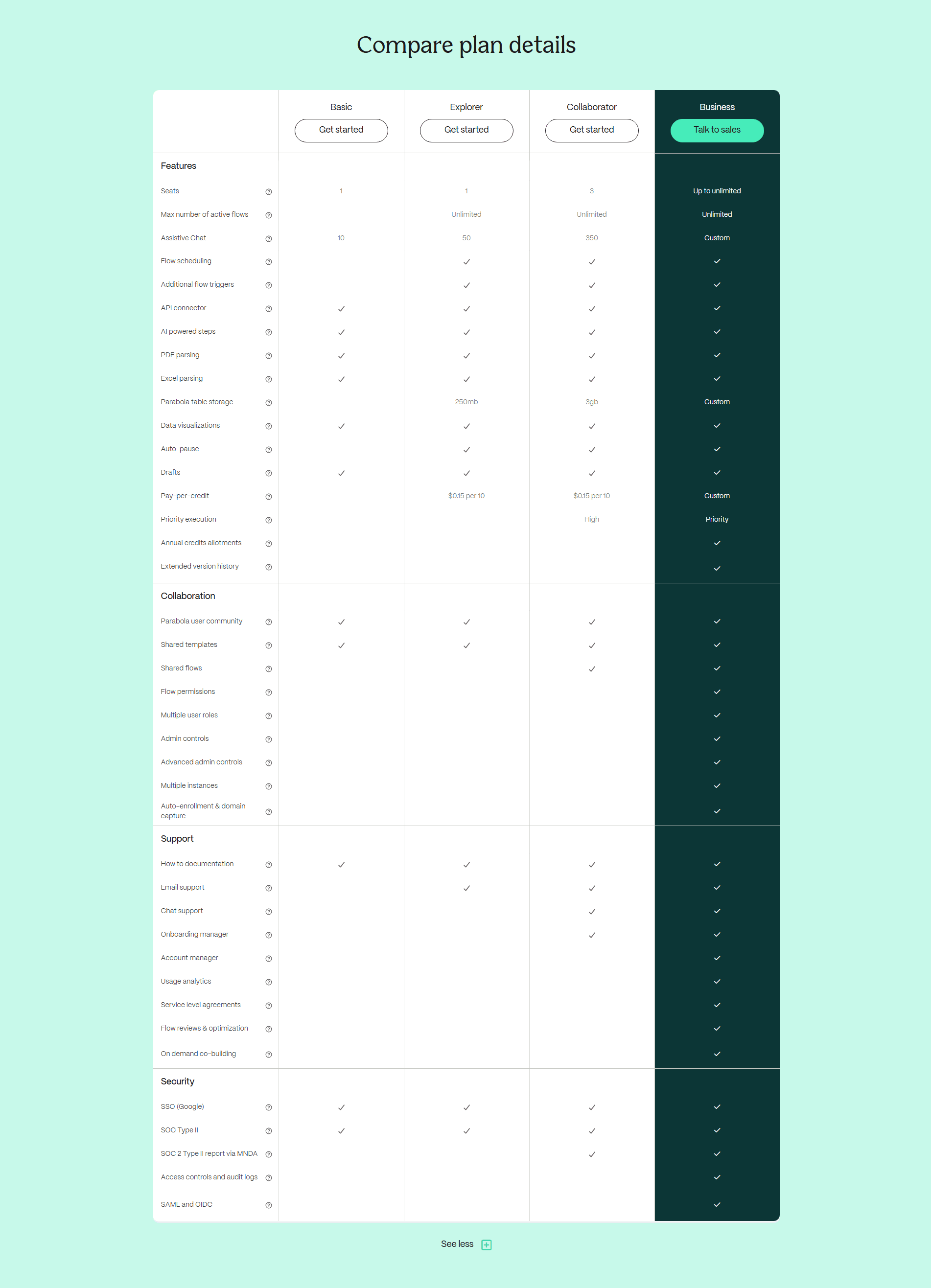
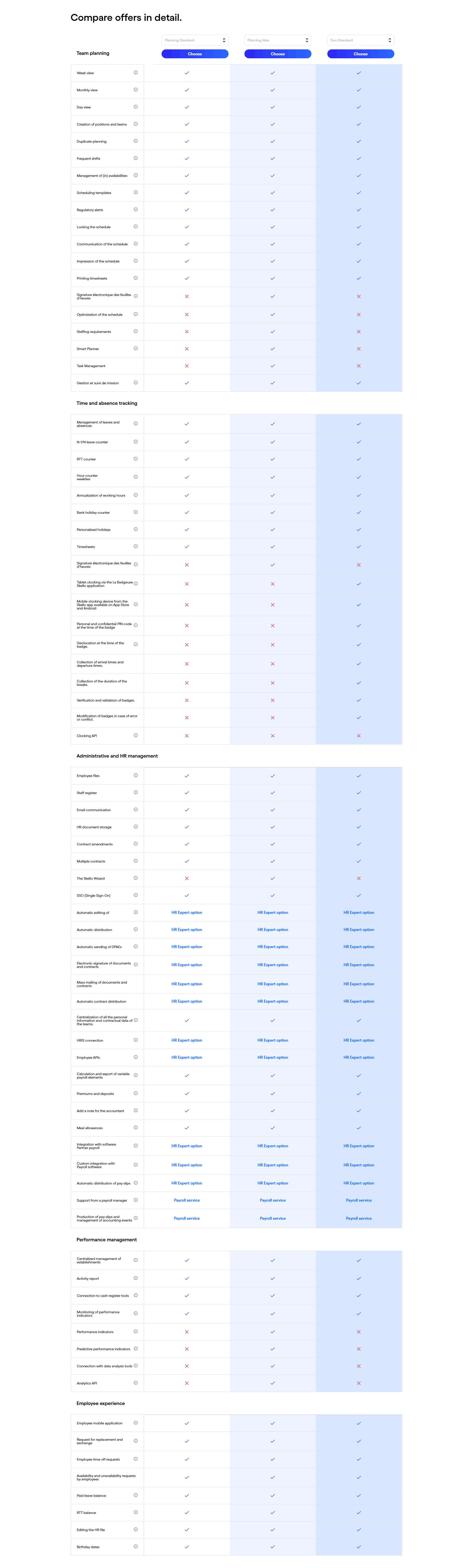
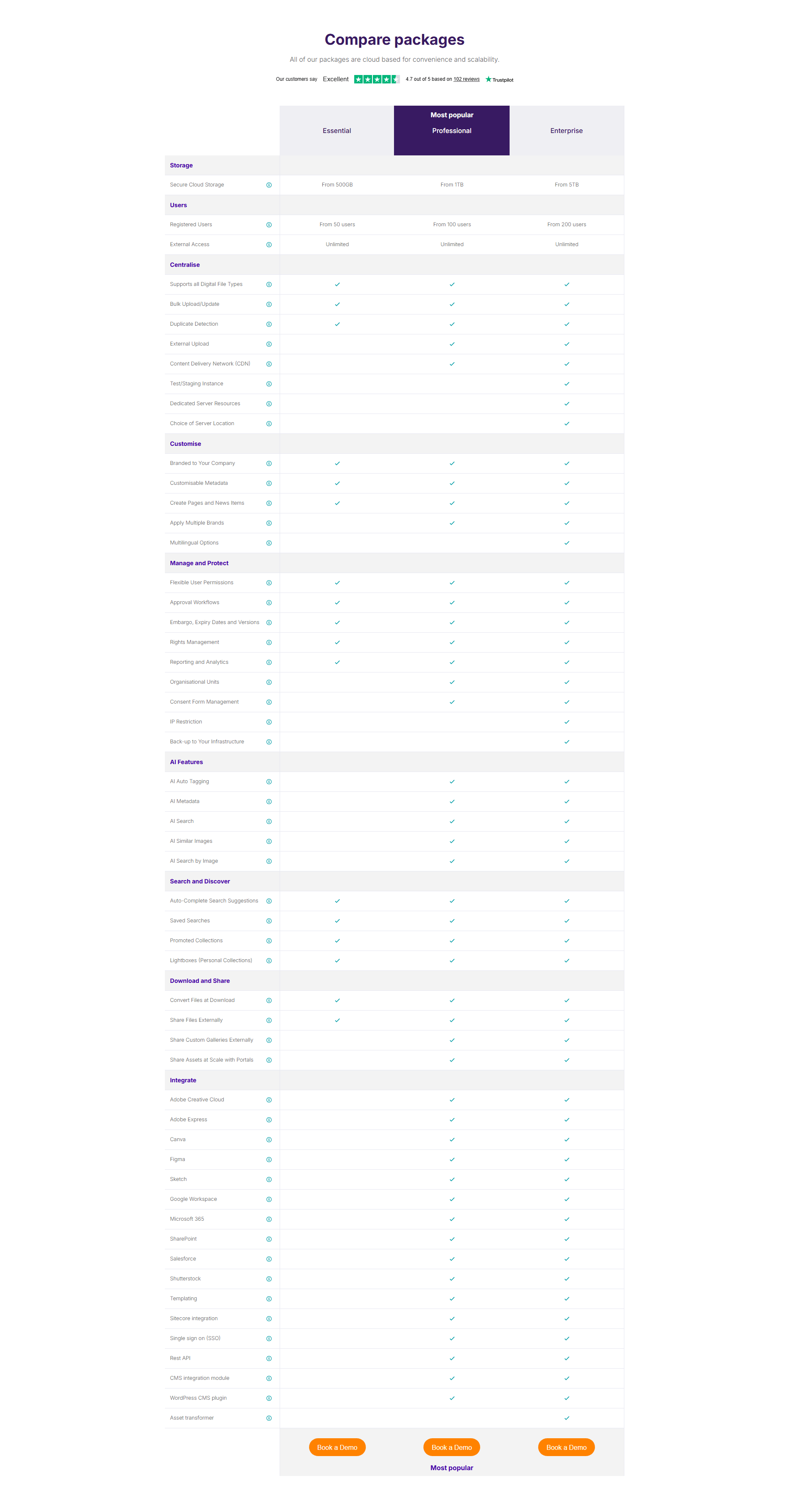
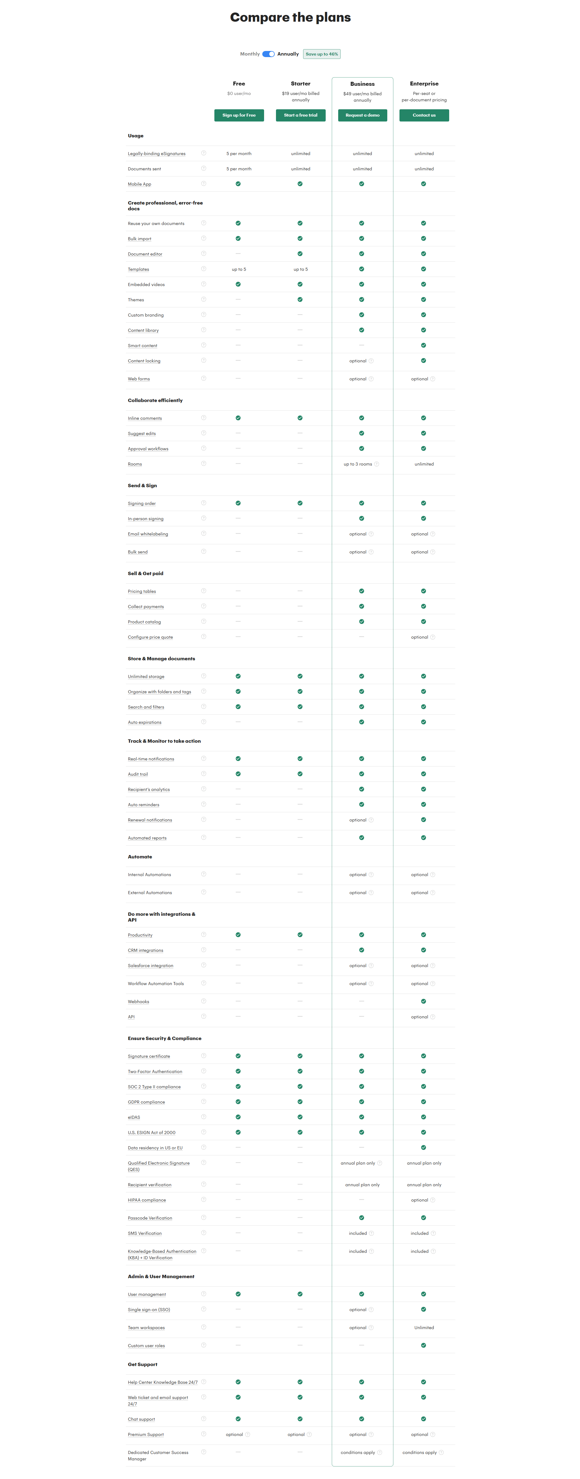
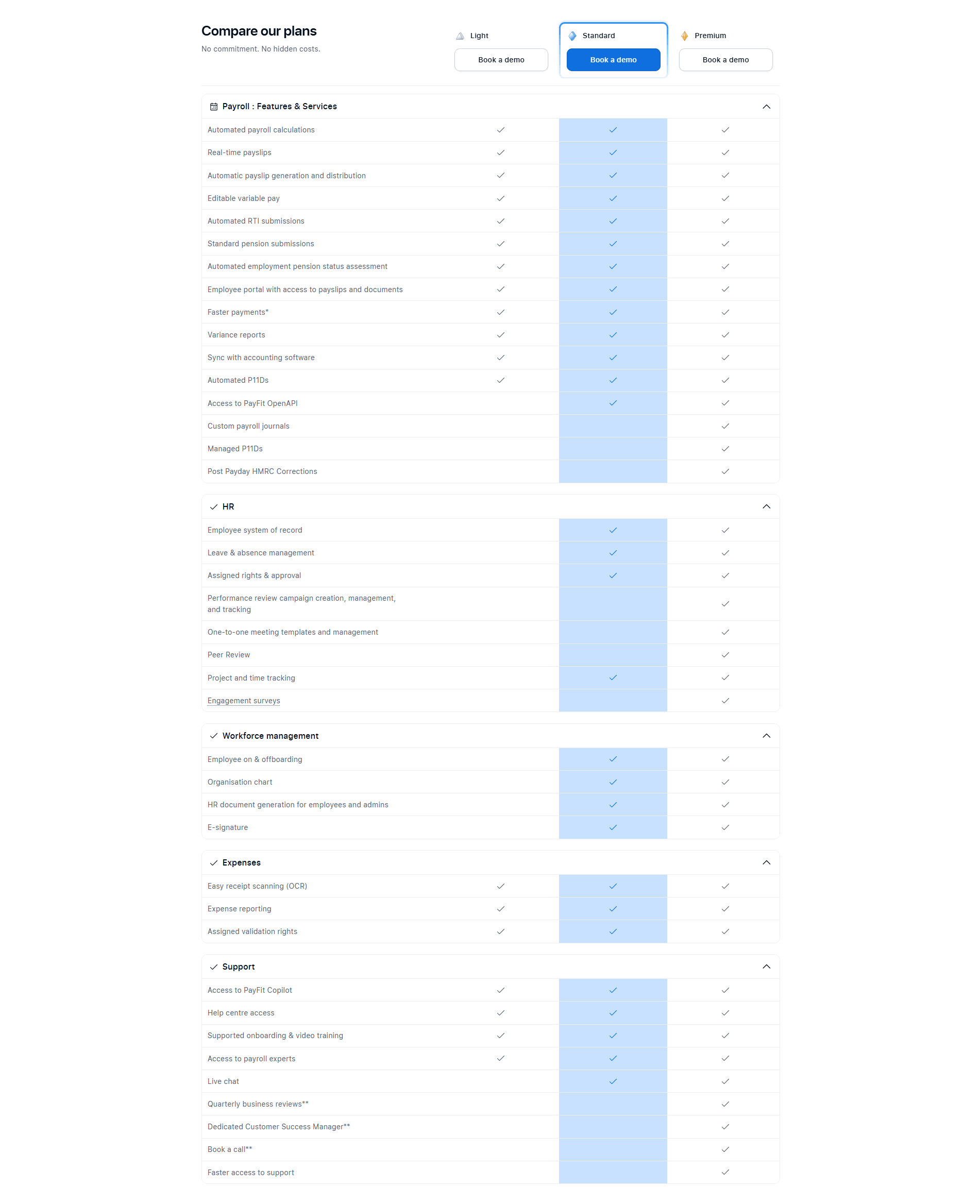
Plan names stay visible while scrolling the feature matrix — keeps visitors oriented
Hover for feature details — clarification without cluttering the table
CTA buttons at the top and/or bottom of the table — conversion access points
Key differentiators visually emphasized — guides the upgrade decision
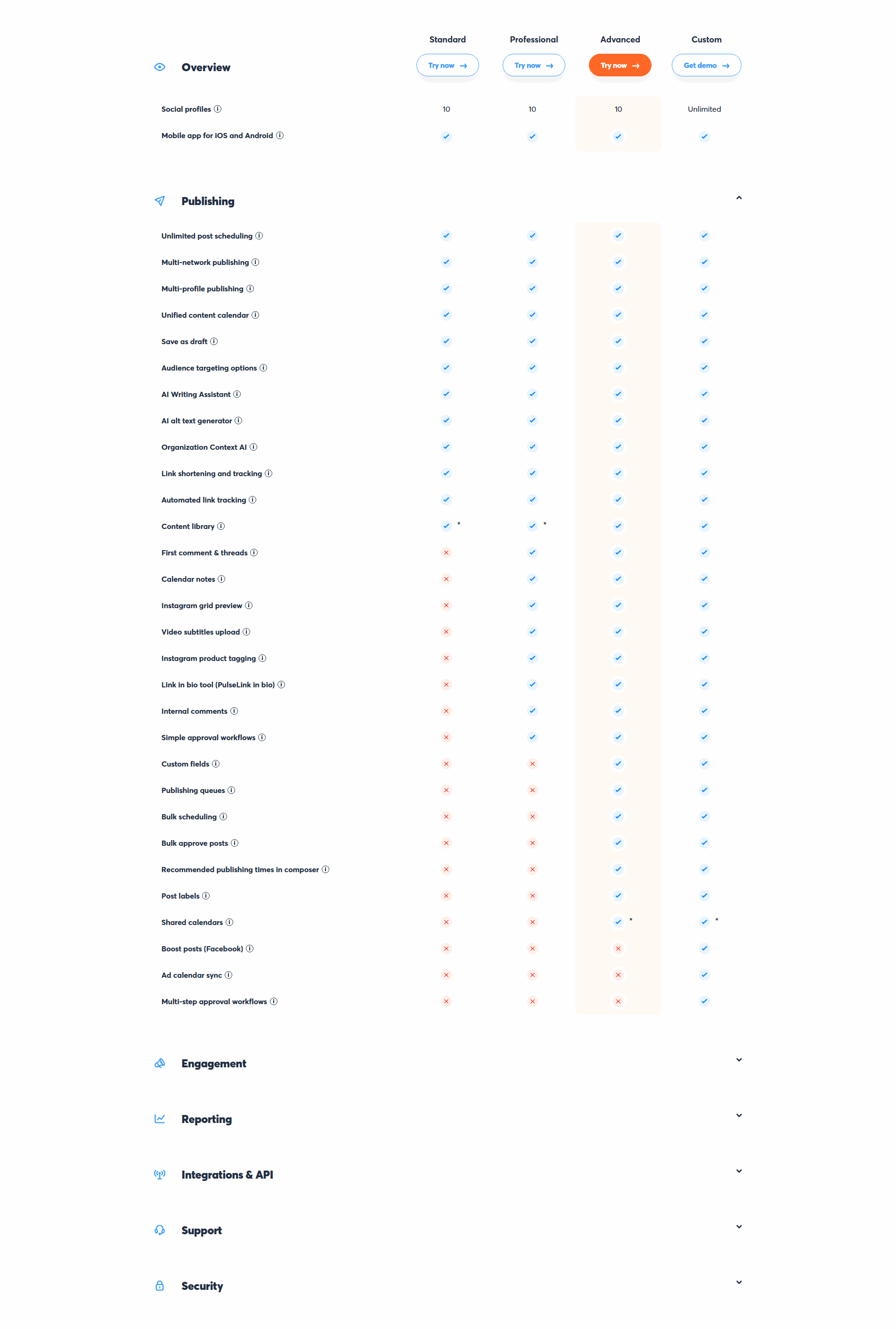
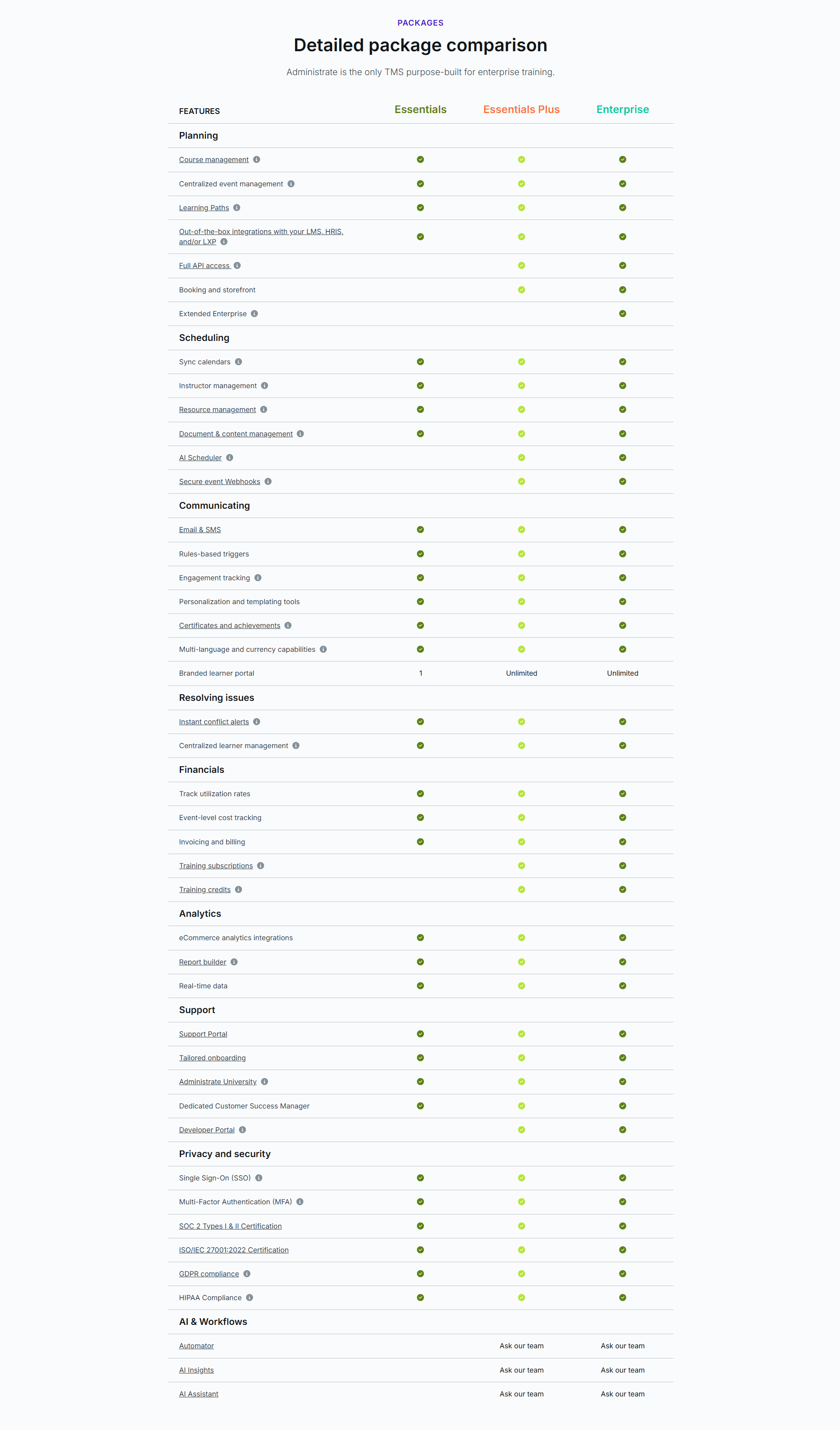
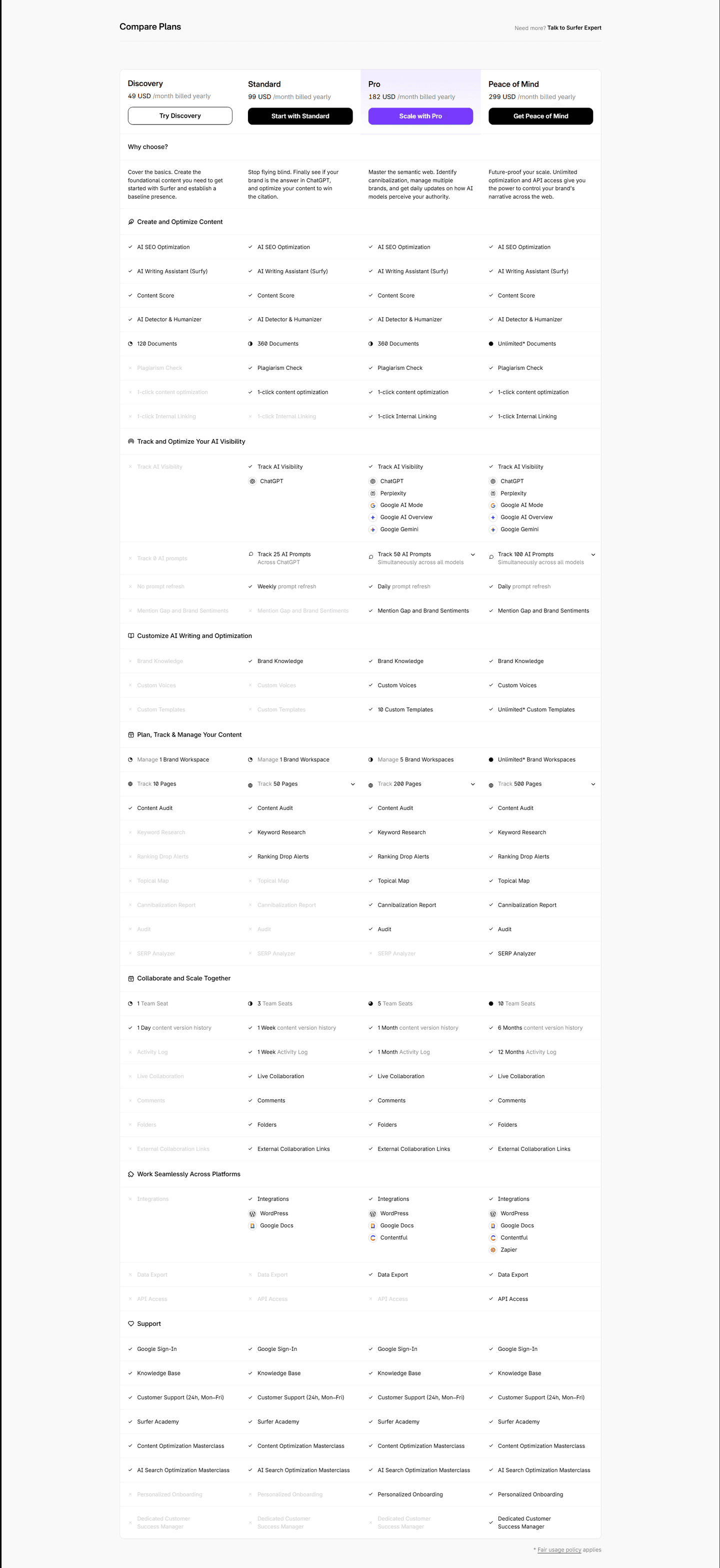
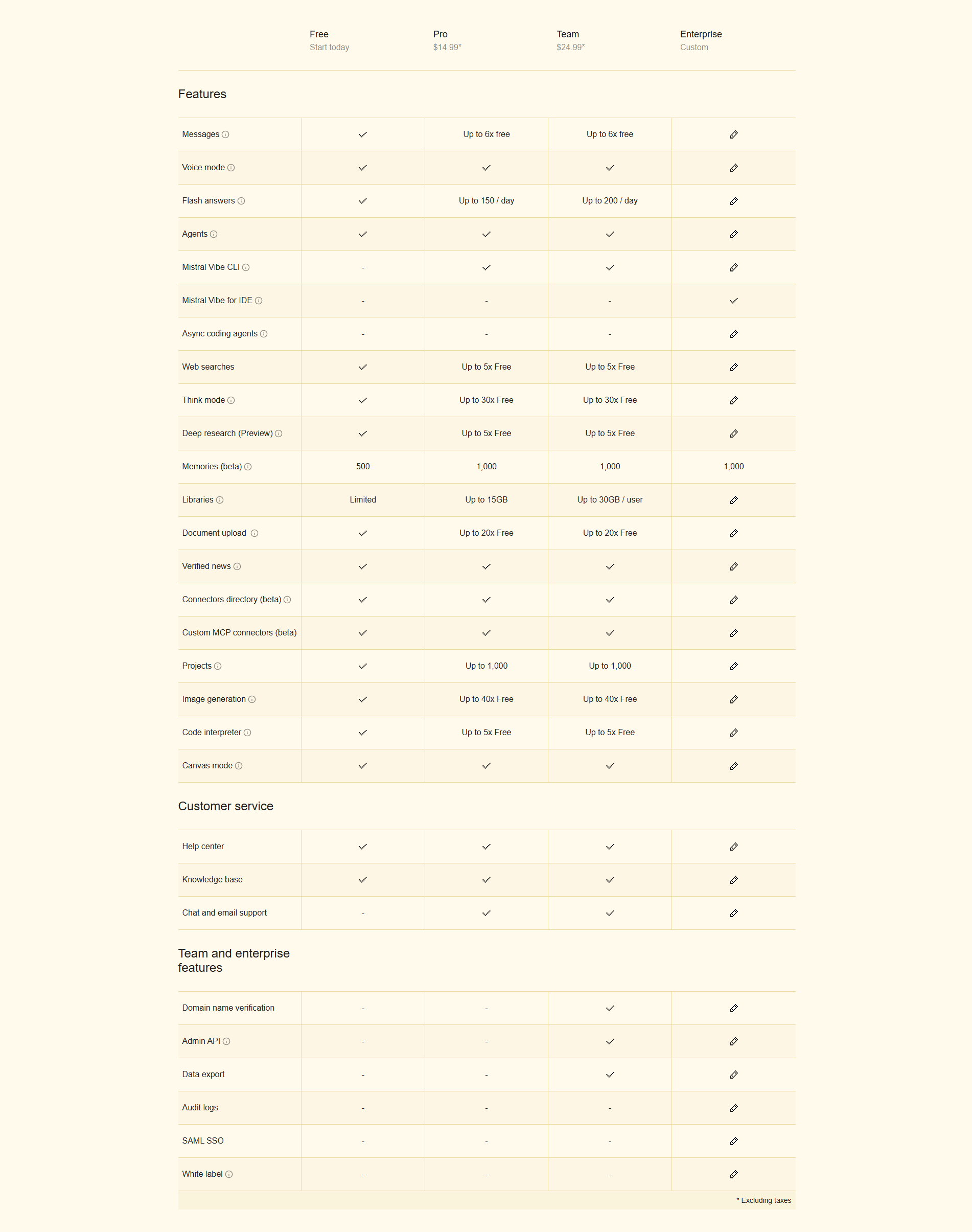
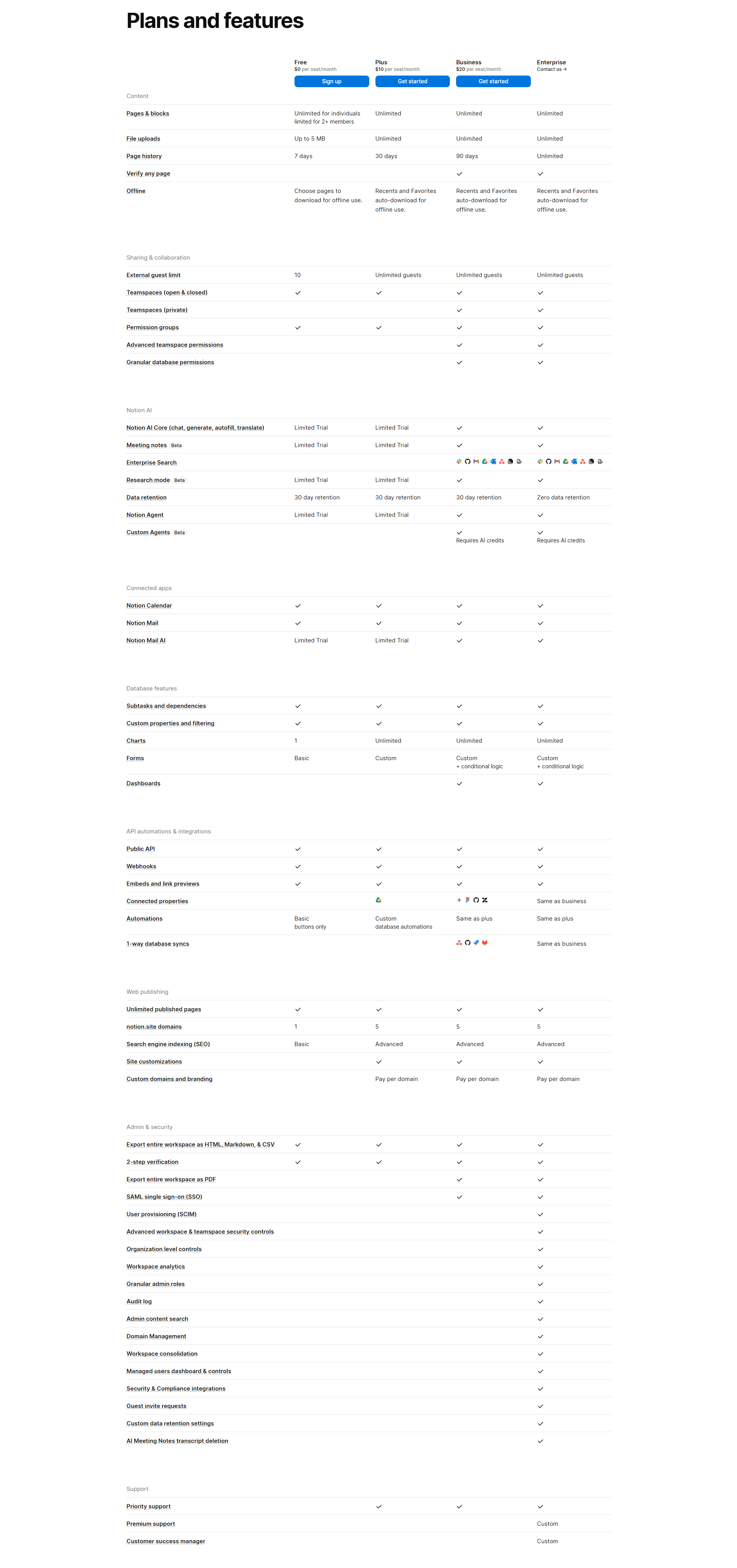
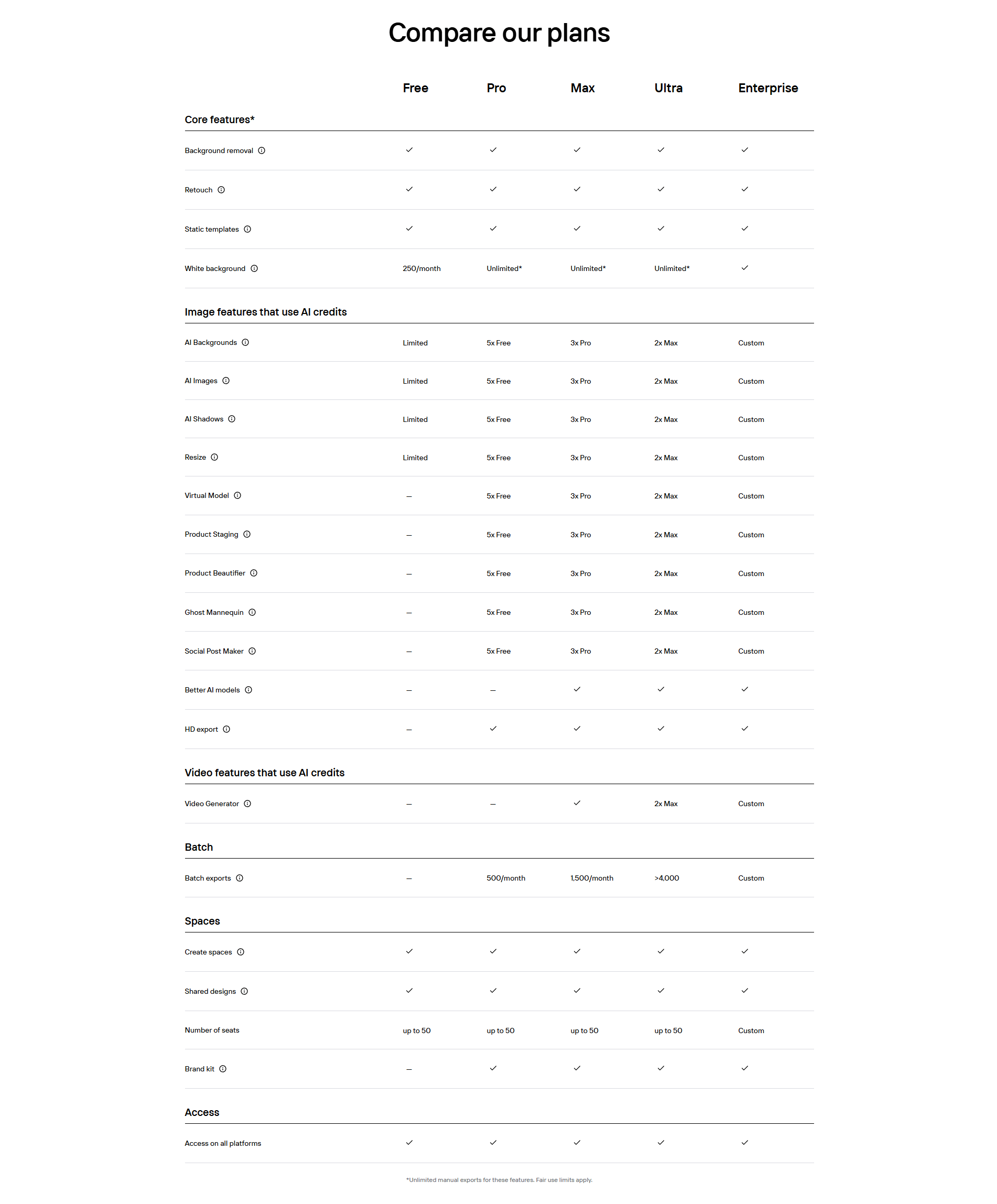
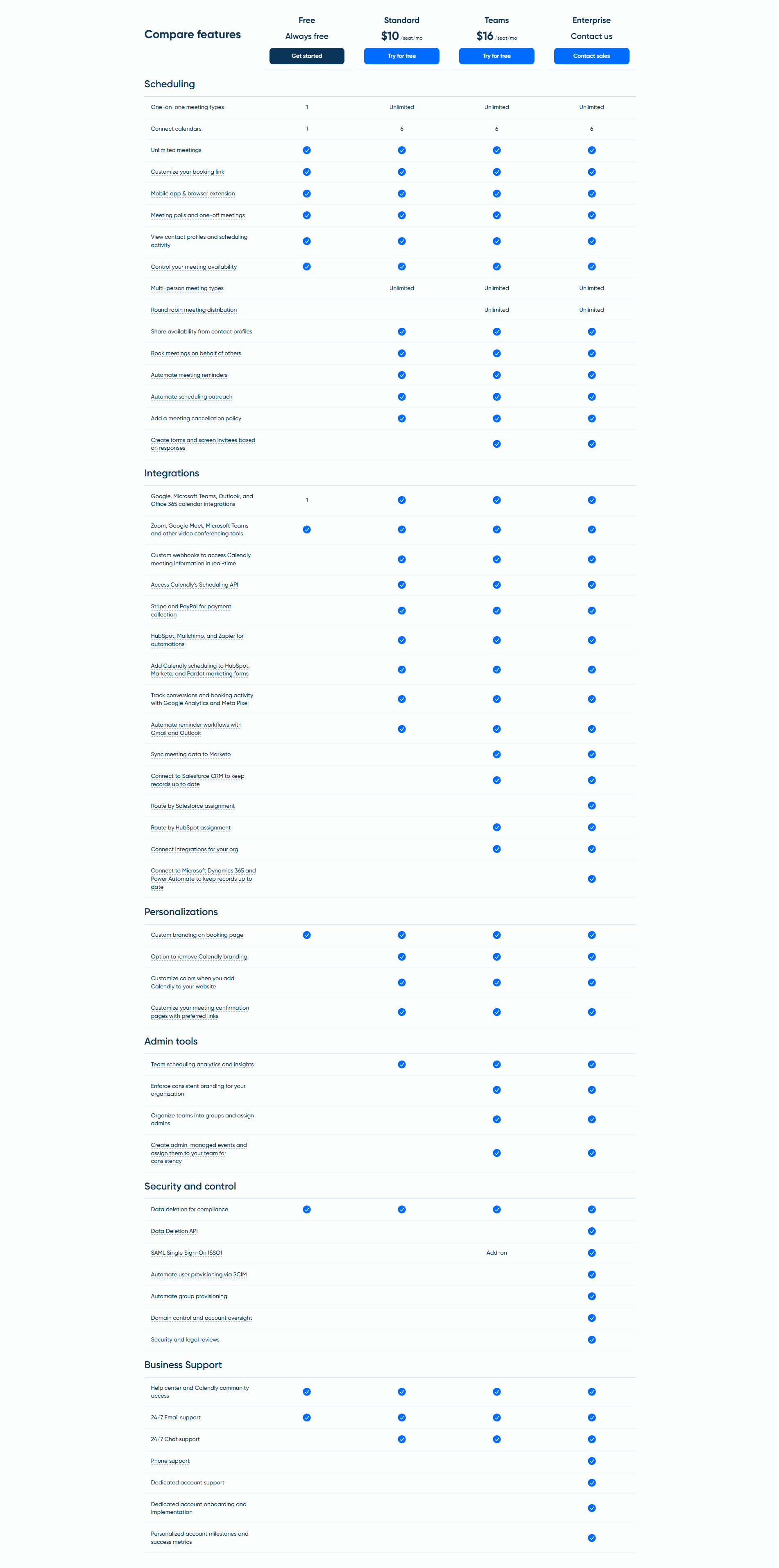
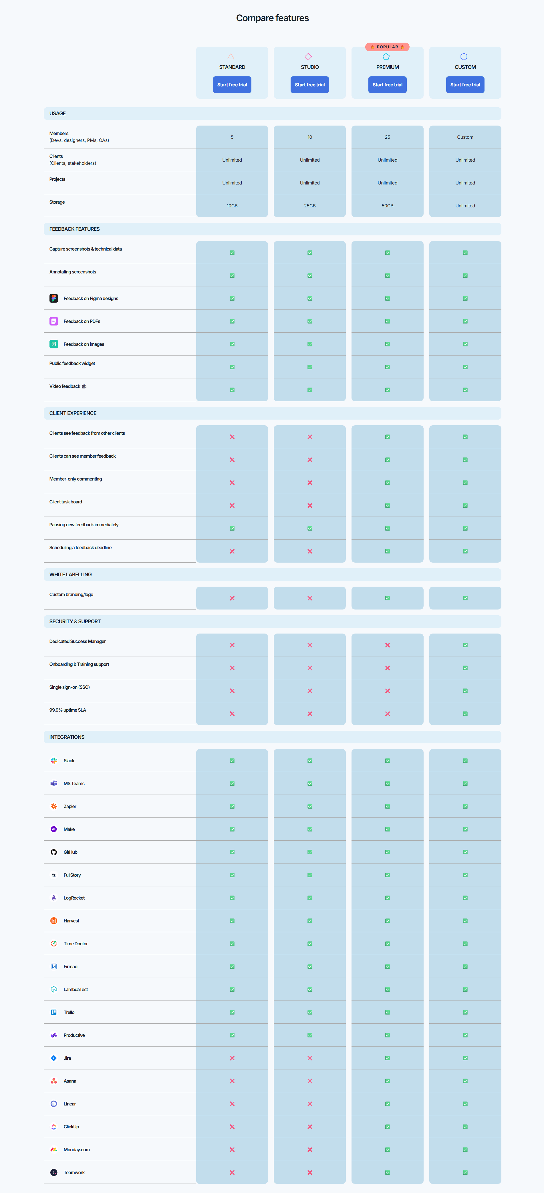
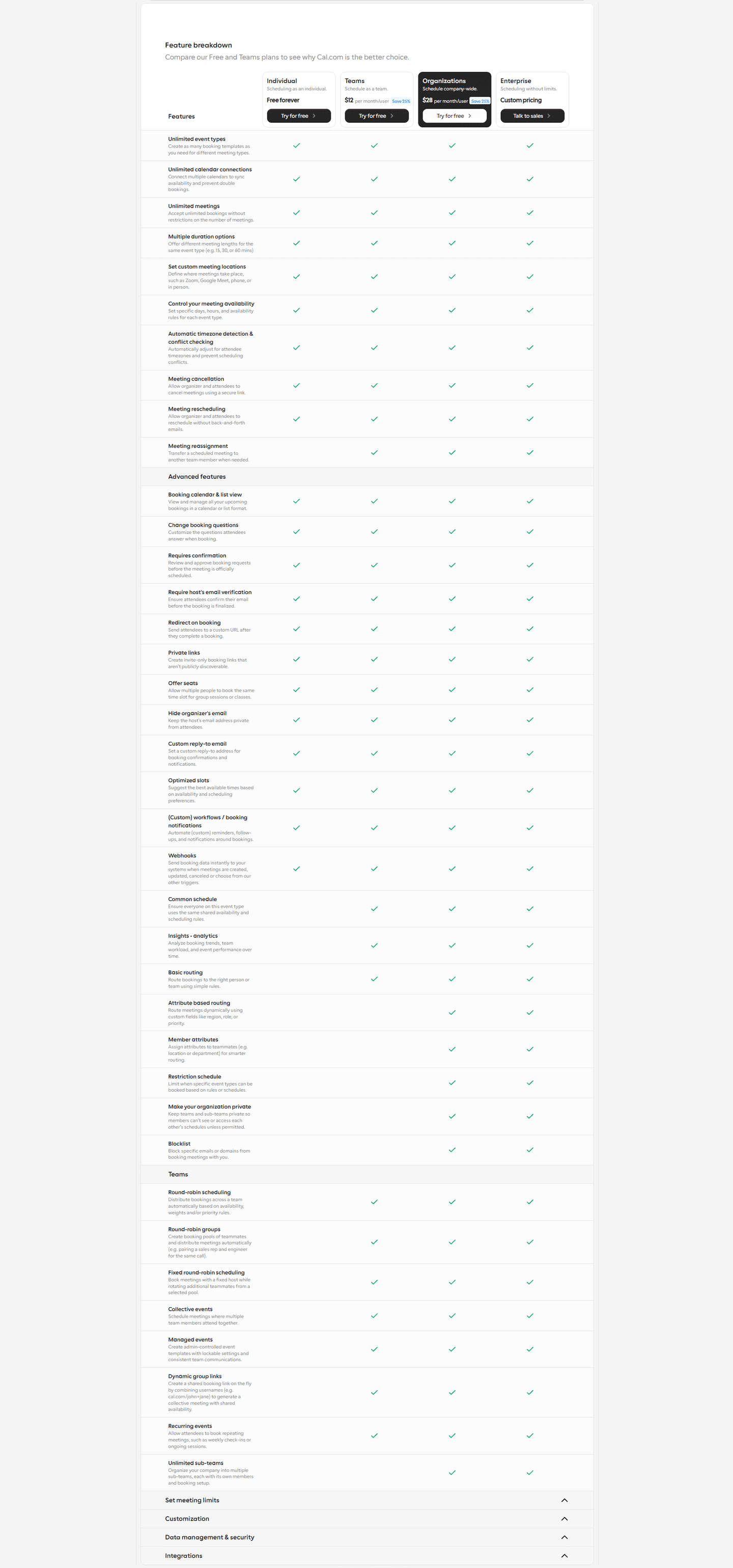
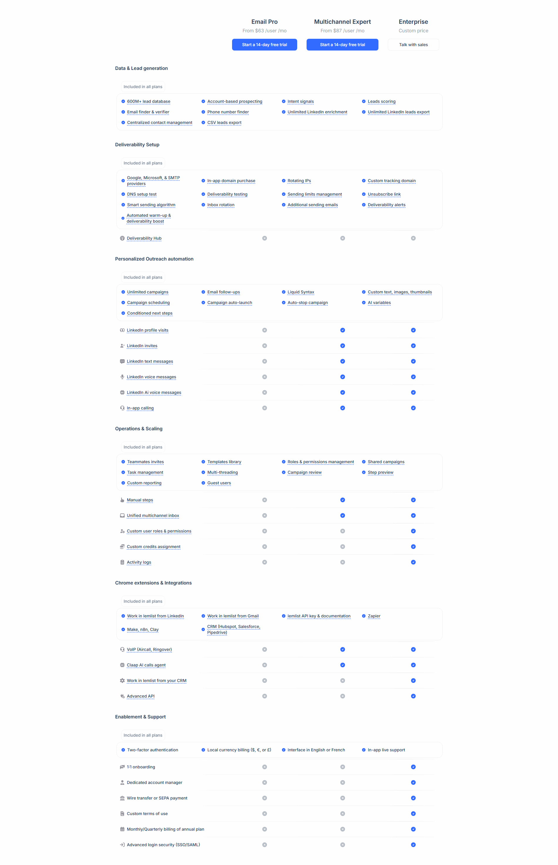
Features grouped by category (Core, Advanced, Enterprise) — organized comparison
Easy to scan rows and columns with clear checkmarks and labels — quick evaluation
| Element | What it means | Use it | Type |
|---|---|---|---|
| Sticky headers | Plan names stay visible while scrolling the feature matrix — keeps visitors oriented | 10% | Big opportunity |
| Tooltip explanations | Hover for feature details — clarification without cluttering the table | 13% | Big opportunity |
| CTA row | CTA buttons at the top and/or bottom of the table — conversion access points | 46% | Opportunity |
| Highlight differences | Key differentiators visually emphasized — guides the upgrade decision | 59% | Common |
| Category grouping | Features grouped by category (Core, Advanced, Enterprise) — organized comparison | 87% | Table stakes |
| Feature matrix clarity | Easy to scan rows and columns with clear checkmarks and labels — quick evaluation | 92% | Table stakes |
Best-in-class pricing tables all highlight differences between plans (100% vs 59% average) and include a CTA row (75% vs 46%). That's the biggest gap in the data.
Sticky headers are the rarest best practice: only 10% of tables use them. For long tables (15+ feature rows), that's a direct usability problem. The visitor scrolls, loses track of which plan is which column, and gives up comparing.
Across 39 scored pricing tables, here's how scores break down. Most land between 40 and 59.
71% of pricing tables score between 40 and 59. 25% break 80. The bar is low — adding 2-3 best practices puts you in the top quartile.
Our AI conversion agent evaluates every pricing table against a weighted checklist that spans two dimensions. Each best practice gets a pass or fail based on the actual page content and screenshot.
Not every best practice carries the same weight. Highlighting differences and CTA rows pull the score up more because in our dataset, tables with those two convert better than tables without them, even when the other best practices are present.
Sections flagged best-in-class are hand-picked by our team from the highest-scoring sections. Administrate, Skello, PayFit, Beamly, and Sierra Interactive are on the list. A high score gets you on the list. Best-in-class means the structure and conversion design work together.
Interactive quiz
Is the feature comparison easy to scan with clear checkmarks?
Clean rows and columns with clear labels — quick evaluation
8 pricing tables in our library are flagged best-in-class. They score higher because they stack best practices differently.
100% highlight the differences between plans, nearly double the average (59%). They don't leave the visitor to compare on their own. They visually guide toward the right plan.
Administrate and PayFit do all of this. Four conversion best practices stacked in a single table. That's what a high score looks like.
100/100The lowest-scoring pricing tables in our library aren't unreadable. Most of them have proper alignment and checkmarks. They just don't do enough.
A low-scoring table typically has only 2 best practices: a feature matrix and category grouping. The basics. No highlighted recommended plan, no CTAs at both ends, no tooltips.
The most common gap: no visual highlighting of differences. 41% of tables don't visually distinguish one plan from the others. The visitor sees three identical columns and has to compare row by row. That's unnecessary cognitive load.
Second: no CTA at the bottom of the table. 54% of tables only have a button at the top. After reading 20 feature rows, the visitor has to scroll back up to take action. That's pure friction.
The fix isn't redesigning the table. It's adding 2-3 elements. A "Recommended" badge takes 5 minutes. A second CTA button at the bottom of the table, same. The gap between an average table and an effective one is usually two missing best practices.
Want to know which best practices your pricing table is missing? Try our landing page analysis →
10/100
Curated by
Gabriel Amzallag , Founder, LPA
5 years CRO + SEO at Qonto (2021–2025). After advising 15+ SaaS on their websites (Payfit, Pigment…), the same patterns kept breaking — so I decided to build the source of truth on what works on the web: the intelligence layer every tool, builder, and team uses to ship sites that perform.
See how different industries design their pricing table sections.
Real examples from top SaaS landing pages, scored and analyzed.
The full section: plans, prices, CTAs, risk reducers. See how top SaaS companies present their pricing.
Browse pricing examples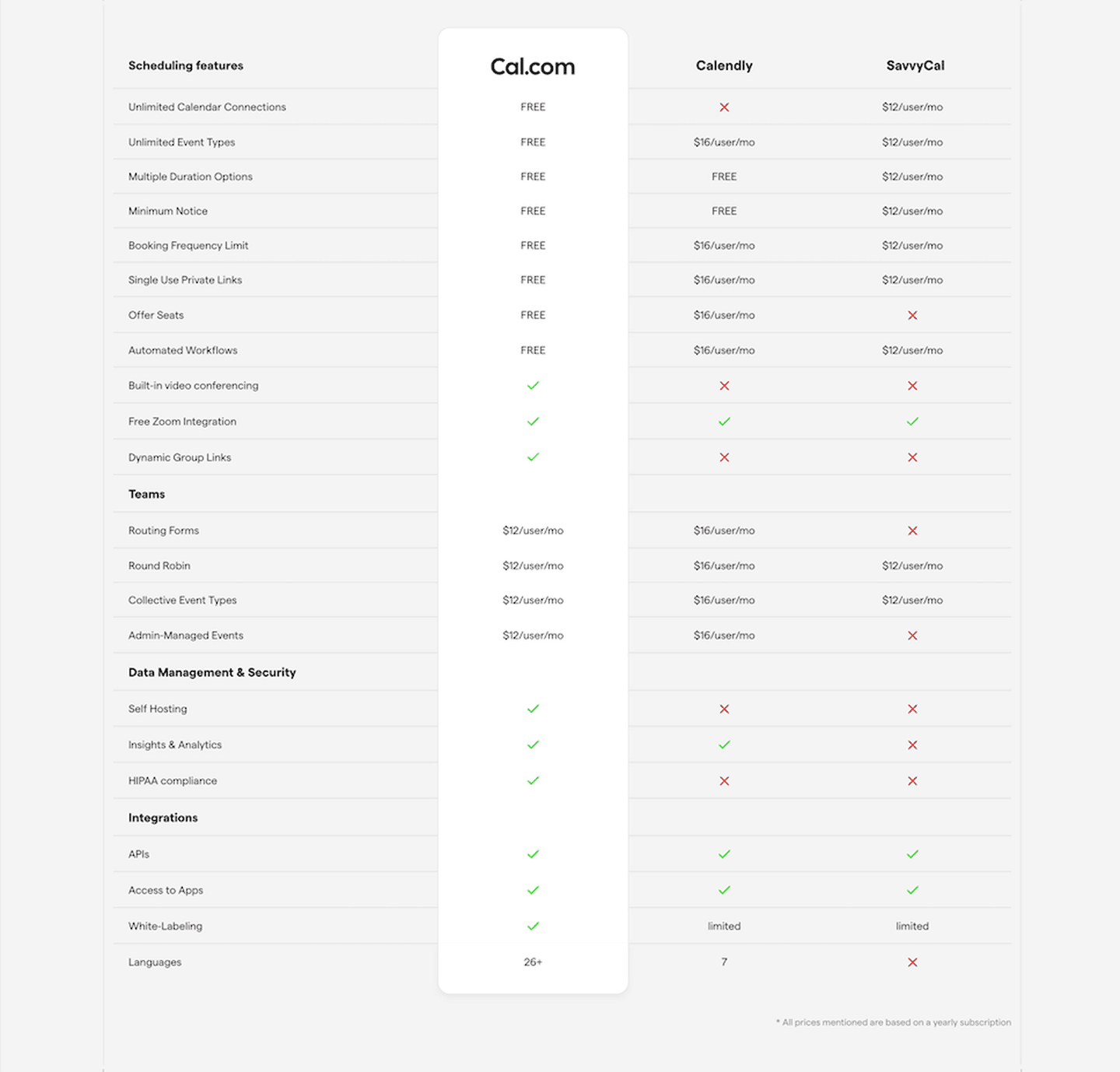
Competitive comparison tables: "why us, not them." Scored examples with conversion analysis.
Browse comparison sections
How top products present their features: grids, bento layouts, interactive demos. Real examples with scores.
Browse features sectionsPaste your URL. Get a scored analysis of your pricing table with specific fixes. Free, no signup.
Everything you need to know about pricing table design, based on our analysis of real SaaS landing pages.
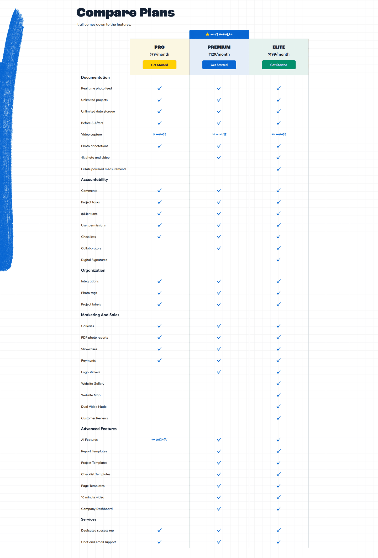
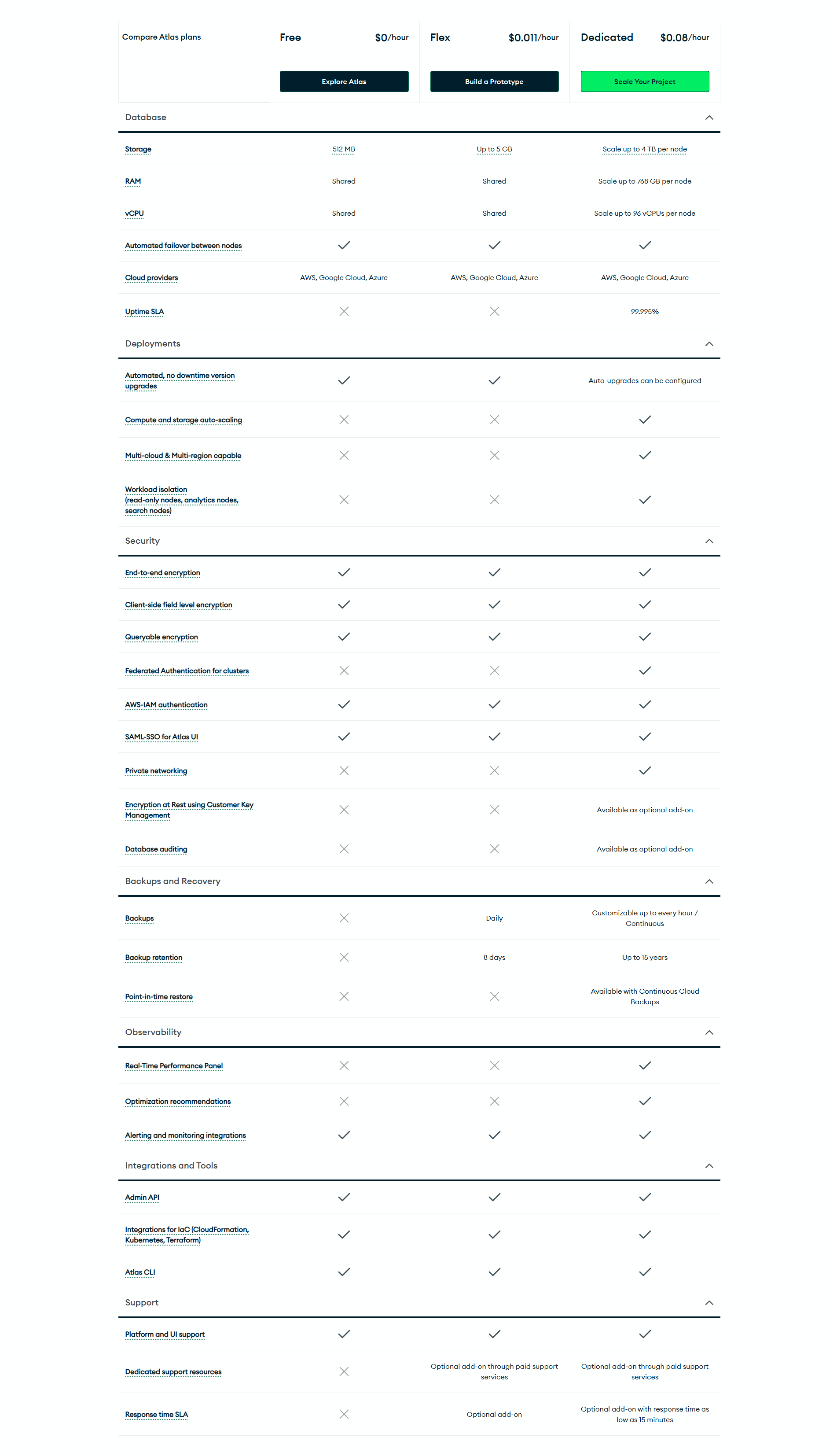
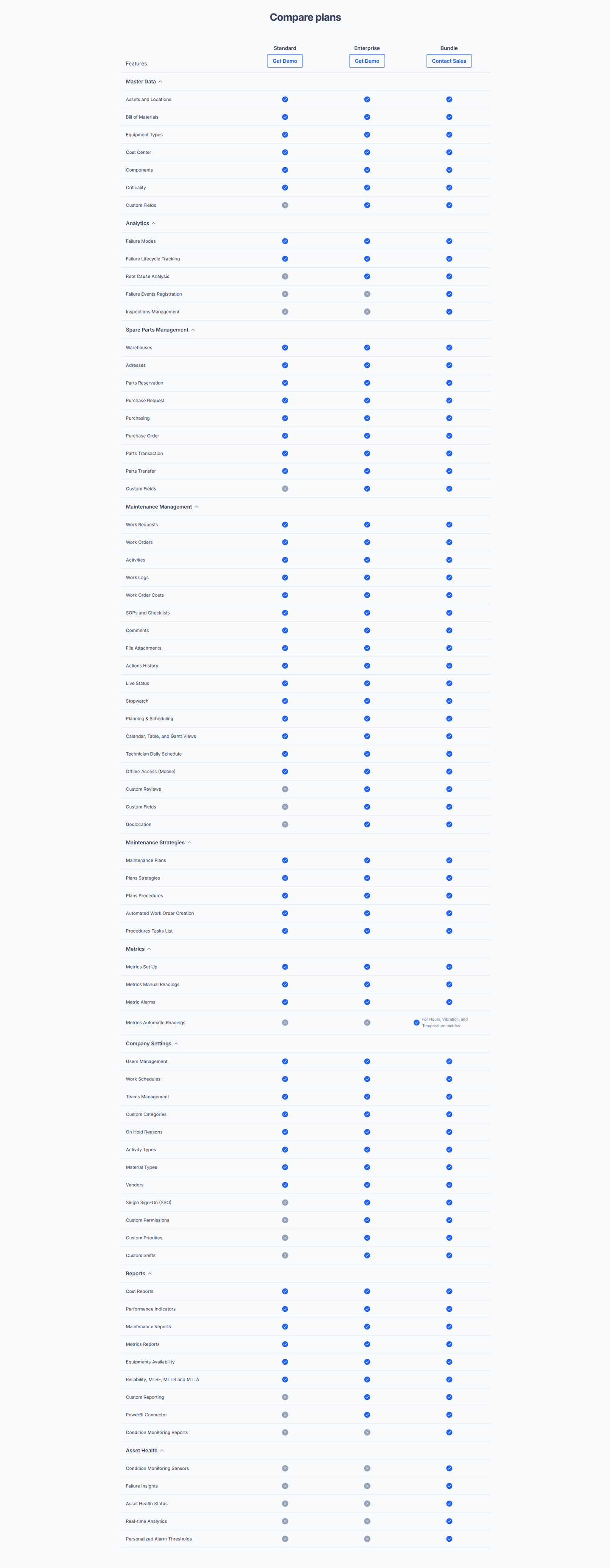
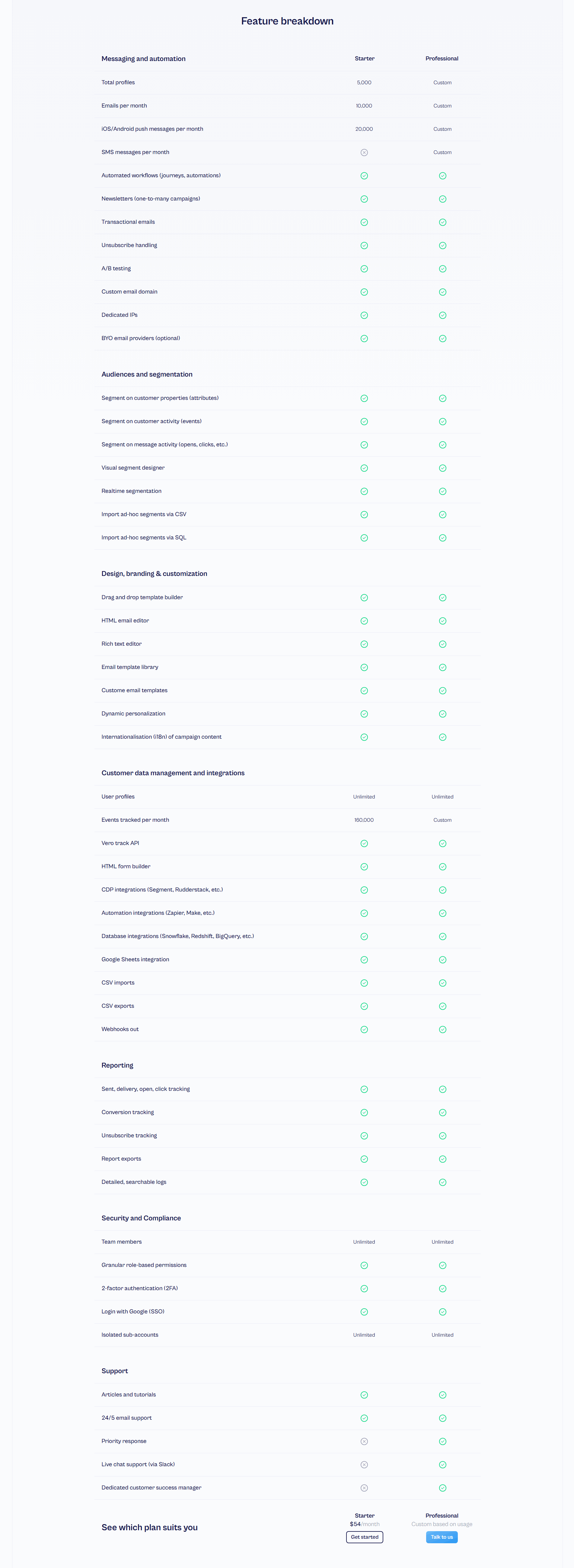
Three or four. Two plans don't give enough context for comparison. Five or more creates visual overload and slows the decision. Three plans with a highlighted "recommended" tier is the most common format in our database of 39 pricing tables. If you have an Enterprise plan, show it separately with a "Contact us" CTA.
The pricing section is the whole package: headline, plan descriptions, price tags, CTAs, risk reducers, FAQ. The pricing table is the feature comparison matrix specifically: feature rows, plan columns, checkmarks. Some pages combine both. Others put the table on a dedicated sub-page. What matters is that visitors can compare plans in under 10 seconds.
If you have more than two plans with different feature sets, yes. Without a table, visitors have to open each plan individually and compare from memory. A table reduces cognitive load and speeds up the decision. The exception: if your pricing is simple (single plan, or a freemium + one paid tier), a table adds unnecessary complexity.
The pricing table shows differentiators between plans, not a full product catalog. If a feature exists in every tier ("Web app, mobile app, email support"), it belongs in the features section, not the table, or in a single "Included in all plans" row at the top. The table should make the upgrade logic obvious: why would someone jump from Starter to Growth? Every row that isn't part of that answer is noise. Aim for 10-20 differentiating rows, not 60, with the top row being the single feature that drives most upgrades.
One plain-English sentence plus a concrete example. "Advanced analytics" is ambiguous. The tooltip should say what that means here: "Custom dashboards with cohort analysis and funnel breakdowns." Skip the marketing copy. Skip the "learn more" link inside the tooltip, because hovers that lead to clicks that leave the page break the comparison flow. Tooltips exist to resolve the confusion right there, not to start a second journey. If a feature name doesn't need explaining, don't add a tooltip just for consistency. Empty tooltips erode trust in the filled ones.
Run your page through our landing page analyzer. You'll get a scored breakdown of your pricing table across conversion best practices (feature matrix clarity, category grouping, highlight differences, CTA row, tooltip explanations, sticky headers) with specific fixes prioritized by impact.