Landing Page Section Examples
Every landing page is built from the same building blocks. Pick a section type below to see real examples from top SaaS pages, scored and analyzed.
1,300+ sections scored · 19 section types
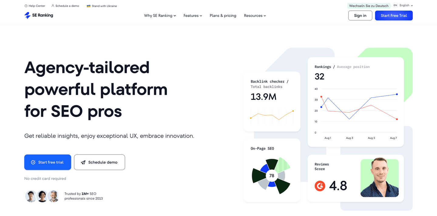
Hero Sections
The first thing visitors see. Headlines, subheadlines, CTAs, and the visual that sets the tone for the entire page.
Browse examples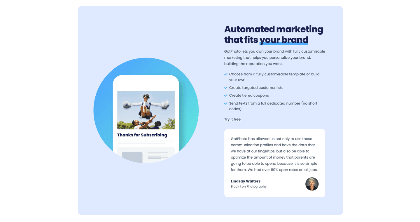
Value Proposition Sections
The blocks that make visitors understand why your product matters. Benefit-driven copy, differentiation, and the "why you" answer.
Browse examples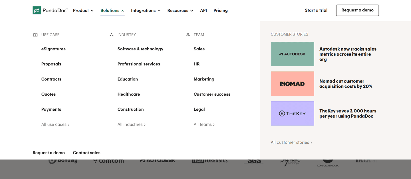
Navbar Sections
Navigation bars that guide without overwhelming. Menu structure, CTA placement, and the details that drive clicks.
Browse examples
CTA Sections
Buttons, forms, and conversion blocks. Where visitors decide to act or bounce.
Browse examples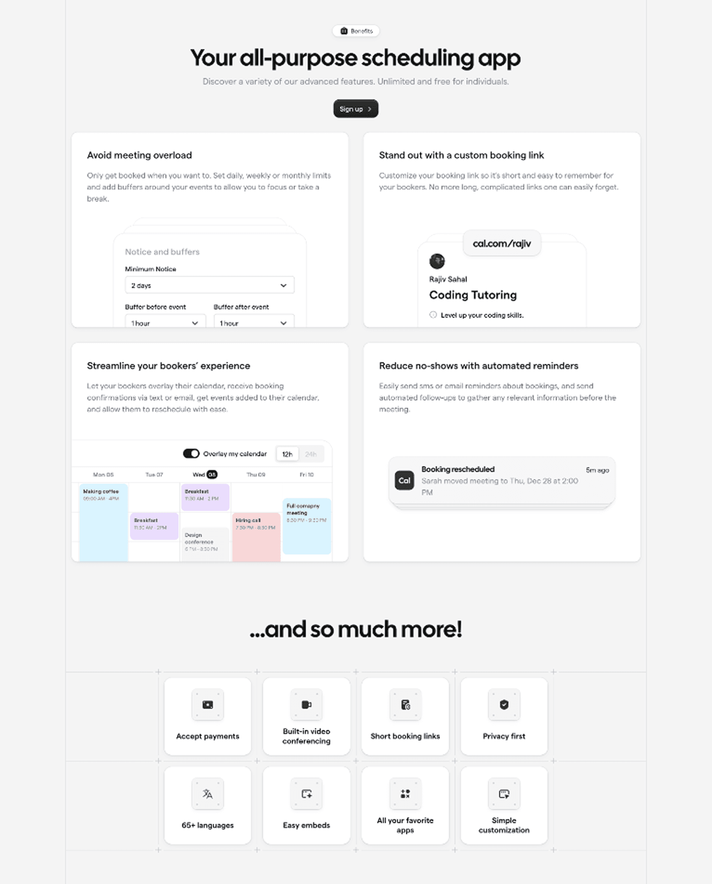
Features Sections
How highest-scoring SaaS pages present what their product does without putting visitors to sleep.
Browse examples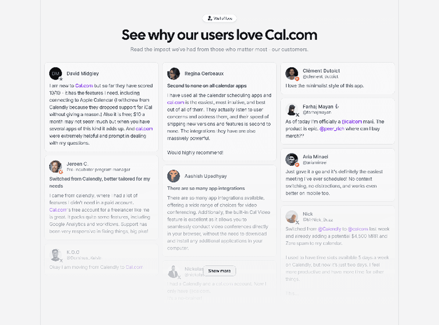
Testimonial Sections
Social proof that converts. Real quotes, logos, video testimonials, and case study snippets.
Browse examples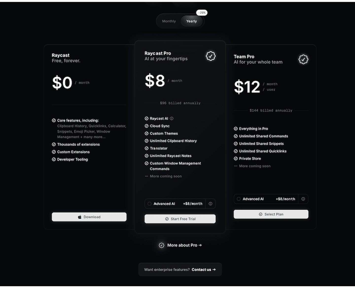
Pricing Sections
Pricing tables, plan comparisons, and the framing tricks that make the right tier feel obvious.
Browse examples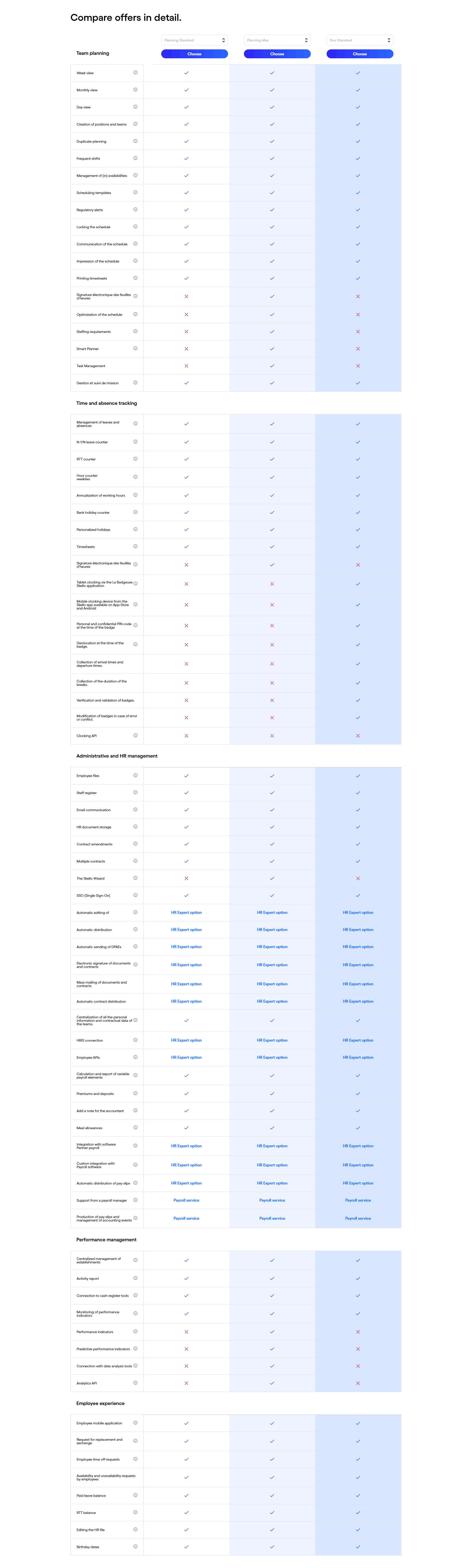
Pricing Table Sections
Feature comparison grids that help buyers pick a plan. Column layouts, checkmarks, and the design choices that reduce decision friction.
Browse examples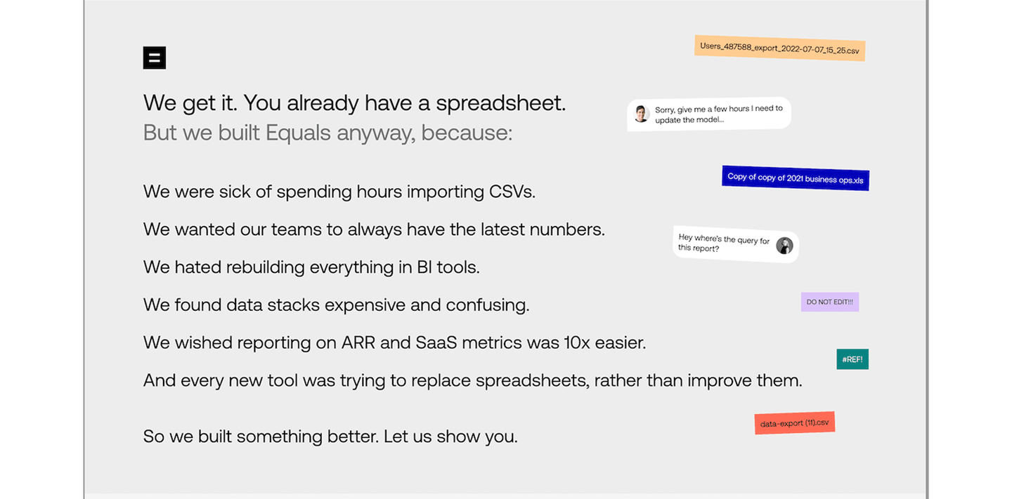
Problem Sections
How the best pages call out the pain before pitching the fix. Empathy-driven copy that makes visitors feel understood.
Browse examples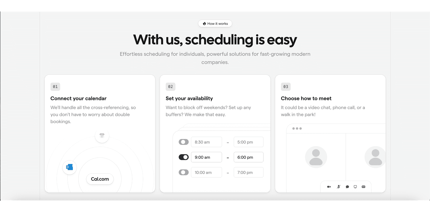
How It Works Sections
Step-by-step flows that show how the product works. Process breakdowns, numbered steps, and guided walkthroughs.
Browse examples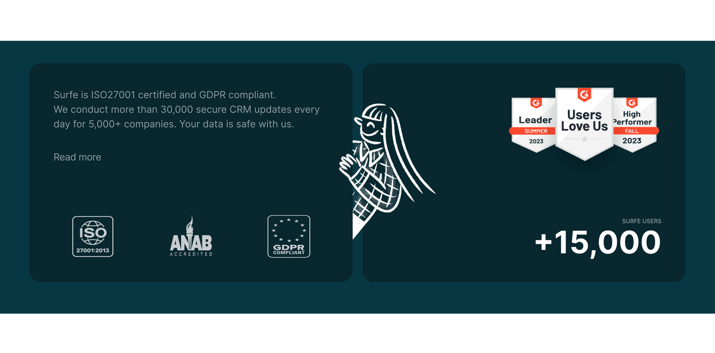
Trust Signal Sections
Logos, badges, certifications, and security indicators. The quiet details that remove buying anxiety.
Browse examples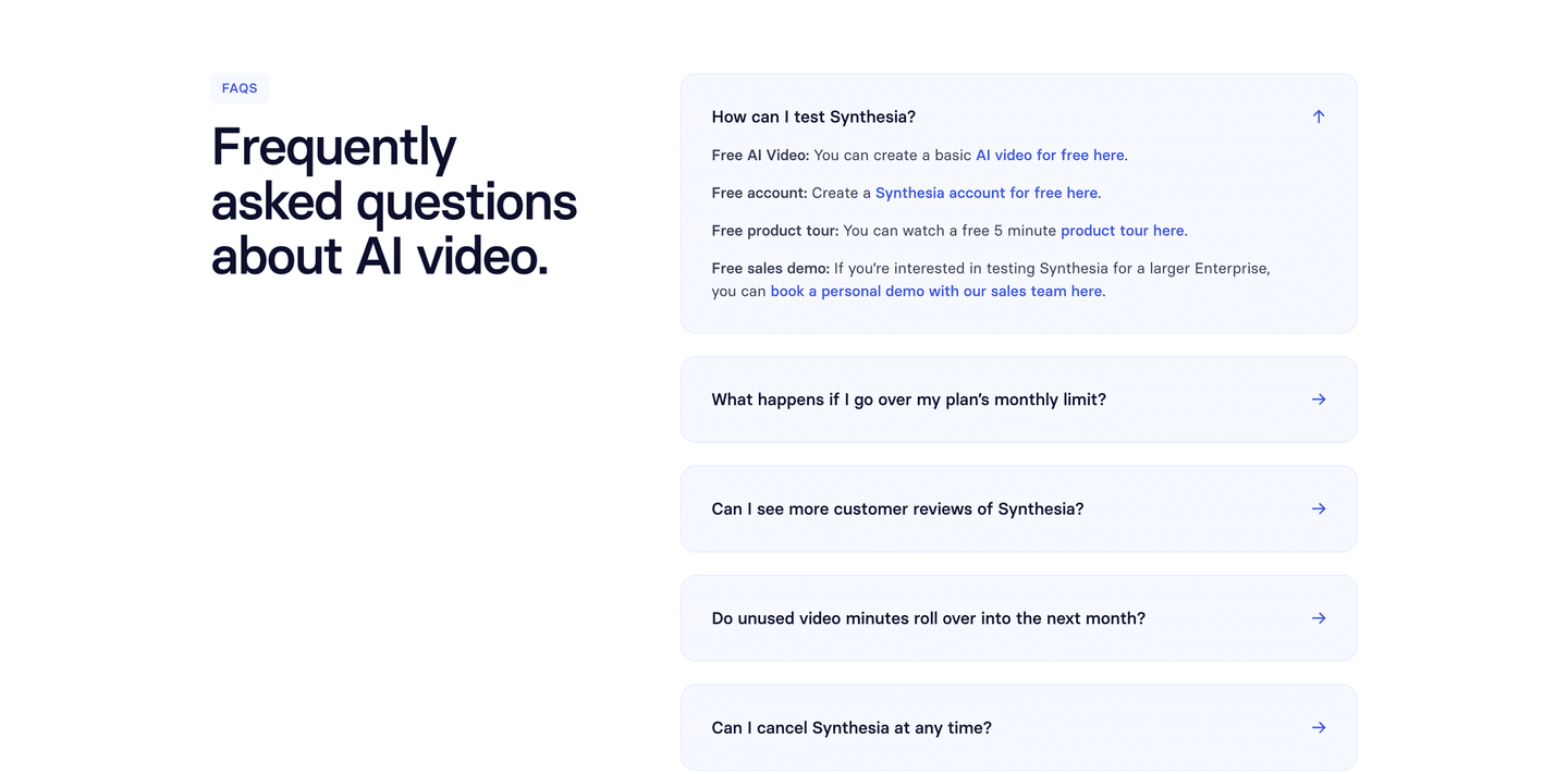
FAQ Sections
Objection handling disguised as helpful answers. Layout patterns that keep visitors on the page.
Browse examples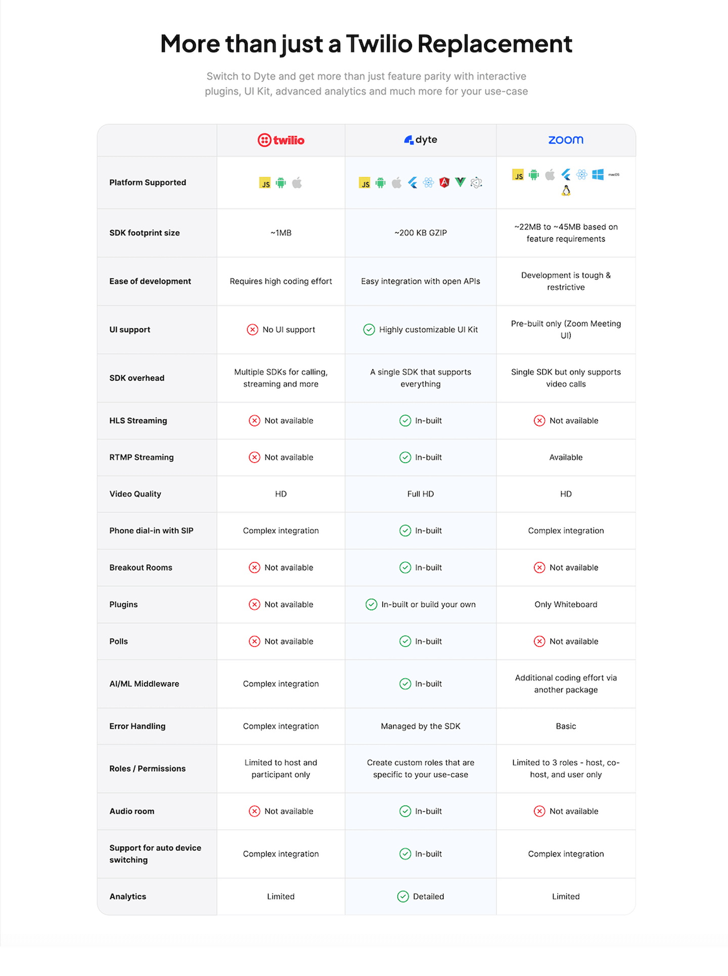
Comparison Sections
Side-by-side tables, before/after visuals, and "us vs. them" blocks that position without trashing competitors.
Browse examples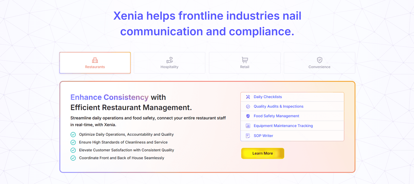
Use Case Sections
Persona-targeted blocks that show different audiences why the product fits them. Role tabs, industry filters, and segmented messaging.
Browse examples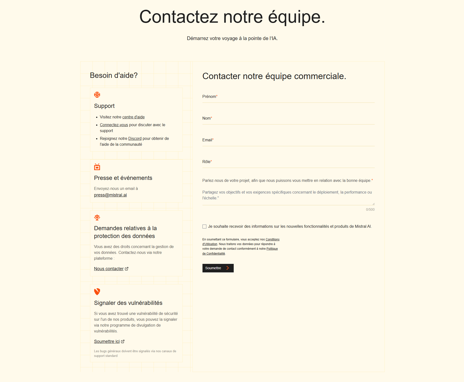
Contact Sections
Forms, calendars, and chat widgets. How top pages make it easy to start a conversation.
Browse examples
About Sections
Team photos, mission statements, and company stories. The blocks that build trust by showing the humans behind the product.
Browse examples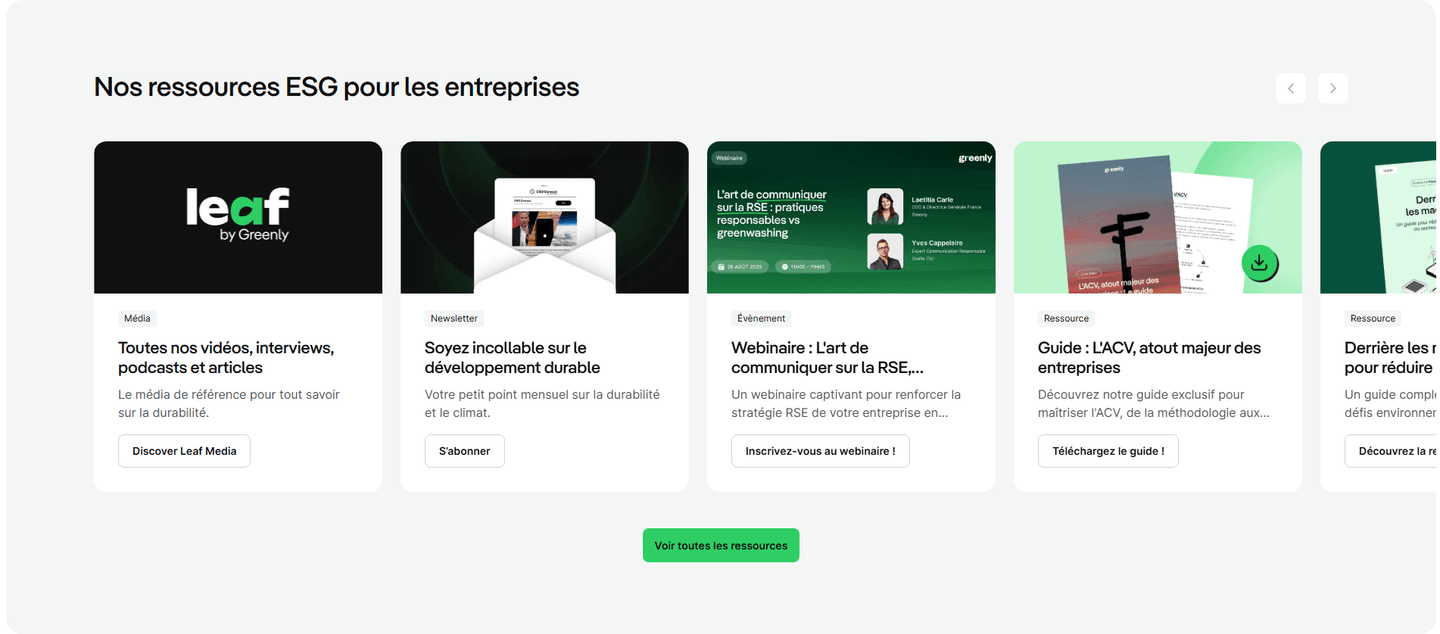
Resources Sections
Educational content blocks, blog highlights, guides, and resource libraries that build authority and keep visitors on the page.
Browse examples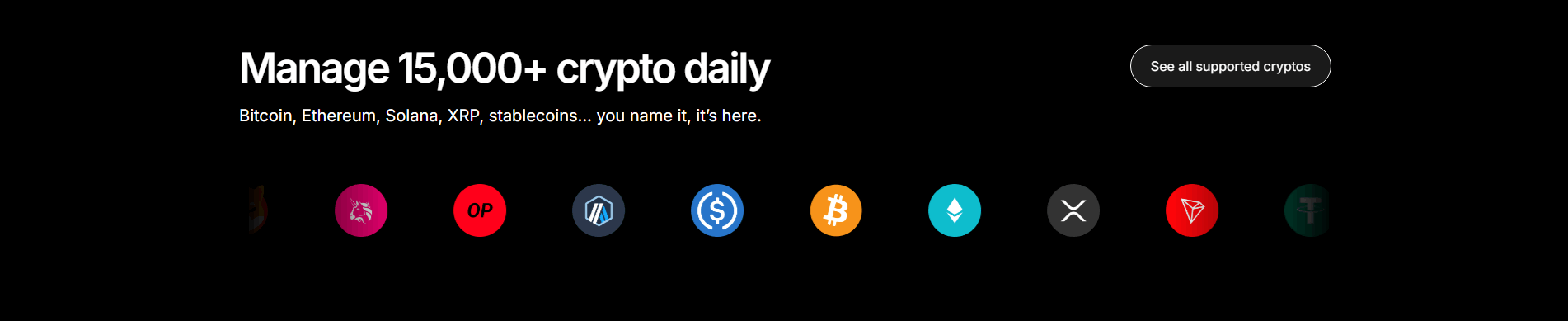
Integrations Sections
Logo grids, integration counts, and ecosystem pages. How top SaaS pages show they play well with others.
Browse examples
Footer Sections
The last thing visitors see. Link structure, secondary CTAs, and the layout choices that turn footers into conversion assets.
Browse examples
Curated by
Gabriel Amzallag , Founder, LPA
5 years CRO + SEO at Qonto (2021–2025). After advising 15+ SaaS on their websites (Payfit, Pigment…), the same patterns kept breaking — so I decided to build the source of truth on what works on the web: the intelligence layer every tool, builder, and team uses to ship sites that perform.
Frequently asked questions
Common questions about landing page sections, what they do, and how to use them.
How many sections are in a landing page?
[01]Most SaaS landing pages have 5 to 10 sections. The essential ones: hero, features, social proof, CTA, and pricing. In our database of 1,300+ scored sections from 350+ companies, the average page has 6 distinct sections. Shorter pages (3-4 sections) work for single-offer pages. Longer pages (10+) work when you're selling to enterprise buyers who need more proof.
What are the main sections of a landing page?
[02]The core sections are: hero (headline + CTA above the fold), features (what the product does), social proof (testimonials, logos, stats), pricing (plans and tiers), CTA (conversion block), and FAQ (objection handling). Beyond those, high-performing pages often add problem sections, how-it-works steps, and comparison tables.
What is a website section?
[03]A website section is a distinct content block on a page — visually separated and serving a single purpose. A hero section introduces the product. A CTA section drives action. A testimonial section builds trust. Each section has its own conversion job. We score sections individually because a page can have a strong hero but a weak CTA — and the CTA is what kills your conversion rate.
What are the 5 major components of a web page?
[04]Header/navigation, hero section, body content (features, benefits, social proof), conversion elements (CTAs, forms, pricing), and footer. On landing pages specifically, the body content is broken into specialized sections — problem, solution, how-it-works, testimonials — each designed to move the visitor closer to action.
What's the difference between a section and a page?
[05]A section is one block within a page. A page is the full experience — all sections combined. A hero section sits at the top of a landing page. A CTA section appears once or multiple times throughout. We analyze both: browse full landing page examples or pick a specific section type to study individual building blocks.
Audit your landing page section by section
Get a scored breakdown of every section on your page with specific fixes. Takes 2 minutes.
Analyze my page free