Best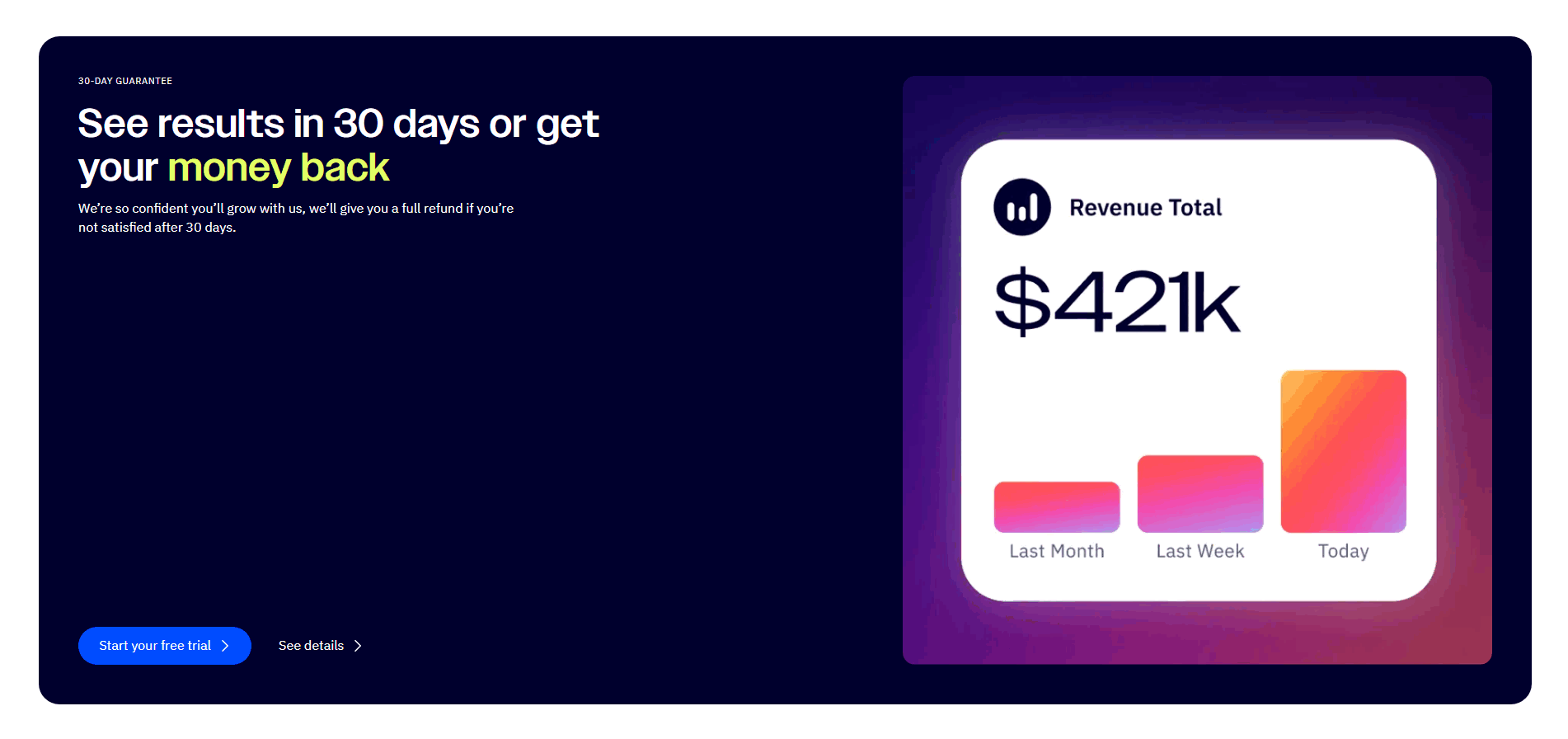
Cta|
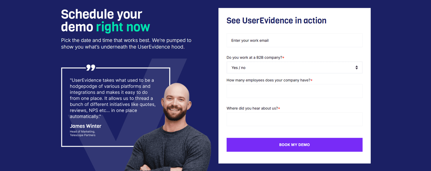
ActiveCampaign SaaS Cta Design
100/100
Hand-picked 322 CTA sections, scored across conversion best practices. See what separates high-converting CTAs from the rest.
Showing 1–21 of 322 examples


Every CTA section is scored across 6 conversion best practices. See which ones stack friction reducers, microcopy, and secondary paths — not just which ones look clean.
Hand-picked from 350+ companies and analyzed by our AI conversion agent. Real CTA sections from real products, not UI kit mockups.
Found a CTA you want to beat? Run yours through the same scoring engine and see where you stand on the same best practices, and what to fix first.
We scored 322 CTA sections across conversion best practices. The table below shows how widely each element is adopted. The lower the number, the bigger your edge by adding it.
Countdown timer, "Limited spots," "Offer ends Friday" — creates a reason to act now instead of later
One clear primary CTA, not three competing buttons. No choice paralysis — the visitor knows exactly what to click
A "Watch demo" or "See pricing" link for visitors who aren't ready to commit — captures hesitant leads instead of losing them
Supportive text near the button that addresses the last doubt: "Join 10,000+ teams" or "Instant access, no setup"
"No credit card," "1-minute setup," "Cancel anytime" — removes the last hesitation before clicking
| Element | What it means | Use it | Type |
|---|---|---|---|
| Urgency / scarcity | Countdown timer, "Limited spots," "Offer ends Friday" — creates a reason to act now instead of later | 12% | Big opportunity |
| Consolidation | One clear primary CTA, not three competing buttons. No choice paralysis — the visitor knows exactly what to click | 14% | Big opportunity |
| Secondary path | A "Watch demo" or "See pricing" link for visitors who aren't ready to commit — captures hesitant leads instead of losing them | 41% | Opportunity |
| Microcopy quality | Supportive text near the button that addresses the last doubt: "Join 10,000+ teams" or "Instant access, no setup" | 72% | Common |
| Friction reduction | "No credit card," "1-minute setup," "Cancel anytime" — removes the last hesitation before clicking | 89% | Table stakes |
Friction reduction and microcopy are table stakes — 89% and 72% of CTA sections have them. The real differentiator is what comes next. Best-in-class CTAs are twice as likely to include a secondary path (80% vs 41%). That's the biggest gap in the data.
Urgency/scarcity is rare (12%) and doesn't separate the best from the rest (7% of best-in-class use it). When it's genuine ("3 spots left in this cohort"), it works. When it's manufactured, visitors ignore it. The best CTAs skip urgency and invest in microcopy and secondary paths instead.
Across 322 scored CTA sections, here's how scores break down.
Our AI conversion agent evaluates every CTA section against a weighted checklist that spans three dimensions. Each best practice gets a pass or fail based on the actual page content and screenshot.
Friction reduction and microcopy are common but not sufficient. Consolidation and secondary path have higher impact because they address the two biggest CTA failure modes: choice paralysis and losing not-ready visitors.
Sections flagged best-in-class are hand-picked by our team from the highest-scoring sections. A high score gets you on the list. Best-in-class means the copy, structure, and mobile experience all work together.
Interactive quiz
Is there a "no credit card" or "cancel anytime" line near the button?
"No credit card required," "1-minute setup," "Cancel anytime"
1 CTA sections in our library are flagged best-in-class. They score higher because they stack best practices differently.
80% include a secondary path, nearly double the average. They don't force a binary "sign up or leave" decision. They give hesitant visitors somewhere to go — a demo, a pricing page, a case study — and keep them in the funnel.
Qonto, Gong, Calendly, Ahrefs, and Thetrainline all score 67 with three stacked best practices. The most common stack: friction reduction + secondary path + microcopy quality.
 100/100
The lowest-scoring CTA sections in our library aren't badly designed. They just do one thing and stop.
A CTA scoring 10/100 typically has a single best practice. A button with one supporting element — either a friction reducer or microcopy — and nothing else. No secondary path, no urgency, no consolidation.
The most common gap: no secondary path. 59% of all CTA sections skip it. The visitor either clicks the primary button or bounces. There's no middle ground for someone who's interested but not ready. That's a leak.
Second: weak or missing microcopy. 28% of CTA sections have a bare button with no supporting text. "Get Started" floating in space. No context, no reassurance, no reason to click right now instead of later.
Consolidation is rare across the board (14%), so it's less of a differentiator. But when a CTA section has 3 competing buttons — "Start trial," "Book demo," "Contact sales" — the visitor has to make a decision before they can take action. That's friction disguised as choice.
The fix isn't a redesign. It's adding a line of microcopy under the button and a secondary link below it. The gap between a 10 and a 67 is two elements, not a new layout.
Want to know which best practices your CTA is missing? Try our landing page analysis →
 10/100
Curated by
Gabriel Amzallag , Founder, LPA
5 years CRO + SEO at Qonto (2021–2025). After advising 15+ SaaS on their websites (Payfit, Pigment…), the same patterns kept breaking — so I decided to build the source of truth on what works on the web: the intelligence layer every tool, builder, and team uses to ship sites that perform.
See how different industries design their cta sections.
Real examples from top SaaS landing pages, scored and analyzed.
See how top SaaS pages structure their hero sections to hook visitors in the first 5 seconds. Scored examples with conversion analysis.
Browse hero examples
Logos, quotes, case studies, video testimonials. Browse the patterns that build trust and reduce hesitation.
Browse testimonials
How top products present their features: grids, bento layouts, interactive demos. Real examples with scores.
Browse features sectionsPaste your URL. Get a scored analysis of your CTA section with specific fixes. Free, no signup.
Everything you need to know about CTA section design, based on our analysis of real SaaS landing pages.
A CTA section should be compact and focused — typically 200-400px tall on desktop. The goal is a single action, not a content block. Include the headline, 1-2 lines of supporting copy, the button, and optionally a friction reducer underneath. In our library, the highest-scoring CTA sections keep it to under 5 elements total.
Right after your strongest proof point. On most SaaS pages that's just below testimonials, after the pricing table, or at the end of the features section, whichever block leaves the visitor most convinced. Don't save the CTA for the footer. If your page is longer than three screens, add a second CTA section mid-page so scrollers don't have to bounce back up. One before the scroll, one mid-page, one at the bottom is a common rhythm that works.
Yes, if your page is longer than 2 screens. The hero has a CTA, but visitors who scroll past it need another prompt. A dedicated CTA section placed after your strongest proof point (testimonials, features, or pricing) catches visitors at their most convinced moment. Most SaaS landing pages in our library have 1-3 CTA sections.
One line that addresses the last objection. Pick whichever doubt stops your visitors most often. If the hesitation is commitment, write "No credit card required" or "Cancel anytime." If it's effort, write "1-minute setup" or "No install needed." If it's loneliness, write "Join 10,000+ teams" with a real number. One line, ten words or fewer, placed directly under the button. Don't stack three. The visitor reads none of them. Pick the single line that removes the single biggest reason not to click right now.
The best next step for a visitor who's interested but not ready. "Watch a 2-min demo" works if the product is visual. "See pricing" works if cost is the hesitation. "Read a case study" works if they need proof from a peer. Pick one, not three, and make it a text link under the primary button, not a competing button beside it. The goal is to keep them in the funnel, not to hand them a menu. Test which link actually gets clicked and prune the rest.
Run your page through our landing page analyzer. You'll get a scored breakdown of your CTA section across 6 conversion best practices (friction reduction, microcopy quality, secondary path, urgency, consolidation, mobile stickiness) with specific fixes prioritized by impact.