Best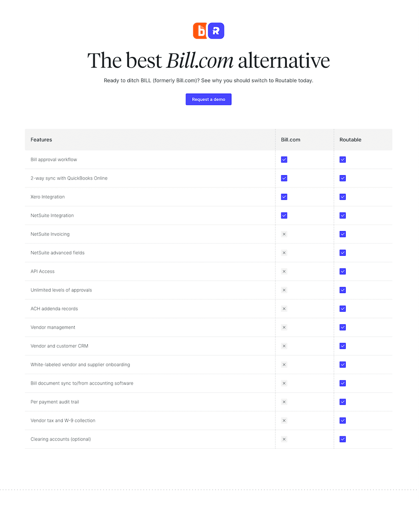
Comparison|
Table CRM Comparison Design
100/100
Hand-picked 33 comparison sections, scored across conversion best practices. See what the best do differently.
Showing 1–21 of 33 examples


Every comparison section is scored across 5 conversion best practices. Copy the best practice stack, not the layout. See what converts and why.
Hand-picked from 350+ companies and analyzed by our AI conversion agent. Not a random dump of comparison tables. Every entry earns its spot.
Built a comparison page? Run yours through the same scoring engine. See where you stand on the same best practices, and what to fix first.
We scored 33 comparison sections across conversion best practices. The table below shows how widely each element is adopted. The lower the number, the bigger your edge by adding it.
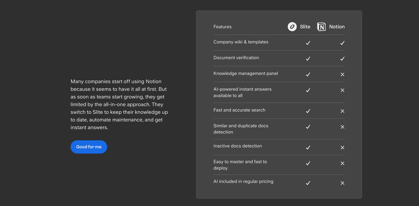
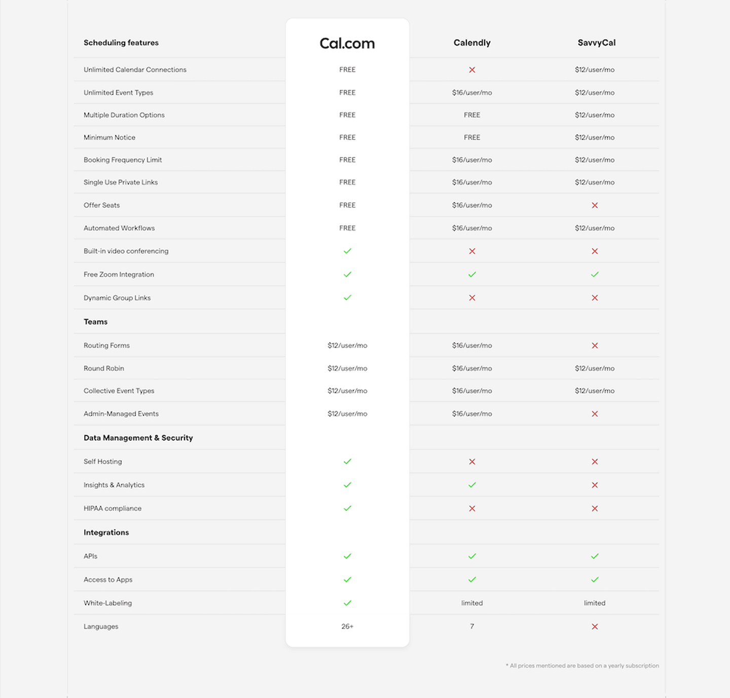
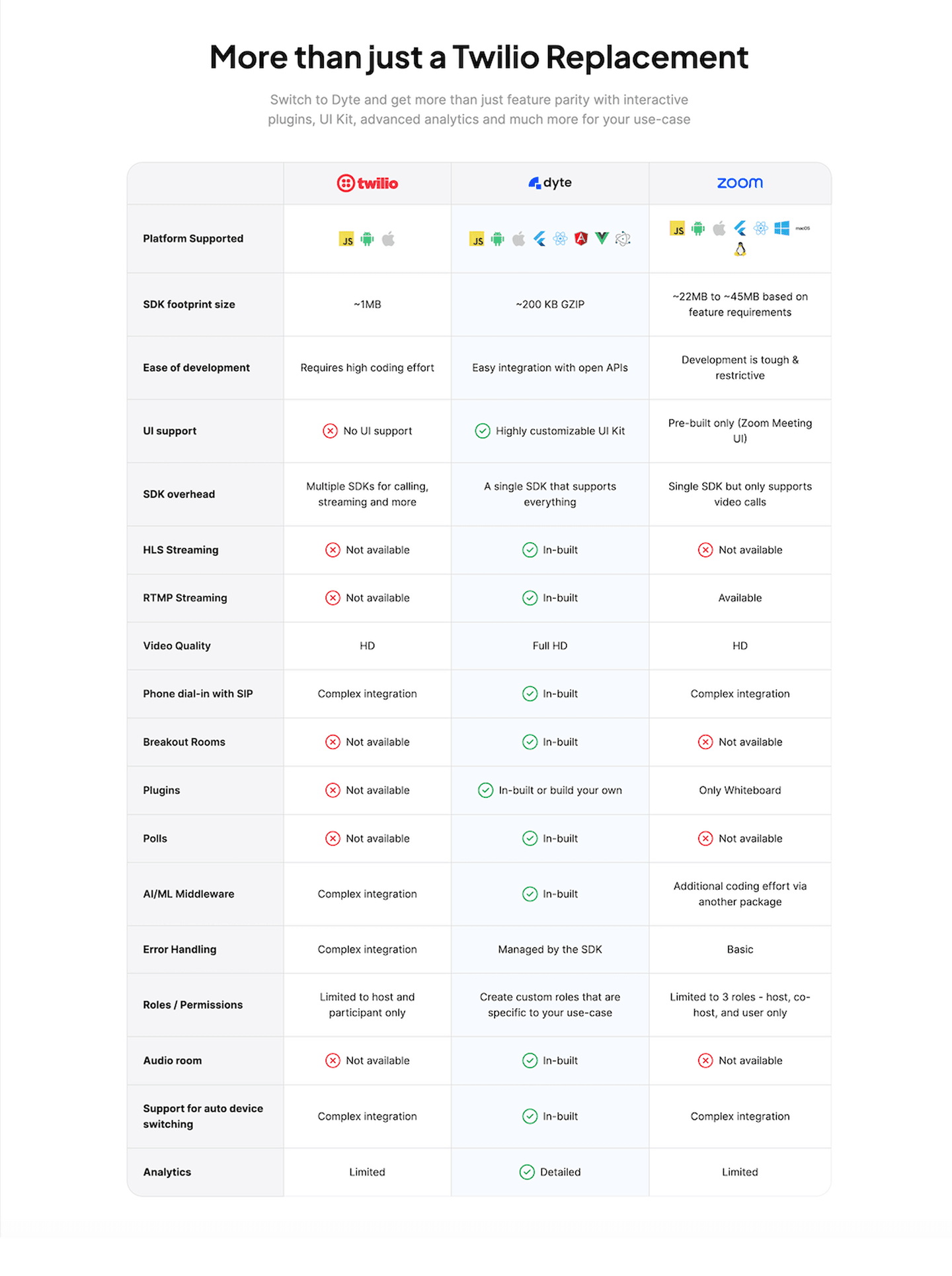
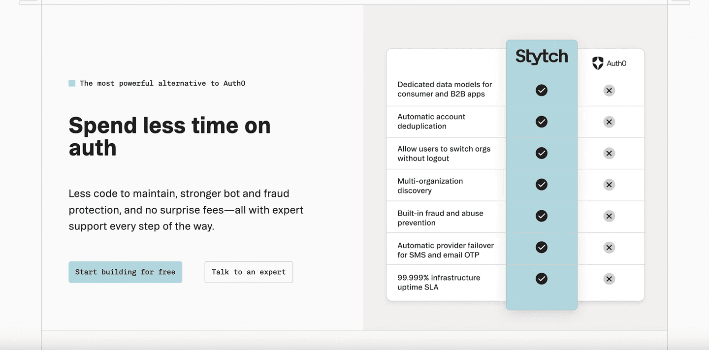
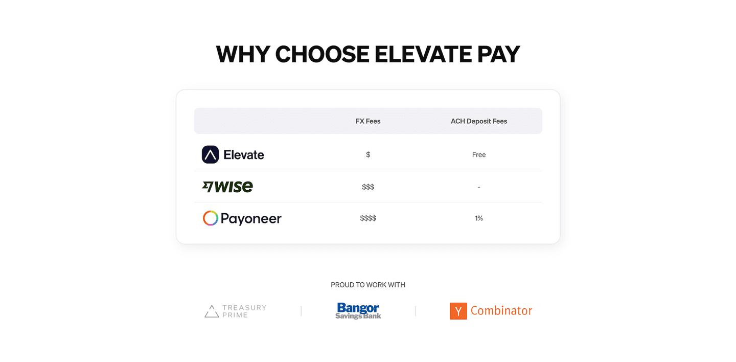
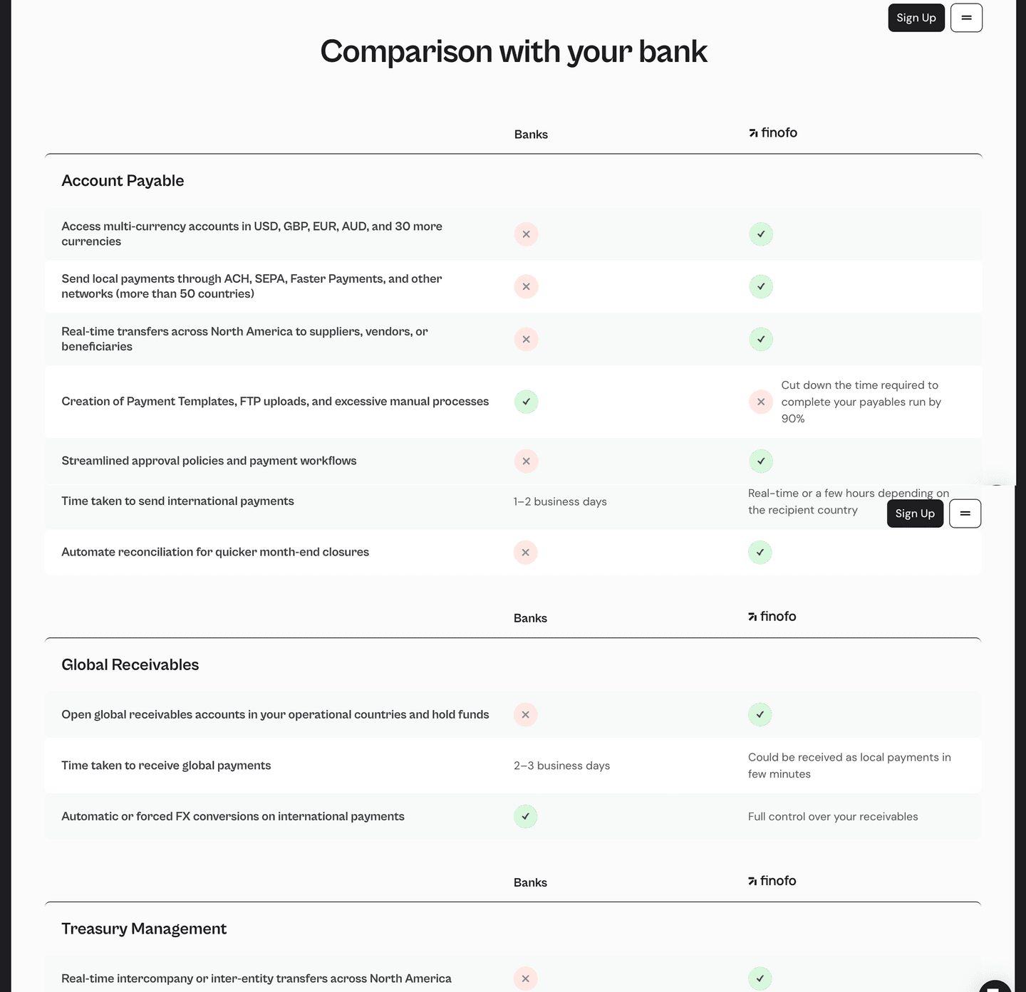
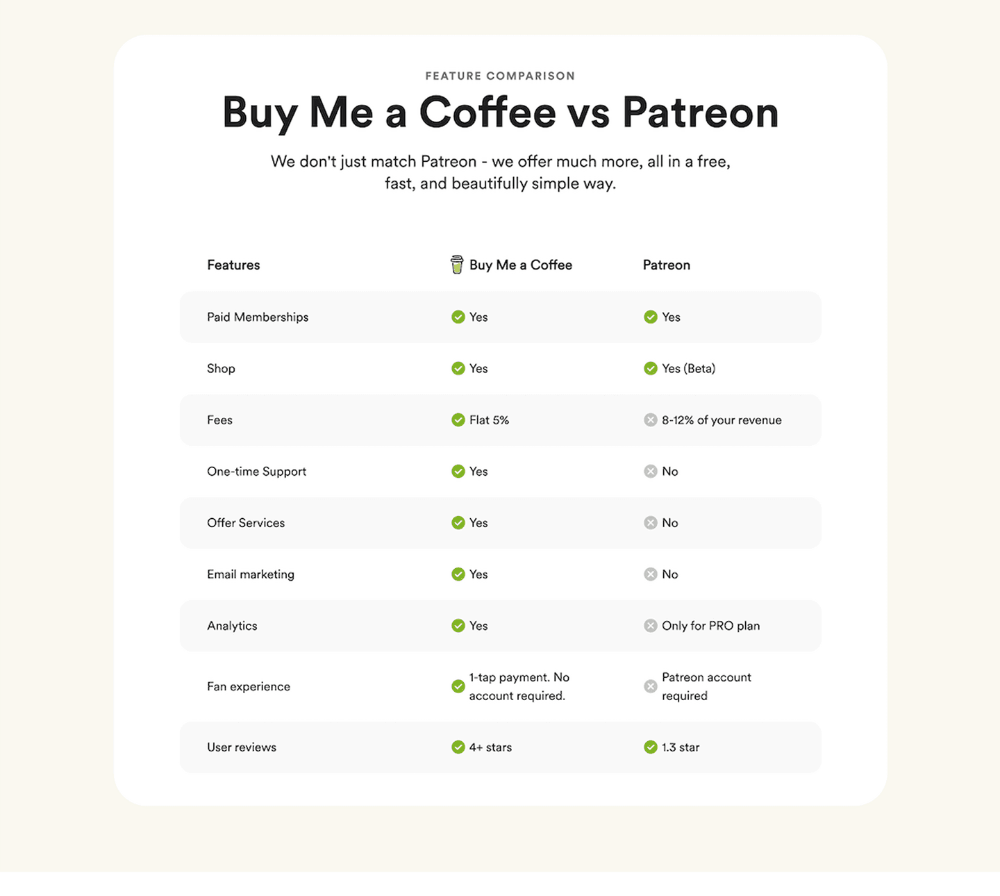
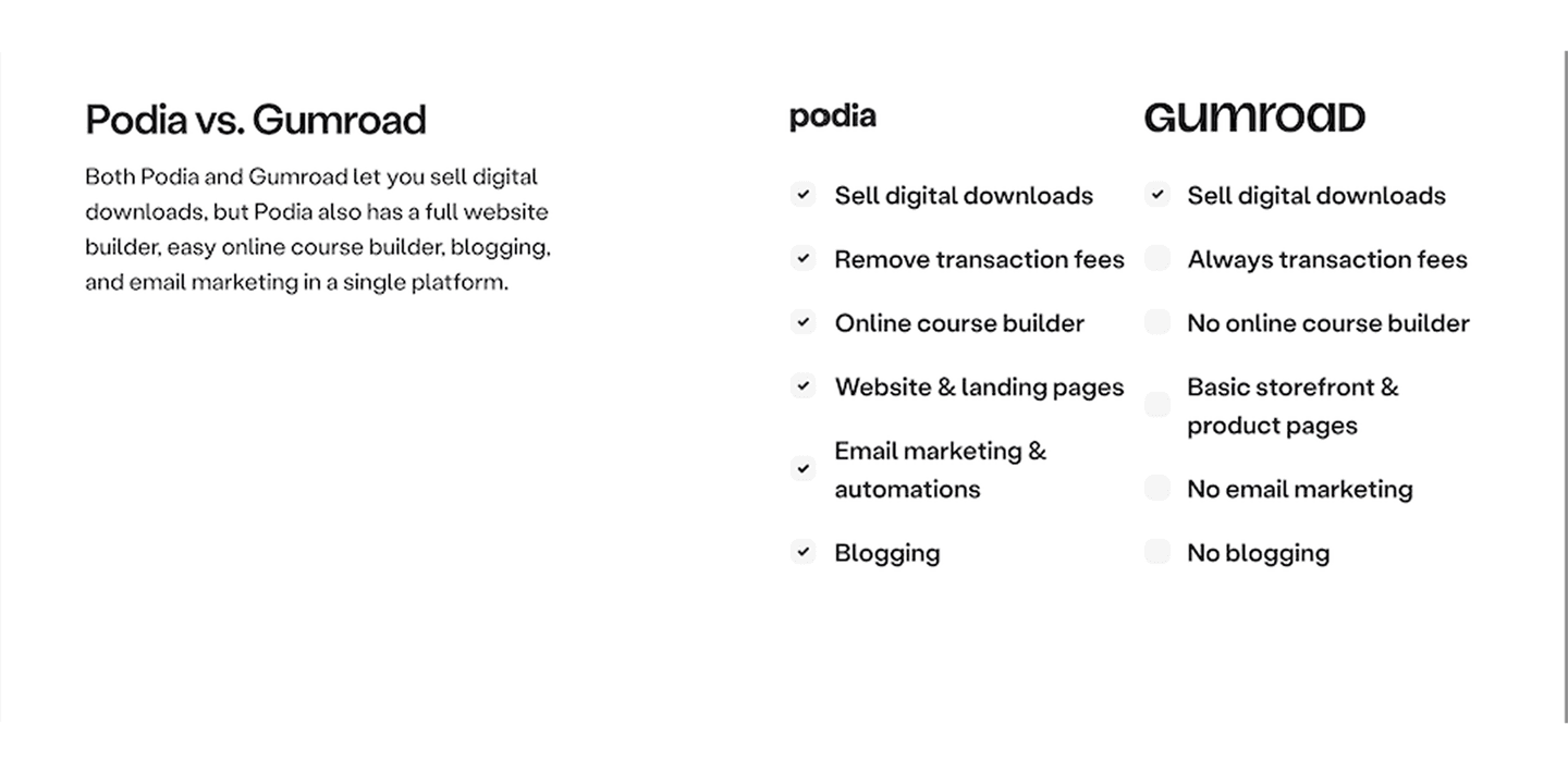
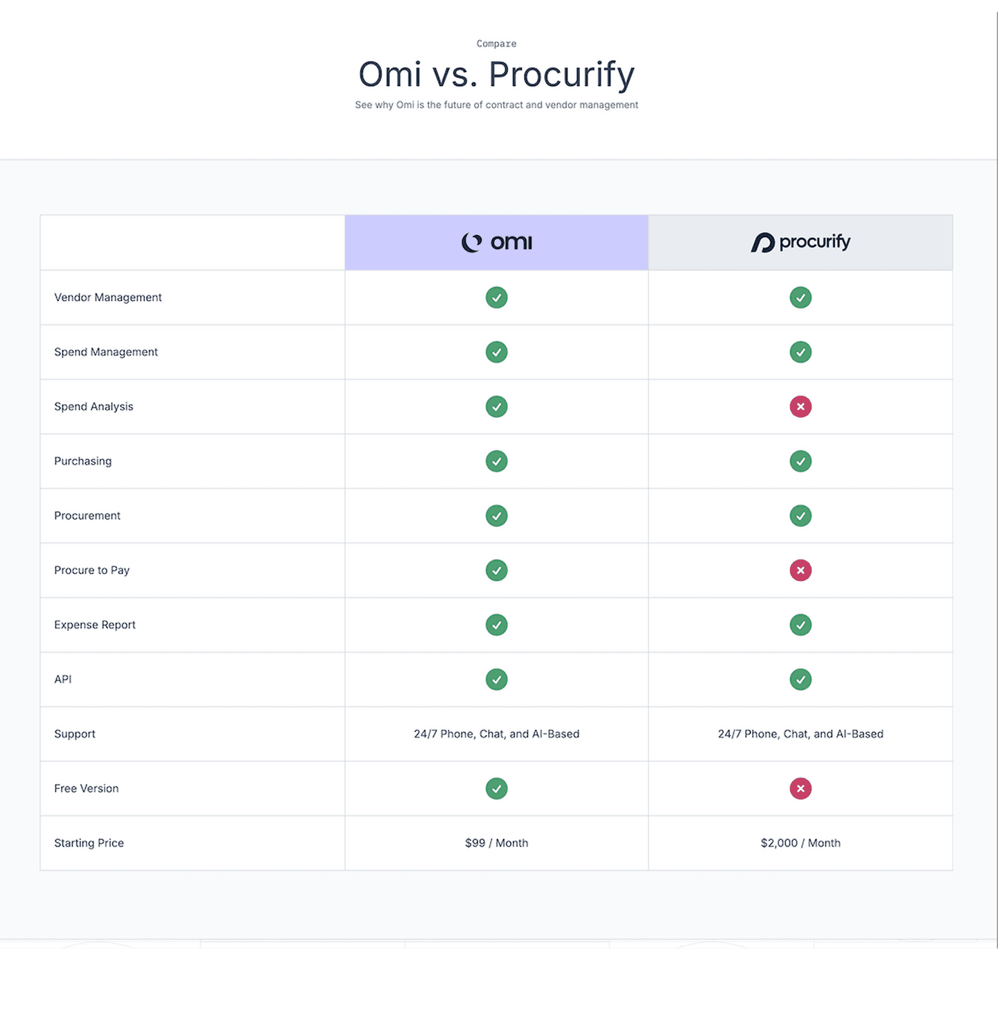
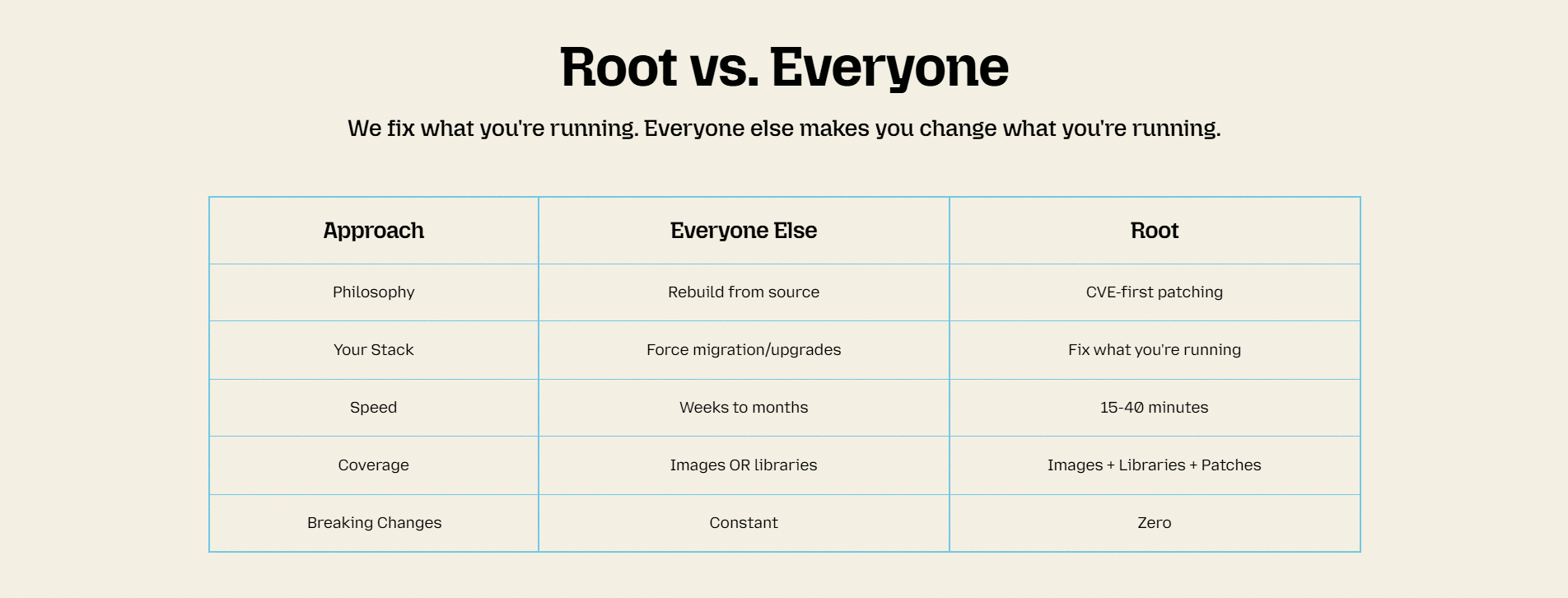
Three or more competitors side by side. One-on-one tables feel incomplete
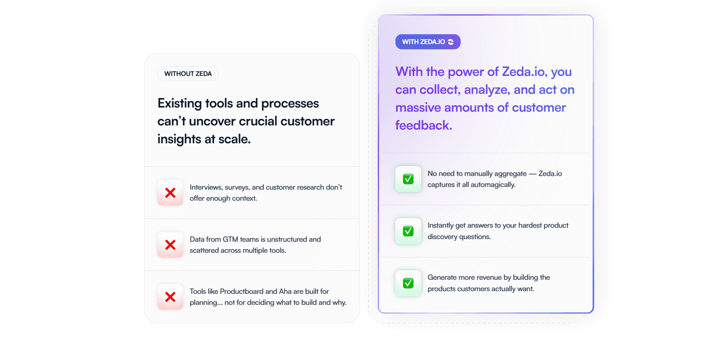
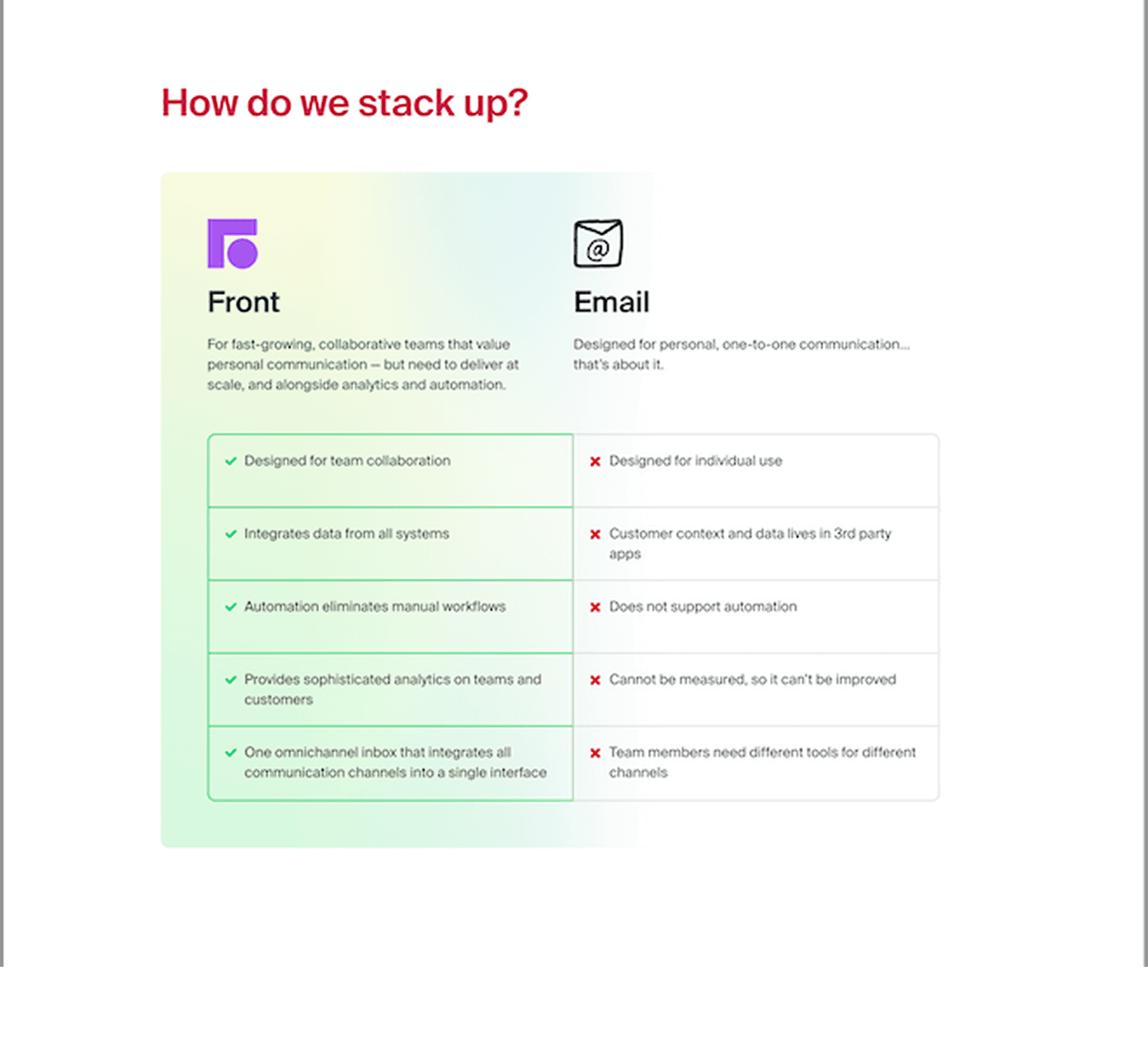
Shows where you lose or tie, not only where you win. "Partial" or "No" entries that build credibility
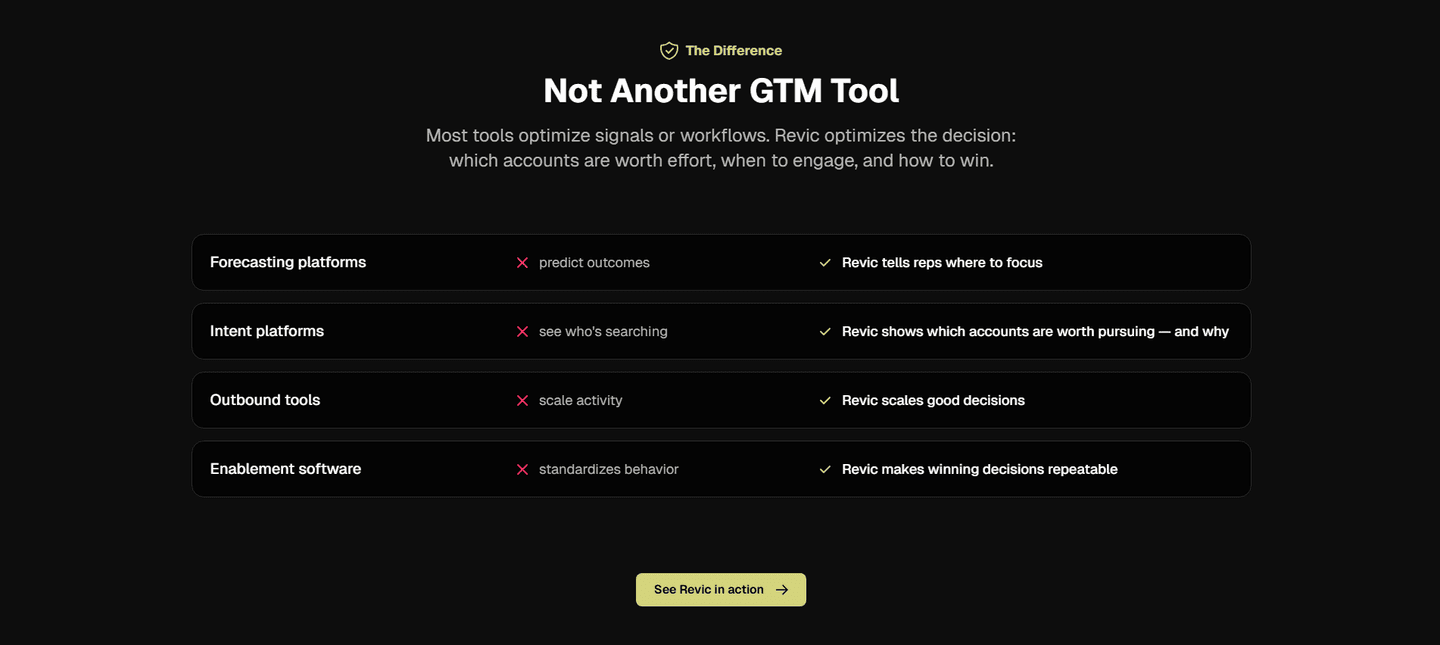
"Why us" framing baked into the table structure, not buried in fine print
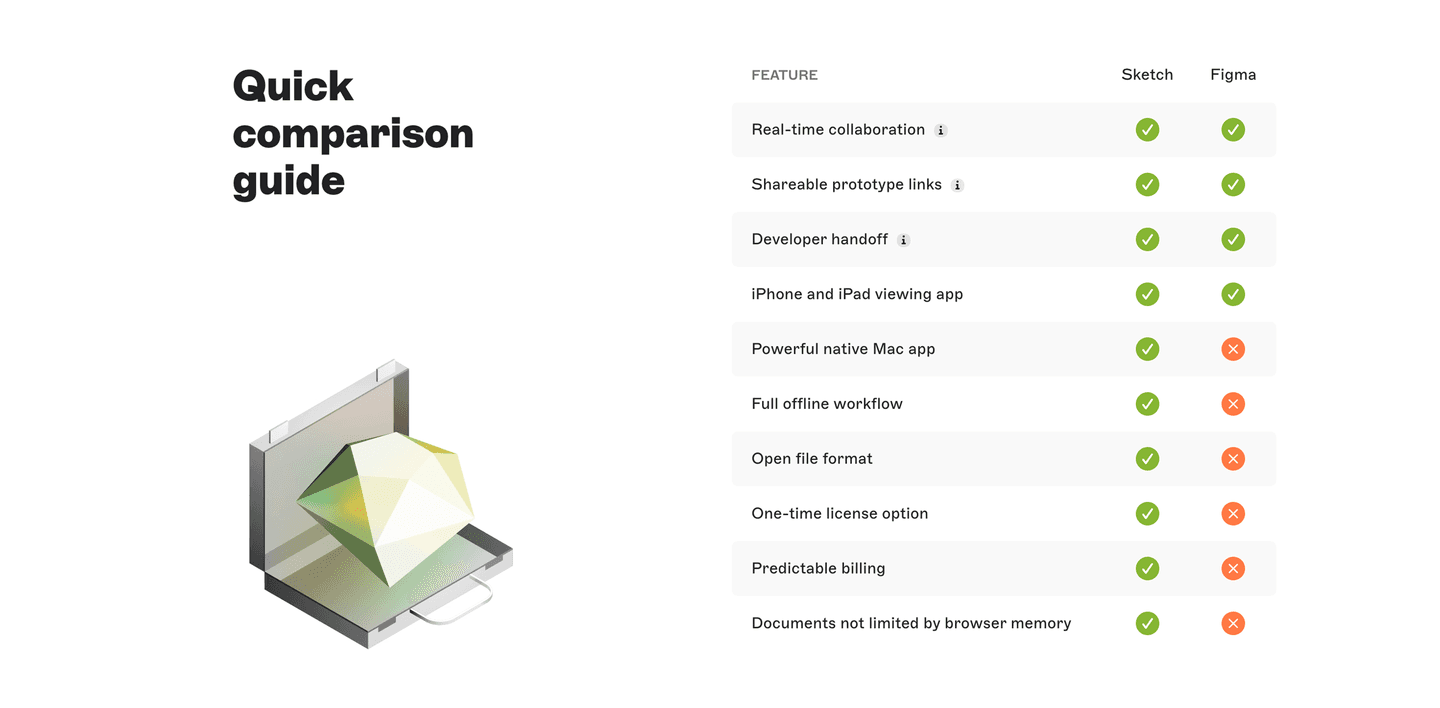
Clean rows, consistent columns, checkmarks or values that scan in under 10 seconds
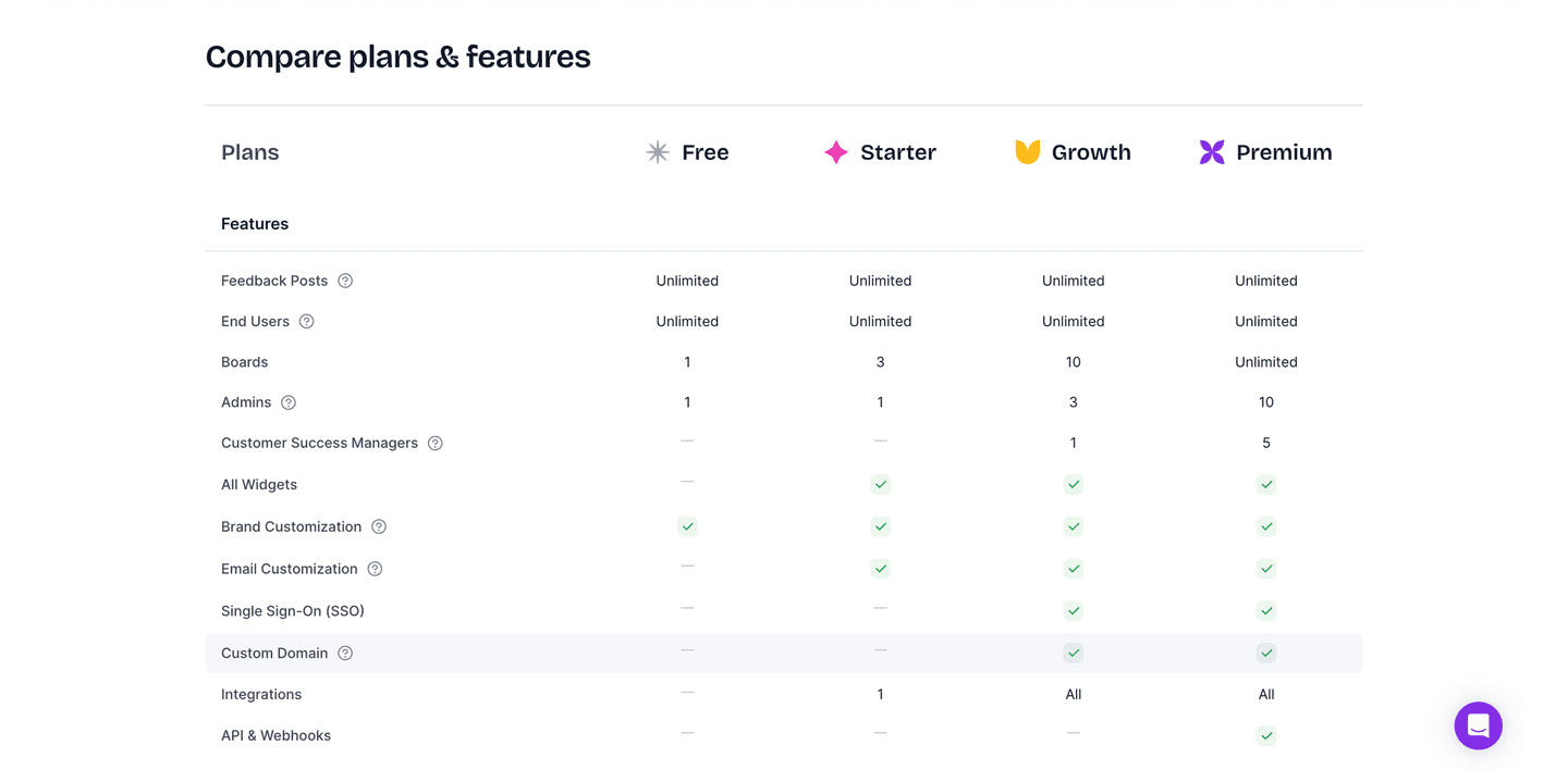
| Element | What it means | Use it | Type |
|---|---|---|---|
| Multiple comparisons | Three or more competitors side by side. One-on-one tables feel incomplete | 47% | Opportunity |
| Honest limitations | Shows where you lose or tie, not only where you win. "Partial" or "No" entries that build credibility | 53% | Common |
| Competitive positioning | "Why us" framing baked into the table structure, not buried in fine print | 89% | Table stakes |
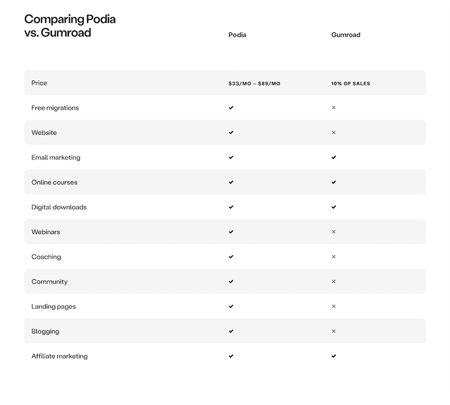
| Feature matrix clarity | Clean rows, consistent columns, checkmarks or values that scan in under 10 seconds | 95% | Table stakes |
The biggest gap between all and best-in-class: honest limitations. Only 53% of comparison sections admit any weakness. Every best-in-class section does. Visitors already assume you are biased. Showing a few "No" cells makes the "Yes" cells believable.
The most surprising finding: zero comparison sections in our database place a CTA inside the table. The comparison table is where the visitor reaches peak conviction. But nobody puts a button there.
Across 33 scored comparison sections, here's how scores break down.
Our AI conversion agent evaluates every comparison section against a weighted checklist that spans three dimensions. Each best practice gets a pass or fail based on the actual page content and screenshot.
Not every best practice carries the same weight. Honest limitations and multiple comparisons pull the score up more because in our dataset, comparison sections that include both convert better than those without them, even when the matrix itself looks clean.
Sections flagged best-in-class are hand-picked by our team from the highest-scoring sections. A high score gets you on the list. Best-in-class means the design, copy, and psychology all work together.
Interactive quiz
Can a visitor scan your comparison table in under 10 seconds?
Clean rows, consistent columns, checkmarks or values that scan quickly
1 comparison sections in our library are flagged best-in-class. They all score 67/100. Every single one stacks the same four conversion best practices.
100% include honest limitations. They show cells where the competitor wins or where neither product has a feature. This is the starkest difference from the average: only 53% of all comparison sections do this.
Dyte, Twilio, and Cal.com all stack these four best practices. That is what a score of 67 looks like.
100/100The lowest-scoring comparison sections in our library are not ugly. They just skip too many conversion best practices.
A comparison section scoring 10/100 typically has only 2 of the 5 best practices: usually competitive positioning and feature matrix clarity. The bare minimum.
The most common gap: no honest limitations. 47% of all comparison sections skip any admission of weakness. In the bottom tier, it is universal. Every cell says "Yes" for your product. The visitor knows this is not realistic and discounts the entire table.
Second: only one competitor. More than half of comparison sections compare against a single alternative. The visitor wonders why you picked that one. Multiple competitors feel more objective.
The fix is not a redesign. Add two things: a few "No" or "Partial" cells where you genuinely lose, and at least two more competitor columns. The gap between a 10 and a 67 is two missing best practices.
Want to know which best practices your comparison section is missing? Try our landing page analyzer →
 10/100
Curated by
Gabriel Amzallag , Founder, LPA
5 years CRO + SEO at Qonto (2021–2025). After advising 15+ SaaS on their websites (Payfit, Pigment…), the same patterns kept breaking — so I decided to build the source of truth on what works on the web: the intelligence layer every tool, builder, and team uses to ship sites that perform.
See how different industries design their comparison sections.
Real examples from top SaaS landing pages, scored and analyzed.
How top SaaS companies structure their pricing tables to drive upgrades. Scored examples with conversion analysis.
Browse pricing examples
How top products present their features: grids, bento layouts, interactive demos. Real examples with scores.
Browse features sections
See how top SaaS pages structure their call-to-action sections to drive clicks. Scored examples with conversion analysis.
Browse CTA examplesPaste your URL. Get a scored analysis of your comparison section with specific fixes. Free, no signup.
Everything you need to know about comparison section design, based on our analysis of real SaaS landing pages.
A comparison section needs enough rows to cover the features that matter to your buyer, typically 8-15 rows. More than 20 rows overwhelms. In our database, 95% of 33 comparison sections use a structured matrix format. Keep columns to 3-5 products max. On mobile, make the table horizontally scrollable or switch to stacked cards.
A pricing table shows your own plans side by side (Starter vs Pro vs Enterprise). A comparison section shows your product against competitors. The intent is different: pricing tables help visitors pick a tier, comparison sections help them pick a vendor. In our library, 89% of comparison sections frame the "why us" angle with competitive positioning.
If your visitors are actively evaluating alternatives, yes. SaaS buyers typically compare 3-4 tools before deciding. A comparison section on your site controls the framing. Without one, your prospects are comparing you on G2 or Reddit, where you do not control the narrative. 47% of comparison sections in our database compare against 3+ competitors.
Yes, but less than most teams assume. Naming a competitor in a comparison table is legal in almost every market as long as the claims are accurate, current, and fair. Two practical rules keep you safe. First, cite a source for every specific claim: their pricing page, their docs, their changelog. Screenshot it and keep it filed. Second, never misrepresent: if a competitor launched a feature last month, update the table. Avoid trademarked logos unless you're in a clean nominative-use context. When in doubt, run the table past a lawyer. One review covers every comparison page you ship.
Checkmarks scan faster. Feature descriptions explain better. The best approach: checkmarks for binary features (yes/no), short values for quantitative features ("Unlimited" vs "Up to 10"). 95% of comparison sections in our library use a clean feature matrix with scannable entries. Avoid paragraph text inside table cells.
Run your page through our landing page audit. You'll get a scored breakdown of your comparison section across 5 conversion best practices (competitive positioning, feature matrix clarity, multiple comparisons, honest limitations, CTA in table) with specific fixes prioritized by impact.