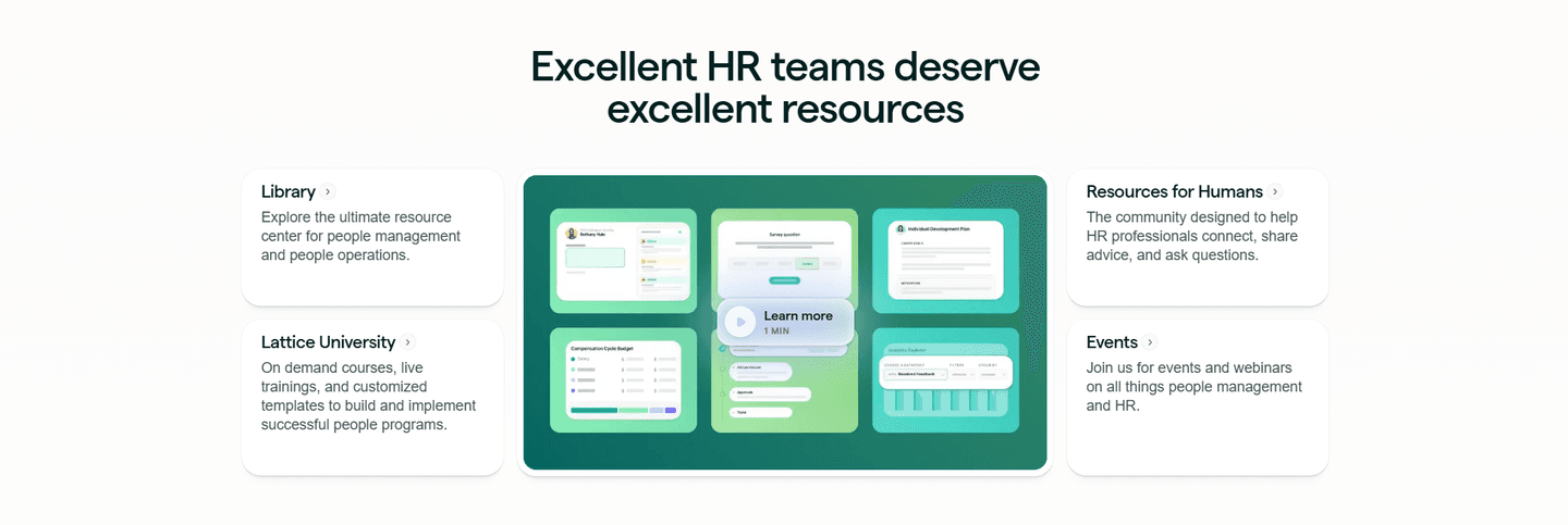
Best
Resources|
SignOnSite SaaS Resources Design
100/100
Hand-picked 88 resources sections, scored across conversion best practices. See what the best do differently.
Showing 1–21 of 88 examples
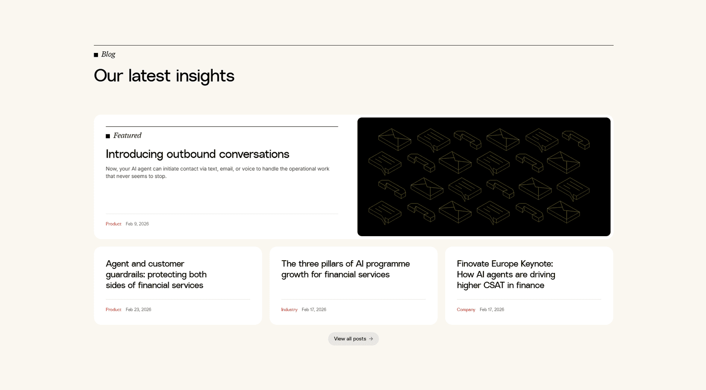
Every resources section is scored across 5 conversion best practices. Copy the best practice stack, not the layout. See what converts and why.
Hand-picked from 350+ companies and analyzed by our AI conversion agent. Not a random dump of content blocks. Every entry earns its spot.
Built a resources section? Run yours through the same scoring engine. See where you stand on the same best practices, and what to fix first.
We scored 88 resources sections from 29+ SaaS companies across conversion best practices. The table below shows how widely each element is adopted. The lower the number, the bigger your edge by adding it.
Links from content back to product pages, pricing, or signup. Keeps visitors in the conversion funnel
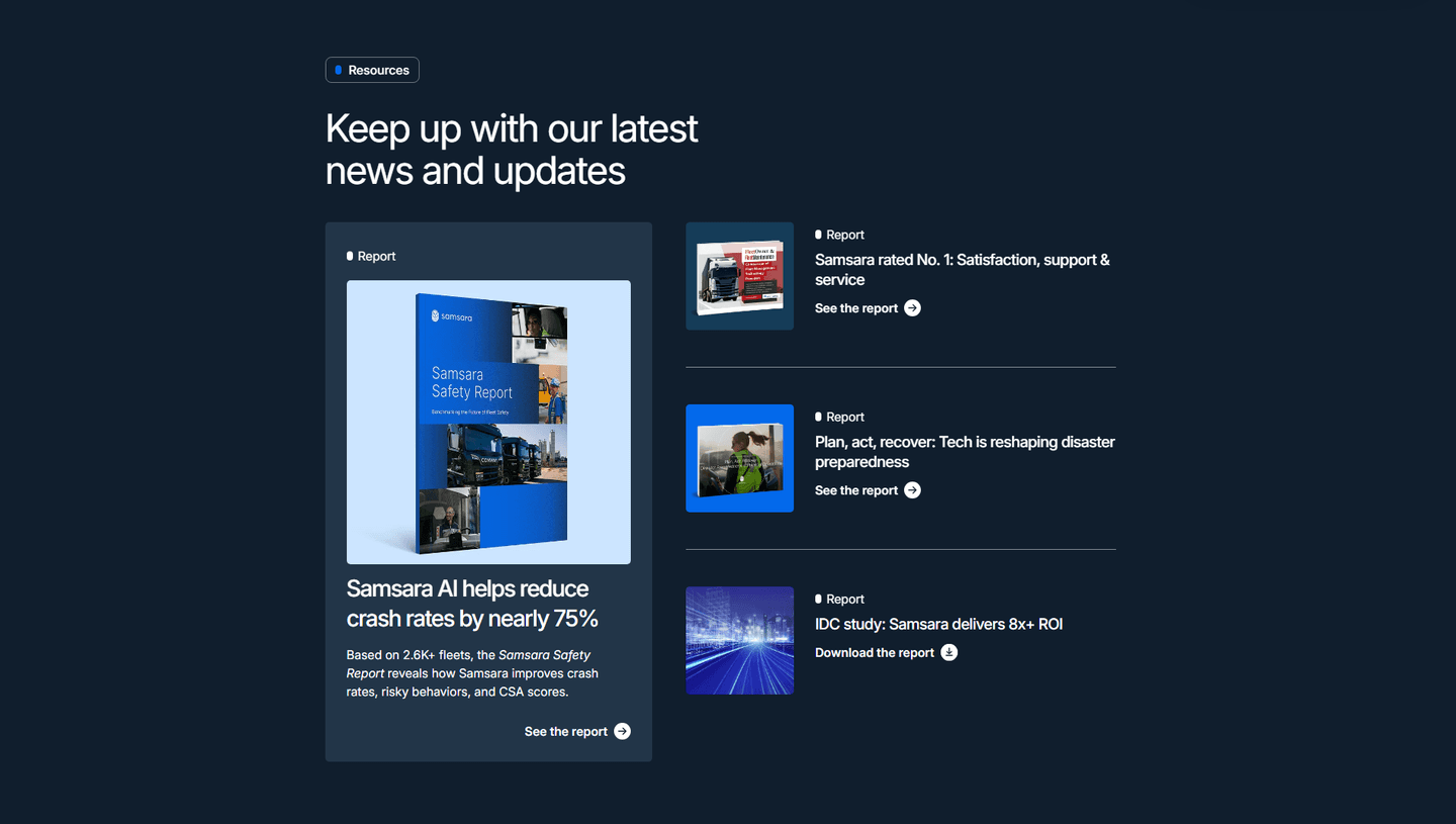
Multiple resource types (blog, video, webinar, case study) rather than one format
Resources organized by topic, type, or audience. Categories and filters that help visitors find what matters
Gated whitepapers, email signup for updates, or free tool access tied to content
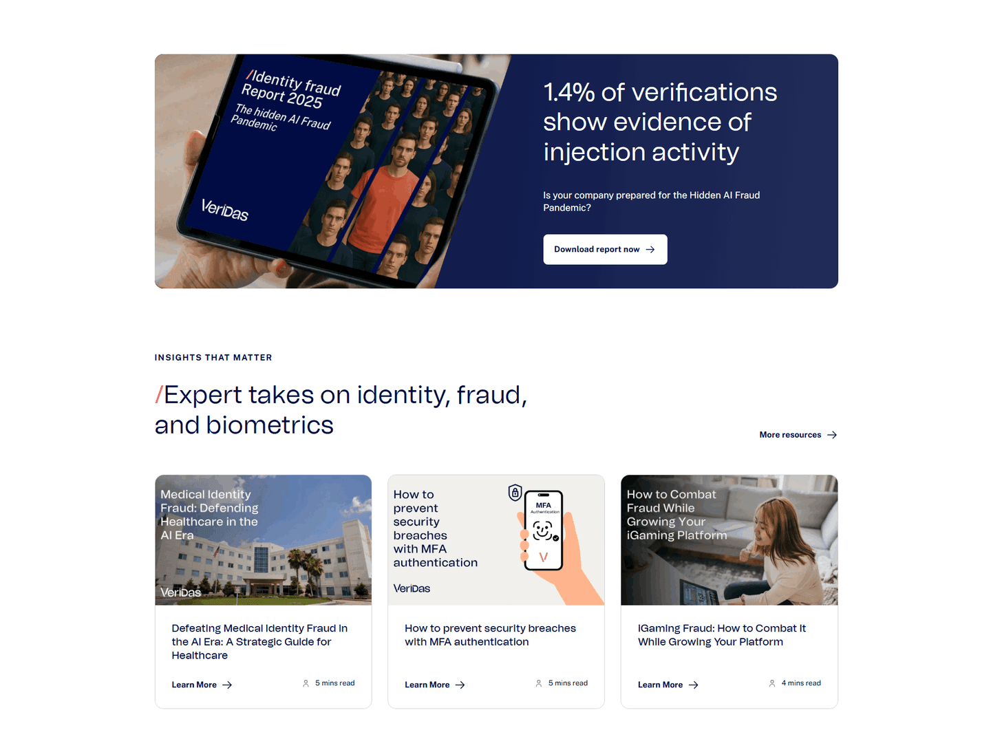
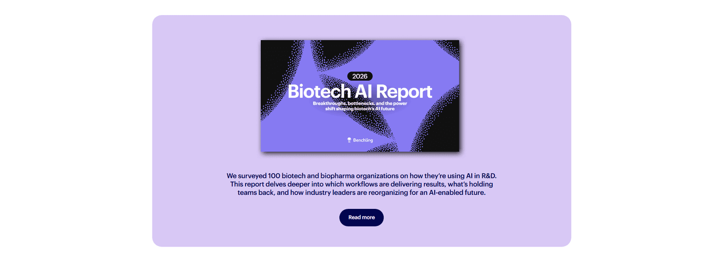
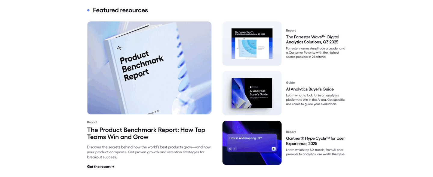
Original research, data-backed guides, expert insights that position the brand as the go-to source
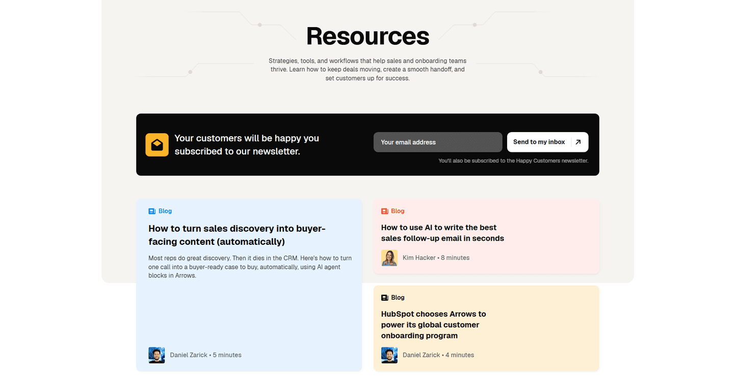
Blog posts, guides, and webinars that address your audience's actual problems, not generic filler
| Element | What it means | Use it | Type |
|---|---|---|---|
| Internal linking | Links from content back to product pages, pricing, or signup. Keeps visitors in the conversion funnel | 29% | Big opportunity |
| Content depth | Multiple resource types (blog, video, webinar, case study) rather than one format | 29% | Big opportunity |
| Visual hierarchy | Resources organized by topic, type, or audience. Categories and filters that help visitors find what matters | 32% | Opportunity |
| Lead capture strategy | Gated whitepapers, email signup for updates, or free tool access tied to content | 56% | Common |
| Authority building | Original research, data-backed guides, expert insights that position the brand as the go-to source | 91% | Table stakes |
| Content relevance | Blog posts, guides, and webinars that address your audience's actual problems, not generic filler | 97% | Table stakes |
The biggest gap: top-scoring resources sections are twice as likely to organize content by audience or topic (60% vs 32%). Dumping everything into a reverse-chronological blog feed is the most common mistake.
Internal linking is the rarest best practice at 29%, but it separates content that builds pipeline from content that just builds traffic.
Across 88 scored resources sections, here's how scores break down. Most land between 40 and 79.
97% of resources sections score between 40 and 79. None break 80. The bar is higher than other section types, but there's still plenty of room to stand out.
Our AI conversion agent evaluates every resources section against a weighted checklist across three dimensions. Each best practice gets a pass or fail based on the actual page content and screenshot.
Not every best practice carries the same weight. Internal linking and lead capture strategy pull the score up more because resources sections that connect content to product pages generate leads. Sections without those links are content for content's sake.
Sections scoring 75+ are the highest-performing in our library as of March 2026. They combine strong content with clear conversion paths.
Interactive quiz
Do your resources address your audience's actual problems?
Guides and posts about their pain points, not generic filler
10 resources sections in our library score 75 or above. They score higher because they stack best practices that most sections skip.
All of them make content relevant to a specific audience. That sounds obvious, but 3% of resources sections publish content with no clear audience fit.
75/100The lowest-scoring resources sections aren't ugly. They're missing the link between content and conversion.
A resources section scoring 25/100 typically has only 2 conversion best practices: relevant content and some evidence of expertise. The basics. No internal links, no lead capture, no content organization.
The most common gap: no internal linking to product pages. 71% of all resources sections skip it. The content exists in isolation. A visitor reads a blog post and has no path back to the product.
Second: no visual hierarchy. 68% of resources sections dump everything into a single feed with no categories, filters, or topic grouping. Visitors can't find what they need, so they leave.
Then there's content depth. 71% of resources sections offer only one format, usually blog posts. No video, no case studies, no downloadable guides. One format limits the audience you reach.
The fix isn't redesigning the page. It's adding a category system, linking content to product pages, and creating one or two additional content formats. The gap between a 25 and a 75 is usually three missing elements.
Want to know which best practices your resources section is missing? Try our landing page audit →
 0/100
0/100
Curated by
Gabriel Amzallag , Founder, LPA
5 years CRO + SEO at Qonto (2021–2025). After advising 15+ SaaS on their websites (Payfit, Pigment…), the same patterns kept breaking — so I decided to build the source of truth on what works on the web: the intelligence layer every tool, builder, and team uses to ship sites that perform.
See how different industries design their resources sections.
Real examples from top SaaS landing pages, scored and analyzed.
How top SaaS pages present what their product does. Scored examples with conversion analysis.
Browse features examples
Logos, security badges, compliance certifications. Browse the patterns that build credibility and reduce risk.
Browse trust examples
How top products explain what they do and why it matters. Step-by-step flows, guided processes, and outcome previews.
Browse how it works examplesPaste your URL. Get a scored analysis of your resources section with specific fixes. Free, no signup.
Everything you need to know about resources section design, based on our analysis of real SaaS landing pages.
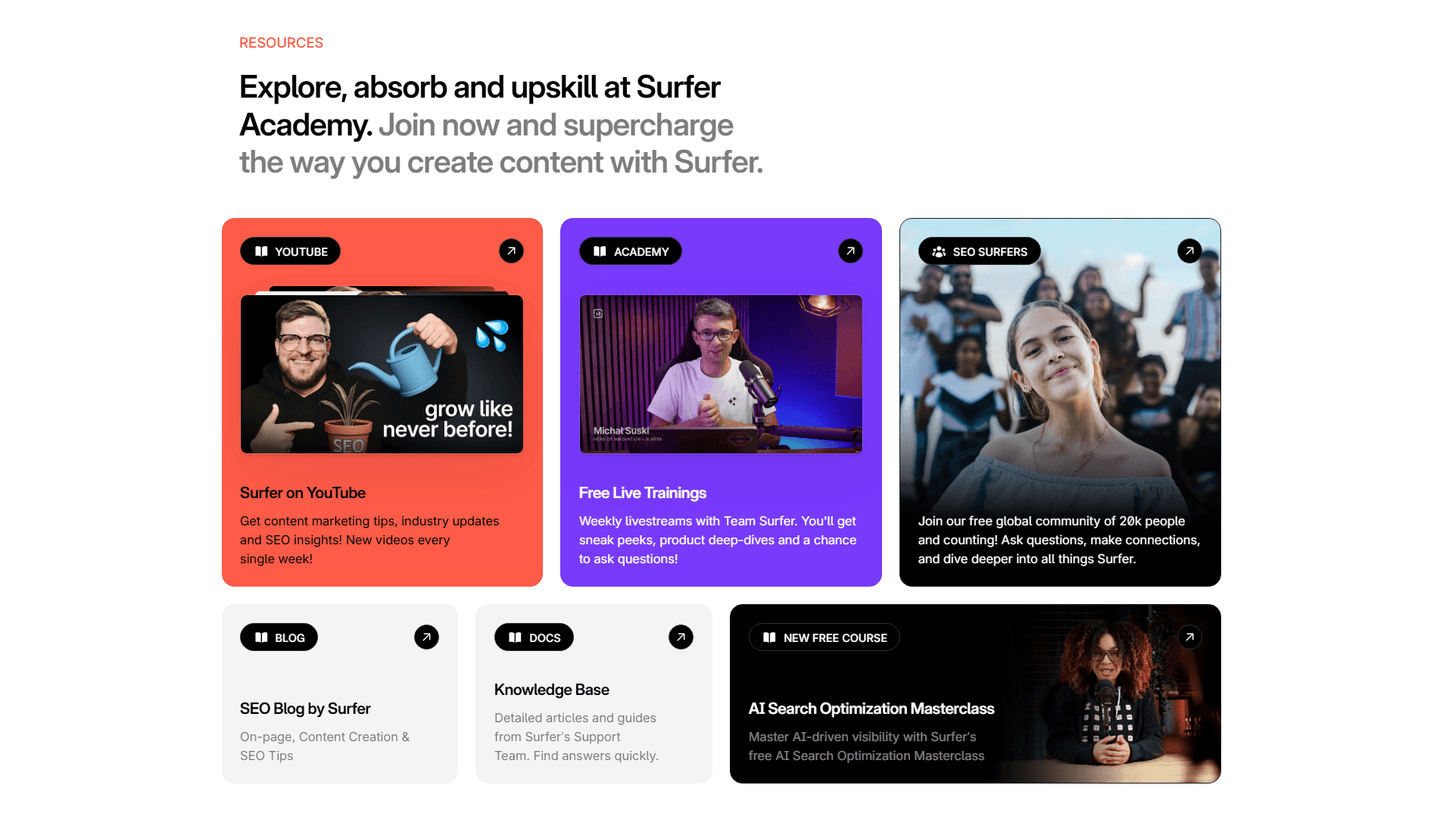
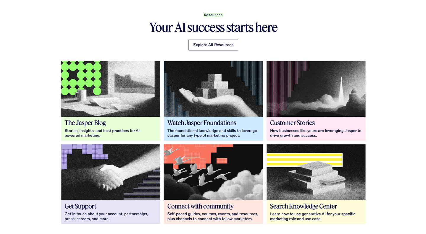
A resources section should show 6-12 items above the fold with clear category filters. If you have more than 20 resources, add search and topic filtering. In our library of 88 resources sections, the top-scoring ones display 8-12 featured items with a "view all" option rather than showing everything at once.
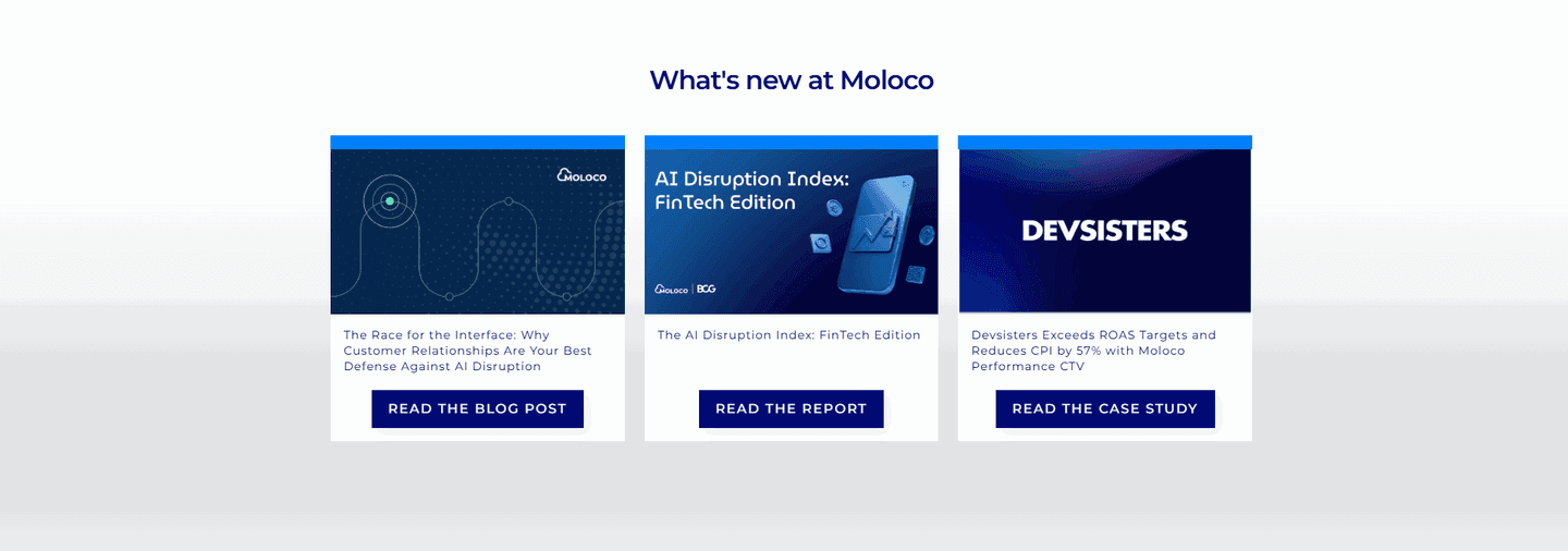
A blog is a chronological feed of articles. A resources section curates multiple content types (guides, webinars, case studies, tools) organized by topic or audience. In our data, 29% of resources sections include multiple content formats. The ones that do score higher because they serve more visitor needs from one page.
Yes, if you sell to an audience that researches before buying. B2B SaaS, enterprise tools, anything with a sales cycle longer than one visit. A resources section builds trust and captures leads from visitors who aren't ready to buy yet. If your product is impulse-buy simple, skip it.
Two placements do the work. First, a homepage block with 3-6 featured resources near the bottom. It catches visitors who scrolled past the main CTA without converting. Second, a dedicated /resources hub linked from your top nav, usually under a "Resources" or "Learn" menu. Avoid burying it under a footer-only link; high-intent research visitors need to find it from the header. If you run content-led growth, the hub belongs in the primary nav, not tucked three clicks deep.
56% of resources sections in our library include some form of lead capture. Gate high-value content (whitepapers, original research, tools) and keep educational content free. The best ones gate 20-30% of content and leave the rest open. Gating everything kills SEO and trust. Gating nothing leaves leads on the table.
Run your page through our landing page analysis. You'll get a scored breakdown of your resources section across conversion best practices (content relevance, lead capture, internal linking, visual hierarchy, authority building) with specific fixes prioritized by impact.