Features|
Jasper AI Features Design
33/100
Hand-picked 289 features sections, scored across conversion best practices. See what the best do differently.
Showing 253–273 of 289 examples
Every features section is scored across 6 conversion best practices. Copy the best practice stack, not the layout. See what converts and why.
Hand-picked from 350+ companies and analyzed by our AI conversion agent. Not a random dump of feature grids. Every entry earns its spot.
Found a features section you admire? Run yours through the same scoring engine. See where you stand on the same best practices, and what to fix first.
How should you present features on a landing page? We scored 289 features sections across conversion best practices. The table below shows how widely each element is adopted. The lower the number, the bigger your edge by adding it.
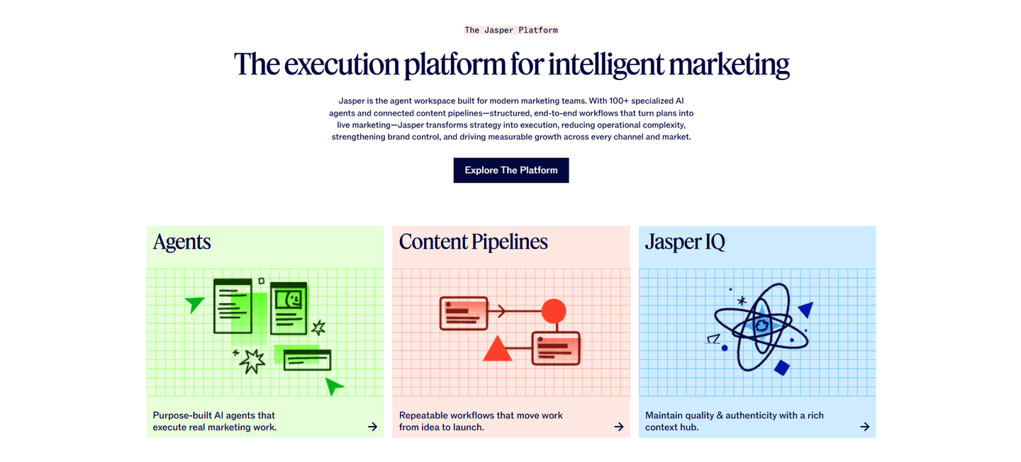
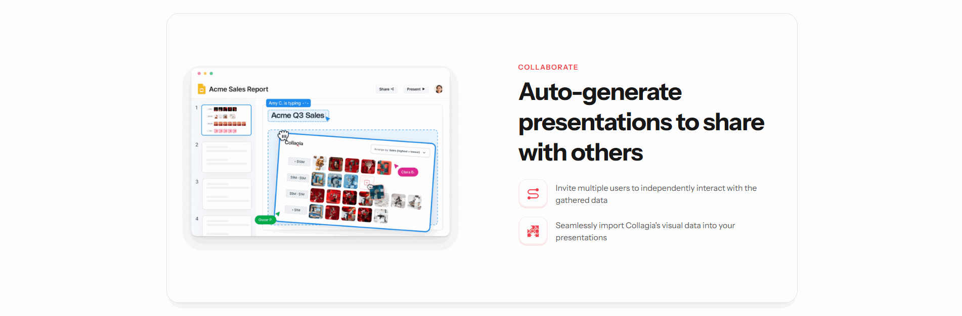
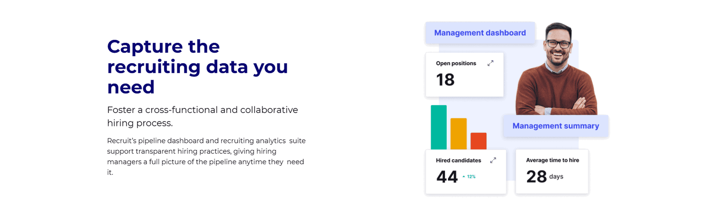
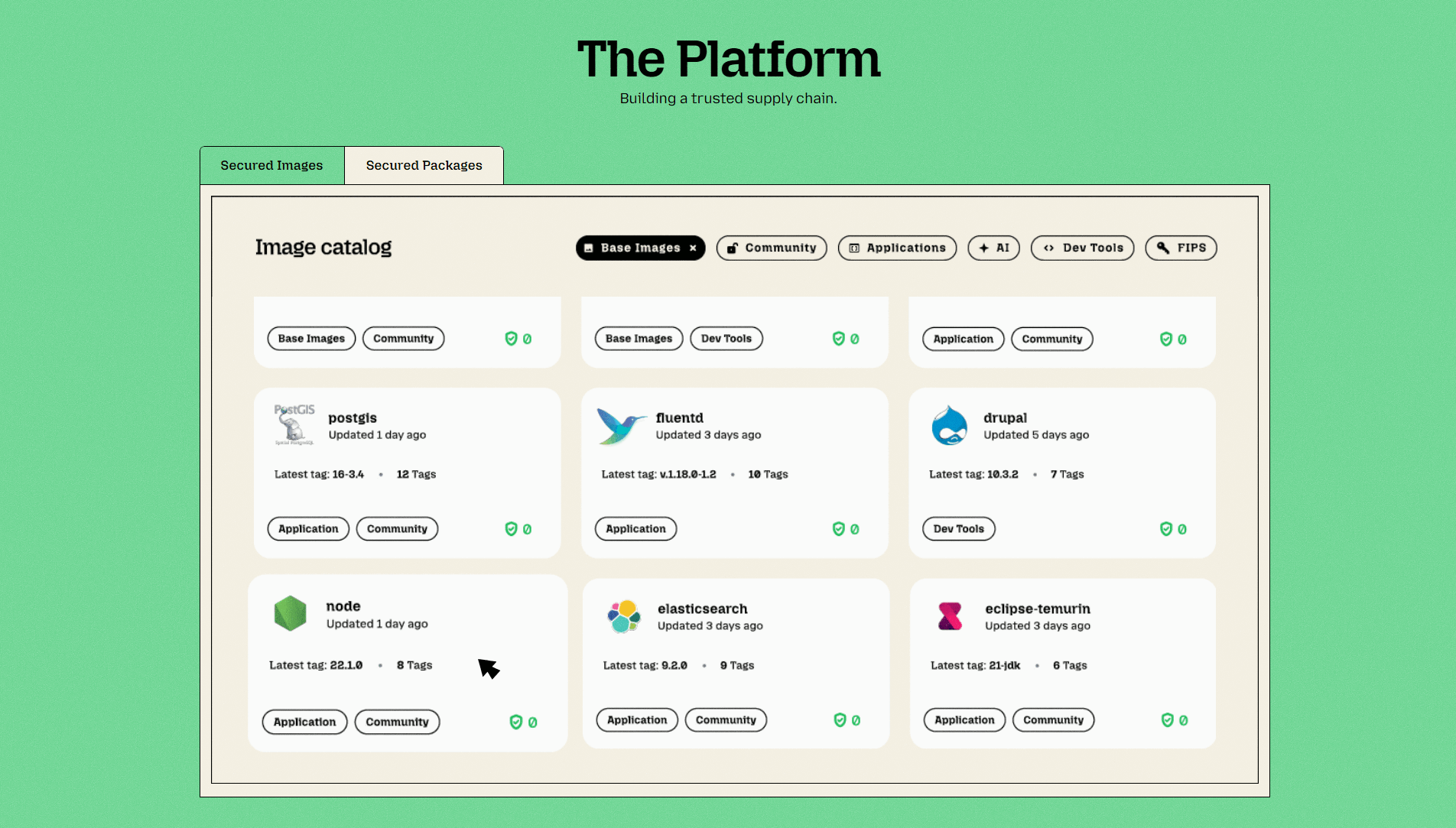
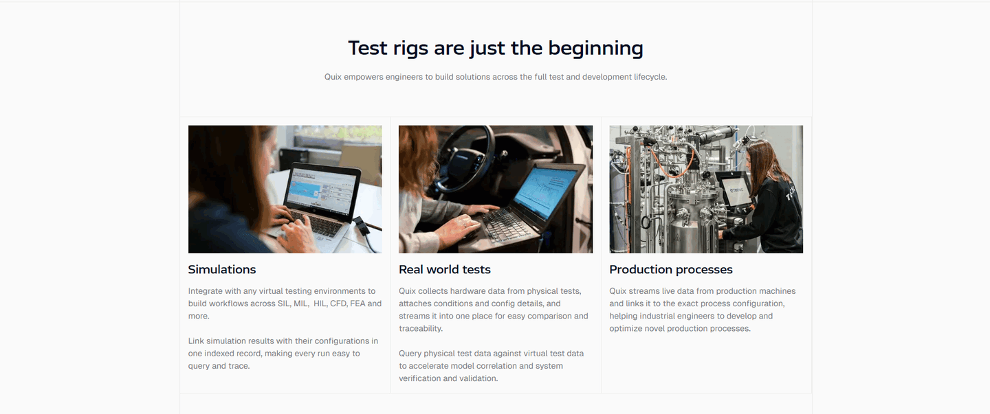
Features organized by role or use case ("For marketers," "For developers")
Each feature card links to its own page — visitors who want more can click through instead of bouncing
A number attached to the outcome: "2x faster deploys," "40% fewer tickets," not just "improves efficiency"
Less important features tucked into an accordion or smaller grid, so the top 3-4 get full attention
Feature → Problem it solves → Result you get. Three steps, not just a title and icon
"Save 4hrs/week" not "Automated reports" — leads with the outcome, not the feature name
| Element | What it means | Use it | Type |
|---|---|---|---|
| Persona grouping | Features organized by role or use case ("For marketers," "For developers") | 21% | Big opportunity |
| Internal linking | Each feature card links to its own page — visitors who want more can click through instead of bouncing | 28% | Big opportunity |
| Outcome focus | A number attached to the outcome: "2x faster deploys," "40% fewer tickets," not just "improves efficiency" | 37% | Opportunity |
| Secondary features | Less important features tucked into an accordion or smaller grid, so the top 3-4 get full attention | 44% | Opportunity |
| Feature-to-outcome mapping | Feature → Problem it solves → Result you get. Three steps, not just a title and icon | 74% | Common |
| Benefit-led copy | "Save 4hrs/week" not "Automated reports" — leads with the outcome, not the feature name | 82% | Table stakes |
Benefit-led copy (82%) and feature-to-outcome mapping (74%) are the most common best practices. But the real gap is in internal linking: 37% of best-in-class sections link features to dedicated pages vs. 28% overall. That exploration path keeps visitors on-site longer and builds understanding.
Persona grouping is the rarest best practice at 21%. Most features sections list everything in one flat grid. When sections group by role, they let each visitor skip to what matters to them instead of scanning 12 feature cards looking for relevance.
Across 289 scored features sections, here's how scores break down.
Our AI conversion agent evaluates every features section against a weighted checklist that spans three dimensions. Each best practice gets a pass or fail based on the actual page content and screenshot.
Not every best practice carries the same weight. Benefit-led copy and feature-to-outcome mapping are the most common, but still missing from 1 in 5 sections. The practices that separate good from great are persona grouping and internal linking, because they show the section was designed for the visitor, not just the product team.
Sections flagged best-in-class are hand-picked by our team from the highest-scoring sections. A high score gets you on the list. Best-in-class means the copy, structure, and navigation all work together.
Interactive quiz
Does your copy lead with outcomes, not feature names?
"Save 4hrs/week" not "Automated reports"
1 features sections in our library are flagged best-in-class. They score higher because they go beyond listing features.
91% use benefit-led copy, well above the 82% average. But that's not what makes them stand out. What does:
Pennylane, Semrush, Greenly, and Contentsquare stack 4-5 of these best practices in a single section. That's what a top score looks like.
 71/100
The lowest-scoring features sections in our library aren't ugly. Most of them look polished. They just do the bare minimum.
A low-scoring features section typically has only 2 conversion best practices: benefit-led copy and feature-to-outcome mapping. The basics. No persona grouping, no internal linking, no secondary features hierarchy.
The most common gap: no persona grouping. 79% of all features sections skip it. The section lists features in a flat grid. Same order, same weight, same audience. A VP of Sales and a junior developer see the same 12 cards. Neither finds what they need fast enough.
Second: no internal linking. 72% of features sections are dead ends. The feature card has a title, a description, maybe an icon. No link to learn more. The visitor who wants depth has nowhere to go.
Third: no feature prioritization. 56% show every feature with equal weight. No "key features" vs. "also included." No accordion for the long tail. The section becomes a wall of cards that nobody reads past the third row.
The fix isn't a redesign. It's adding structure to what's already there. Group by persona. Link to feature pages. Collapse the secondary features. The gap between a low score and a high score is usually organization, not content.
Want to know which best practices your features section is missing? Try our landing page audit →
 0/100
0/100
Curated by
Gabriel Amzallag , Founder, LPA
5 years CRO + SEO at Qonto (2021–2025). After advising 15+ SaaS on their websites (Payfit, Pigment…), the same patterns kept breaking — so I decided to build the source of truth on what works on the web: the intelligence layer every tool, builder, and team uses to ship sites that perform.
See how different industries design their features sections.
Real examples from top SaaS landing pages, scored and analyzed.

First impression above the fold. Value proposition, product visuals, social proof placement. Scored across conversion best practices.
Browse hero sections
How top SaaS pages walk visitors through their process: step-by-step sequences, outcome visualizations, timeline specificity.
Browse how it works sections
Plan clarity, feature matrices, anchoring tags. See how top companies structure pricing to reduce decision friction.
Browse pricing sectionsPaste your URL. Get a scored analysis of your features section with specific fixes. Free, no signup.
Everything you need to know about features section design, based on our analysis of real SaaS landing pages.
Not the whole shipped list. Show the 3-5 features the buyer actually evaluates on. Ask your last ten customers what made them pick you and look for the pattern. Usually two or three capabilities decide the buy; the rest is reassurance. Put the decisive ones up top with benefit-led copy. Tuck the reassurance features into a smaller grid or accordion below. A single "Plus 40 more" link to a dedicated features page handles the long tail without cluttering the landing page.
Three beats: outcome first, mechanism second, proof third. Outcome in the headline ("Close deals 2x faster"), mechanism in one sentence ("Auto-logs every call and pulls CRM context into a summary"), proof in a small line underneath ("Used by 400+ sales teams" or a single metric). Skip the feature name as the headline. That's marketing to yourself, not the buyer. Keep each card under 40 words. If you need more room, the feature deserves its own page, not a bigger card.
Yes, if your product has more than one capability and your landing page needs to explain what it does. Product pages, homepages, and feature-comparison pages all benefit. The exception: single-feature tools or pages targeting a hyper-specific use case where one hero section and a demo cover it.
By whichever one matches how your buyer shops. If you sell to multiple roles with different needs (developers and ops, accountants and founders), group by persona so each visitor finds their section in two seconds. If one role buys but uses the product across several workflows, group by use case ("Onboarding," "Retention," "Billing"). Only group by product area when the buyer already knows the product map, usually on a feature-comparison page for existing customers rather than a first-touch landing page.
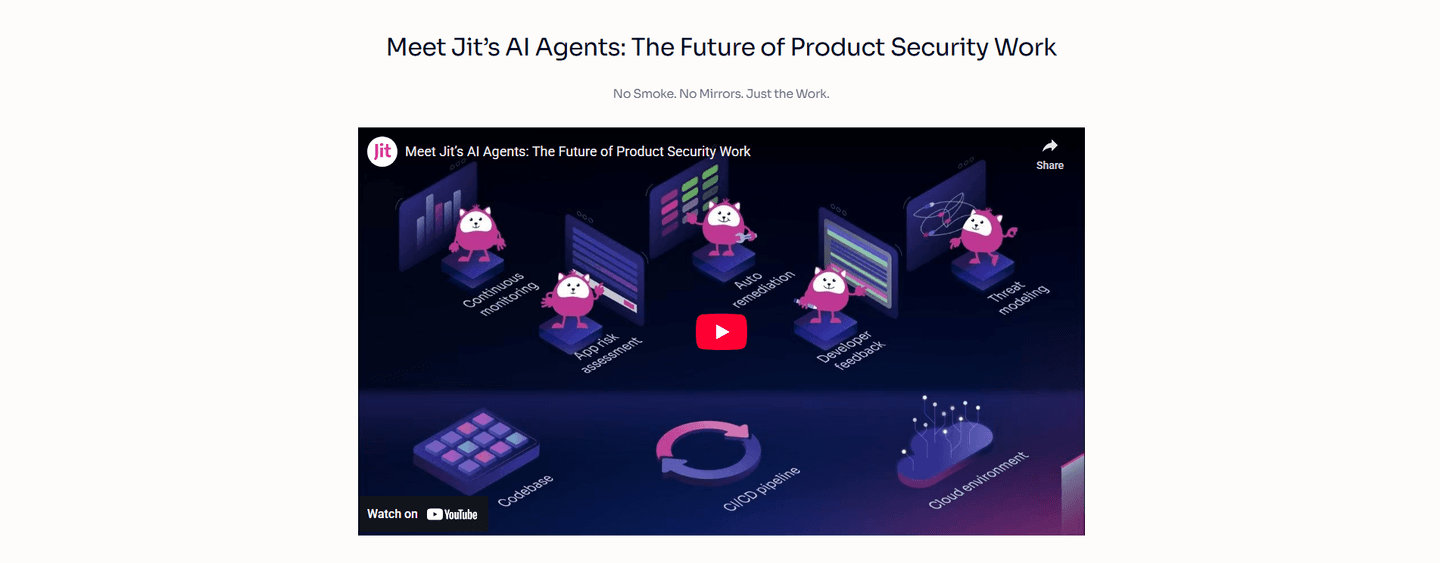
Match the visual to what the feature actually is. A UI-heavy feature (dashboard, editor, inbox) gets a real cropped screenshot. The buyer sees themselves using it. A conceptual feature (API, security, compliance) gets a clean icon or a small diagram, because a screenshot of JSON adds nothing. Animations only when the feature is about motion or state change. Otherwise the GIF distracts from the copy. Whatever you pick, use the same treatment across the grid. Mixing icons and screenshots in one row looks unfinished.
Run your page through our landing page analysis. You'll get a scored breakdown of your features section across conversion best practices (benefit-led copy, outcome focus, persona grouping, internal linking, secondary features, feature-to-outcome mapping) with specific fixes prioritized by impact.