Best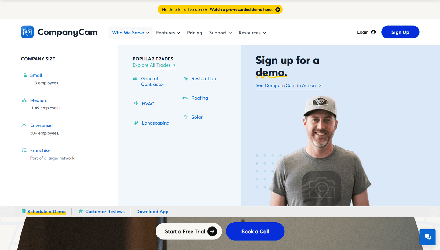
Navbar|
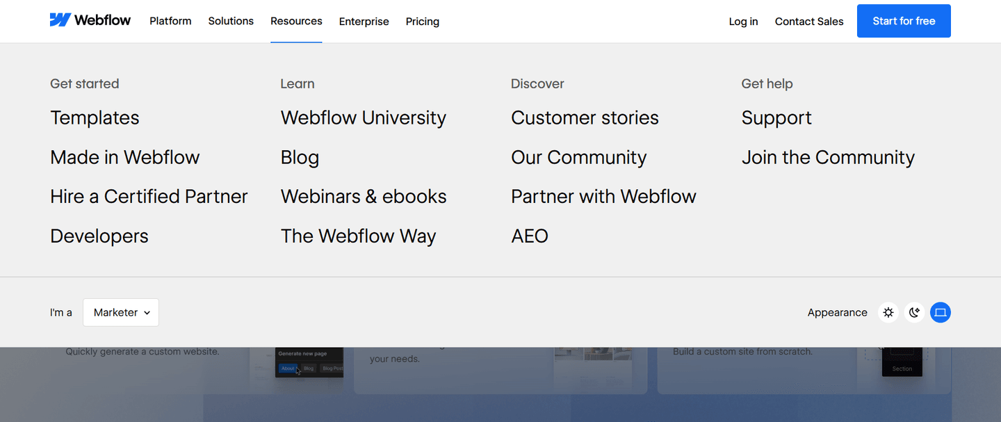
CompanyCam SaaS Navbar Design
100/100
151 navigation bars scored across conversion best practices. See how the best SaaS companies structure their navbar for clicks.
Showing 64–84 of 151 examples
_navbar.png&w=1440&q=75)

Every navbar is scored across 7 conversion best practices. Copy the navigation structure, not the design. See what converts and why.
Hand-picked from 350+ companies and analyzed by our AI conversion agent. Not a random dump of navigation bars. Every entry earns its spot.
Found a navbar you admire? Run yours through the same scoring engine. See where you stand on the same best practices, and what to fix first.
We scored 151 navbars across conversion best practices. The table below shows how widely each element is adopted. The lower the number, the bigger your edge by adding it.
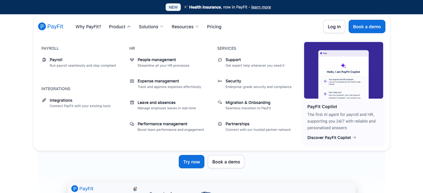
Featured assets, visuals, or promoted content inside the dropdown — richer hierarchy when opened
Login, language picker, search placement — secondary actions accessible but not competing with the CTA
"For Sales," "For Marketing," "For Enterprise" — audience-specific paths from the first click
Pricing as a visible top-level nav entry — easy access to the decision page
Navigation organized by use case — task-oriented browsing instead of product-oriented
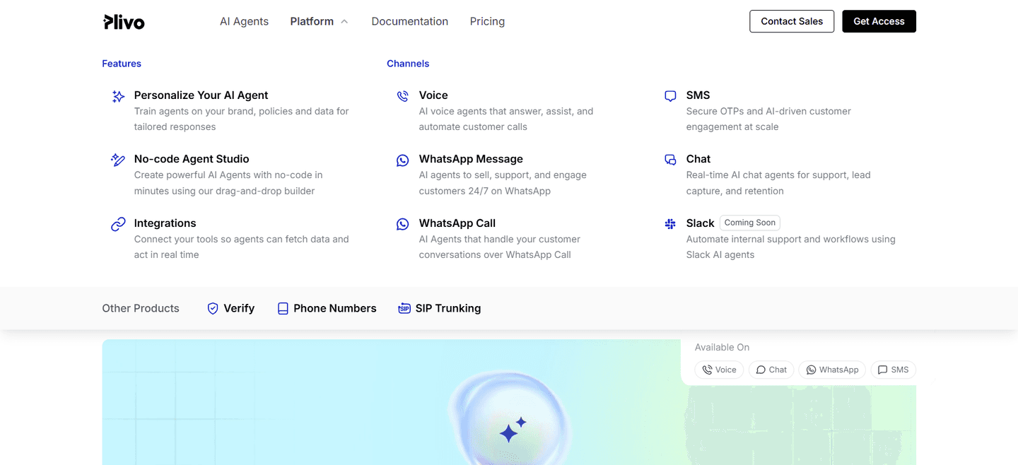
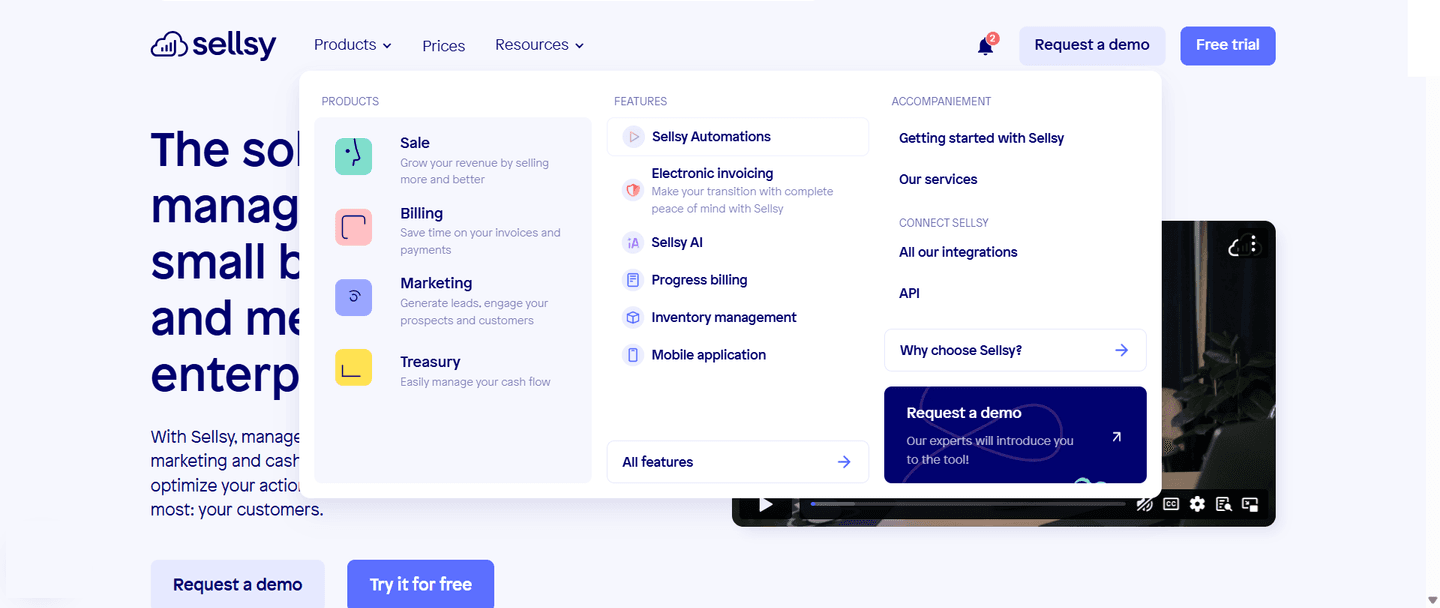
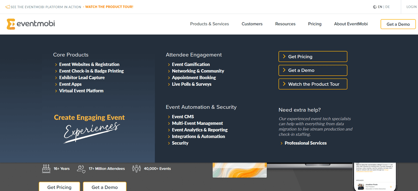
Dropdown with clear categories (Product, Solutions, Resources) — structured exploration
"Get started" or "Try free" button always visible in the nav bar — persistent conversion path
| Element | What it means | Use it | Type |
|---|---|---|---|
| Mega menu highlights | Featured assets, visuals, or promoted content inside the dropdown — richer hierarchy when opened | 9% | Big opportunity |
| Utility navigation | Login, language picker, search placement — secondary actions accessible but not competing with the CTA | 21% | Big opportunity |
| Persona tabs | "For Sales," "For Marketing," "For Enterprise" — audience-specific paths from the first click | 28% | Big opportunity |
| Pricing tab | Pricing as a visible top-level nav entry — easy access to the decision page | 28% | Big opportunity |
| Use case tabs | Navigation organized by use case — task-oriented browsing instead of product-oriented | 42% | Opportunity |
| Mega menu categories | Dropdown with clear categories (Product, Solutions, Resources) — structured exploration | 53% | Common |
| Primary CTA visible | "Get started" or "Try free" button always visible in the nav bar — persistent conversion path | 98% | Table stakes |
The biggest gap between average and best-in-class: use case tabs. 42% of all navbars have them, but 100% of top-performing navbars do. The other strong signal: persona tabs (28% overall vs 67% for the best).
Mega menu highlights are the rarest best practice: only 9% of navbars use them. When they're there (a visual, a promoted article, a case study link inside the dropdown), the menu stops being a flat list of links.
Across 151 scored navbars, here's how scores break down. Most land between 0 and 59.
82% of navbars score between 0 and 59. Only 4% break 80. The bar is low — adding 2-3 best practices puts you in the top 18%.
Our AI conversion agent evaluates every navbar against a weighted checklist that spans three dimensions. Each best practice gets a pass or fail based on the actual page content and screenshot.
Not every best practice carries the same weight. Use case tabs and persona tabs pull the score up more because in our dataset, navbars with those two offer more targeted paths than those that just list features.
Sections flagged best-in-class are hand-picked by our team from the highest-scoring navbars. A high score gets you on the list. Best-in-class means the structure, conversion paths, and depth all work together.
Interactive quiz
Is there a visible CTA button always in the nav bar?
"Get started" or "Try free" — persistent conversion path
120 navbars in our library are flagged best-in-class. They score higher because they stack best practices differently.
100% of them have use case tabs, compared to just 42% overall. They don't settle for a Product/Solutions/Resources menu. They organize navigation around what the visitor wants to do.
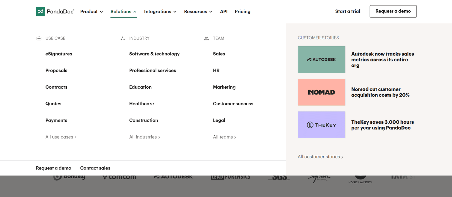
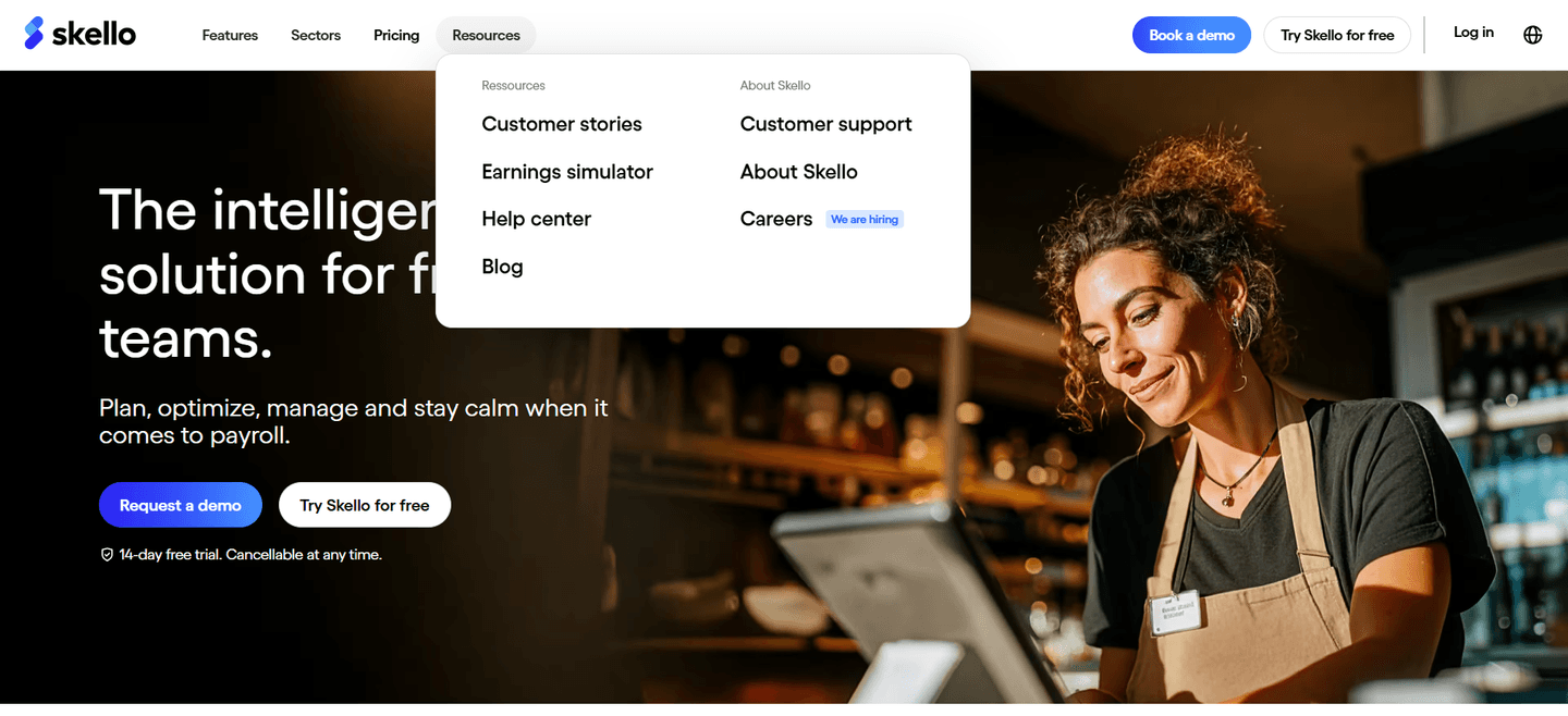
Skello, PandaDoc, and Comet do all of this. Four or five conversion best practices stacked in a single navbar. That's what separates a high score from a standard menu.
 100/100
The lowest-scoring navbars in our library aren't ugly. Most of them look clean. They just don't do enough.
A low-scoring navbar typically has a logo, flat links, and a CTA button. The minimum. No mega menu, no persona tabs, no use case structure. The visitor has to guess which link is relevant to them.
The most common gap: no featured content inside dropdowns. 91% of all navbars skip this. Menus open to a plain list of text links, no visuals, no context, no promoted content.
Second: no persona tabs. 72% of navbars don't help visitors self-identify. The menu says "Product" and "Solutions" but never "For marketers" or "For sales teams." The visitor has to click around to figure out if this is for them.
The fix isn't redesigning the entire navigation. It's adding structure to what's already there. A mega menu with two or three columns takes half a day to build. Persona tabs are a few links and some CSS. The gap between a basic navbar and a high-scoring one is depth, not design.
Want to know which best practices your navbar is missing? Try our landing page analyzer →
 10/100
Curated by
Gabriel Amzallag , Founder, LPA
5 years CRO + SEO at Qonto (2021–2025). After advising 15+ SaaS on their websites (Payfit, Pigment…), the same patterns kept breaking — so I decided to build the source of truth on what works on the web: the intelligence layer every tool, builder, and team uses to ship sites that perform.
See how different industries design their navbar sections.
Real examples from top SaaS landing pages, scored and analyzed.

The first seconds matter. Browse the highest-scoring hero sections across conversion best practices.
Browse hero examples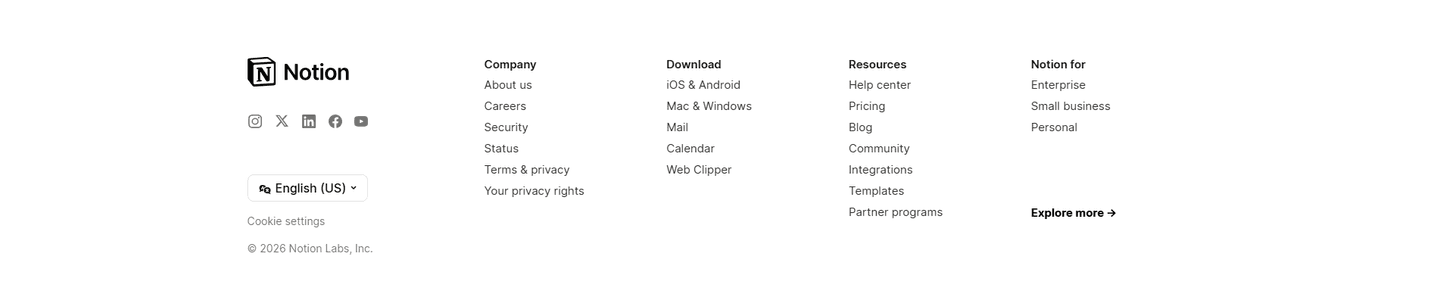
Organized links, trust signals, secondary conversion. See how top SaaS companies structure their footer.
Browse footer examples
See how top SaaS pages structure their call-to-action sections to drive clicks. Scored examples with conversion analysis.
Browse CTA examplesPaste your URL. Get a scored analysis of your navbar with specific fixes. Free, no signup.
Everything you need to know about navbar design, based on our analysis of real SaaS landing pages.
Between 5 and 7 top-level links. Beyond 7, visitors spend too long scanning. In our dataset of 151 navbars, 53% use mega menu categories to group their links (Product, Solutions, Resources) rather than listing everything flat. That keeps the nav looking lean while offering depth on click.
The navbar is the horizontal bar at the top of the page: logo, links, CTA button. A mega menu is a type of dropdown that opens from the navbar, with content organized in columns and categories. 53% of navbars in our gallery use mega menus. A mega menu isn't required. It becomes useful when your product serves multiple audiences or use cases.
Yes, for long landing pages. When visitors scroll, a fixed navbar keeps the CTA within reach. 98% of navbars in our dataset have a primary CTA visible at all times. If your page is longer than 3 screens, a sticky header saves visitors from scrolling back up to act.
Far right, visually distinct from the other links. Use a solid button in your brand color while nav links stay as text. The eye lands there last when scanning left-to-right, which is exactly when the visitor has finished reading and is ready to act. Two common mistakes: styling the CTA like any other link (it disappears), or stacking two CTAs next to each other ("Login" + "Sign up") without a clear hierarchy. One primary button, one secondary text link, never two buttons competing.
No. The data shows 53% of SaaS navbars use mega menu categories on desktop, with dropdowns that work. A hamburger menu hides your links and CTA behind an extra click. Save it for mobile. On desktop, show the navigation structure and keep the primary CTA visible.
Run your page through our landing page audit. You'll get a scored breakdown of your navbar across conversion best practices (visible CTA, mega menu categories, use case tabs, persona tabs) with specific fixes prioritized by impact.