Integrations|
Correlated SaaS Integrations Design
50/100
Hand-picked 52 integrations sections, scored across conversion best practices. See what the best do differently.
Showing 22–42 of 52 examples


Every integrations section is scored across 4 conversion best practices. Copy the best practice stack, not the design. See what converts and why.
Hand-picked from 350+ companies and analyzed by our AI conversion agent. Not a random dump of homepages. Every entry earns its spot.
Found an integrations section you admire? Run yours through the same scoring engine. See where you stand on the same best practices, and what to fix first.
We scored 52 integrations sections across conversion best practices. The table below shows how widely each element is adopted. The lower the number, the bigger your edge by adding it.
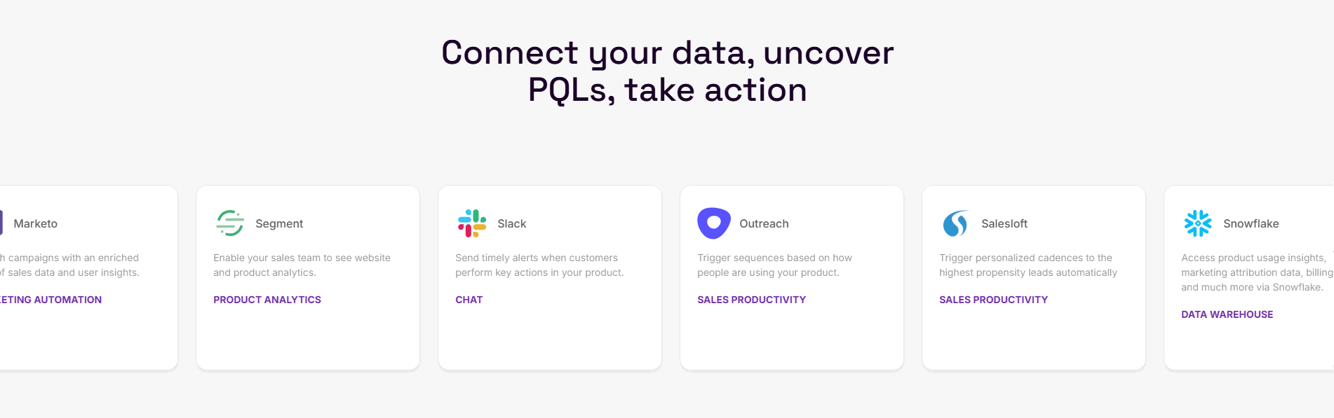
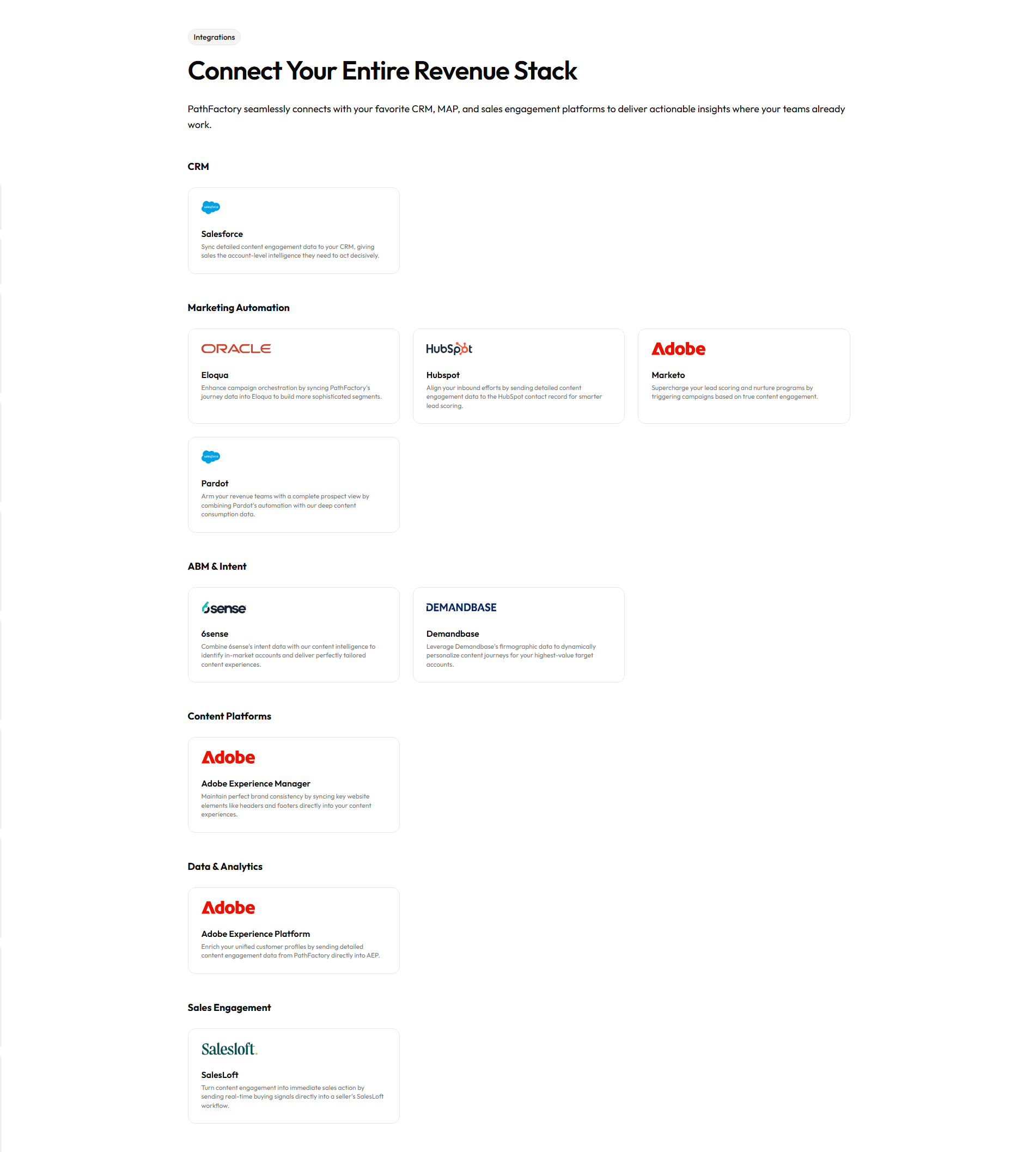
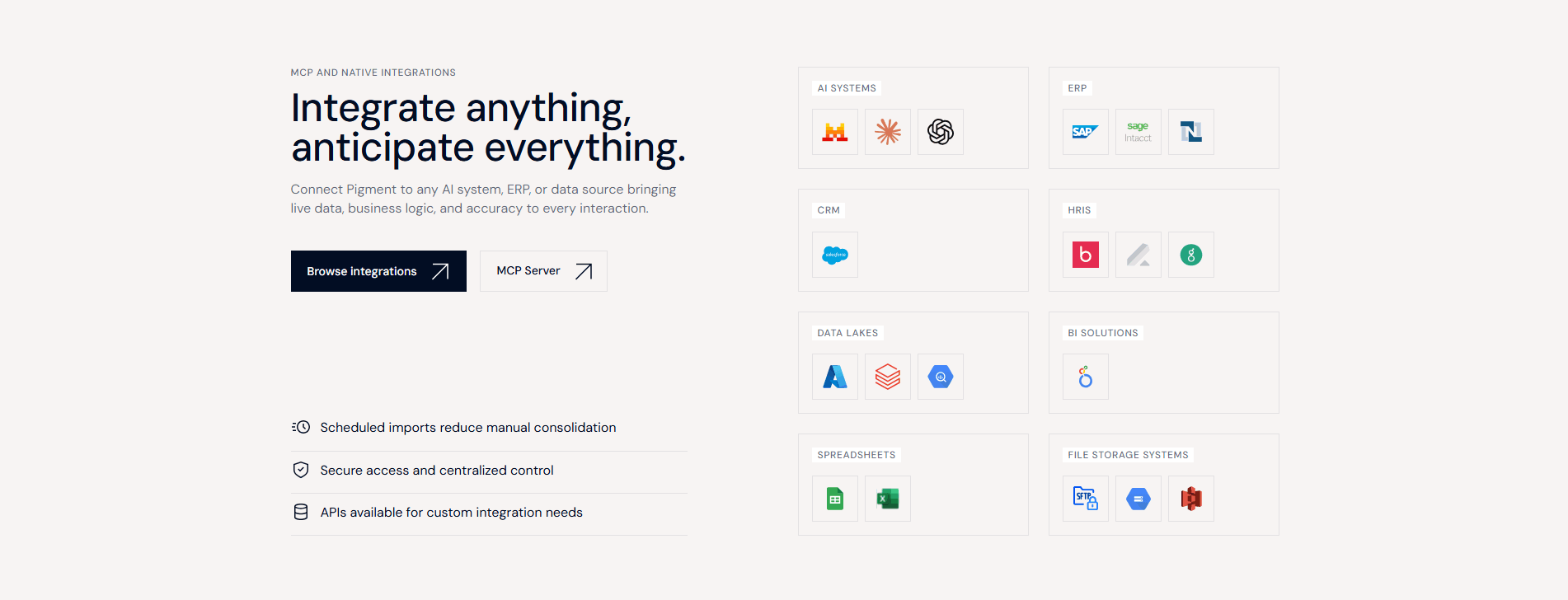
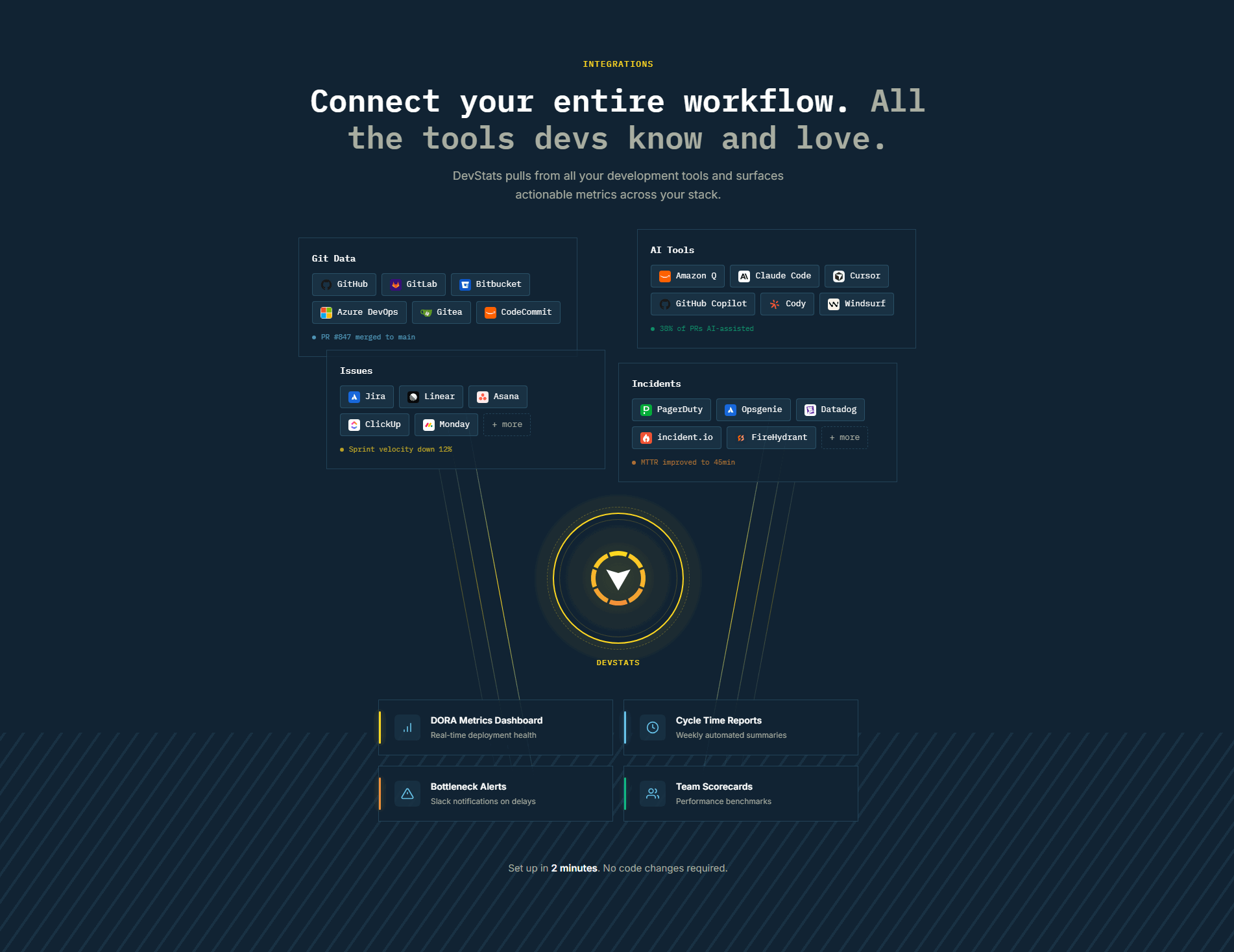
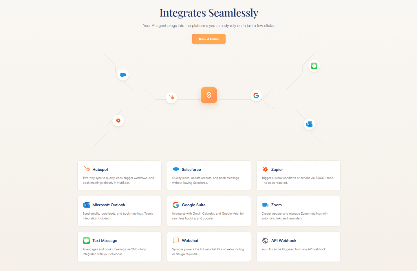
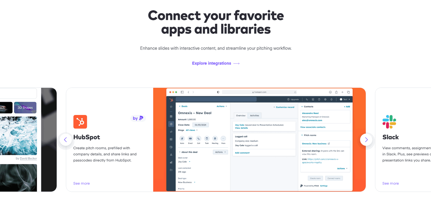
One concrete integration use case shown, like "Connect Slack to get deal alerts" instead of a logo grid alone
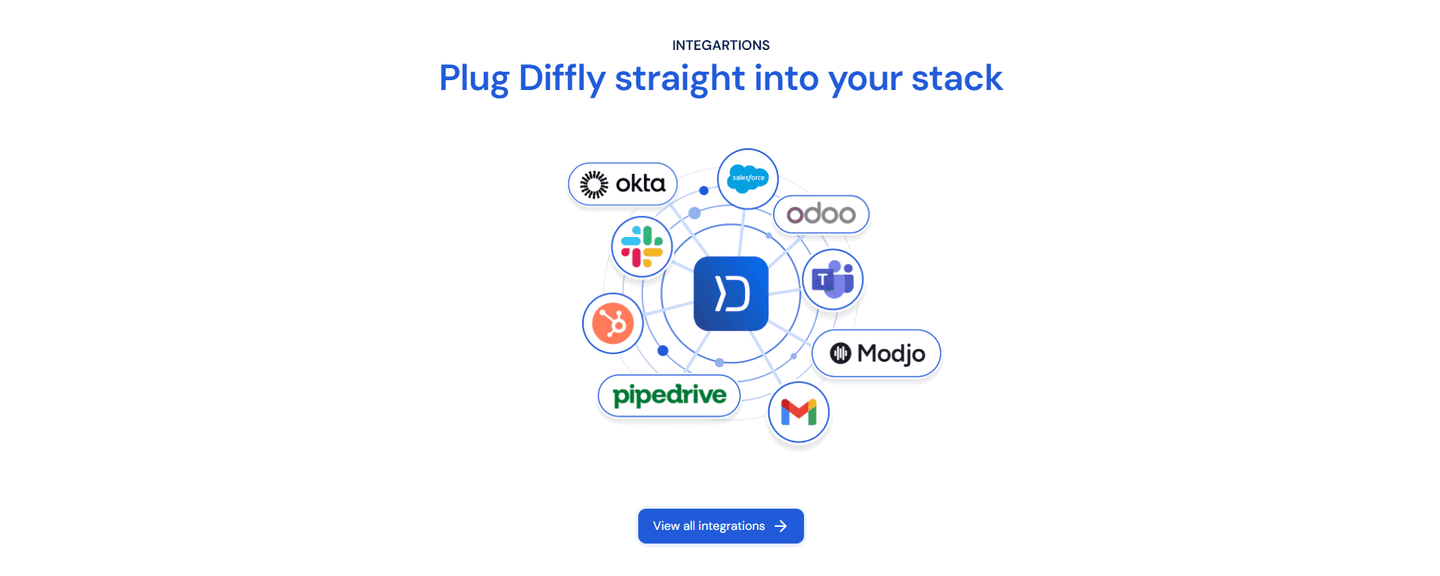
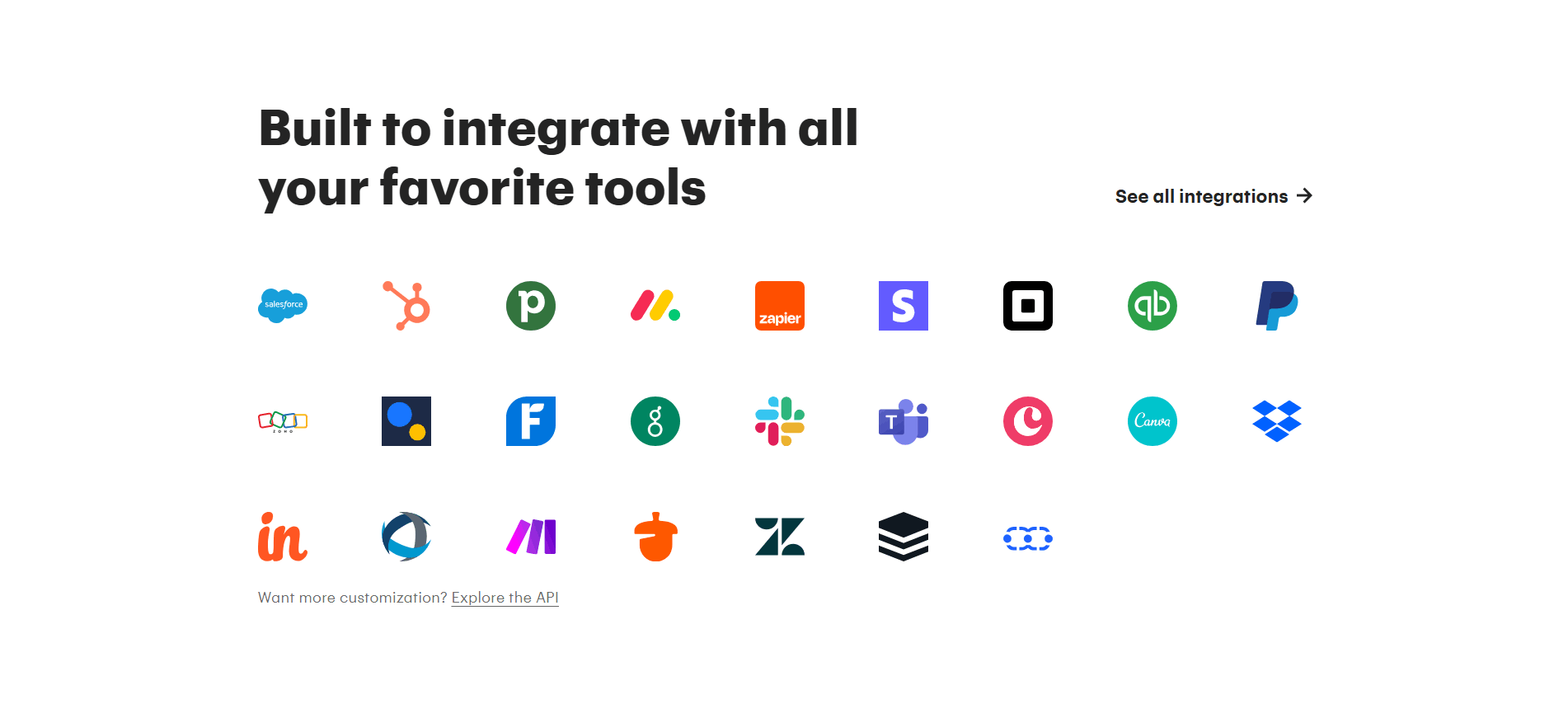
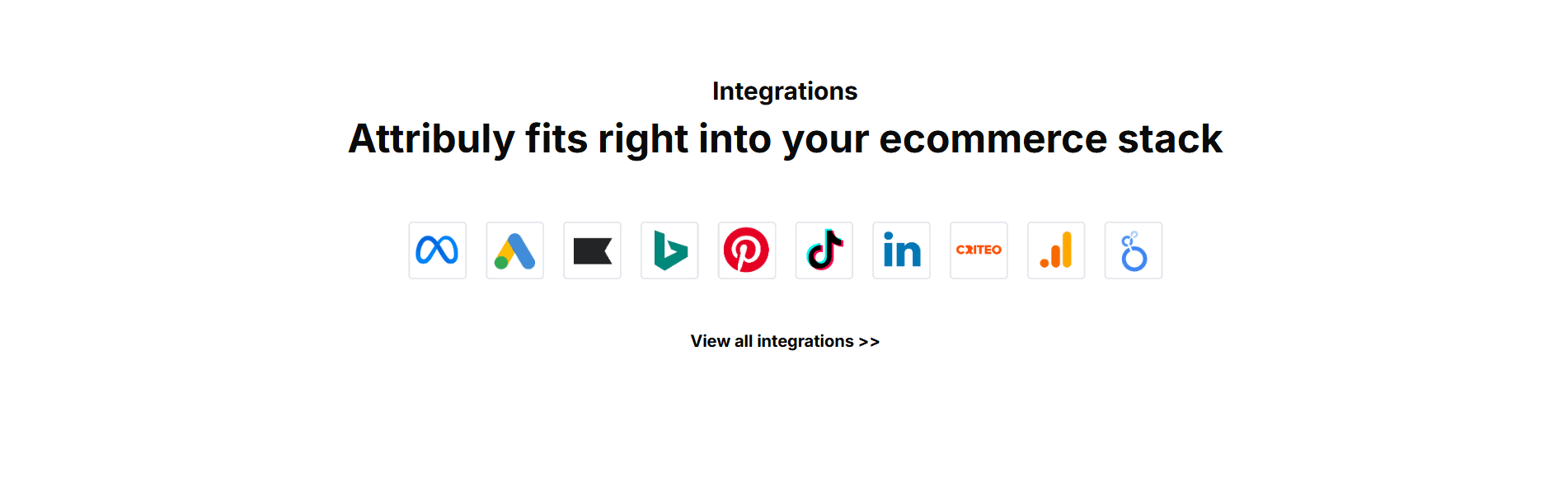
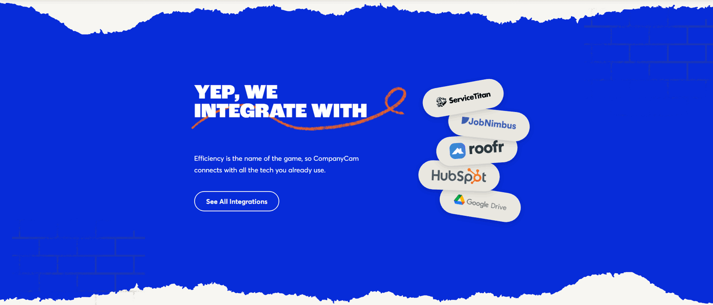
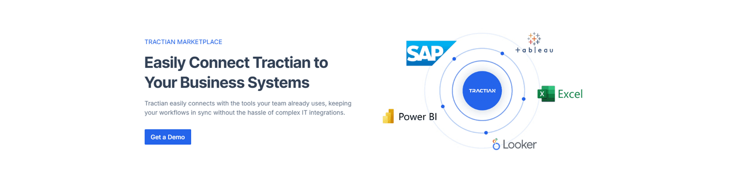
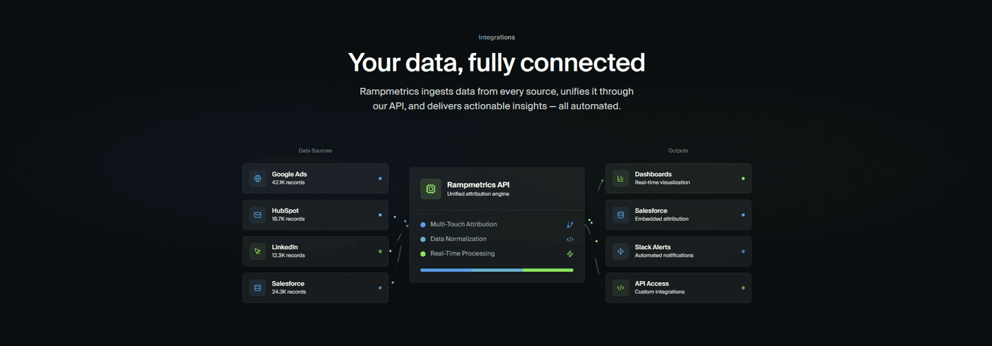
Link to a full integrations directory for details, giving high-intent visitors an exploration path
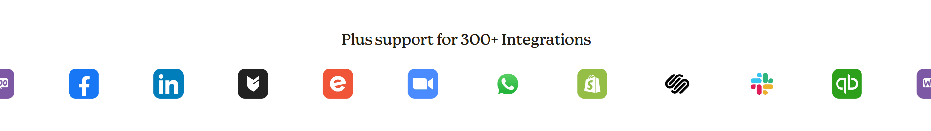
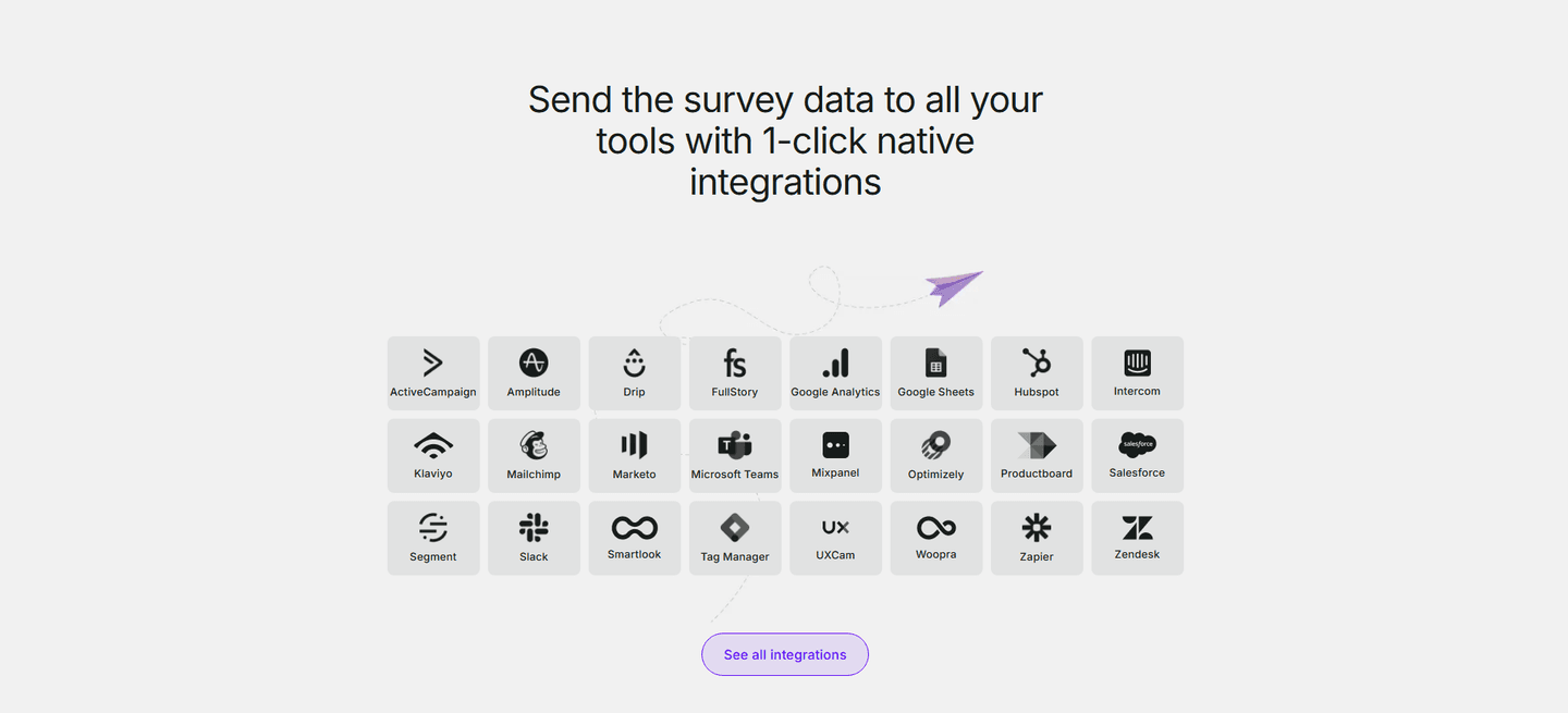
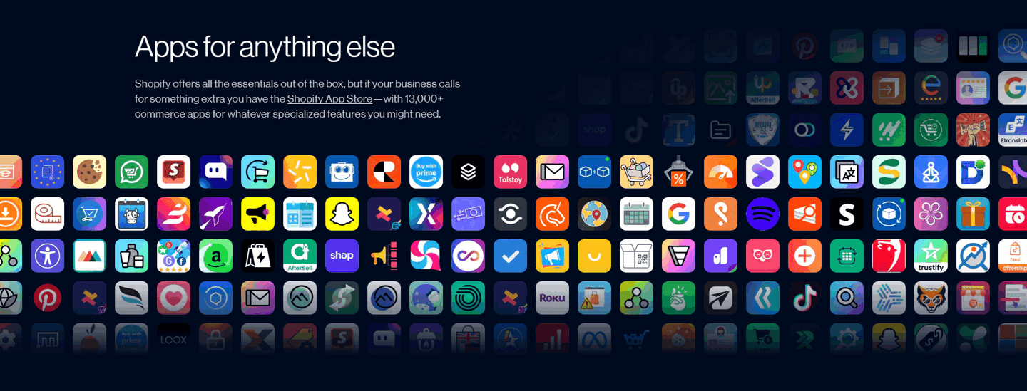
"200+ integrations" or "Works with 50+ tools" showing ecosystem scale at a glance
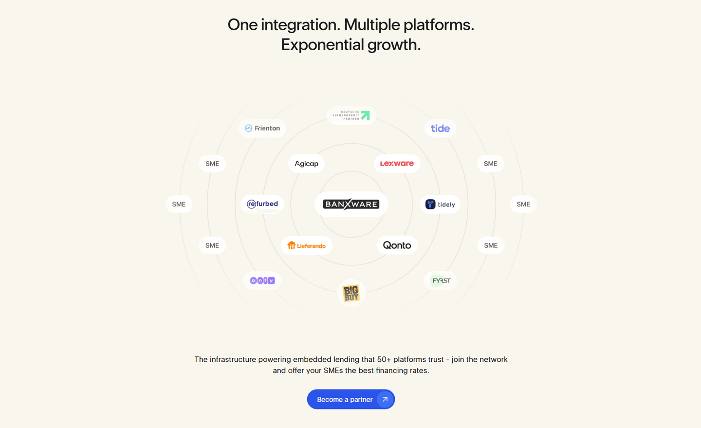
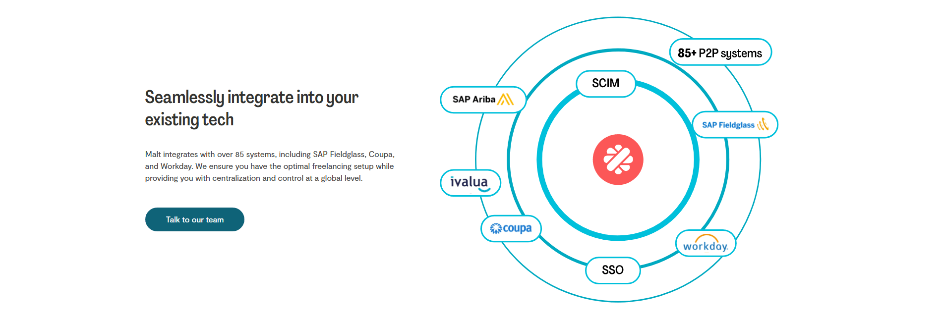
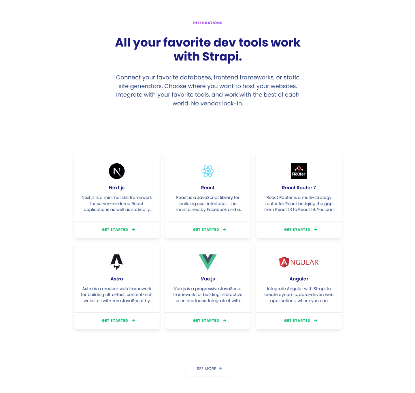
Prominent display of well-known logos (Slack, Salesforce, HubSpot) for borrowed credibility
| Element | What it means | Use it | Type |
|---|---|---|---|
| Use case example | One concrete integration use case shown, like "Connect Slack to get deal alerts" instead of a logo grid alone | 17% | Big opportunity |
| Depth page link | Link to a full integrations directory for details, giving high-intent visitors an exploration path | 58% | Common |
| Integration count | "200+ integrations" or "Works with 50+ tools" showing ecosystem scale at a glance | 63% | Common |
| Famous logo highlight | Prominent display of well-known logos (Slack, Salesforce, HubSpot) for borrowed credibility | 87% | Table stakes |
Best-in-class sections are 43% more likely to display an integration count (90% vs 63%) and 55% more likely to include a depth page link (90% vs 58%). That's the biggest gap in the data.
Use case examples are the rarest best practice: only 17% of integrations sections include one. When it's there ("Sync your HubSpot contacts automatically"), the visitor understands the concrete value instead of guessing what each logo means.
Across 52 scored integrations sections, here's how scores break down.
Our AI conversion agent evaluates every integrations section against a weighted checklist that spans three dimensions. Each best practice gets a pass or fail based on the actual page content and screenshot.
Not every best practice carries the same weight. Famous logos and integration count pull the score up more because in our dataset, sections with those two consistently score higher.
Sections flagged best-in-class are hand-picked by our team from the highest-scoring sections. A high score gets you on the list. Best-in-class means the design, copy, and psychology all work together.
Interactive quiz
Are well-known integration logos prominently displayed?
Slack, Salesforce, HubSpot — borrowed credibility
2 integrations sections in our library are flagged best-in-class. They score higher because they stack best practices differently.
90% include both an integration count and a depth page link, compared to 63% and 58% on average. They don't just show logos. They give scale and an exploration path.
Ledger, Survicate, Sellsy, ERPNext (Frappe), and HubSpot stack all three best practices in a single section. That's what a top score looks like.
 100/100
The lowest-scoring integrations sections in our library aren't poorly designed. They're just incomplete.
The typical pattern: a logo grid with nothing around it. No count (37% of sections skip it), no link to a detailed page (42% skip it), no use case showing what the integrations actually do (83% skip it).
The most common gap: no use case example. 83% of integrations sections display logos without showing a single example of what the connection does. The visitor sees Slack in the grid but doesn't know if it's a notification, an import, or a bot.
Second: no exploration path. The section shows 12 logos and stops. No "See all integrations," no detailed page. High-intent visitors have nowhere to go.
The fix isn't redesigning the grid. It's adding a count (one line of text), a use case (one sentence), and a depth link (one button). Three additions that take 30 minutes and separate average sections from the best.
Want to know which best practices your integrations section is missing? Try our landing page analysis →
10/100
Curated by
Gabriel Amzallag , Founder, LPA
5 years CRO + SEO at Qonto (2021–2025). After advising 15+ SaaS on their websites (Payfit, Pigment…), the same patterns kept breaking — so I decided to build the source of truth on what works on the web: the intelligence layer every tool, builder, and team uses to ship sites that perform.
See how different industries design their integrations sections.
Real examples from top SaaS landing pages, scored and analyzed.
Logos, certifications, guarantees. Browse the patterns that build trust and reduce hesitation.
Browse trust examples
How top products present their features: grids, bento layouts, interactive demos. Real examples with scores.
Browse features sections
Navigation bars, menus, headers. Real examples from top SaaS landing pages.
Browse navbar examplesPaste your URL. Get a scored analysis of your integrations section with specific fixes. Free, no signup.
Everything you need to know about integrations section design, based on our analysis of real SaaS landing pages.
There's no magic number, but the top-scoring sections in our library display 8-20 visible logos then a counter for the rest ("200+ integrations"). 63% of the 52 integrations sections we analyzed use an integration count. Show your most recognizable connections first, volume second.
The integrations section is a block on your landing page: a few logos, a counter, a CTA to the full page. The integrations page is a dedicated directory with filters, categories, and per-connection details. 58% of the sections we analyzed include a depth page link. The section sells the ecosystem. The page documents it.
If your product connects to other tools your prospects already use, yes. It's an instant trust signal: the visitor sees Slack, Salesforce, or HubSpot and knows your tool fits into their existing stack. 87% of integrations sections in our library feature famous logos for exactly this reason.
Pick the ones your prospects already use daily. Match by ICP: if you sell to sales teams, Salesforce and HubSpot carry more weight than a design tool, even if both exist in your API. Lead with the category-defining name (Slack for messaging, Stripe for payments). Include at least one logo per major use case your product covers. Drop anything your audience wouldn't recognize in one second. A prospect-relevant logo beats a famous-but-irrelevant one every time.
Logos. 87% of integrations sections in our dataset use prominent famous logos. Logos are recognized in a fraction of a second; text names require reading. Use logos for your top 10-15 most recognizable integrations, and a "See all integrations" link for the rest.
Run your page through our landing page analyzer. You'll get a scored breakdown of your integrations section across conversion best practices (famous logo highlight, integration count, use case example, depth page link) with specific fixes prioritized by impact.