Best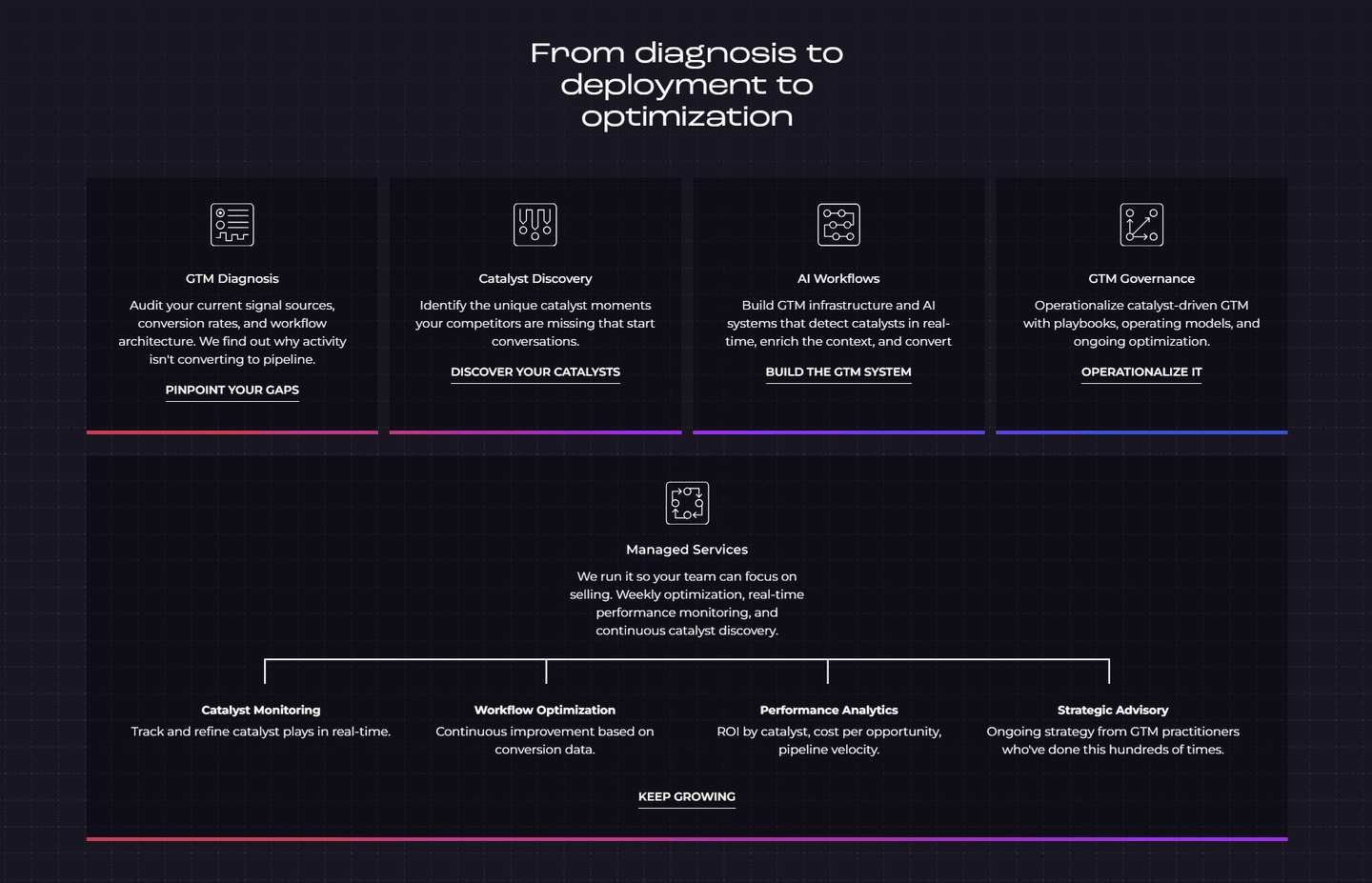
How It Works|
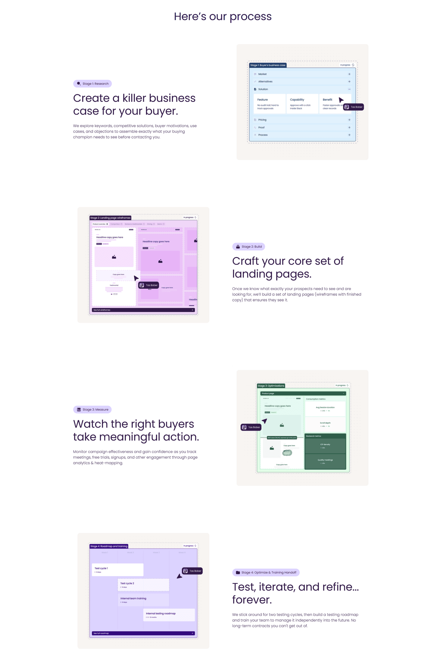
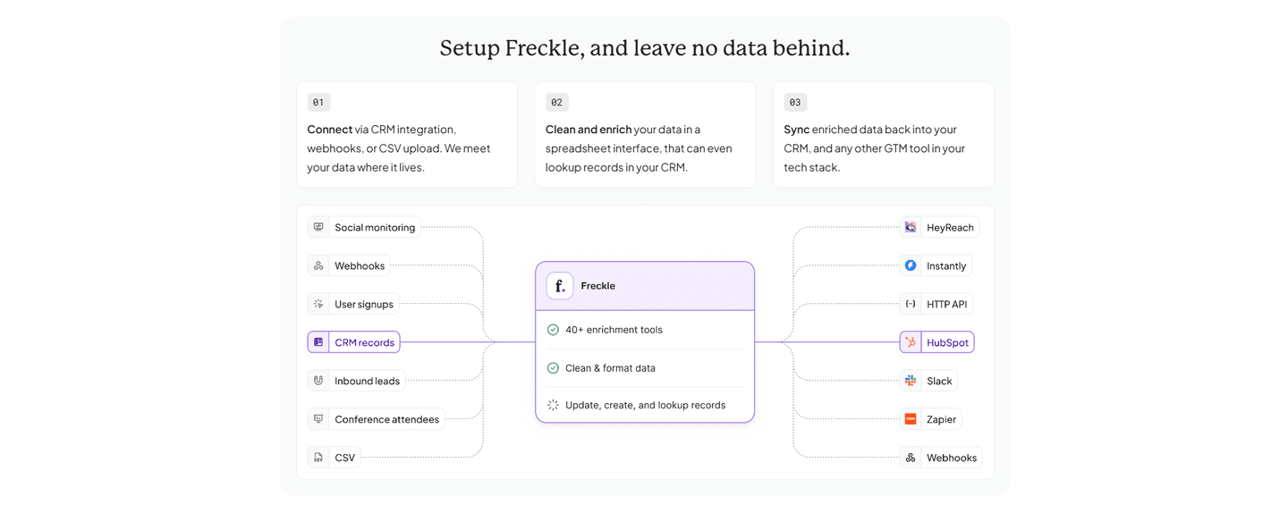
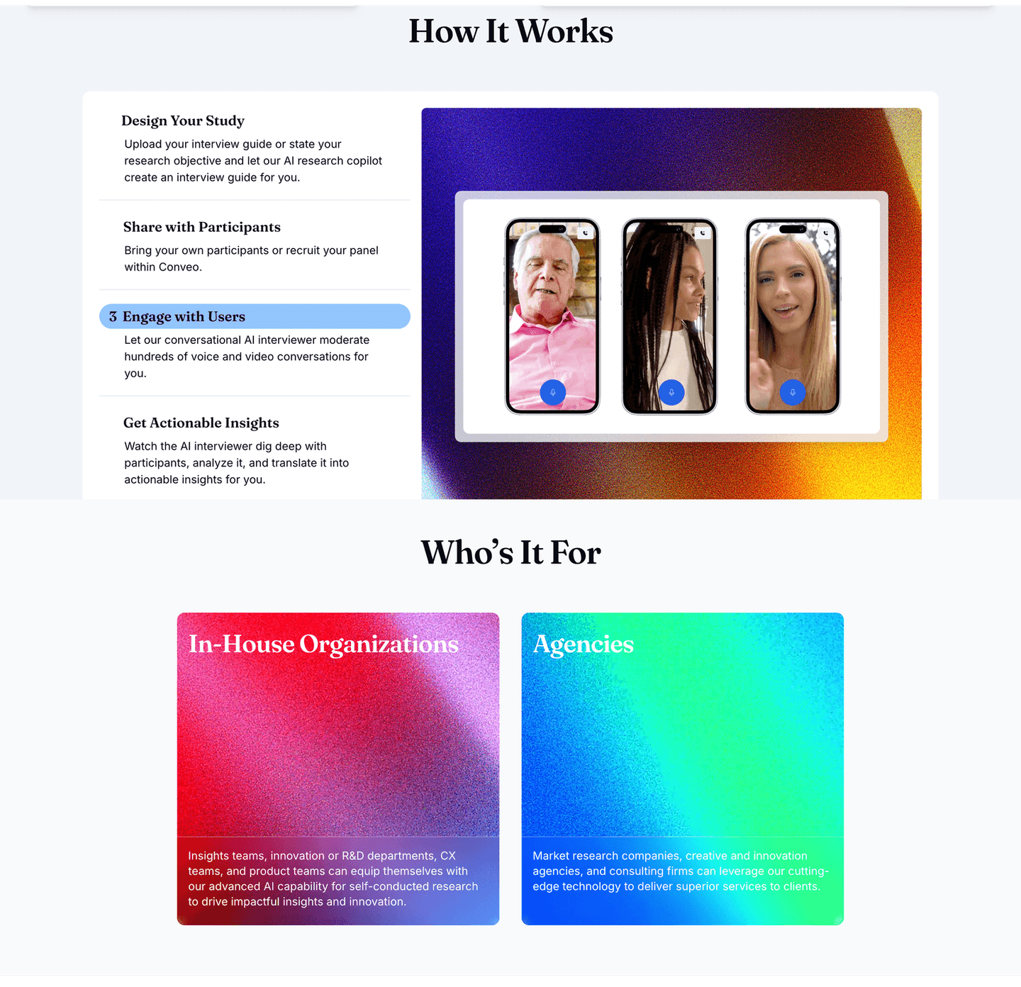
RevShoppe B2B How It Works Design
100/100
Hand-picked 63 how it works sections, scored across conversion best practices. See what the best do differently.
Showing 43–63 of 63 examples
Every how it works section is scored across 7 conversion best practices — from step clarity to timeline specificity. Copy the best practice stack, not the design. See what converts and why.
Hand-picked from 350+ companies and analyzed by our AI conversion agent. Not a random dump of pages. Every entry earns its spot.
Found a how it works section you admire? Run yours through the same scoring engine. See where you stand on the same best practices, and what to fix first.
We scored 63 how it works sections across conversion best practices. The table below shows how widely each element is adopted. The lower the number, the bigger your edge by adding it.
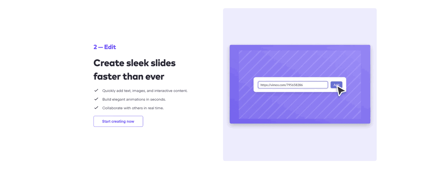
An embedded walkthrough or product demo — visitors see the product in action
"Old way vs. new way" or "Without us vs. with us" — shows the transformation
"For sales teams," "For ecommerce brands" — named scenarios that make the section feel personal
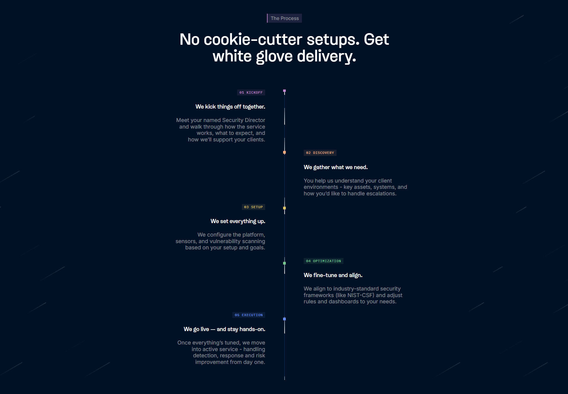
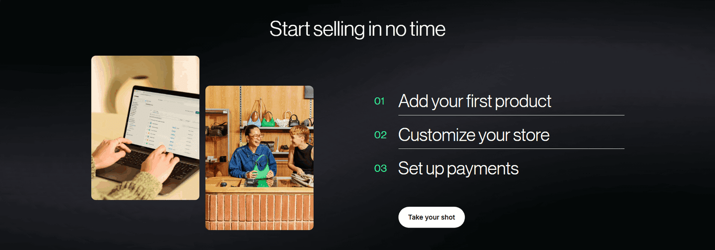
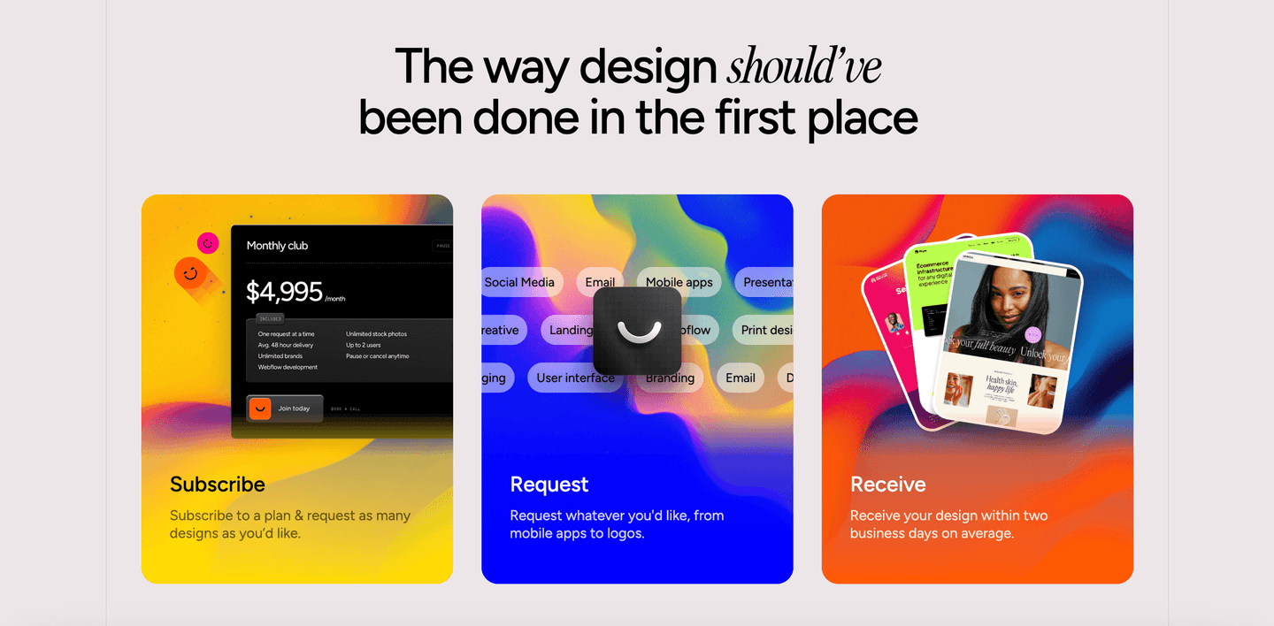
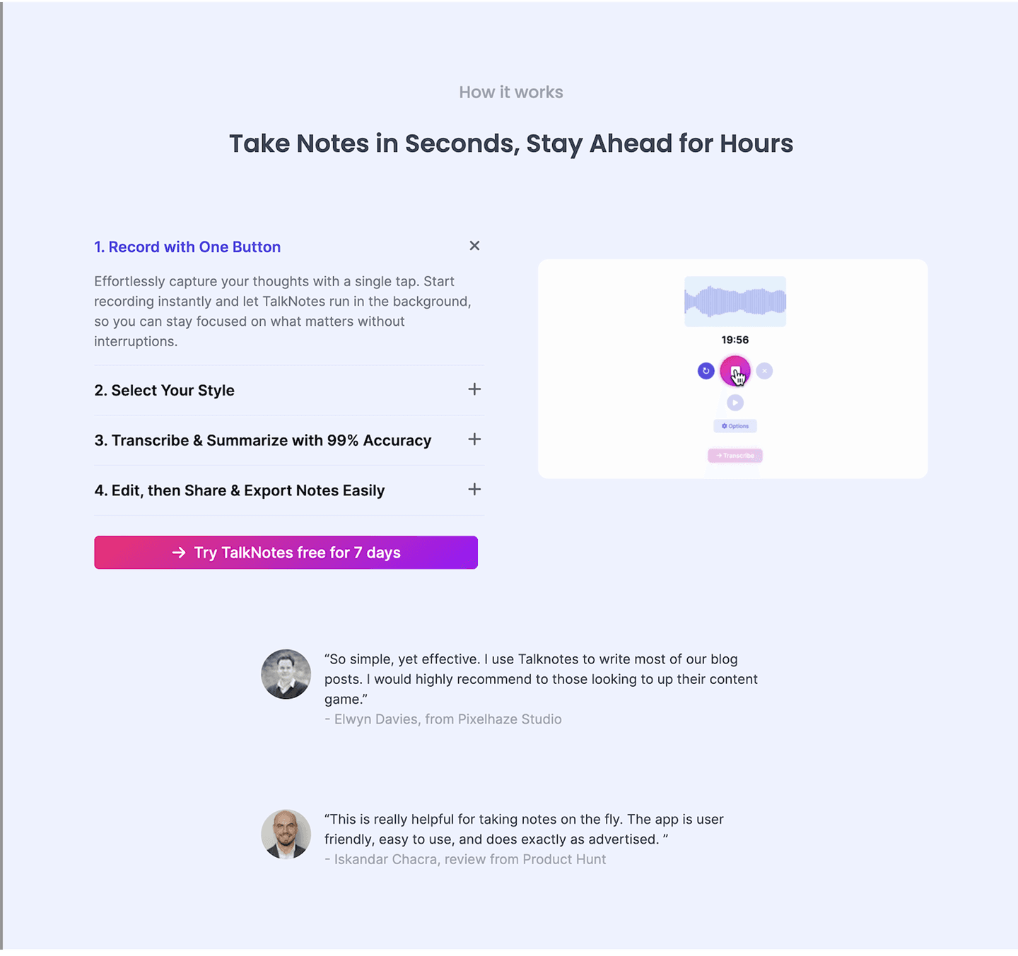
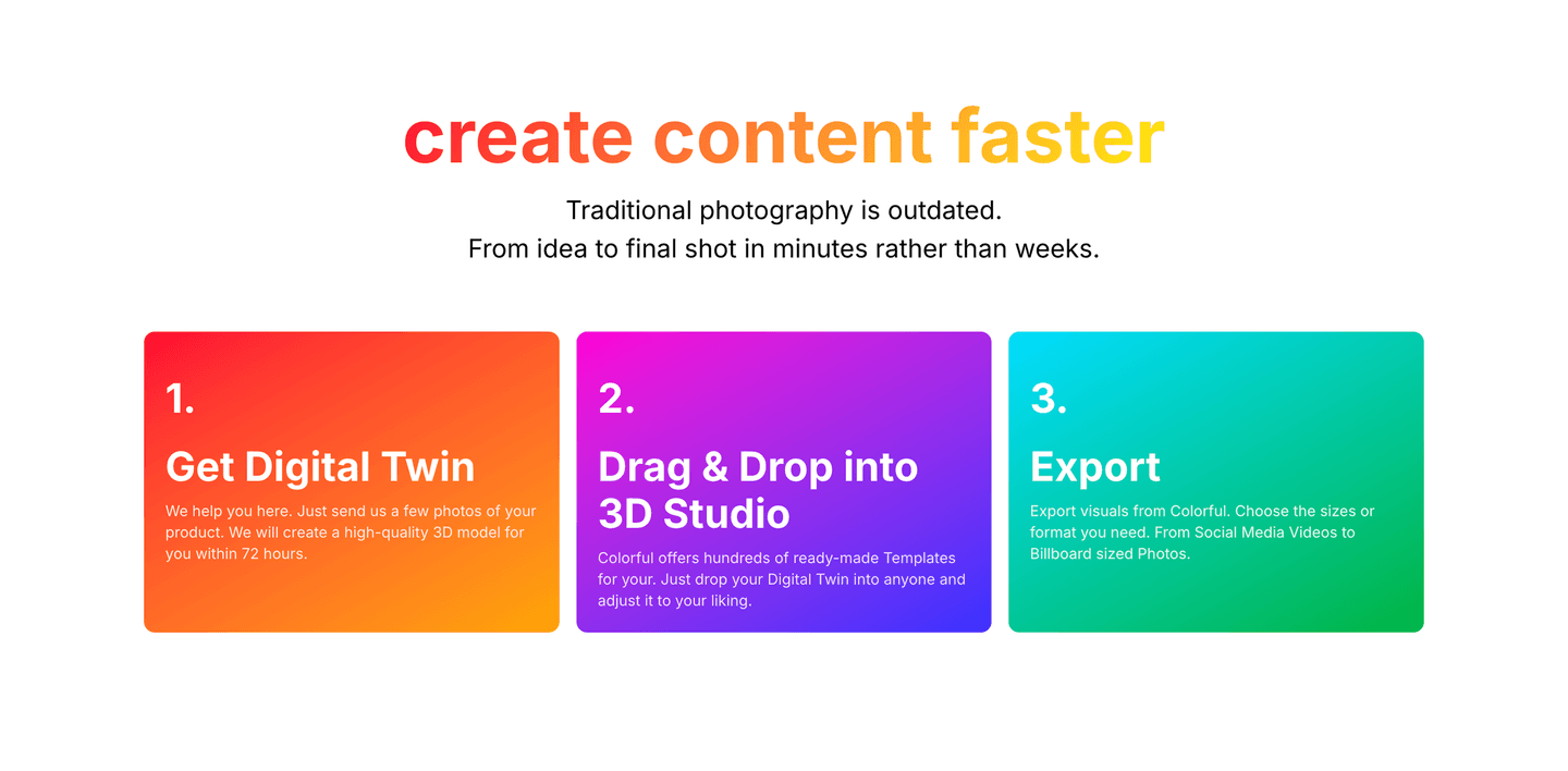
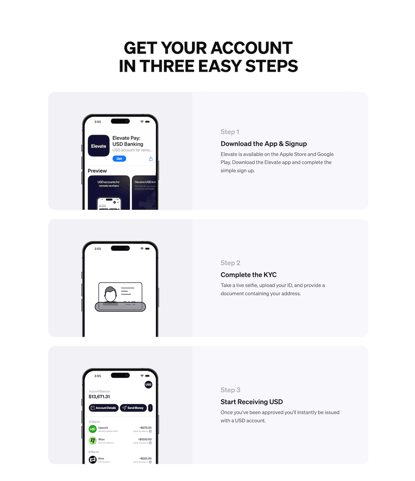
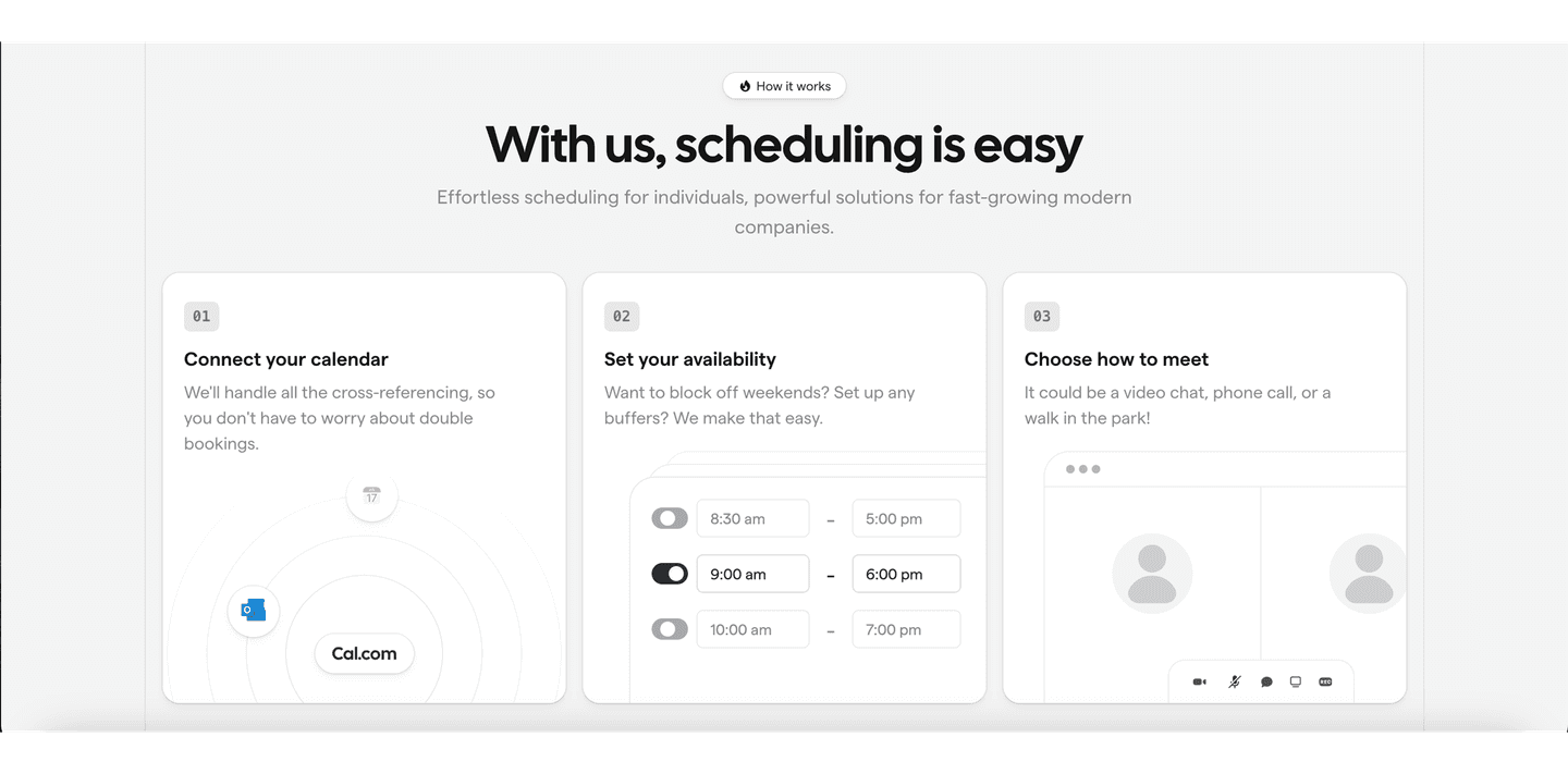
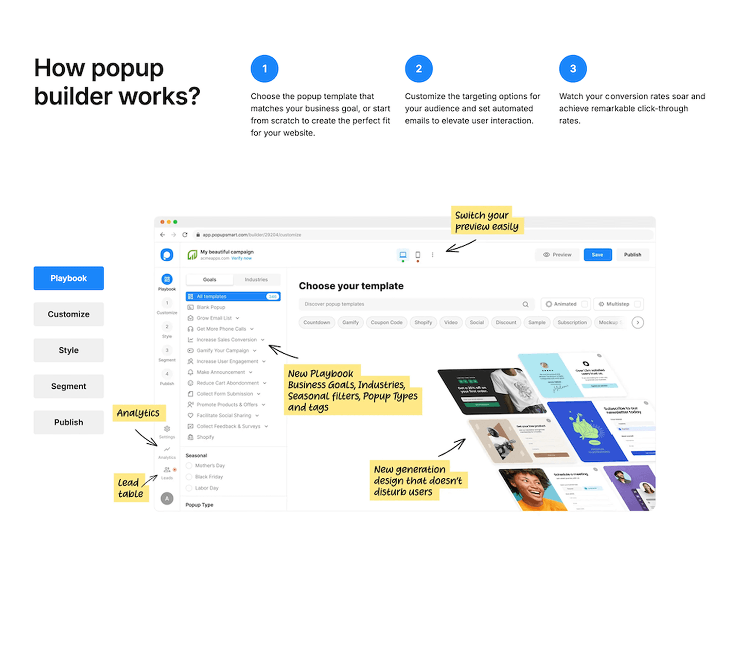
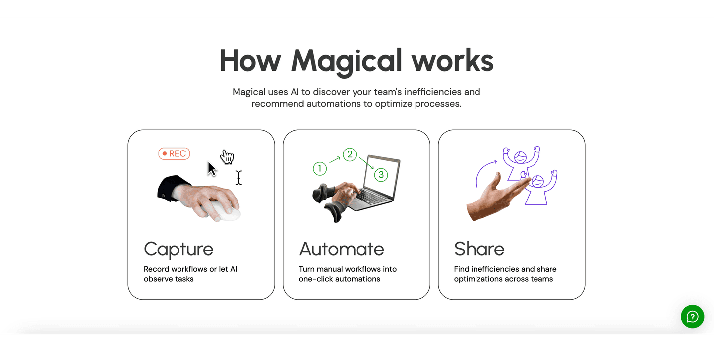
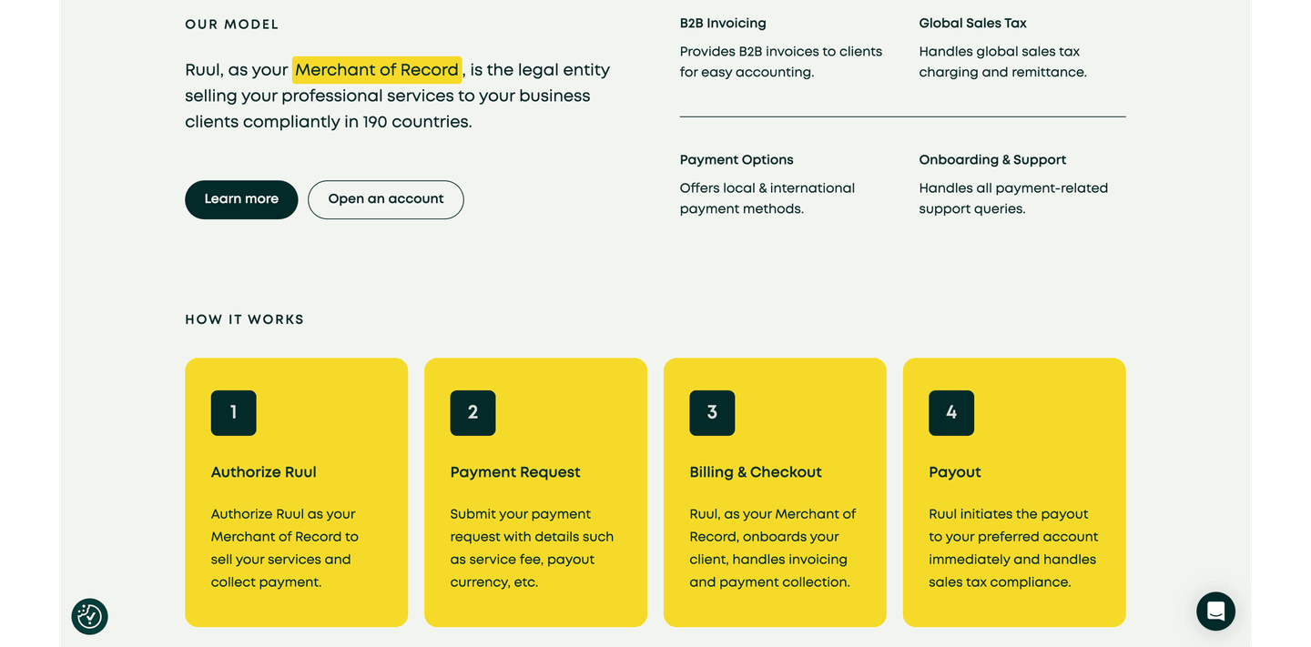
A clear 3-5 step sequence: "1. Connect your data, 2. Set your goals, 3. Watch it grow"
"Here's what success looks like" — a dashboard preview, a result metric, or a visual showing the end state
| Element | What it means | Use it | Type |
|---|---|---|---|
| Demo video teaser | An embedded walkthrough or product demo — visitors see the product in action | 6% | Big opportunity |
| Before/after contrast | "Old way vs. new way" or "Without us vs. with us" — shows the transformation | 26% | Big opportunity |
| Use case specificity | "For sales teams," "For ecommerce brands" — named scenarios that make the section feel personal | 59% | Common |
| Step-by-step process | A clear 3-5 step sequence: "1. Connect your data, 2. Set your goals, 3. Watch it grow" | 61% | Common |
| Outcome visualization | "Here's what success looks like" — a dashboard preview, a result metric, or a visual showing the end state | 74% | Common |
Use case specificity is the standout gap: 88% of best-in-class how it works sections name their audience or scenario explicitly, vs 59% overall. Nearly a 30-point spread.
Timeline specificity and effort perception don't appear in our scored dataset yet, but they show up in every strong how it works section we reviewed qualitatively. Shine's onboarding section nails both: each step includes a timeframe and an effort cue so the visitor already knows the commitment before starting.
Across 63 scored how-it-works sections, here's how scores break down.
Our AI conversion agent evaluates every how it works section against a weighted checklist that spans three dimensions. Each best practice gets a pass or fail based on the actual page content and screenshot.
Not every best practice carries the same weight. Use-case specificity and outcome visualization pull the score up more because in our dataset, how it works sections with those two convert better, even when the other best practices are present.
Sections flagged best-in-class are hand-picked by our team from the highest-scoring sections. A high score gets you on the list. Best-in-class means the structure, copy, and proof all work together.
Interactive quiz
Do you show what success looks like at the end?
A dashboard preview, a result metric, or a visual showing the end state
53 how it works sections in our library are flagged best-in-class. They score higher because they stack best practices differently.
Brevo and Pennylane both score 100/100. They stack use-case specificity, outcome visualization, and clear steps in a single section.
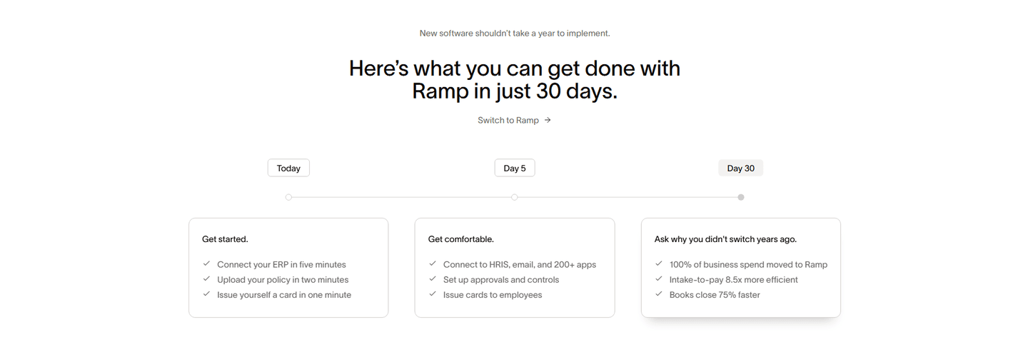 100/100
The lowest-scoring how it works sections in our library aren't ugly. They just don't do enough.
A section scoring 10/100 typically has a single conversion best practice: one use-case mention or one process step. Nothing else. No outcome visualization, no before/after, no demo.
The most common gap: no timeline or effort cues. The steps exist but feel abstract. "Step 1: Set up your account" tells you nothing about how long it takes or how hard it is. Without timeline specificity and effort perception, every step feels like work.
Second: no outcome visualization. 26% of sections skip it entirely. The visitor reads the steps but never sees what success looks like after completing them. Steps without a payoff at the end are a process with no destination.
Then there's generic positioning. A how it works section that says "1. Sign up, 2. Use the tool, 3. Get results" instead of "1. Connect your Shopify store, 2. Set your return policy rules, 3. Watch returns drop 30%" could belong to any company on the internet.
The fix isn't a redesign. It's adding 2-3 missing elements. A timeframe per step is one sentence. A named scenario ("For teams doing X") is one sentence. An outcome visual takes an afternoon. The gap between a 10 and a 67 is usually two missing best practices.
Want to know which best practices your how it works section is missing? Try our landing page audit →
 10/100
Curated by
Gabriel Amzallag , Founder, LPA
5 years CRO + SEO at Qonto (2021–2025). After advising 15+ SaaS on their websites (Payfit, Pigment…), the same patterns kept breaking — so I decided to build the source of truth on what works on the web: the intelligence layer every tool, builder, and team uses to ship sites that perform.
See how different industries design their how it works sections.
Real examples from top SaaS landing pages, scored and analyzed.
How top SaaS pages frame the pain before the solution. Scored examples showing quantified pain, before/after setups, and emotional resonance.
Browse problem sections
How top products present their features: grids, bento layouts, interactive demos. Real examples with scores.
Browse features sections
See how the best SaaS pages communicate their value in seconds. Real examples scored on clarity, specificity, and conversion impact.
Browse value propositionsPaste your URL. Get a scored analysis of your how it works section with specific fixes. Free, no signup.
Everything you need to know about how it works section design, based on our analysis of real SaaS landing pages.
Three to five. In our dataset of 63 sections, the highest-scoring ones use 3-5 steps, each with a one-liner, a timeframe, and a supporting visual. Fewer than three feels incomplete. More than five overwhelms visitors and kills the "this is simple" message the section is supposed to convey. Each step should answer three questions: what happens, how long it takes, and how much effort it requires.
A how it works section answers "what's the process?" A features section answers "what can it do?" The how it works section walks the visitor through steps in order, showing a clear path from start to result. The features section lists capabilities without a sequence. In practice, 61% of sections in our library use numbered steps, while features sections rarely do.
Yes, if your product requires any explanation. SaaS pages, service pages, and product launches all benefit from a section that bridges "I'm interested" to "I understand how this works." If your product is self-explanatory (a simple e-commerce purchase), you can skip it. For everything else, a clear step-by-step process reduces friction.
Most teams build the section in whatever their site runs on: Webflow, Framer, or custom React. The harder part is the visuals. For product screenshots, Arcade and Tella record clean walkthroughs you can trim per step. For stylized UI frames, Figma plus a mockup plugin like Rotato works well. If you need a short demo video, Loom is the fastest path; Vimeo or Mux if you want it embedded with custom chrome. Don't overthink the tool. The specificity of each step matters far more than the polish.
Use active verbs and name the artifact. "Connect your Shopify store" beats "Set up your account." Each step should answer three questions in one line: what happens, how long it takes, how much effort it requires. Keep steps to 8-15 words each. Avoid passive phrasing ("data is synced"), because visitors read it as work done to them, not by them. Lead with the verb, follow with the specific noun, end with the timeframe. That formula alone separates most good sections from the average.
Run your page through our landing page analysis. You'll get a scored breakdown of your how it works section across 7 conversion best practices (step clarity, outcome visualization, use-case specificity, timeline specificity, effort perception, before/after contrast, demo video) with specific fixes prioritized by impact.