Contact|
Benchify SaaS Contact Design
33/100
Hand-picked 79 contact sections, scored across conversion best practices. See what the best do differently.
Showing 43–63 of 79 examples

Every contact section is scored across 5 conversion best practices. Copy the best practice stack, not the layout. See what converts and why.
Hand-picked from 350+ companies and analyzed by our AI conversion agent. Not a random dump of contact forms. Every entry earns its spot.
Built a contact section? Run yours through the same scoring engine. See where you stand on the same best practices, and what to fix first.
We scored 79 contact sections across conversion best practices. The table below shows how widely each element is adopted. The lower the number, the bigger your edge by adding it.
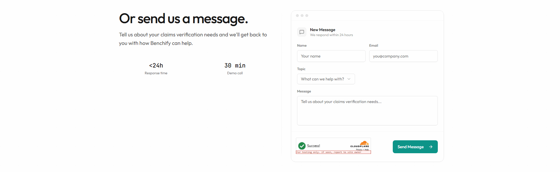
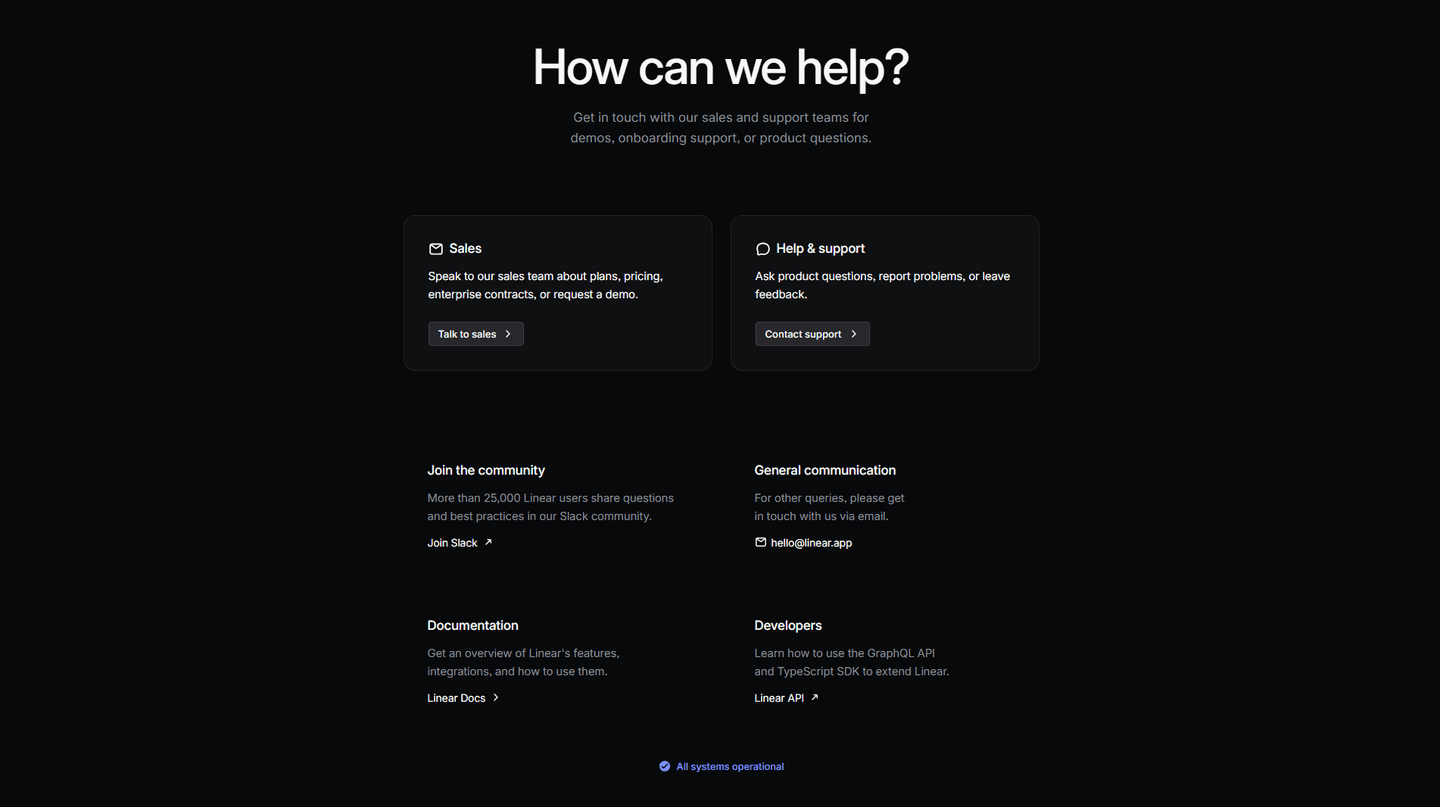
"We'll reply within 24 hours" or "Check your inbox." Tells the visitor what happens after submit
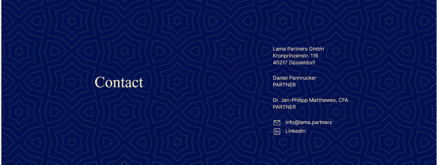
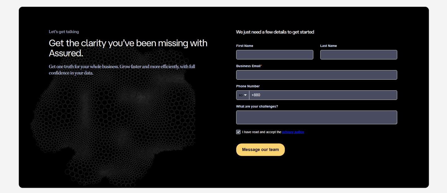
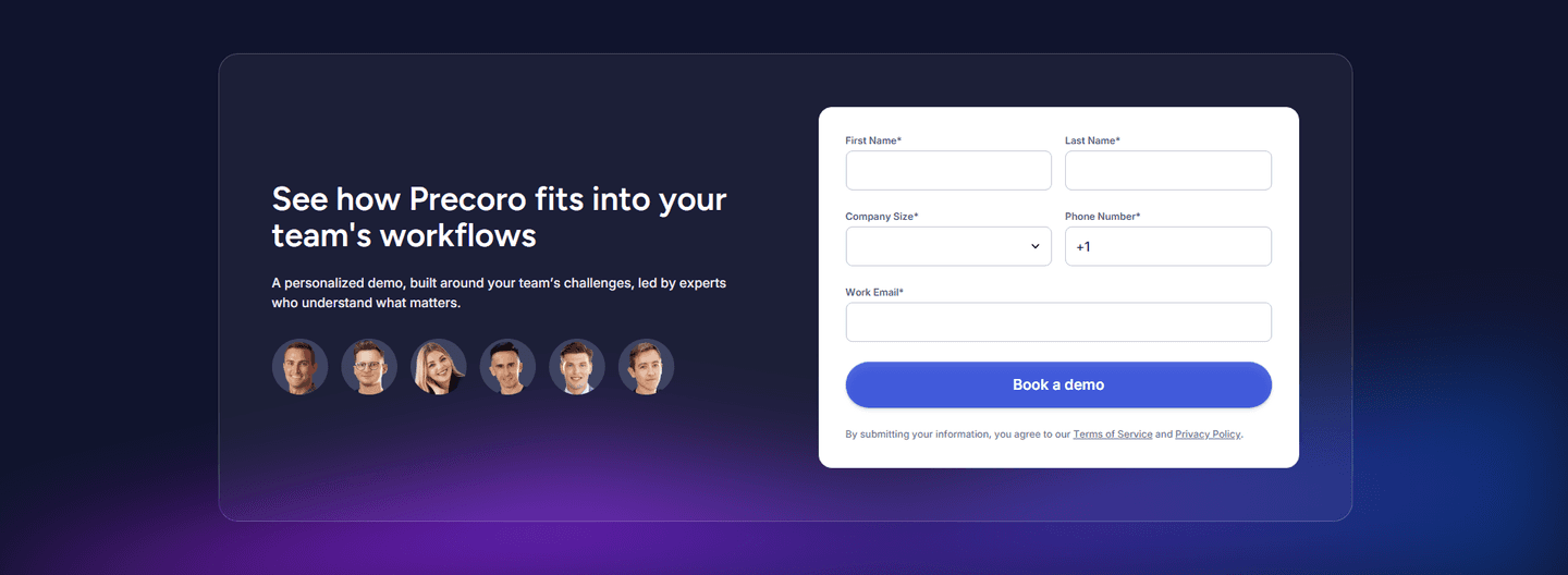
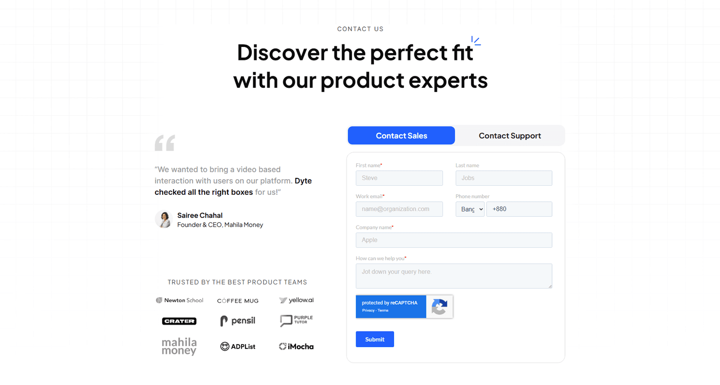
A face, team photo, or personal greeting near the form. Shows a real person receives the message
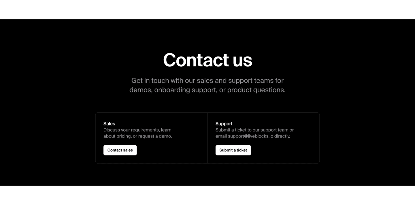
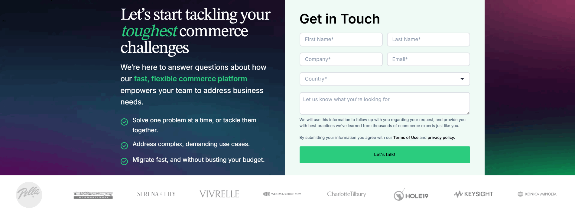
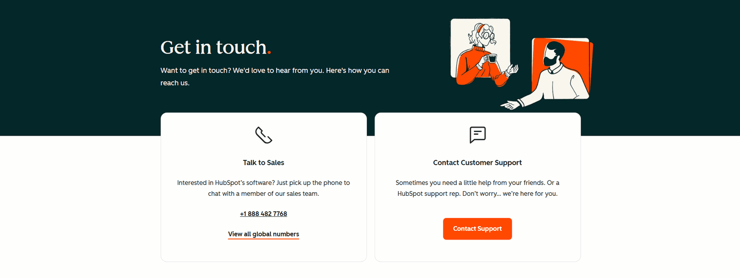
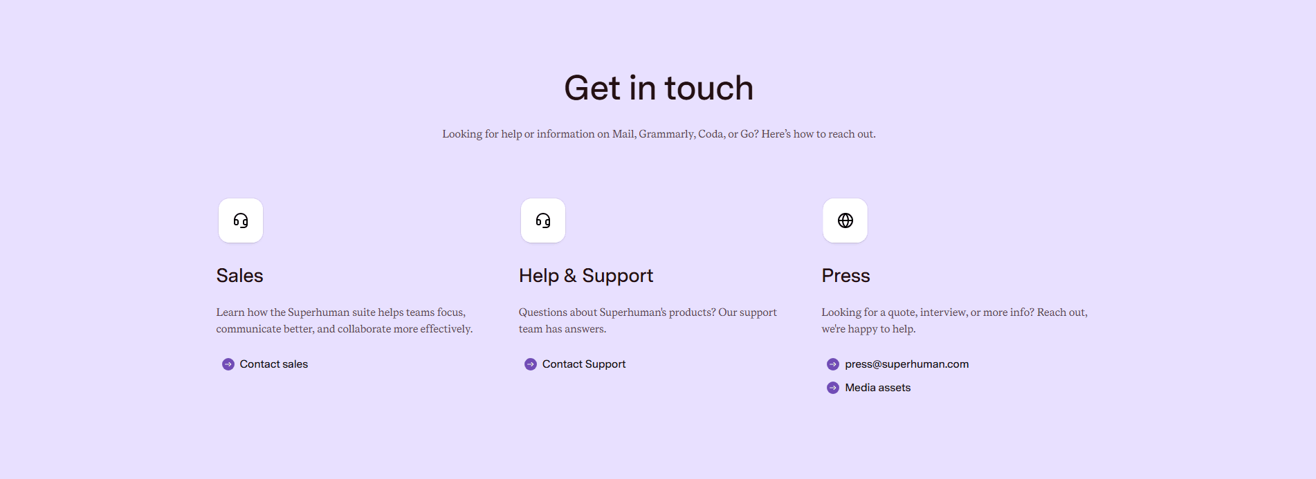
Chat widget, phone number, calendar link. Not everyone wants to fill a form
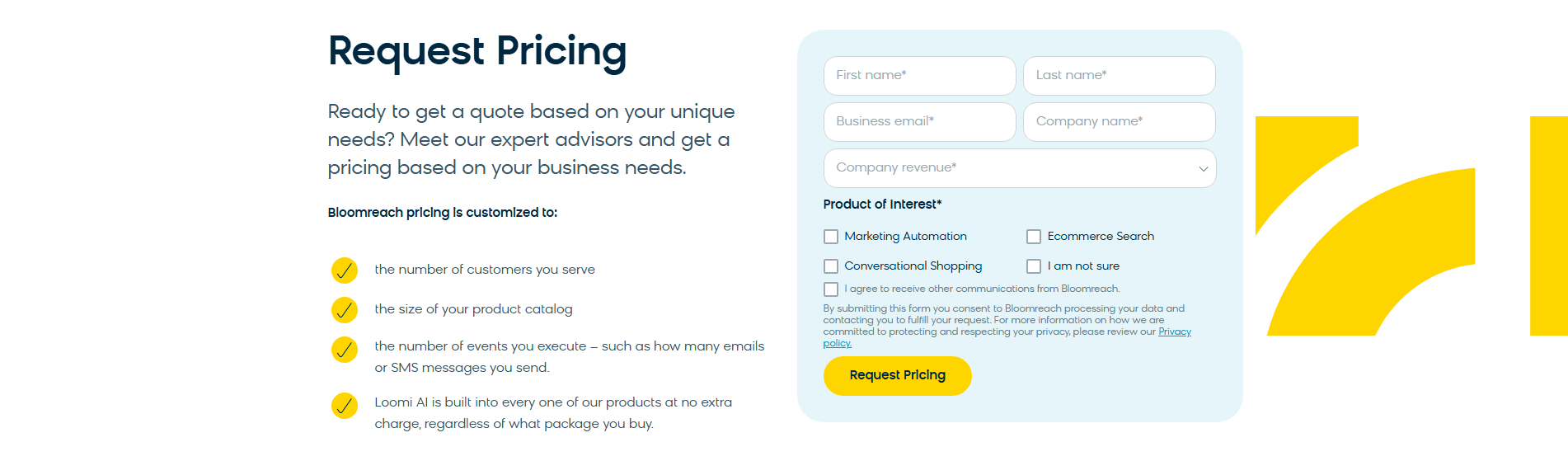
A privacy note, "no spam" promise, or security badge next to the submit button
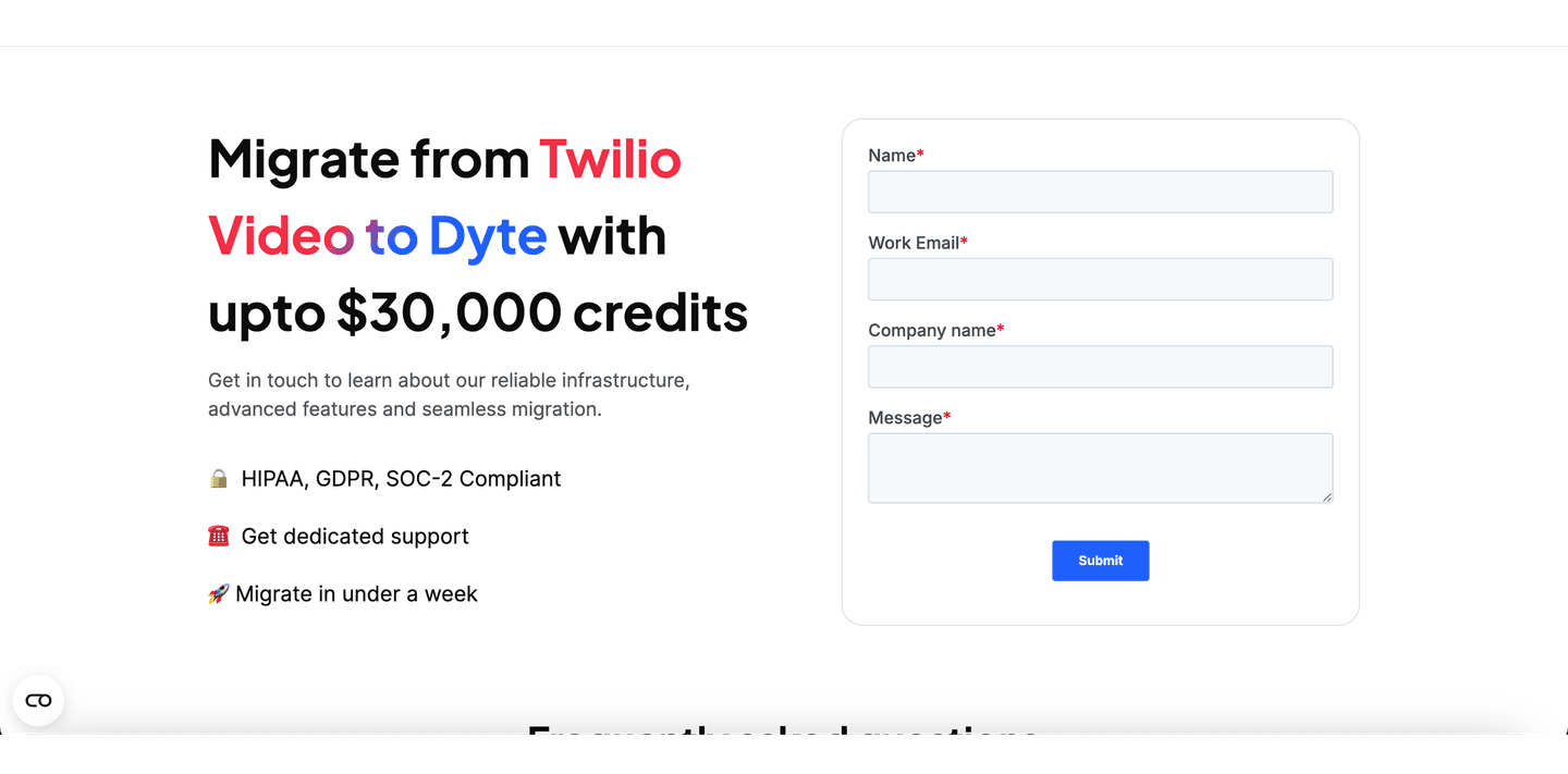
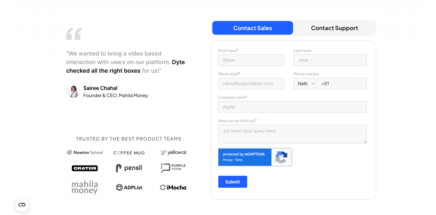
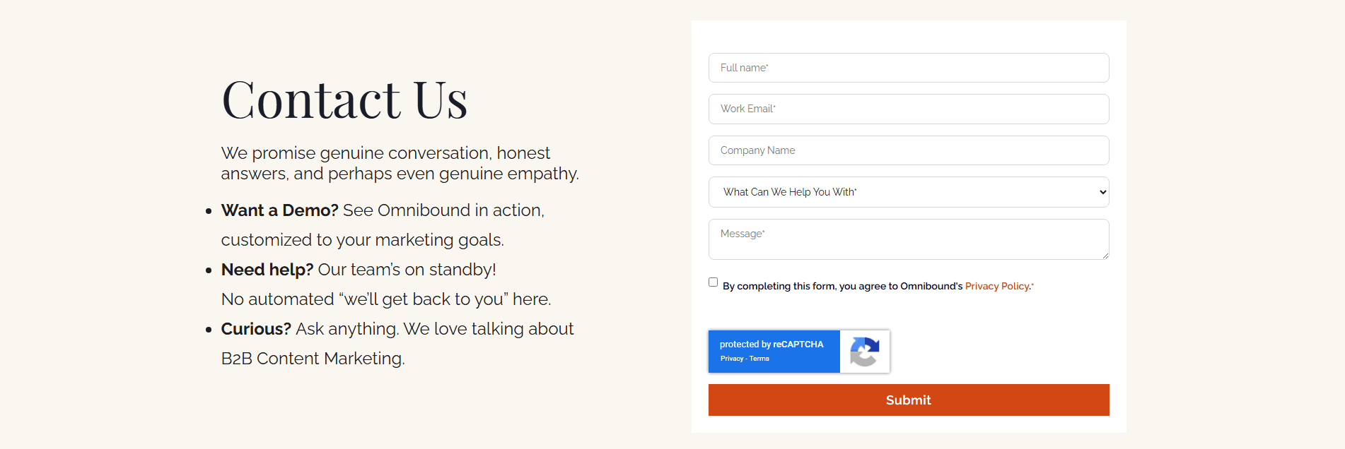
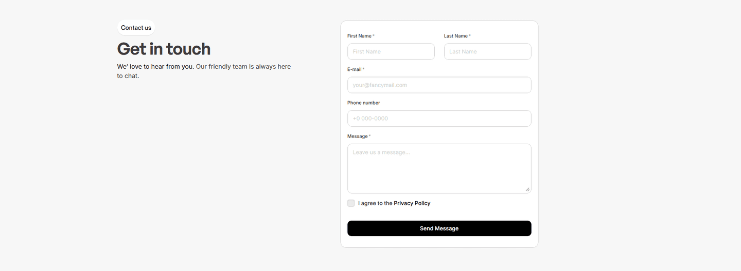
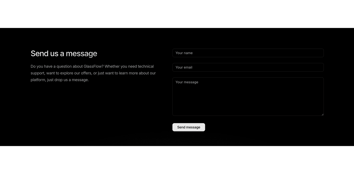
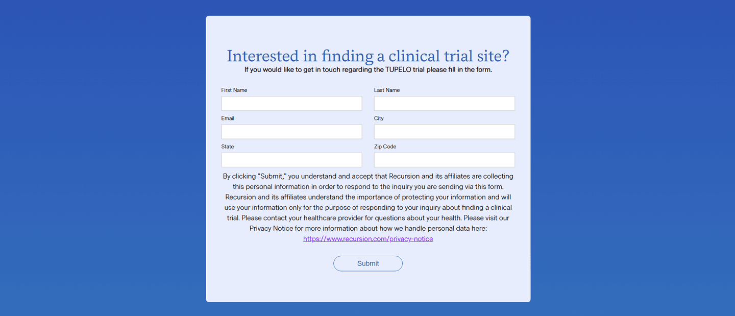
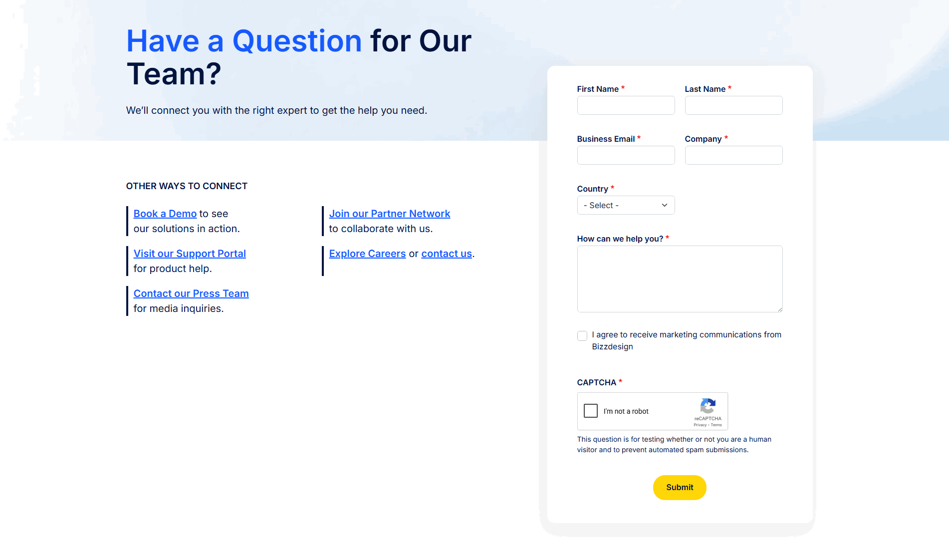
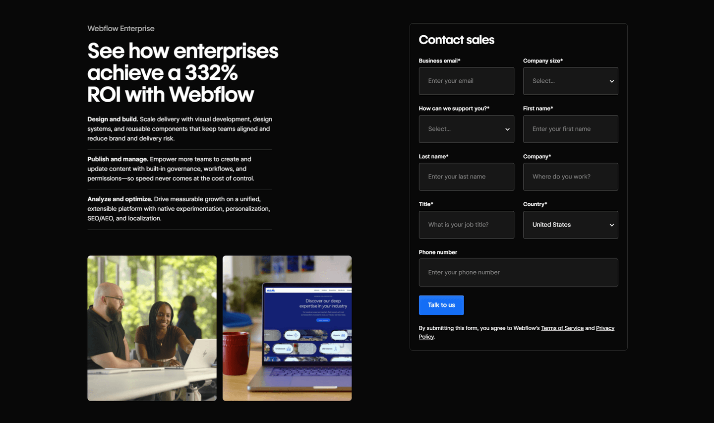
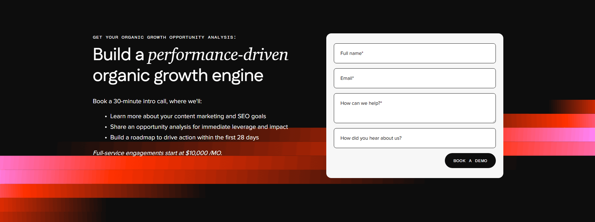
3 fields or fewer, smart labels, autofill-friendly. Visitors bail when the form asks for too much
| Element | What it means | Use it | Type |
|---|---|---|---|
| Confirmation clarity | "We'll reply within 24 hours" or "Check your inbox." Tells the visitor what happens after submit | 12% | Big opportunity |
| Human element | A face, team photo, or personal greeting near the form. Shows a real person receives the message | 27% | Big opportunity |
| Alternative channels | Chat widget, phone number, calendar link. Not everyone wants to fill a form | 56% | Common |
| Trust signals near form | A privacy note, "no spam" promise, or security badge next to the submit button | 63% | Common |
| Form optimization | 3 fields or fewer, smart labels, autofill-friendly. Visitors bail when the form asks for too much | 90% | Table stakes |
The biggest gap between all contact sections and best-in-class: the human element. Only 27% of contact sections show a face or team photo, but 75% of the best do. A form next to a real person feels like a conversation. A form alone feels like a support ticket.
Confirmation clarity is the rarest best practice: only 12% of contact sections tell the visitor what happens after they click submit. When it is there ("We respond within 2 hours"), it removes the last reason to hesitate.
Across 79 scored contact sections, here's how scores break down.
Our AI conversion agent evaluates every contact section against a weighted checklist that spans three dimensions. Each best practice gets a pass or fail based on the actual page content and screenshot.
Not every best practice carries the same weight. The human element and trust signals near the form pull the score up more because in our dataset, contact sections with those two get higher engagement than contact sections without them, even when the form itself is well-optimized.
Sections flagged best-in-class are hand-picked by our team from the highest-scoring sections. A high score gets you on the list. Best-in-class means the design, copy, and psychology all work together.
Interactive quiz
Does your form have 3 fields or fewer?
Smart labels, autofill-friendly — visitors bail when the form asks too much
4 contact sections in our library are flagged best-in-class. They all score 67/100. Every one stacks at least three conversion best practices, but they do not all use the same three.
75% include alternative channels. A calendar link, a chat widget, or a direct email alongside the form. They do not force every visitor into the same funnel. Some people want to book a call. Others want to type two sentences. The best contact sections let you choose.
Formcarry, Cal.com, Designjoy, and Evergreen all stack these. That is what a score of 67 looks like.
 67/100
The lowest-scoring contact sections in our library are not ugly. They just do one thing and stop.
A contact section scoring 10/100 typically has only 1 conversion best practice: form optimization. The form works. It collects an email and a message. That is it. No trust signals, no alternative channels, no human element.
The most common gap: no human element. 73% of all contact sections skip it. In the bottom tier, it is universal. Visitors see a form with no face, no name, no hint of who receives the message. It feels like shouting into a void.
Second: no alternative channels. 44% of contact sections offer only the form. No phone number, no chat, no calendar link. If the visitor does not want to fill a form, there is nowhere else to go. They leave.
Then there is confirmation clarity. 88% of all contact sections skip it. The visitor clicks "Submit" and gets a generic "Thanks." No timeline, no next step. They have no idea if anyone will ever respond.
The fix is not a redesign. Add a team photo next to the form. Add a calendar link or chat widget. Add one line under the button: "We respond within 24 hours." The gap between a 10 and a 67 is three missing elements.
Want to know which best practices your contact section is missing? Try our landing page audit →
 10/100
Curated by
Gabriel Amzallag , Founder, LPA
5 years CRO + SEO at Qonto (2021–2025). After advising 15+ SaaS on their websites (Payfit, Pigment…), the same patterns kept breaking — so I decided to build the source of truth on what works on the web: the intelligence layer every tool, builder, and team uses to ship sites that perform.
See how different industries design their contact sections.
Real examples from top SaaS landing pages, scored and analyzed.

See how top SaaS pages structure their call-to-action sections to drive clicks. Scored examples with conversion analysis.
Browse CTA examples
The first screen visitors see. Browse scored hero sections with conversion best practice breakdowns.
Browse hero examples
How top SaaS companies structure their pricing tables to drive upgrades. Scored examples with conversion analysis.
Browse pricing examplesPaste your URL. Get a scored analysis of your contact section with specific fixes. Free, no signup.
Everything you need to know about contact section design, based on our analysis of real SaaS landing pages.
A contact section works best when it fits in one viewport, roughly 400-600px tall on desktop. The form itself should have 3 fields or fewer. In our database of 79 contact sections, 90% keep the form optimized with minimal fields. If you need more information, use a multi-step form that breaks fields into stages rather than showing everything at once.
A contact section lives on your homepage or landing page, typically near the bottom. A contact page is a standalone page (like /contact) dedicated to reaching you. The section catches visitors who have already scrolled your page and are ready to talk. The page catches visitors who arrived specifically to contact you, often from your navigation menu.
If your page has a conversion goal that involves human interaction — demo requests, sales conversations, support questions — yes. 56% of contact sections in our database include alternative channels alongside the form. For pure self-serve SaaS with no sales team, a CTA section with a free trial button may work better than a contact form.
Three, almost always: name, email, and message. Everything else is optional or a lead-qualification question disguised as friction. If sales needs company size or use case, collect it on the thank-you page or in the first reply, not before the visitor has committed. The one exception: if your form routes to different teams (support vs sales vs partnerships), add a single dropdown. Every extra field measurably drops completion, so each one needs to earn its spot.
Both. 56% of contact sections in our library offer alternative channels. A form captures visitors who prefer async communication. A calendar link captures visitors who want a specific time slot. Offering both removes friction for both types. If you must pick one, match your sales process: high-touch products benefit from calendar links, self-serve products benefit from short forms.
Run your page through our landing page analysis. You'll get a scored breakdown of your contact section across 5 conversion best practices (form optimization, trust signals, confirmation clarity, alternative channels, human element) with specific fixes prioritized by impact.