Your Landing Page Report
https://www.movelyapp.com/Executive Summary
Conversion Score
56
score
Fair
Type:Pricing PageGoal:Book DemoPersona:HR & People TeamsIndustry:HR Tech
“Clear concept and strong ROI proof, but the page fights itself with split CTAs, noisy proof, and unclear “team vs individual” paths.”
Strengths
- Concrete ROI calculator + sources
- Privacy message repeated across page
- Integrations match remote teams
To Improve
- Conflicting CTAs and audience paths
- Trust proof feels generic/repetitive
- Key info buried in long sections
Your Score, Explained
Your page scored across 50+ best practices.
Needs Work
- •Add visible hero image above the fold
- •Add clear numbers like ratings or results
- •Add reassurance text close to main hero button
Excellent
- ✓Clear promise with time, trial, pricing, strong ROI
- ✓Messaging across sections supports the main promise
- ✓Differentiators explained with scheduling, privacy, analytics, integrations
Fair
- •Add clear before-and-after stories in one block
- •Standardize main CTA text across all buttons
- •Rewrite key copy to speak directly to users
Needs Work
- •Remove placeholder strings and repeated low-quality content
- •Add recognizable customer or partner logos early
- •Add testimonials with names, roles, and photos
Needs Work
- •Show real product and context images on page
- •Define clear heading levels and standout CTA style
- •Verify and adjust text and button color contrast
Needs Work
- •Make a single primary CTA style clearly visible
- •Repeat primary CTA mid-page and near bottom
- •Explain what happens immediately after form submission
Excellent
- ✓Strong mobile hero shows headline and main button
- ✓Readable mobile text with good size and spacing
- ✓Comfortable mobile buttons with safe tap spacing
N/A
Desktop: —
Mobile: —
Top of Page
45
Needs Work- •Add visible hero image above the fold
- •Add clear numbers like ratings or results
- •Add reassurance text close to main hero button
Value Proposition
100
Excellent- ✓Clear promise with time, trial, pricing, strong ROI
- ✓Messaging across sections supports the main promise
- ✓Differentiators explained with scheduling, privacy, analytics, integrations
Copywriting
70
Fair- •Add clear before-and-after stories in one block
- •Standardize main CTA text across all buttons
- •Rewrite key copy to speak directly to users
Trust & Credibility
38
Needs Work- •Remove placeholder strings and repeated low-quality content
- •Add recognizable customer or partner logos early
- •Add testimonials with names, roles, and photos
Design & UX
0
Needs Work- •Show real product and context images on page
- •Define clear heading levels and standout CTA style
- •Verify and adjust text and button color contrast
Conversion
38
Needs Work- •Make a single primary CTA style clearly visible
- •Repeat primary CTA mid-page and near bottom
- •Explain what happens immediately after form submission
Mobile Experience
100
Excellent- ✓Strong mobile hero shows headline and main button
- ✓Readable mobile text with good size and spacing
- ✓Comfortable mobile buttons with safe tap spacing
Page Speed
—
N/ADesktop: —
Mobile: —
Page Overview
Improvement Ideas, Section by Section
Clarify who it’s for and align the primary CTA
High
Problem
Above the fold mixes “remote teams” with individual actions (1-minute session) and demo-first CTA. Low-intent visitors can’t quickly tell what to do next or if this is for them.
A few suggestions
•Rewrite H1/subhead to name buyer and outcome (HR/People Ops, fewer sick days, more energy)
•Make one primary CTA for the main KPI (demo for teams) and one secondary for low-intent (try 1-minute)
•Add 2–3 scannable proof points under CTAs (e.g., “25% fewer sick days”, “calendar-aware”, “private data”)
•Remove stray/garbled hero text (e.g., “PKMLPOAFGJ”)
To inspire you (48)
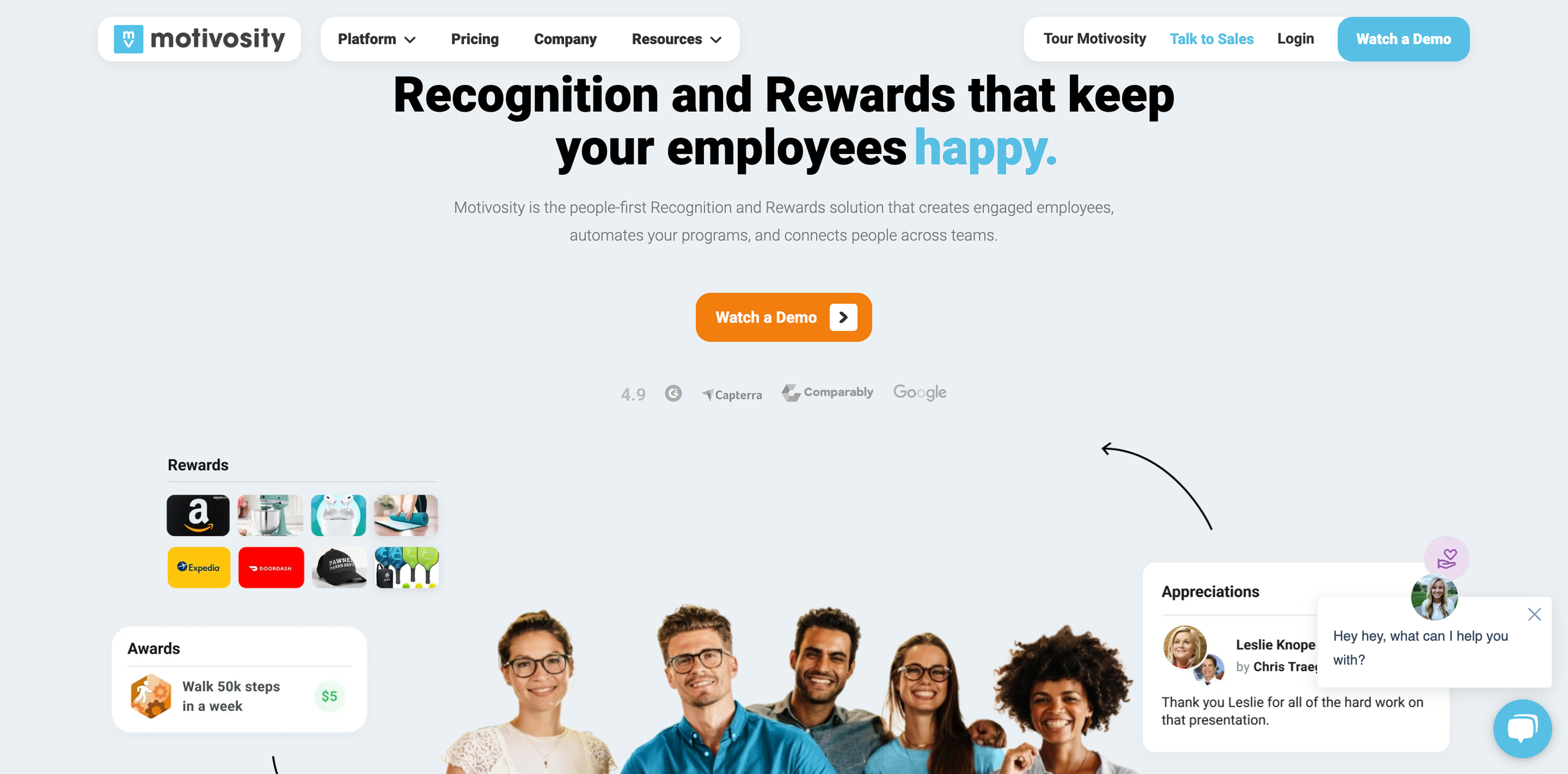
MotivosityExact match
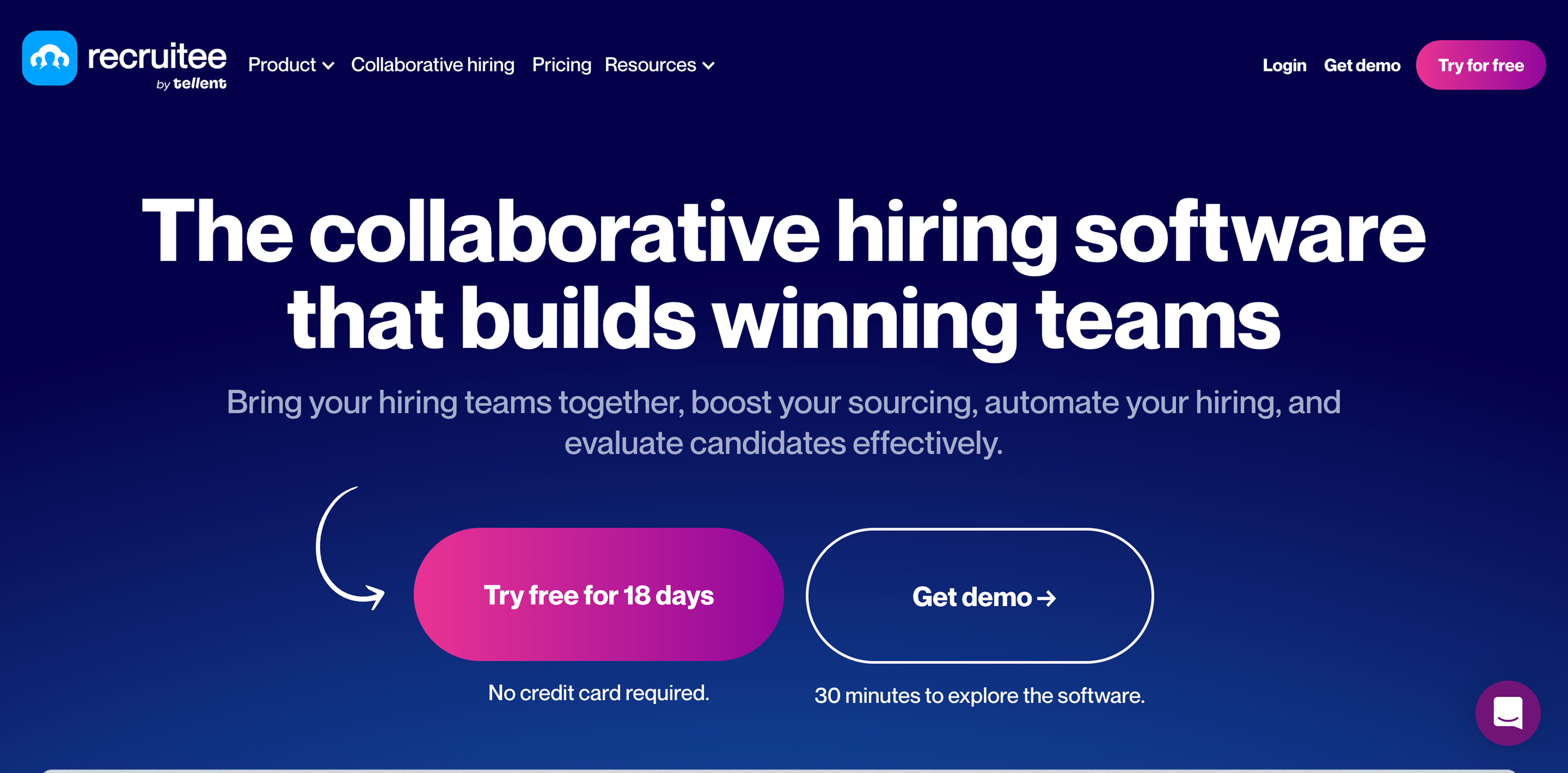
RecruiteeExact match
.png)
BloomerangExact match
Replace vague “high-growth teams” line with real trust markers
High
Problem
“Join high-growth teams…” has no logos, counts, or verification. Without recognizable trust signals, claims like “25% fewer sick days” feel ungrounded and increase skepticism.
A few suggestions
•Add identifiable trust assets near the hero (customer logos, number of teams/users, or named companies if allowed)
•If logos aren’t available, use verifiable stats: “Used by X teams”, “Y sessions completed”, “Avg weekly participation”
•Add 1 security/privacy trust cue here (e.g., “Calendar events are private”) with a link to details
•Remove duplicate or decorative trust lines that don’t prove anything
To inspire you (3)
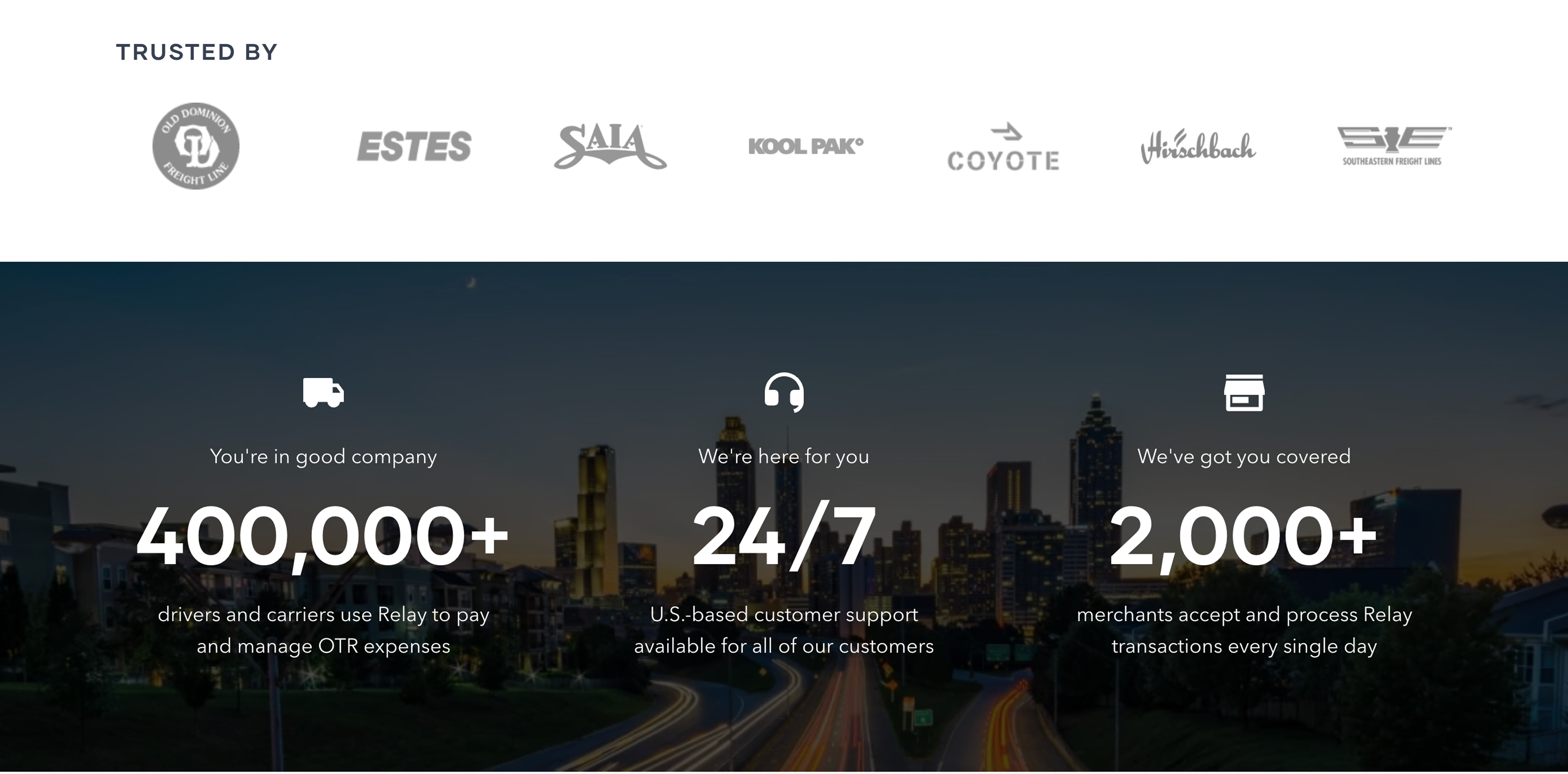
RelayExact match
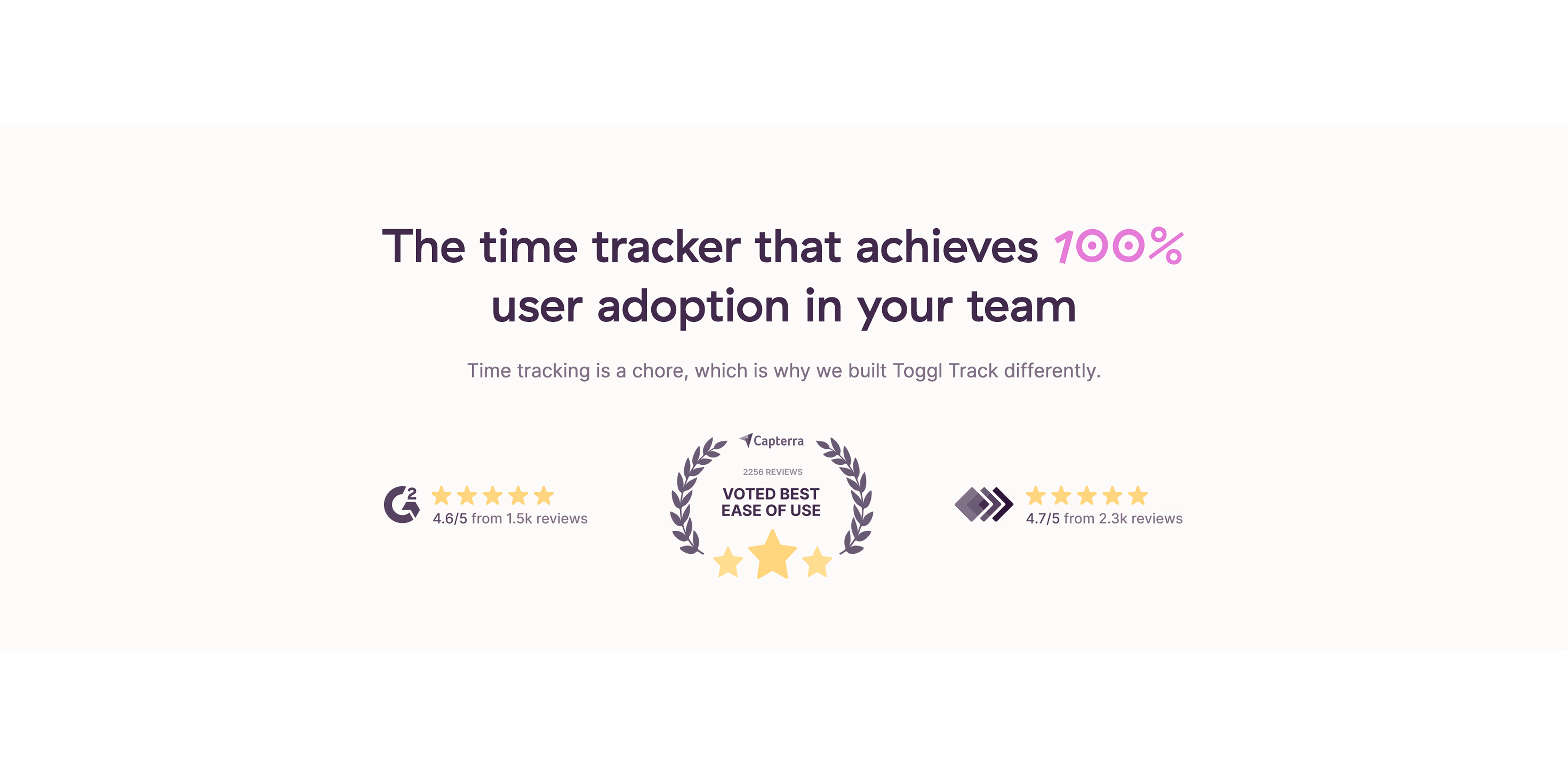
Toggl TrackExact match

Create a dedicated, consistent team CTA strip after the first section
High
Problem
CTAs change labels (Book a demo, Get Movely for my team, Get started in 60 seconds, Try Movely now). This inconsistency creates friction and makes the next step feel unclear.
A few suggestions
•Add a sticky or repeated CTA block after the hero/impact section with one primary action
•Use consistent CTA naming site-wide (same verb, same outcome)
•Add microcopy to reduce fear, e.g., “See a sample schedule”, “No obligation”, “15–30 min” (only if true)
•Pair with a secondary CTA for individuals (trial/sign-in) but visually deemphasized
To inspire you (5)
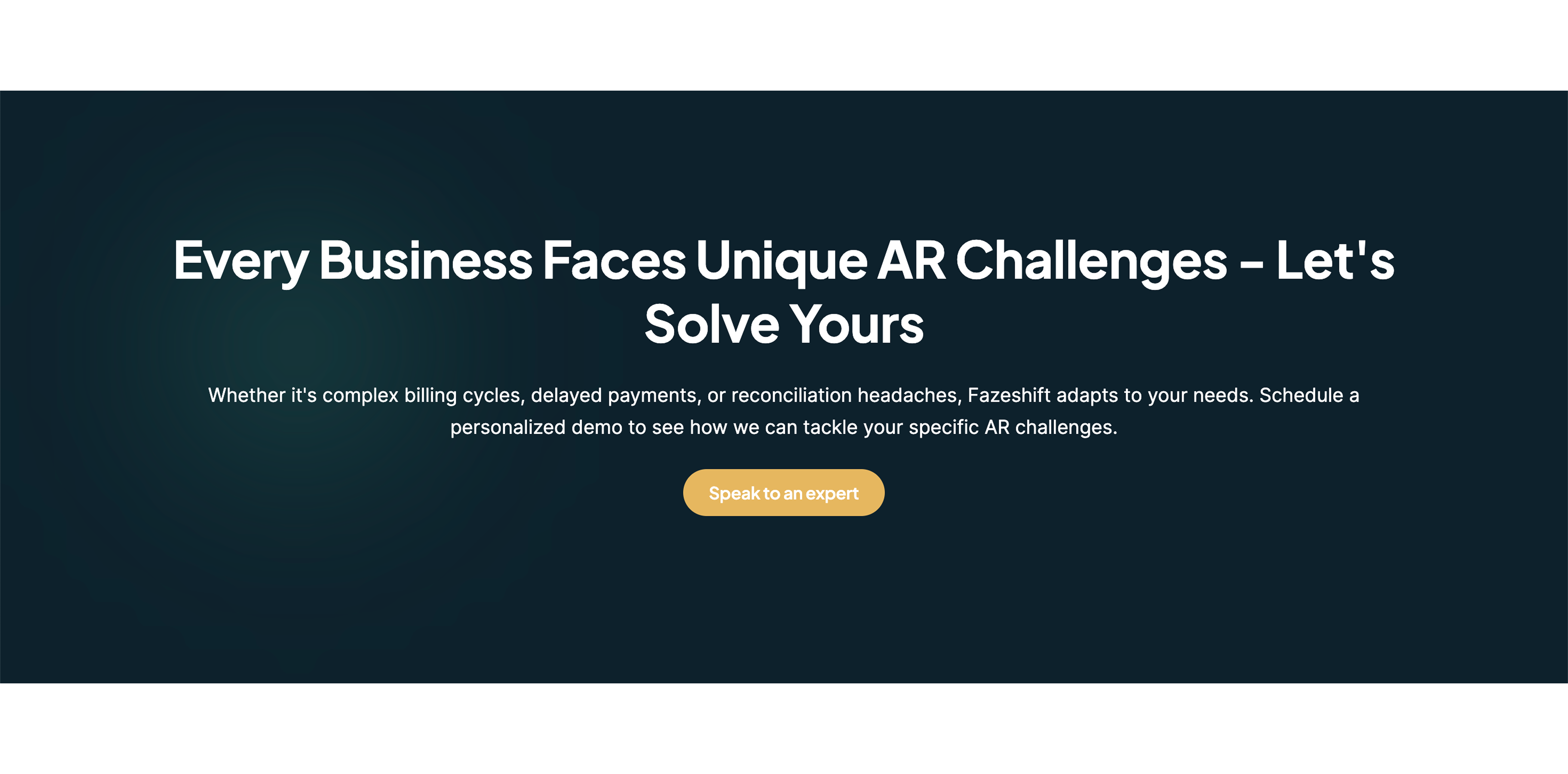
FazeshiftExact match
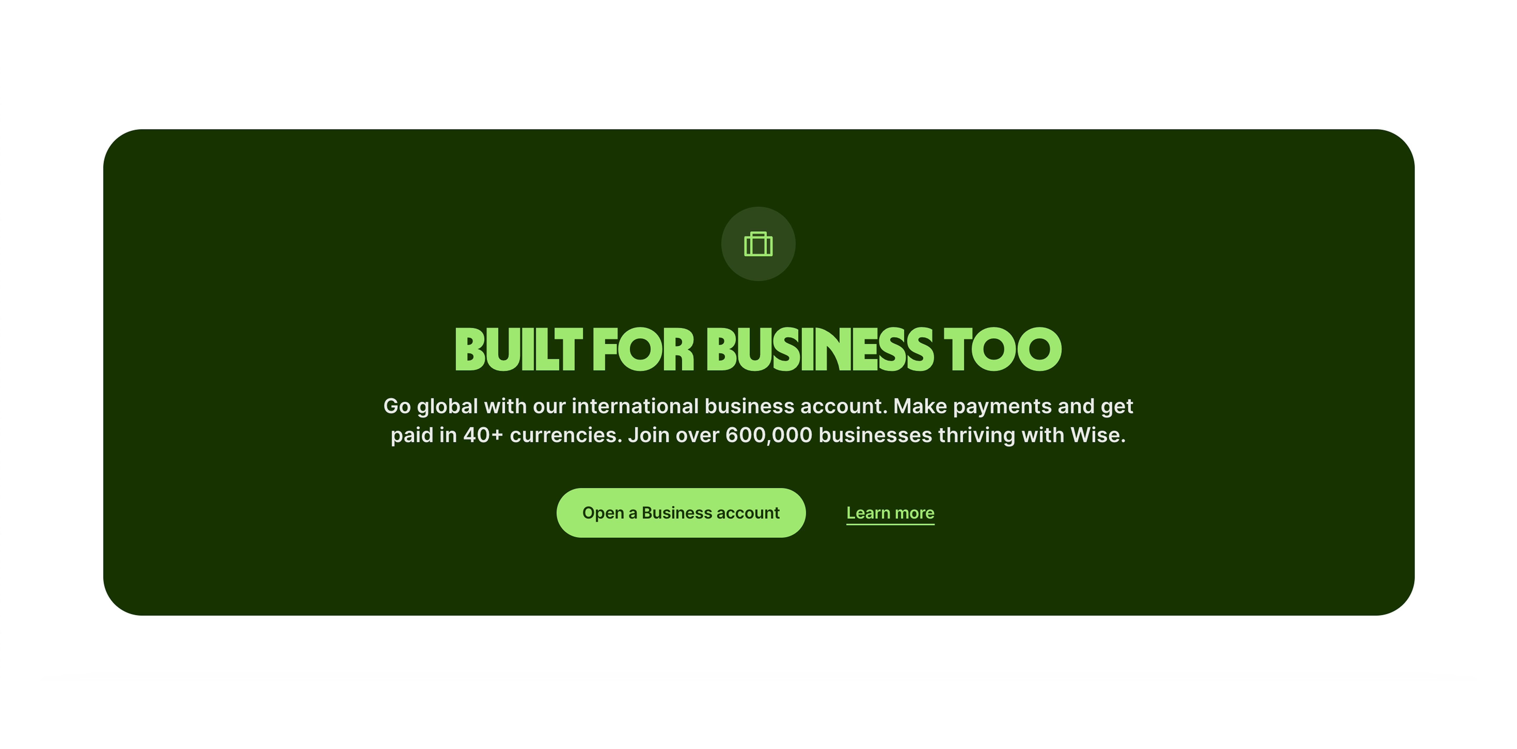
WiseExact match
Turn “The sitting problem” into scannable, relevant business pain
High
Problem
The problem section is a long list of medical citations. It’s credible but hard to scan and doesn’t directly connect to workplace outcomes (focus, neck pain, absenteeism) for decision makers.
A few suggestions
•Summarize into 3–5 bullets with plain-language takeaways tied to work impact
•Keep 1–2 strongest citations as expandable “Sources” instead of a long wall
•Add a short bridge line connecting sedentary risk to remote work reality (back-to-back meetings)
•Remove duplicate entries (same Harvard link repeated) to reduce noise
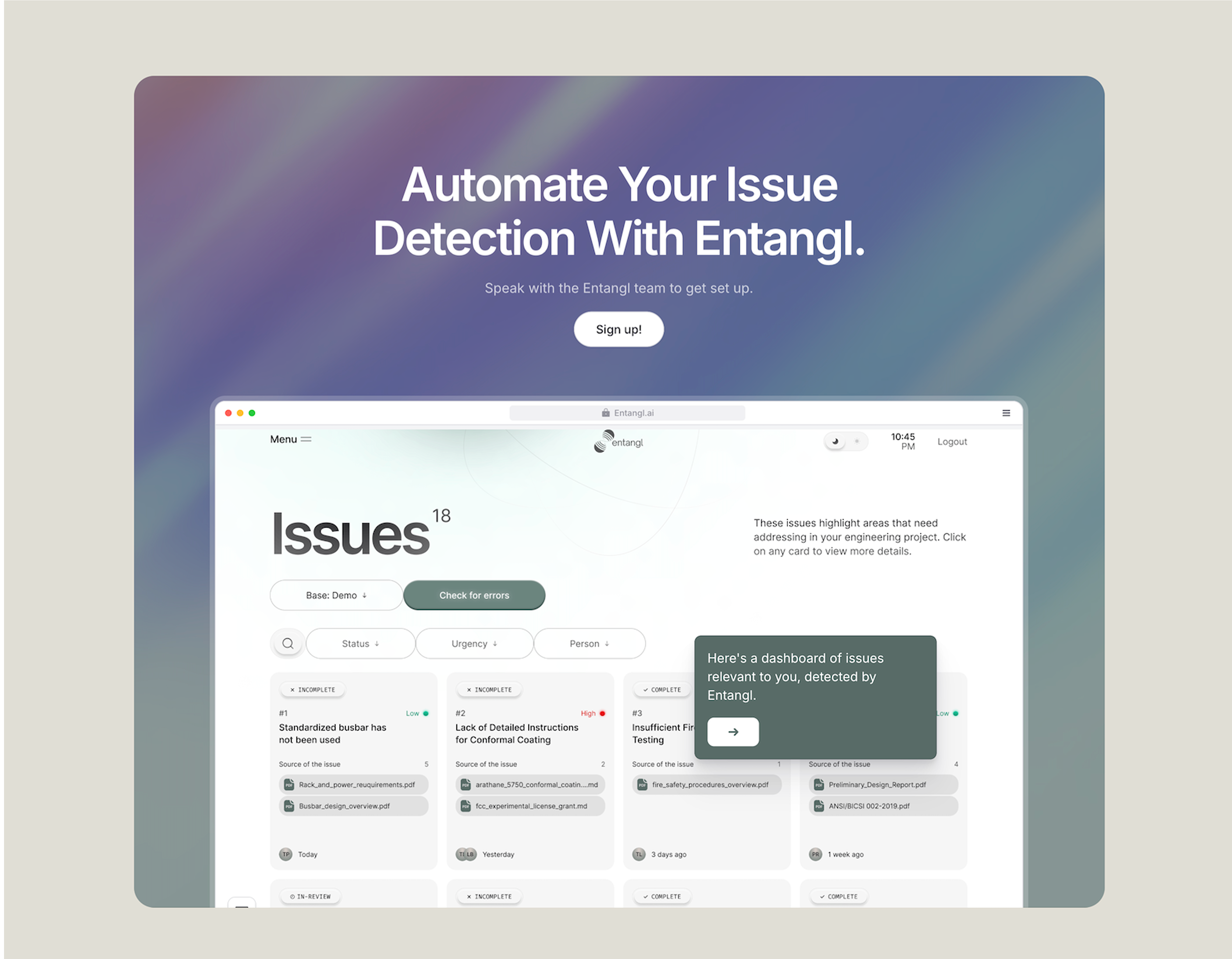
To inspire you (6)
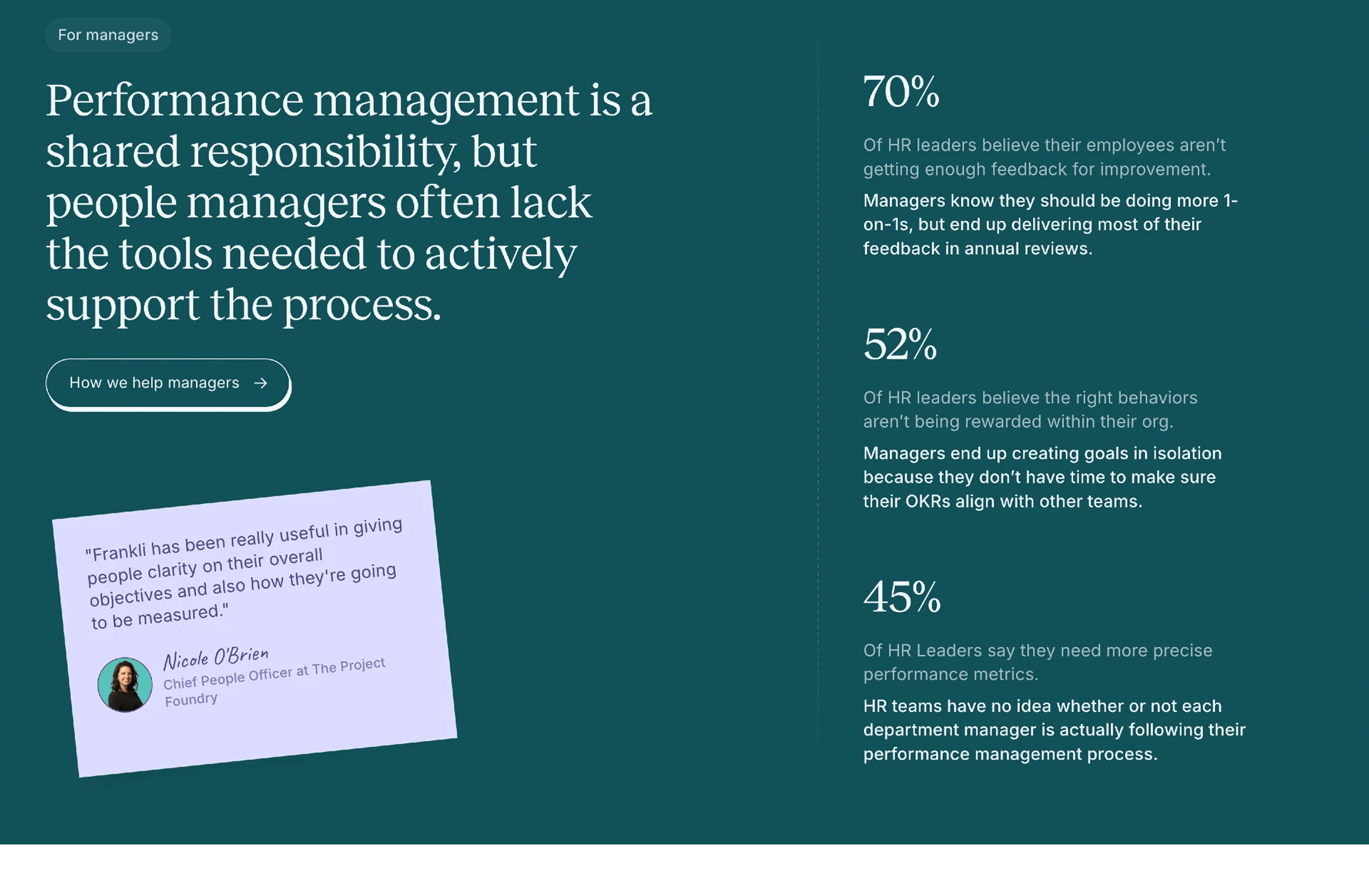
FrankliExact match
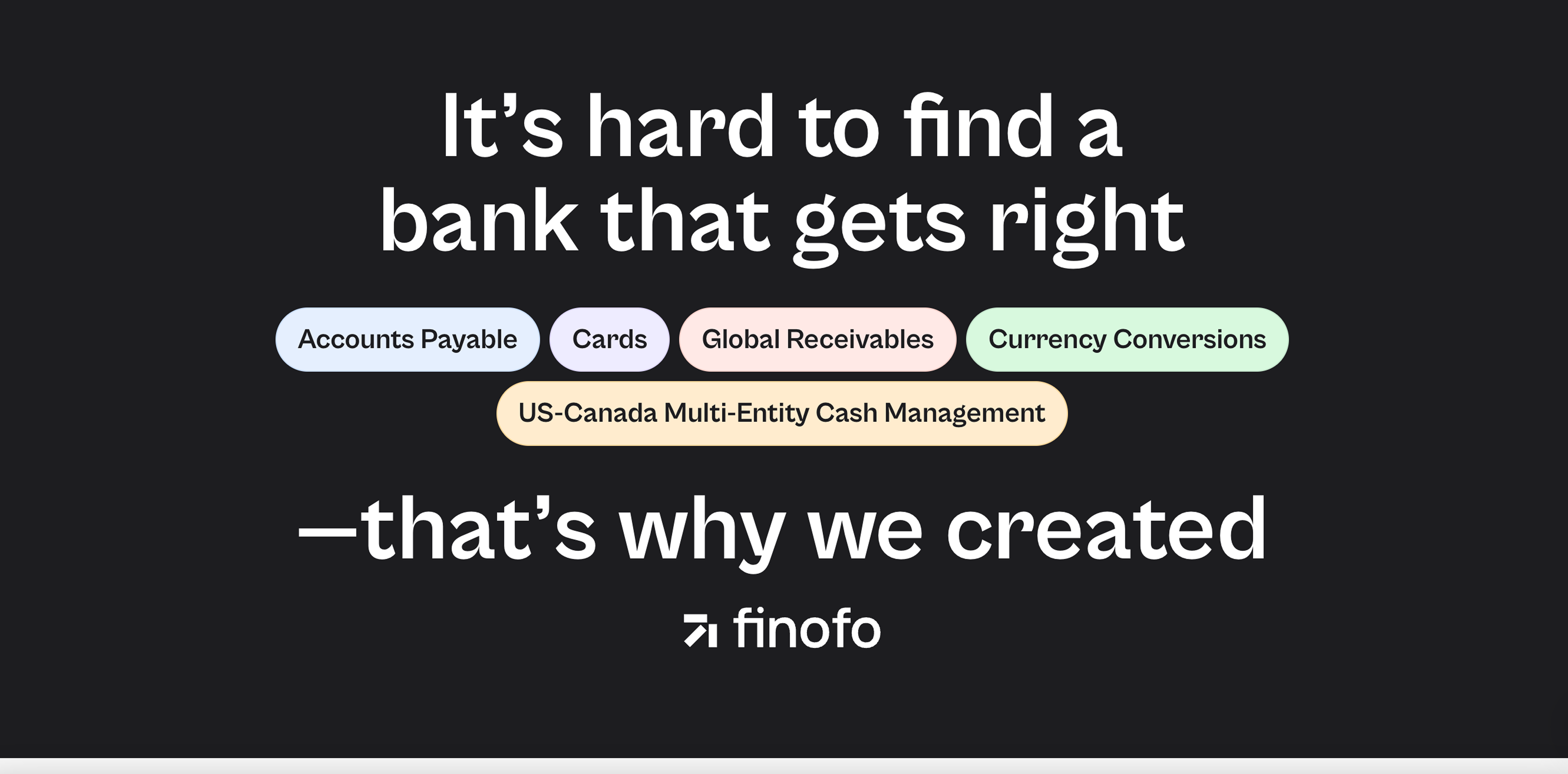
FinofoExact match
Explain how group sessions actually work for remote teams
High
Problem
The promise says “sessions your team does together,” but the page doesn’t clearly explain the experience: who schedules, how invites work, what happens in Slack/Calendar, and how time zones are handled.
A few suggestions
•Add a simple 3-step flow: set team rules, auto-find slots, run guided 2-minute sessions
•Specify where it happens (calendar event, Slack reminder) and what employees see
•Clarify group mechanics: opt-in vs required, joining late, time zone behavior
•Include one concrete example scenario (e.g., “Marketing team, Tue/Thu at 10:10”)
To inspire you (3)
ShineExact match
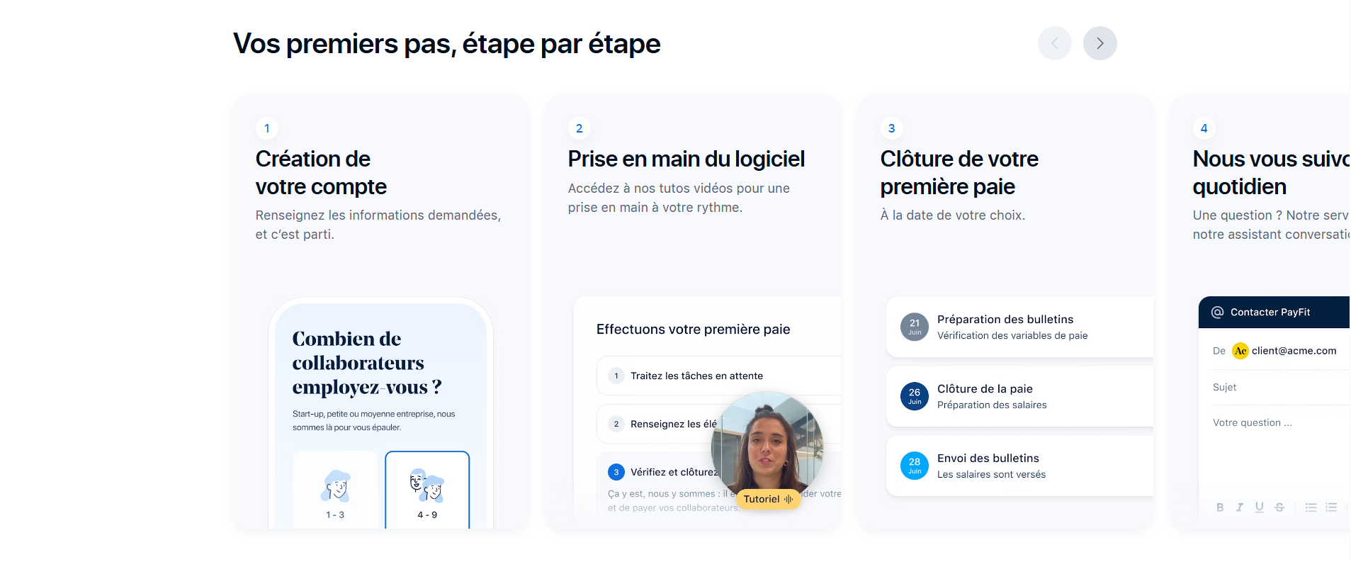
PayFitExact match
Clarify pricing target user and resolve plan confusion for teams
High
Problem
Pricing mixes individual plans (0€/year, Movely+) with an Enterprise team offer, while the top of page sells “for teams.” Visitors may not know which plan applies to a company rollout.
A few suggestions
•Add a short selector or labels: “Individuals” vs “Teams” so paths don’t conflict
•Clarify seat basis and minimums for team/Enterprise (only if true)
•Explain what the demo is for (Enterprise only, or also team onboarding)
•Add one risk reducer near plans: “14-day trial, no card” and reiterate privacy promise
To inspire you (6)
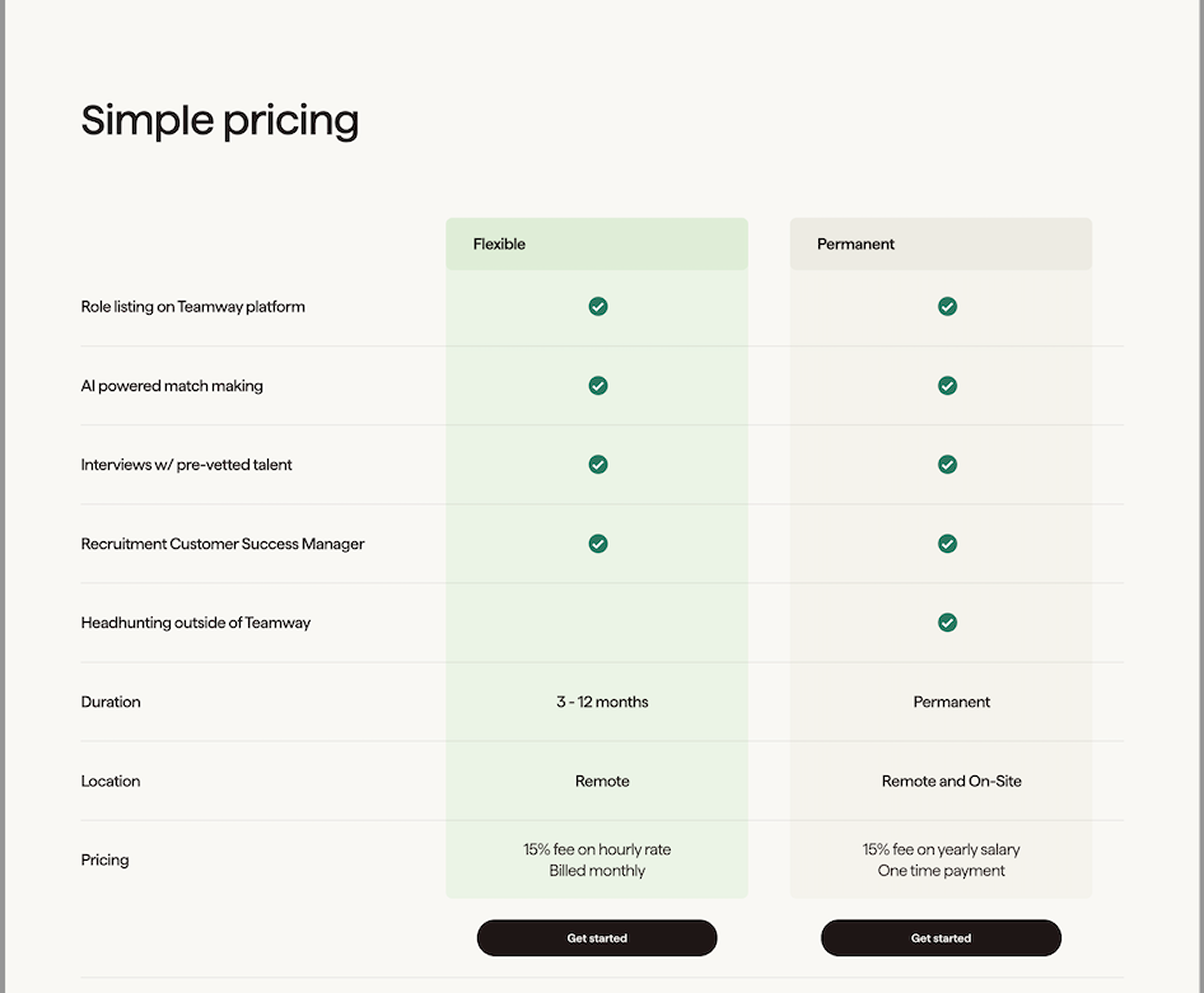
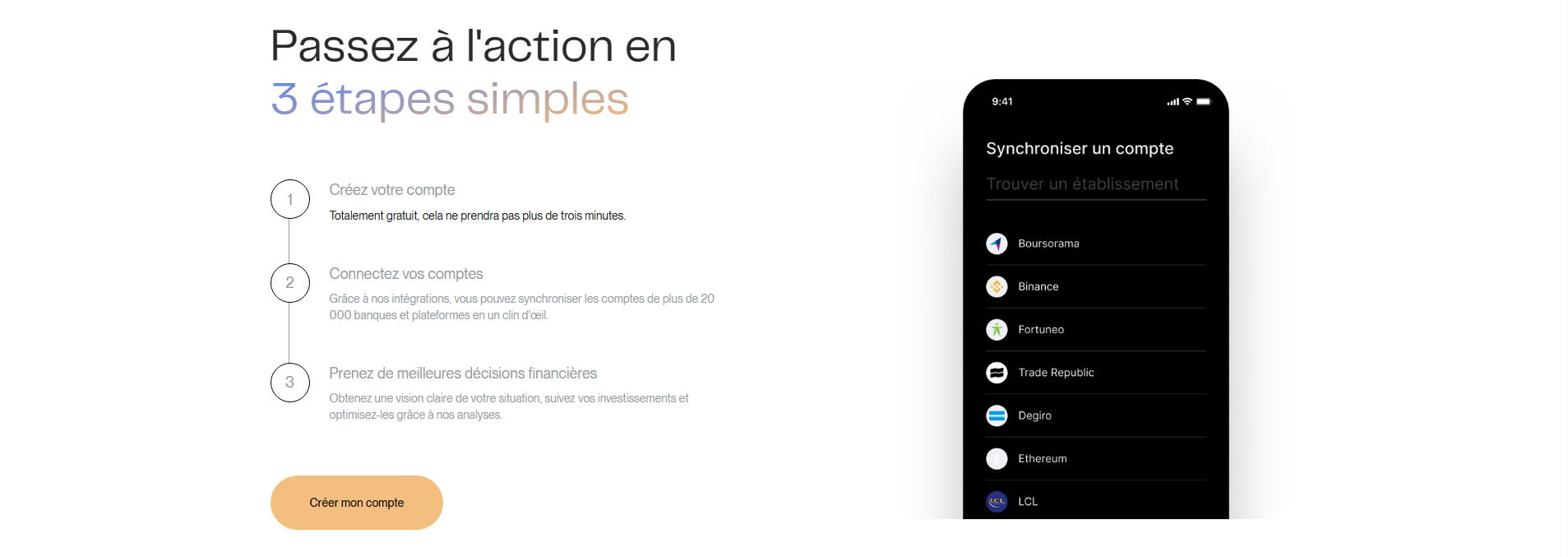
TeamwayExact match
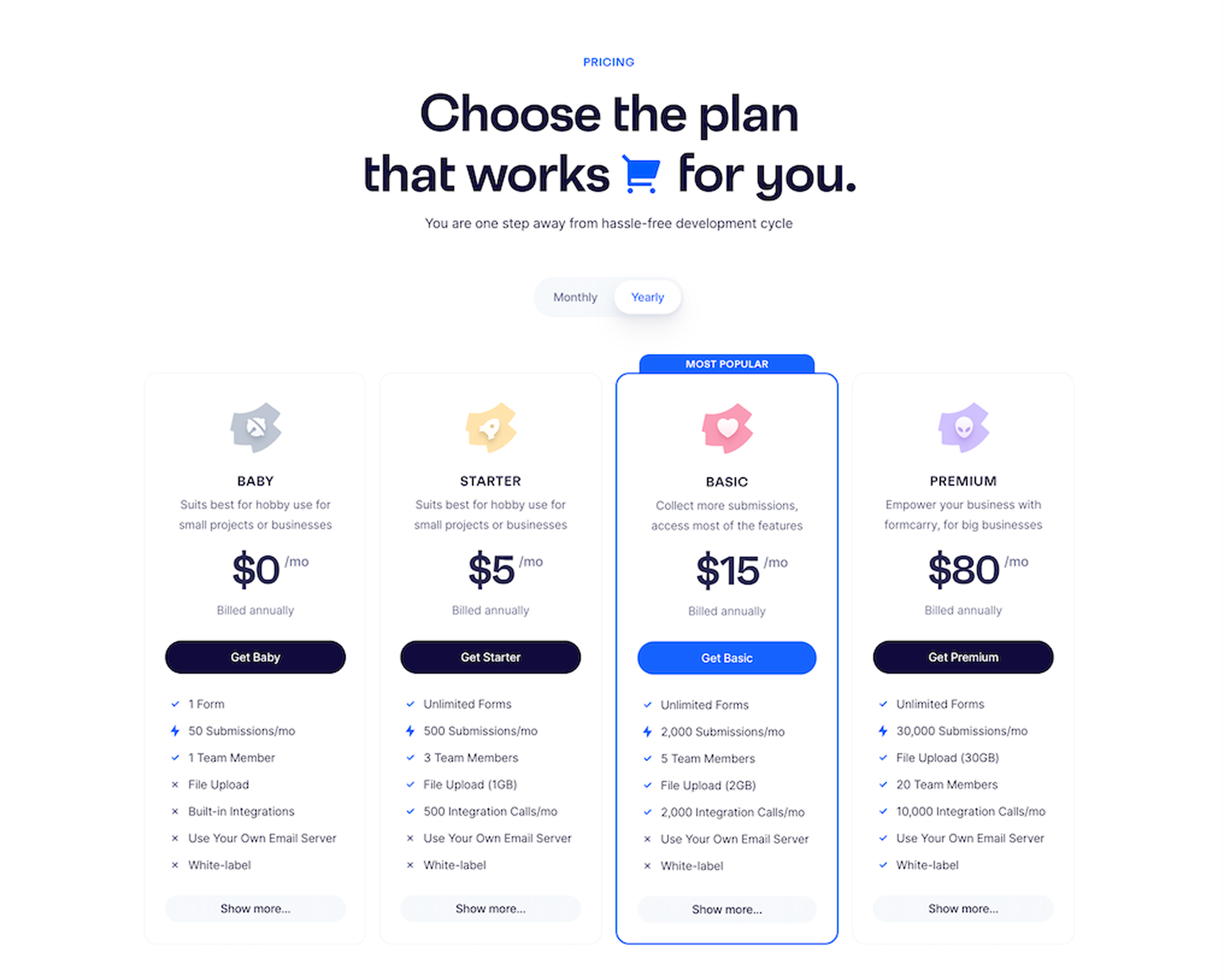
FormcarryExact match
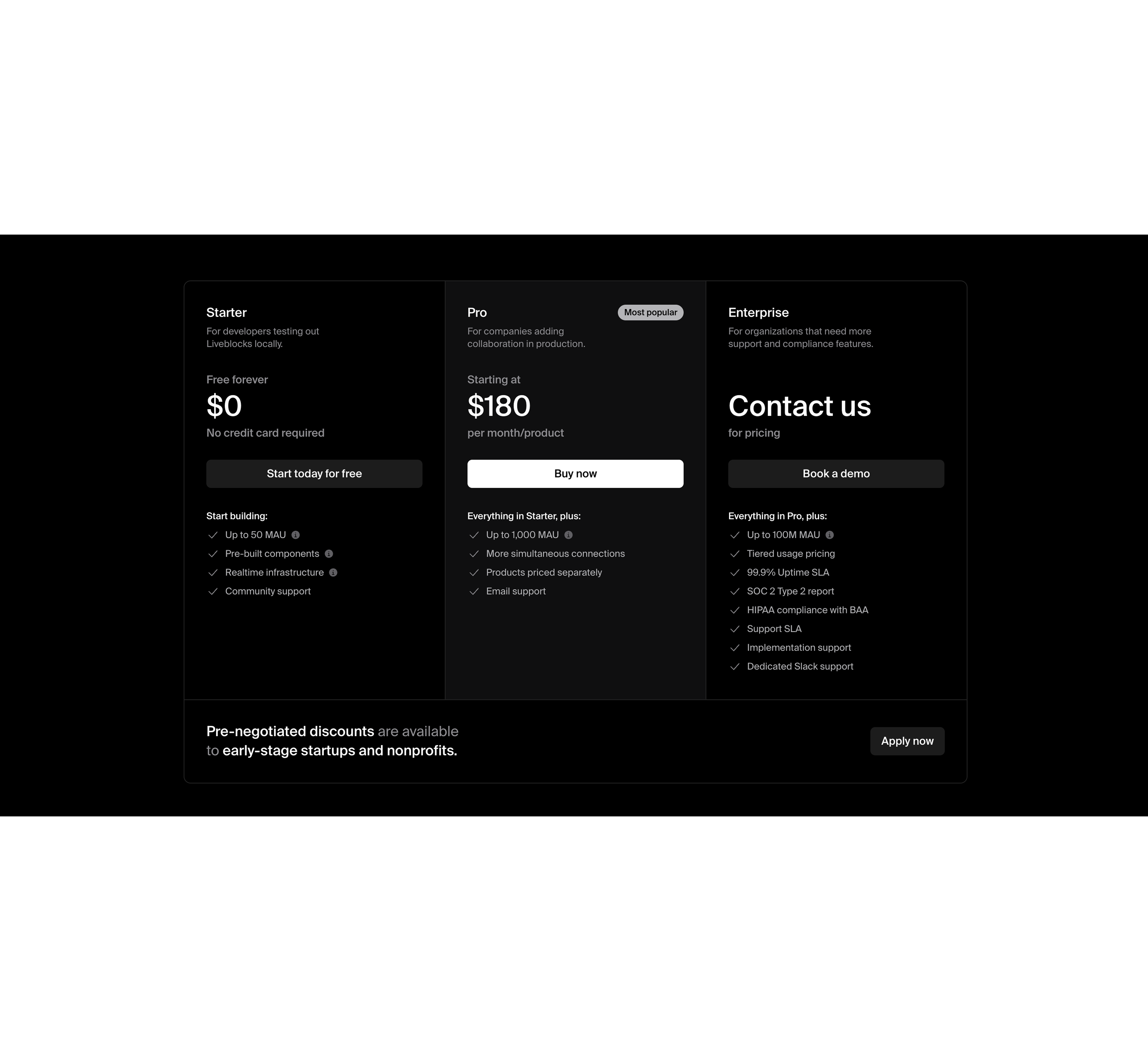
LiveblocksExact match
Reorder “Built for teams” to lead with outcomes, not admin items
Medium
Problem
The features list leads with admin management, which is not the primary value for many visitors. Benefits like smart scheduling and privacy are buried, reducing immediate relevance.
A few suggestions
•Reorder cards to lead with top value drivers: Smart Scheduling, Multi-timezone, Privacy
•Add 1 benefit line per feature (result, not capability), keep it scannable
•For admin features, state the buyer benefit (e.g., “controls for rollouts, seats, exports”)
•Add a short “works for remote teams” proof point under this section
To inspire you (14)
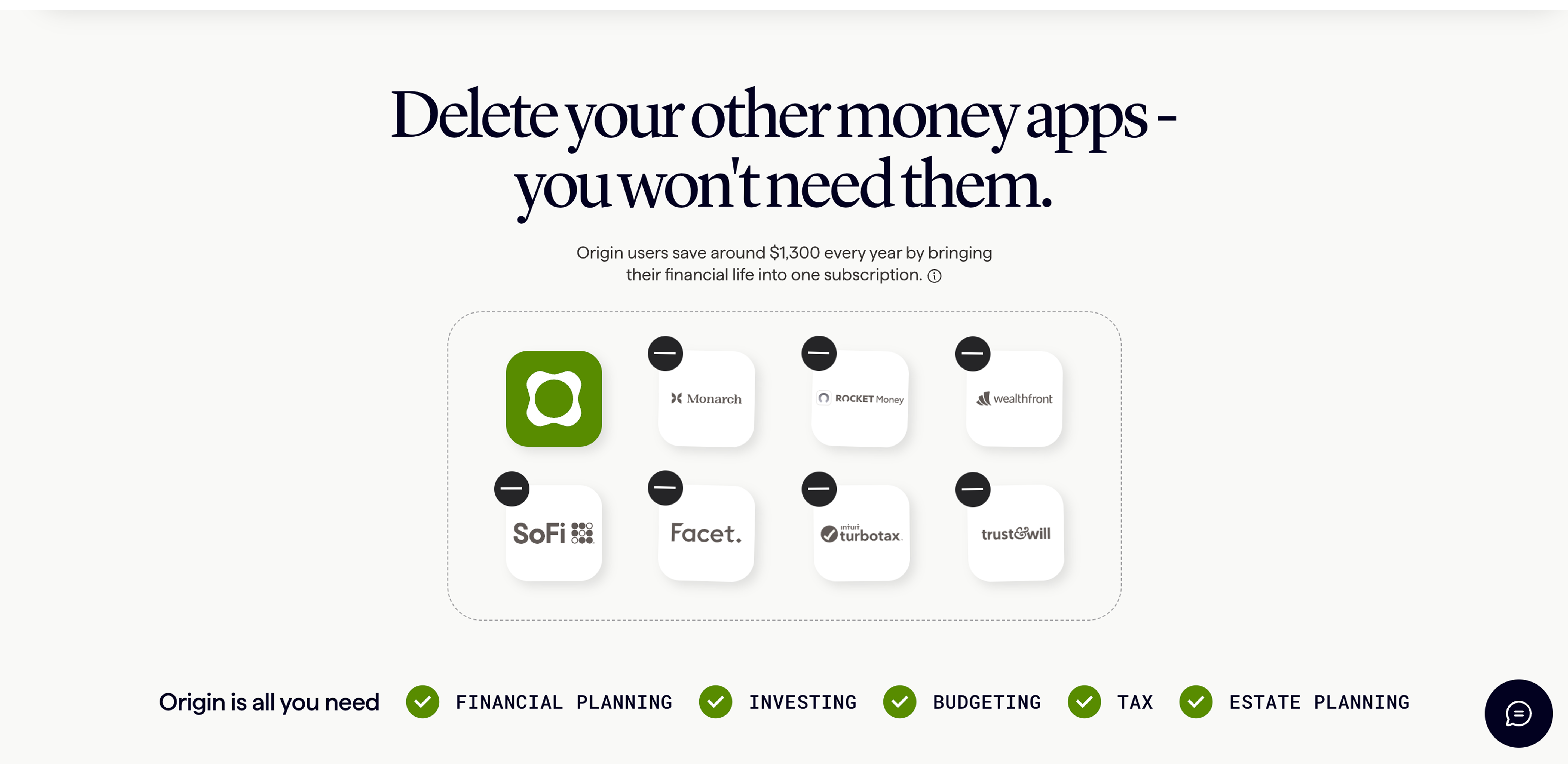
BrighterwayExact match
OriginExact match
Reduce testimonial repetition and add specificity tied to team use
Medium
Problem
Testimonials appear heavily duplicated and mostly say “easy” or “recommend.” Repetition and low detail can read as filler and undermines credibility.
A few suggestions
•Deduplicate entries and show 6–8 strongest, varied roles (HR/manager + IC)
•Add specifics: frequency, outcome, context (remote day, back-to-back meetings)
•Include at least 1 team/admin quote about rollout and engagement
•Add light verification details if available (company, team size) without over-claiming
To inspire you (6)

ShelfExact match
Elevate PayExact match
Technical SEO (Beta)
| Issue | Priority | Fix |
|---|---|---|
| Canonical points to another domain | Medium | Confirm this cross-domain canonical is intentional and valid. |
| Multiple H1 headings detected | Medium | Use a single primary H1 and move secondary headings to H2/H3. |
| Title tag is likely truncated | Medium | Shorten the title to roughly 50-65 characters while keeping the main keyword. |
| Meta description length can be improved | Low | Keep it concise, specific, and usually within 70-170 characters. |
MAKE YOUR PAGE BEST IN CLASS
Get a full conversion audit and the recommended benchmarks for your page.